TechRadar Verdict
Asus Zenfone 2 is a cheap way to upgrade to an Android 5.0 Lollipop phone, housing a 5.5-inch display and solid specs to boot. But a dull screen, plastic design and poor camera hold this handset back.
Pros
- +
Inexpensive Android 5.0 phone
- +
Spacious display
- +
Lots of RAM
- +
Two SIM card slots
- +
Full of customization options
Cons
- -
Cheap look and feel
- -
Dim screen
- -
Poor camera quality
- -
Weak power button
Why you can trust TechRadar
The Asus Zenfone 2 fills an interesting niche as an Android phone full of deep customizations, yet one that sells for half the price of similarly sized phablets.
Typically, Android tinkerers who want to invest a lot of time into customizing their phone also have to pay full price for a flagship. But the Zenfone 2 turns that concept on its meditating head.
At $300 (about £210, AU$408) unlocked and now available in the US, it's a bargain for a 5.5-inch display that's as big as a the LG G4 and iPhone 6 Plus, and specs that include a speedy Intel processor and 4GB of RAM.
There's an even cheaper $200 (about £139, AU$272) model with a slower Intel chip and just 2GB of RAM, but the 4GB version is the one that's going to last you some time – if it holds up.
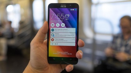
Where Zenfone 2 makes its compromises to hit that price point is in its build quality and camera. It's easy to spot the flaws of its cheaper plastic construction and poor 13-megapixel sensor.
That said, the Zenfone 2 remains one of the most inexpensive ways to upgrade to Android 5.0 Lollipop with enough processing power leftover, so long as you don't care about style or feel.
Design
Zenfone 2 is true to its unintentional theme of finding internal strength and beauty because, on the outside, this isn't a very pretty or strong phone.
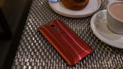
It feels more cheaply made than it looks. This is thanks to the artfully deceptive, brushed metal design on the back cover and its 5.5-inch display made with Gorilla Glass 3 and an anti-glare coating .
But holding the phablet in my stretched out hand, I could tell the difference between it and the glass-backed Samsung Galaxy S6 and aluminum-backed iPhone 6 Plus right away.
I could also see the difference in quality as my stretched out hand accidentally dropped the phone, and its top-right corner met pavement. Cracks spread across the screen's surface and a frown stretched across my face.
This unintentional drop test was a tumble at 32 inches (81cm), rather than a direct drop, from my pocket. The phone's bulkier-than-normal dimensions didn't fit in my jeans as well as I had expected.
While Samsung and HTC upgraded their flagship phones to Gorilla Glass 4, Asus stuck with the previous generation's less durable material. LG G4 kept Gorilla Glass 3 too, but at least it features a slight curve that might have saved this phone from its now unsightly blemish.
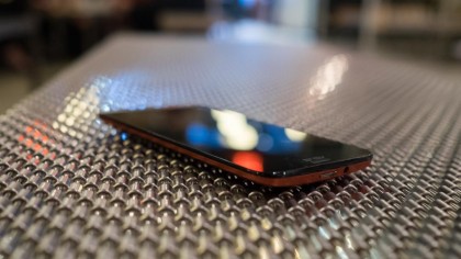
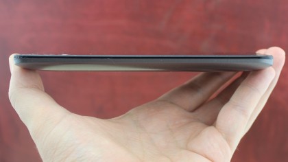
Despite the plastic body and cheaper glass construction, the Zenfone 2's dimensions and weight are less svelte, as expected given its price.
Its curved back gives it a thickness of 10.9mm. By comparison, the Galaxy S6 is 6.8mm, the HTC One M9 is 9.4mm and the LG G4's thickest point is 9.8mm.
The rest of the measurements are actually competitive. It's 152.5mm in length with a 77.2mm width. But, at 170g, it weighs slightly more than everything but the iPhone 6 Plus.
Zenfone 2 also cheaps out on the power button. It sits at the top of the phone, in an odd center location, and has little tactical feedback, almost as if it's broken. Luckily, the phone's software makes use of the handy double-tap-to-wake screen feature introduced in the LG G2.
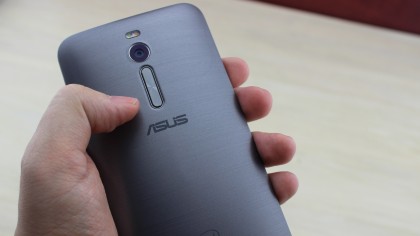
While the power button is annoyingly squishy, the volume buttons have the necessary clicky feedback, taking cues from LG with their location on the back.
Three capacitive buttons for back, home and recent line the bottom of the display, but are neither on-screen buttons, like on some Androids; nor do they light up, like on Samsung devices. This makes it difficult if you're moving from a Samsung phone (where the back and recent buttons are swapped), as you may have trouble getting used to this order in the dark.
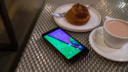
There's a single loud-sounding speaker, but it stretches across the back of the phone, which means calls on speakerphone and music point in the wrong direction. Costlier phones, like the Galaxy S6, have moved the speaker to the bottom of the phone. Better yet, the HTC One M9 has stereo speakers on the front.
Display
The Asus Zenfone 2 can compete on size, especially for the price. Its large 5.5-inch display, which is slowly becoming the norm among Android phones, feels quite roomy.
Everything from typing out messages to getting work done on the spacious, LED-backlit LCD is a little bit easier, and this phablet has enterprise-ready specs to back up that work.
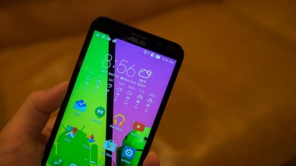
But don't expect a super-rich screen for fun multimedia. Its diagonal measurement matches the 5.5-inch LG G4, but its resolution of 1,920 x 1,080 cannot compare to a quad HD display.
More importantly, while its the same resolution as the 1080p iPhone 6 Plus, the brightness literally pales in comparison to Apple's Retina or Samsung's Super AMOLED displays.
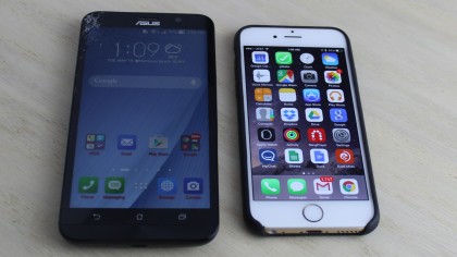
That becomes a real problem when in sunlight. Taking a photo at the sun-drenched beach is nearly impossible when you can't use the display as a viewfinder. For better or worse, the Zenfone 2 isn't a great camera phone, so the point is kind of moot anyway.
I do like how, even when selecting the "auto" ambient light mode, the brightness can be adjusted ever so slightly. But overall, the screen looks half as bright as it should be.

