TechRadar Verdict
A smartphone that initially unimpresses but quickly comes to the user willing to put in a couple of hours effort. A far cry from the horror of the first Storm and hopefully the sign of good touchscreen phones to come from RIM
Pros
- +
Solid OS with a good number of features
- +
Responsive touchscreen
- +
Easy to use media player
- +
Superbly intuitive texting
Cons
- -
Poor internet browser
- -
Annoying SurePress touchscreen
- -
Poor build quality in the battery cover
Why you can trust TechRadar
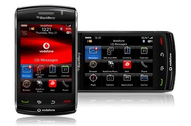
RIM has rebooted its touchscreen range with the Storm 2 9520, featuring re-tooled clickable touchscreen technology and new, intuitive text input options.
It's still going to be seen as RIM's attempt to rival the likes of the iPhone 3GS, Palm Pre and HTC Hero, but are the updates on the Storm 2 enough to fix the issues that were so widely condemned on the original Storm?
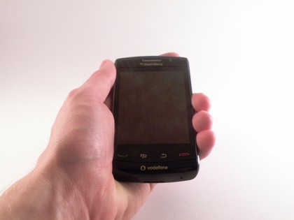
The Storm 2 is the same size as the original, but 5g heavier. We'd have imagined this would have given it a weightier and premium feel, but in practice this isn't the case with the phone feeling a little too heavy in the hand.
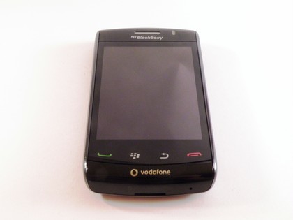
However, it sits well in the palm, with minimal dexterity needed to shuffle up and down the screen and also hit the on/lock screen button on the top left-hand side, which is a crucial feature often missed by mobile designers.
The Storm 2 is pretty button-packed around the edges, with a number of rubberised buttons (which are apparently manufactured this way to stop them falling off, a problem with the original Storm).
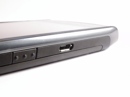
The left-hand side of the device holds the microUSB port (without cover, so watch out that it doesn't get too dirty in there) and a function key that can be re-assigned to provide access to your favourite shortcut.
The top of the phone hold two buttons embedded into the phone itself – the power/lock button and the mute key. The 3.5mm headphone jack is now recessed into the phone and lives on the right-hand side of the phone, just above the rubber-cased volume/up and down keys.
Sign up for breaking news, reviews, opinion, top tech deals, and more.
Finally the camera shutter button is also located on the right-hand side, although far enough away from the other keys that you can easily avoid striking it.
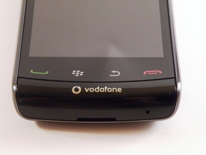
The buttons on the front of the phone – call, menu, return and terminate –have been embedded into the LCD screen for the new Storm 2, as these were also apparently prone to falling off. They're now part of the SurePress click screen too, making them ever so slightly harder to use in one hand mode.
The button layout is well thought through – the only slightly difficult key to hit is the mute key on the top right. However, given we probably used this least (and only when we got a call) that wasn't the end of the world.
The screen is built on four piezoelectric sensors, and clicks when you press down on it. This system is similar to the first Storm, which also used a clickable screen (known as SurePress) but where that only had one mechanical sensor, the Storm 2 has four.
This means the screen has less travel in it, and is easier to press down. You can also click two parts of the LCD at once, which means faster typing.
But when the phone is put into sleep mode, RIM has come up with a cool trick – the screen will lock and cannot be clicked down. This obviously annoyed enough people on the first Storm for the company to change it, and it's very cool.
The call/terminate keys can be pressed though, meaning the screen will light up if you accidentally strike down there. Speaking of lights, there's an LED indicator at the top which blinks different colours for things likes charging and new messages - handy when the Storm 2 is in sleep mode.
The idea of the locked screen is to add to the premium feel of the device – constant pressing of the old Storm's screen made the whole process feel a little bit cheap and poorly made.
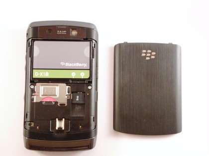
There's another problem with the Storm 2 though, and that's that the battery cover doesn't sit so well on the rear of the phone, meaning that there's a little bit of give in it.
This means that when you hold the phone in your hand there's a lot of movement in the supposedly static chassis, which once again ruins the premium feel.
Removing the metallic battery cover is difficult too – it can't be done with a finger so you'll need to find some extra implement to help you. It's an odd choice, and we thought there might be something in the box to help, but there isn't.
The microSD slot lives under the battery cover, next to the not-insubstantial 1400mAh battery, which falls out with a simple pat. It's a simple system, although the fact it feels like it's guarded by Cerberus himself thanks to the locked down battery cover is very annoying.
In the box
The BlackBerry Storm 2 box is as luxurious as you'd expect a flagship device to be. RIM has thoroughly eschewed the minimal packaging favoured by HTC and Apple, and gone with a nice black box.
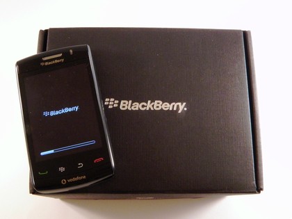
The phone is centre stage when you open it up, but beneath layers of cardboard live a whole host of goodies. We're talking microUSB travel charger (why do we have to have a travel version? We want a home one!), USB cable, 3.5mm headphones, a pouch and a nice cloth to wipe the screen with.
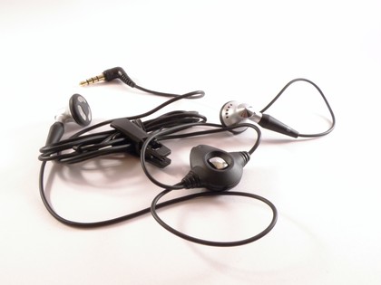
The headphones are average quality but double as a hands-free kit with call answer button, and are decked out in a nice chrome and silver look – if that's your kind of thing.
Current page: BlackBerry Storm 2 9520: Overview, design and feel
Next Page BlackBerry Storm 2 9520: Interface
Gareth has been part of the consumer technology world in a career spanning three decades. He started life as a staff writer on the fledgling TechRadar, and has grew with the site (primarily as phones, tablets and wearables editor) until becoming Global Editor in Chief in 2018. Gareth has written over 4,000 articles for TechRadar, has contributed expert insight to a number of other publications, chaired panels on zeitgeist technologies, presented at the Gadget Show Live as well as representing the brand on TV and radio for multiple channels including Sky, BBC, ITV and Al-Jazeera. Passionate about fitness, he can bore anyone rigid about stress management, sleep tracking, heart rate variance as well as bemoaning something about the latest iPhone, Galaxy or OLED TV.
