TechRadar Verdict
For the appealing price of £299.99, Honor's 6 Plus packs a great screen, solid build and a snapper that mostly get the job done. If the UI was up to scratch and Lollipop was around to complete the package, this could be one of the best mid-range smartphones around.
Pros
- +
Great screen
- +
Long battery life
- +
Sleek design
- +
3GB Ram
- +
Appealing price
- +
4G, NFC
Cons
- -
Horrible UI
- -
Stuck on Android 4.4.2
- -
Same gaming lag
- -
No Qi or quick charge tech
- -
So-so snapper
Why you can trust TechRadar
You might not have heard of Honor. In-fact, the brand didn't even exist a year ago, but the Huawei spin-off is now producing some well specced yet affordable smartphones that you can actually buy on the high-street.
While they were first intended to be sold unlocked through a web store only, the Honor 6 Plus is now available through the network 3, so it's easier to get hold your hands on.
For £299.99 ($470, $587 AUD), you're getting a 5.5-inch screen with three 8MP snappers, 3GB RAM, 4G connectivity, and a whopping 3,600 mAh battery.
If the Nexus 6, iPhone 6 Plus or Samsung Galaxy Note series had you wishing for more screen real-estate, but your wallet just couldn't stretch, the Honor 6 Plus has plenty to offer.
There's a feeling of familiarity about the Honor 6 Plus. It's like the designers picked up a few recent devices, chose the parts they liked, ditched the ones they didn't, and combined them to make the 6 Plus.
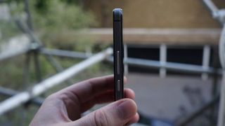
The Honor's sides, a metal ridge sandwiched between the front and back, remind me of the iPhone 5. It even has similar antenna bands cutting across the top. The glass front and back is also a design choice from Apple, that Google used in the Nexus 4 and Samsung resurrected this year with the S6.
There's a whiff of Sony's Xperia style at play too, with the curved corners and plastic bottom.
It's a solid slab of smartphone, that feels far more premium than the sub-£300 price tag would suggest.
Plastic is mostly eschewed for metal and glass, always a plus in my eyes, and there's certainly no give or flex when I tried to recreate the 'bendgate' scandal.
The volume and standby buttons are very clicky, placed in just the right spots. Below those buttons are the dual sim card slots (one is only 2G compatible, no make not of that) and the MicroSD expansion slot.
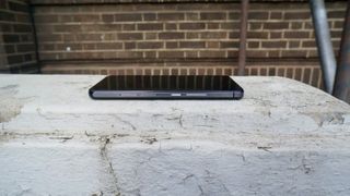
If you're using a MicroSD card, you do give up the second sim slot, but that's definitely a trade-off I'd make.
Another nice addition, especially on something many would consider a 'budget' device, is a standard 32GB of onboard storage. Even Apple kits its pricier handsets with just 16GB, so Huawei has to be commended for doubling that.
Combine that 32GB with a 128GB MicroSD, and you've got yourself a serious media machine.
Using these more premium materials does increase the weight somewhat, but not to a point I'd call heavy. It tips the scales at 165g, making it 3g heavier than the OnePlus One, but lighter than Apple's iPhone 6 Plus.
It's also smaller than those two handsets, measuring in at 150.5 x 75.7 x 7.5 mm. The OnePlus One comes in at 152.9 x 75.9 x 8.9 mm, while Apple's beastly phablet pushes that further to 158.1 x 77.8 x 7.1 mm.
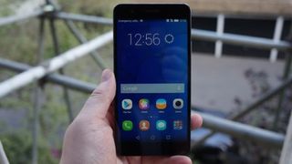
But make no mistake, this is a big phone. Slipping it into my pocket was sometimes a struggle and I often decided to just keep it in my bag. That's not necessarily a negative point, though. If you're on the look-out for a phone like this, then you should know what you're getting yourself into.
Key features
Honor, or rather Huawei, is clearly pushing this device as affordable, without sacrificing features we'd normally find in high-end devices.
Highly powered yet well-priced, Android phones are nothing new - the OnePlus One was, and still is, one of my favourites, and that comes in at just £279.99 - but the market is definitely growing and that's great for everyone.
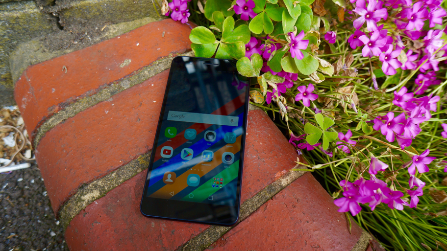
The 6 Plus matches the OnePlus One for screen size, coming in at 5.5-inches, so it's definitely on the larger side. If you have small pockets or tight jeans, you'll have to start storing the phone in your bag when you're not using it. While it's large, the display is also one of the device's key selling points.
As someone used to smaller devices, switching to a larger phone really does take practice. If you're familiar with the iPhone 6 Plus, Samsung Galaxy Note 4 or Nexus 6, you'll feel at home, but coming from anything smaller you'll have to rethink how to use the device.
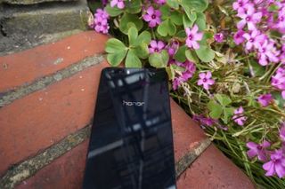
One-handed operation is downright impossible, especially without feeling like your new investment is about to kiss the pavement. Dragging down the notification tray is tricky, playing portrait games equally so.
The big screen is something I can live with. However, if it sacrificed pixels to achieve that size and keep the affordable price, I'd be less happy. Thankfully, I'm truly impressed by the panel on this device. It's outshone my expectations in almost every area.
Let's kick off with the specs: the 1080p 5.5-inch IPS LCD packs an impressive 401 ppi- exactly the same as the OnePlus One and Apple's iPhone 6 Plus. It's impressive on paper, and just as impressive in day-to-day use.
Colours are vibrant, viewing angles are exceptional, and the panel has a great hit of brightness. I've been using the device for a week in the spring sunshine and I've had no issues with glare. Blacks are inky too, though colours aren't quite as saturated as you'd find on Super AMOLED displays.
It might not pack a quad-HD resolution like the Nexus 6 or Samsung Galaxy S6 - there's still a long way to go before that tech comes to phones in this price bracket - but pixels are indistinguishable. Watching some Netflix or iPlayer on this big, sharp display is a pleasure.
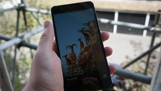
Huawei - you've impressed me with this display.
Android used to have a bit of an identity crisis. OEMs everywhere were taking Google's baby and skinning it, adding their own quirks and changing how it looked. Pick up an HTC device, along with one from Samsung and LG, and you'd be met with three very different takes on the Android operating system.
While that's still the case, most of these brands - yes, even Samsung - have dialled back their meddling, and Android skins have become much more pleasing to look at and use.
Seems like Honor didn't get the memo.
I'm just going to throw this out there - the worst thing about the Honor 6 Plus is the awful interface. It's called Emotion UI and it's the same skin you'll find on many Huawei devices, such as the P8. I just can't take it seriously.
Oh, it's also running atop Android 4.4.2 (even if the on-screen buttons are the new style). No Lollipop lovin' here yet, though I'm told the update is coming. After using a lot of Android 5.0 phones, I found it odd going back. I miss the lock-screen notifications and the rolodex- style multitasking. I miss the Material Design look and the smoother interface.
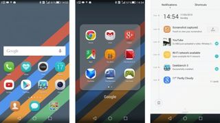
In truth, KitKat feels a bit antiquated. Why a new phone is shipping old software more than six months after the introduction of Lollipop is beyond me.
The best way I can describe Huawei's take on Android is by imagining iOS and Android having a baby. The similarities between Emotion UI and Apple's iOS are bleedingly obvious and it takes Android backwards, rather than forwards.
First off, there's no app drawer, just endless pages of apps to scroll through. You can put them in folders, but if you're an app hoarder like myself, then prepare to get annoyed.
Huawei has also ruined the app icons, bordering them all and turning them into squares. These look fine for the brand's own apps, as they're designed for this aesthetic, but otherwise it looks like you've installed a bad icon pack.
I had to put all of Google's apps inside a folder just so I didn't have to look at them. For someone who uses every single Google app on a daily basis, that's far from helpful.
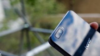
The notification panel is set up in a timeline view, showing all your notifications in chronological order. I quite like this, but it gave app installs the same importance as texts and emails, so I often found things I actually wanted to see bundled near the bottom.
Multitasking is done in a similar way to HTC's Sense, with nine app panels shown simultaneously in a grid.
You've got support for 4G LTE connectivity and NFC, both vital for a modern day smartphone, and I found 4G speeds impressive on 3's UK network.

As Arcane season 2 sends Jayce down a very dark path, its showrunners tease 'all will be revealed' about the Hextech co-creator's sudden heel turn

Roborock Qrevo Curv review: the crème de la crème of robot vacuums

Here's why your smartphone storage is disappearing so fast — popular productivity apps grew 10x in size in a decade, with Asana and Trello the major culprits, but video games remain the biggest data hogs
