TechRadar Verdict
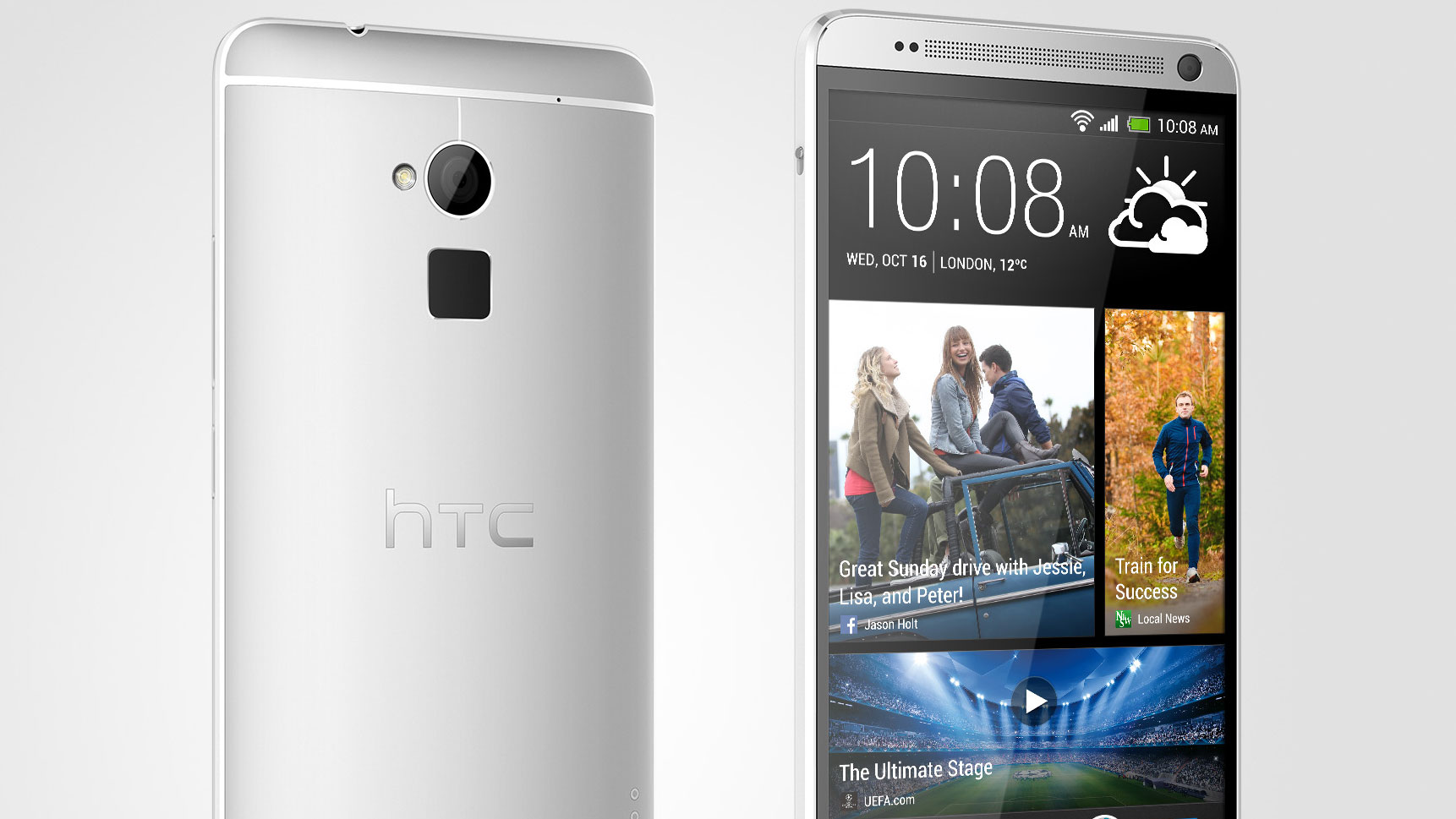
The HTC One Max is almost identical to the One, but with a bigger screen. There's been no attempt to make use of that upgraded size, and given the new features will be appearing on the One in the near future, this means the One Max has very few unique selling points.
Pros
- +
Larger screen
- +
Longer battery
- +
MicroSD slot
Cons
- -
Older CPU
- -
Expensive
- -
Unwieldy
- -
Pointless fingerprint scanner
Why you can trust TechRadar
The HTC One Max is the phone that the Taiwanese brand created to show that it still is able to make a phone for all occasions.
Coming with a 5.9-inch screen and all the same technology that made the HTC One such a world-beater, is this going to be the handset that topples Samsung's Note range, too?
It's not a cheap handset either, coming in at round 23% more on SIM free sales compared to the smaller One, and 12% more on contract. In the UK, this translates to £600 (around $930 / AU$1,010) and £47 (around $75/AU$80) per month, and that's paying upfront for the phone, too.
The One Max is a phone that borrows a lot from its heritage as HTC looks to create a family of products around the One series. The same metallic properties are there, with the all aluminium body still (sort of) in place.
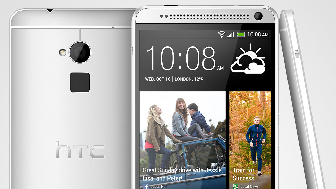
We say that cautiously because while it does have the same metallic shell, there's a difference between the One and the One Max: a removable battery cover.
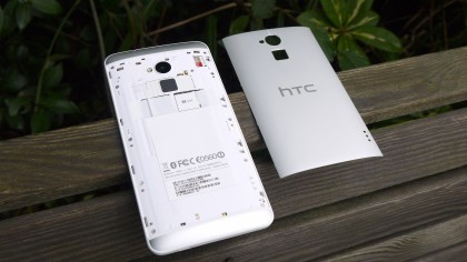
This is actually quite an odd feature, as it detracts from the overall build quality of the handset compared to the regular-sized device. It's there for two reasons: to allow access to the microSD card slot (whoo) and to facilitate the use of dual SIM cards in some countries.
The problem is that the battery cover, which pops off using a small switch in the top right-hand corner, doesn't sit very well on the back of the phone, meaning it's difficult to pop it back into place after you remove it.
Sign up for breaking news, reviews, opinion, top tech deals, and more.
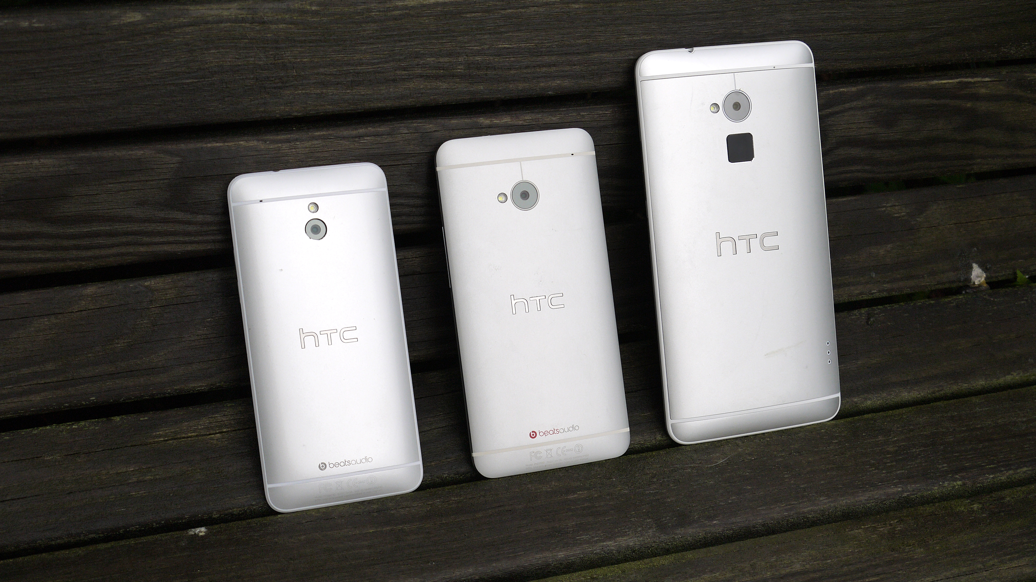
Unless you're willing to spend a couple of minutes smoothing the cover down over and over again, then you may be left with unsightly raises which will irk when holding.
It also seems to affect the balance of the phone, as it doesn't have the all-in-one feel that the One was so famed for, thanks to being made from a single piece of aluminium.
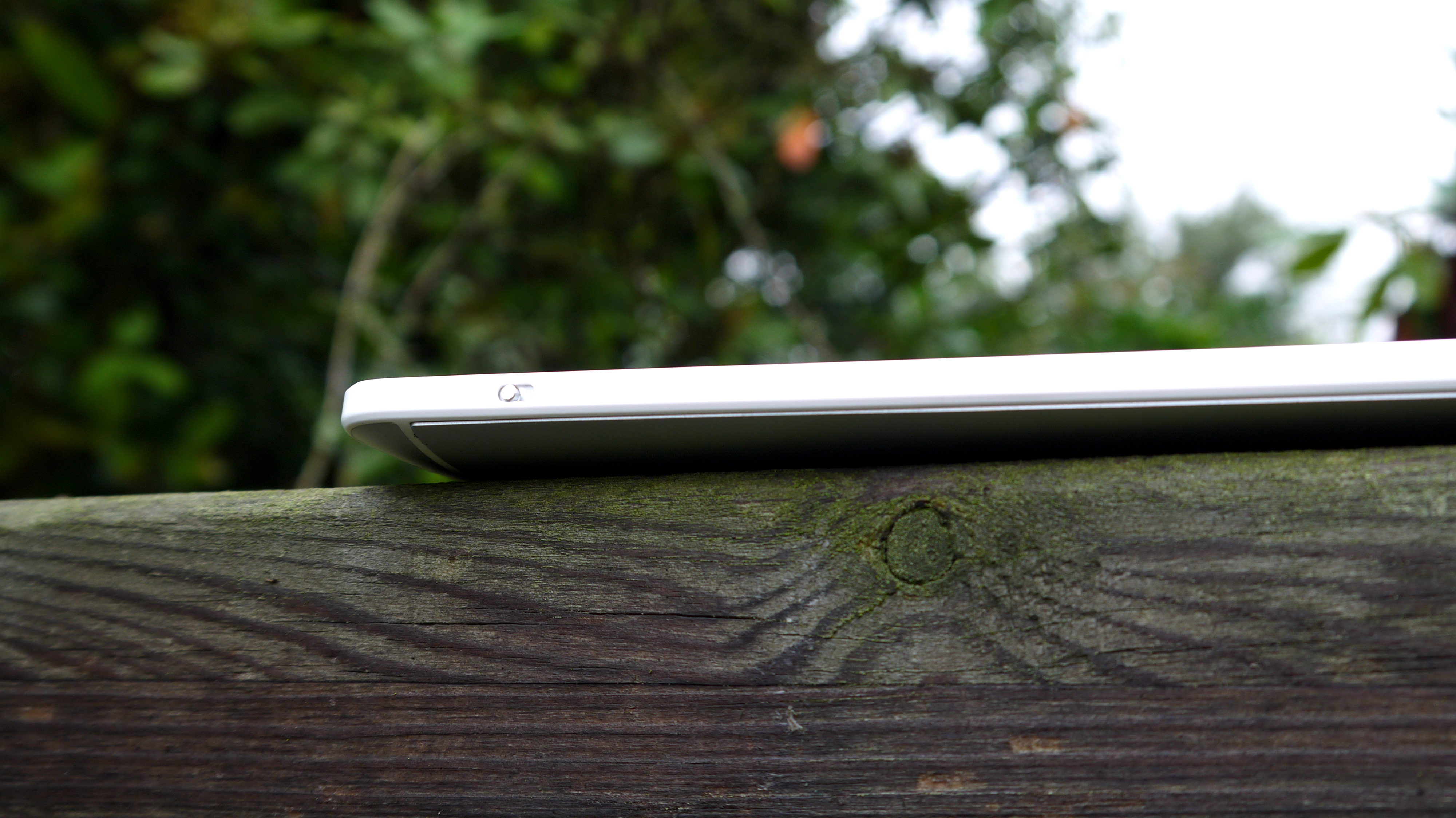
We like the idea, but if the microSD card slot could have been designed into the side of the phone, then perhaps some country variants of the One Max could have packed a single chassis.
The battery isn't even removable, which will disappoint many, and it really shows that this is a phone designed for the Asian market, where the bigger screen is king, rather than the US or Europe.
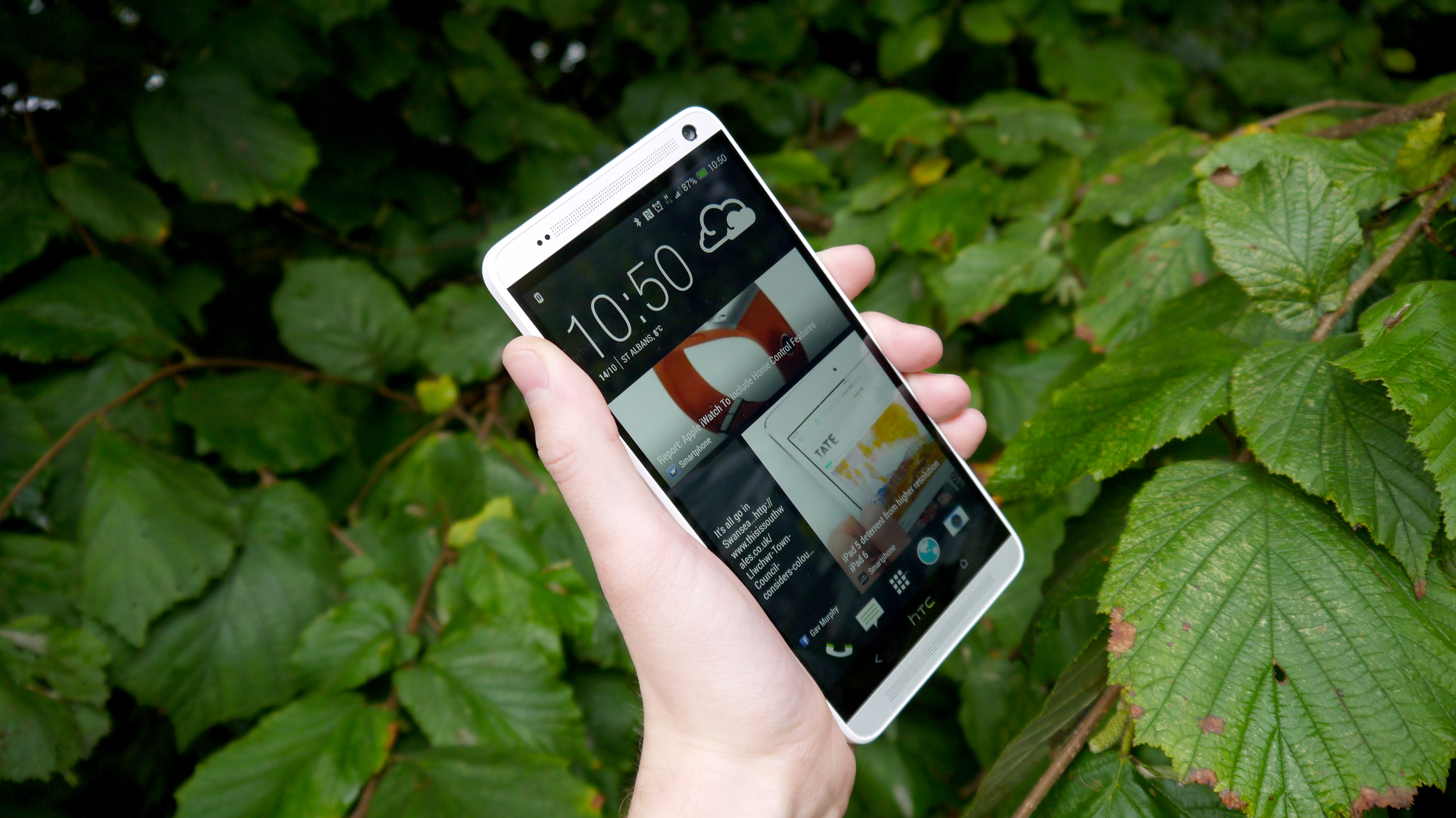
But enough of the way it looks. How does it actually feel to hold in the hand?
The HTC One Max is not an easy phone to manipulate in a single palm. We urge you to buy a cover for it as soon as you can (the power cover, which serves as both as a stand and an extra 1200mAh of juice, is an expensive yet attractive option).
The reason is this: You will drop this phone if you try to use it in one hand. The sides are laced with plastic, giving a very similar feel to the One Mini, and the overall shape is made larger thanks to the presence of the BoomSound speakers on the top and bottom.
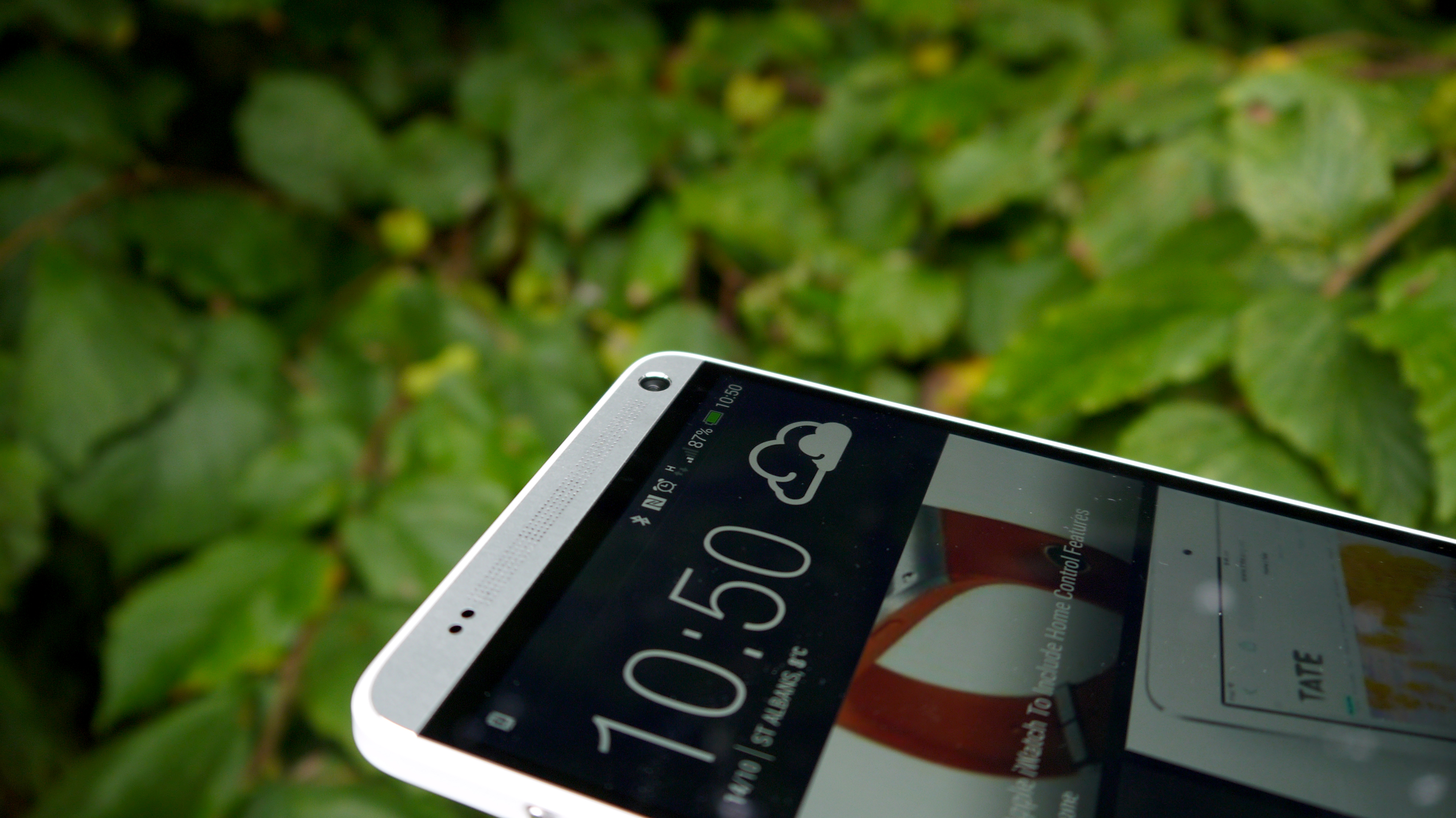
It's those speakers that really make the phone unwieldy - we're not against them, as you'll see later in the review, but compared to the Samsung Galaxy Note 3, this is a much, much harder phone to hold - so get used to double-handing where possible.
HTC has mostly put the original One on steroids with the One Max, as it has a similar design.
Thankfully, the power button has been moved. No longer combined with the top-mounted infra-red blaster, the power button now has the same ridged aluminium design as the volume buttons on the right-hand side of the phone, sitting below the sound keys in an easy-to-reach position for the right-handed.
The screen is still very impressive, with the 5.9-inch Full HD display offering fantastic clarity despite being less sharp than its smaller counterpart thanks to the pixels having more space to roam.
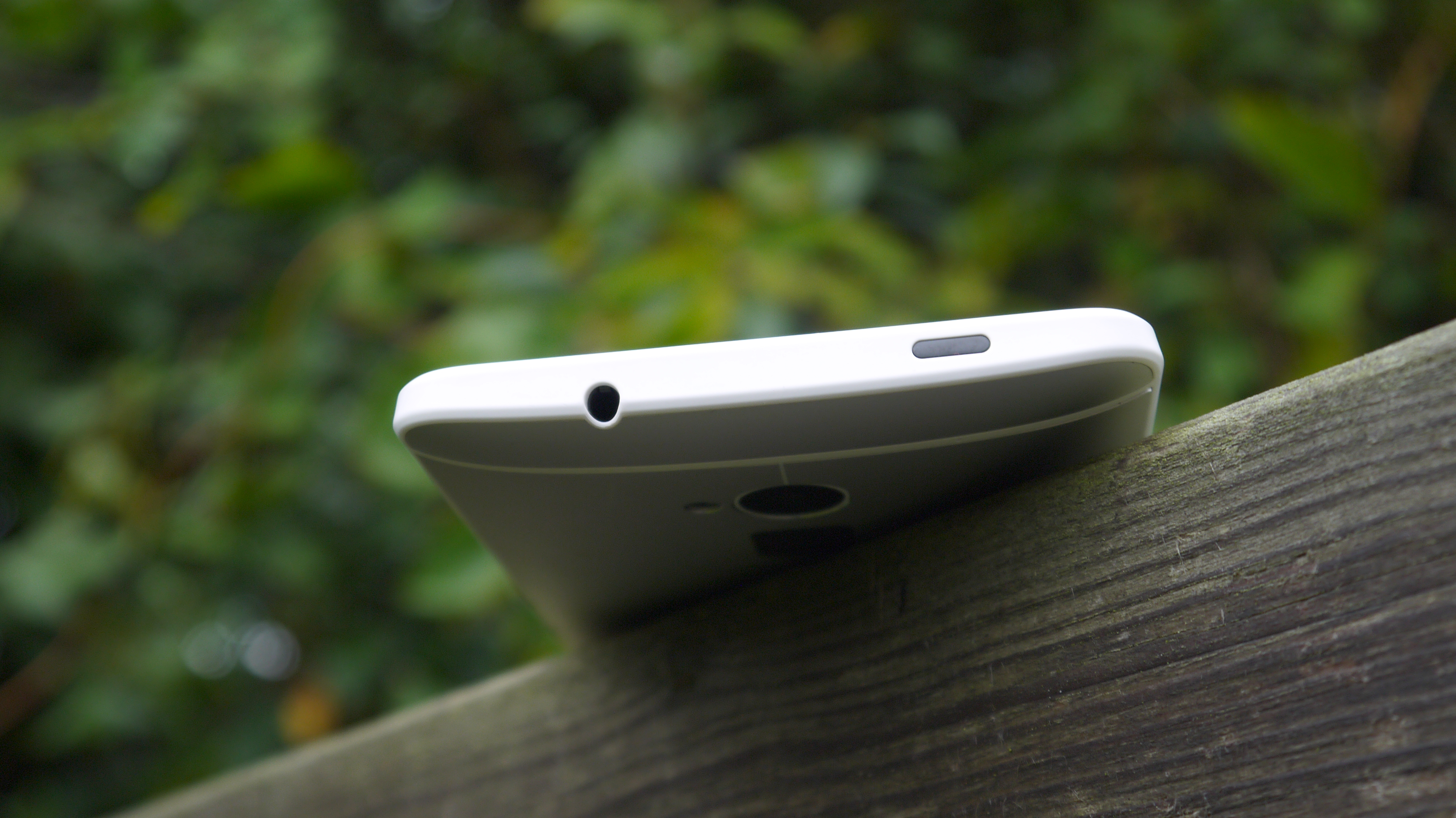
It's not easy to interact with most elements of the UI though at times, as you often need to stretch your thumb way across the screen, and that's simply not possible.
We like the way the HTC One Max is put together, but we can't help but feel that this phone is just too big. We know it's supposed to be larger, but Samsung and Sony have devices that feel much more suited to the phablet market.
Perhaps the screen could have been slightly smaller, or the BoomSound speakers engineered down. Basically, don't buy the HTC One Max unless you're ready to hold your phone in a new way.

Gareth has been part of the consumer technology world in a career spanning three decades. He started life as a staff writer on the fledgling TechRadar, and has grew with the site (primarily as phones, tablets and wearables editor) until becoming Global Editor in Chief in 2018. Gareth has written over 4,000 articles for TechRadar, has contributed expert insight to a number of other publications, chaired panels on zeitgeist technologies, presented at the Gadget Show Live as well as representing the brand on TV and radio for multiple channels including Sky, BBC, ITV and Al-Jazeera. Passionate about fitness, he can bore anyone rigid about stress management, sleep tracking, heart rate variance as well as bemoaning something about the latest iPhone, Galaxy or OLED TV.
