TechRadar Verdict
The Motorola Flipout is one for the young-uns, but their small hands might find the form factor tricky to cope with at times.
Pros
- +
Quirky design
- +
Connected music player
- +
Motoblur is a clever system
- +
Small overall size when closed
- +
Accessible microSD card slot
Cons
- -
Motoblur is cramped in the small screen
- -
Camera is poor
- -
Android 2.1 unlikley to be upgraded
- -
Physical keyboard is only so-so
- -
Web browsing is painful
Why you can trust TechRadar
UPDATE: The Motorola Flipout has had another price drop, this time to less than £150 (with a £10 top up on Orange).
Motorola has also recently refused to comment on a possible FroYo (Android 2.2 update) for the budget handset, so we're assuming that it's going to be stuck on Eclair for the rest of its natural life.
After some time in the doldrums Motorola appears to be resurrecting its reputation. Motoblur, the social networking user interface is helping, as is some nifty device design to present it in, such as the recently reviewed Motorola Defy.
Things don't always go Moto's way, though. The Milestone was a bit of a mixed bag, with its keyboard-located navipad not receiving a warm reception in all quarters - which has at least been updated now (see our Milestone 2 review).
Moto has a reputation for going off piste when it comes to handset design. Remember the Aura, anyone?
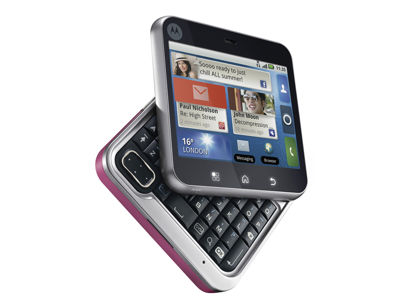
Sadly, the Android-toting Flipout is not Motorola's greatest moment, design wise. We understand what Moto is trying to achieve: nifty, different design that appeals to a younger market interested in text creation. The price is certainly aimed at that market, with a £181 SIM-free price online at launch.
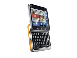
But the execution is flawed, and that's in no small part due to trying to cram a pint into a half pint glass – Android and Motoblur just don't fit into a small screen.

There's a keyboard hidden away underneath the screen, and you flick the upper section around a hinge located in the bottom-right corner of the chassis to reveal it. This works well if you're right handed, not so well if you're a lefty, and is easiest if you use both hands.
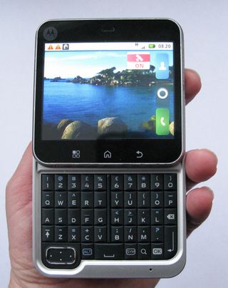
The plasticky materials one our review unit weren't that great, though the hinge feels solid enough.
The Motorola Flipout is square – it measures 67mm square to be precise, and 17mm thick. Even the huge HTC Desire HD is only 1mm wider and that, plus the thickness, makes the Flipout bulky for the hand. Younger people, who form much of the target for this phone, might have trouble reaching across the screen for one-handed use.
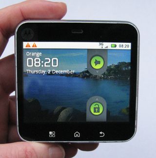
There are three touch buttons under the screen for Home, Back and Menu functions. If you want Android search you'll need to, er, flip out the keyboard and use the dedicated button there.
Three of the sides have a connector or input on offer. The left edge is blank, but on the bottom is the micro-USB slot, the right side houses the power/screen lock button and headset connector and the volume rocker is on top.
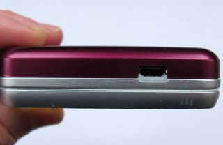
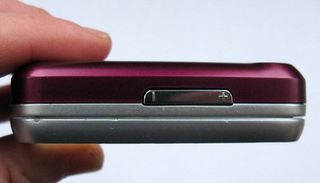
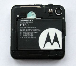
Android fans might prefer version 2.2 to the 2.1 provided, but there's plenty of other plus points. HSDPA 3G mobile broadband is here, as well as Wi-Fi with 802.11n support, GPS and Bluetooth. There's 2GB of built-in storage and a microSD card slot under the backplate. All very similar to the Motorola Defy, in fact.
Current page: Motorola Flipout review: Overview
Next Page Motorola Flipout review: InterfaceMost Popular


