TechRadar Verdict
Motorola has updated one of the best budget handsets of last year with some key features including an overdue selfie snapper and 4G connectivity.
Pros
- +
Solid design
- +
Great low price
- +
4G connectivity
Cons
- -
Some display issues
- -
Not enough storage
- -
Poor front camera
Why you can trust TechRadar
At the back end of February this year, as I was packing my bag for MWC 2015, Motorola delivered a surprise package to TechRadar towers.
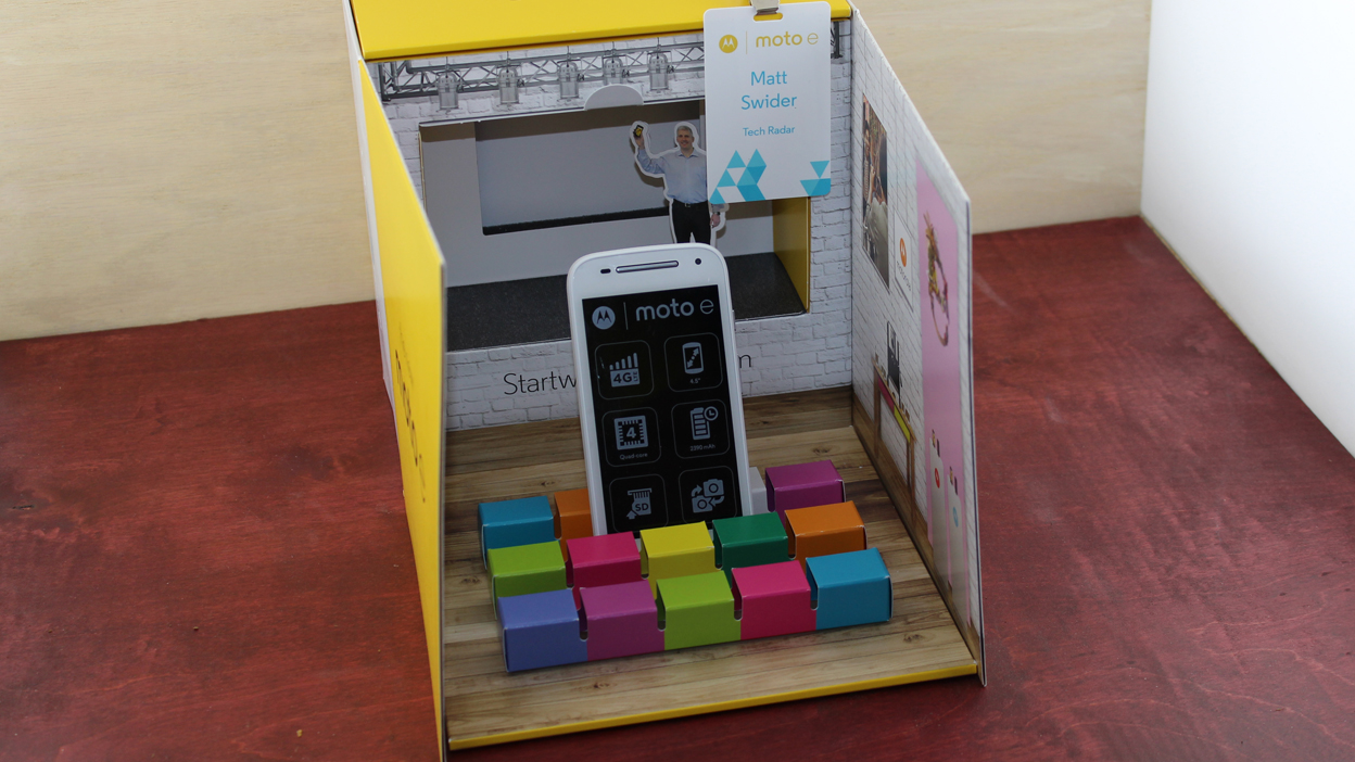
Quite like a child abandoned on an orphanage's doorstep, there was a small box waiting for us when we got to work and upon bringing it into the warmth we found it to be Motorola's own "press conference in a box."
It's a smart idea considering inside was the Motorola Moto E (2015), and heading to a full blown press conference for this would likely have been a misstep - so it being delivered directly to my palms was great.
The second generation Motorola Moto E is an upgraded version of 2014's Moto E, one of the best affordable handsets you could pick up last year.
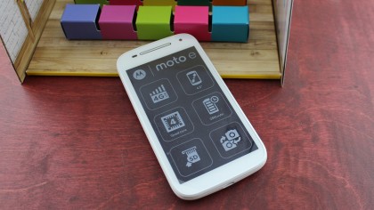
Motorola has packed a bunch of new features into the refresh and given the design some major tweaking as well. The Moto E aims to offer the Moto G features to a fresh audience with a lower price.
In fact you can pick up the second generation Moto E for just £99.99 (around $150, AU$190) SIM free, which means it finds itself up against the EE Kestrel, Nokia Lumia 535 and Sony Xperia E3.
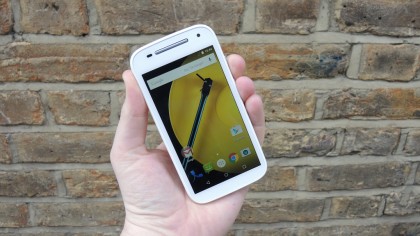
The design is pretty similar to what we saw on the original Moto E. It's still got a plastic body with a rounded back and all the buttons remain in the same easy to reach places, with the metal unlock and volume rocker on the right side of the phone.
The headphone jack sits in the middle at the top and the micro USB slot continues to sit in the bottom middle of the handset.
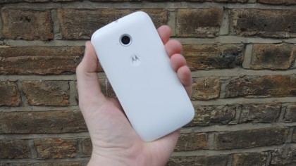
The Motorola logo is emblazoned on the back in a small indent to the body and the main camera sits above it. I always find myself placing my index finger in the Motorola logo dent, giving what feels like a little extra grip. The camera is a little larger now with a nice looking silver rim around the edge of the sensor.
The back panel is made of a softish plastic that picks up grease and dirt really quickly. It was less noticeable when playing with the white version of the handset but it showed up immediately when using the black model.
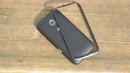
You've got the choice here of either black or white, I much prefer the white version but the black one still looks good when it's clean.
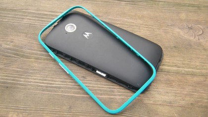
Motorola's biggest change to the design on the Moto E 2015 is the omission of the removable back panel - it's now a removable plastic edging.
When peeled away from the body it reveals the pure edges of the phone, plus ports for micro SIM and microSD cards.
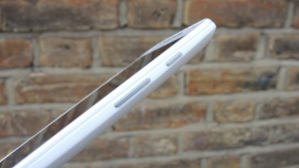
It can be a real struggle getting the plastic edging off the Moto E and once I actually thought I'd broken it off. I hadn't, but it's pretty flimsy and you're easily going to get frustrated with it.
It does also mean you can replace those edges with some jazzier colour versions such as yellow and blue to give it a slightly different look but these will cost you extra directly from Motorola.
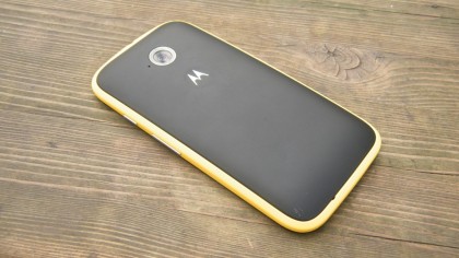
Losing the removable back panel also means the battery can't be replaced and that was a selling point of the original Moto E.
Coming round to the front of the Moto E 2015 you'll find 4.3-inch display. Above that sits a forward-facing snapper, a new addition to the Moto E, on the top right hand side next door to the long earpiece.
The phone isn't particularly thick considering the price range of the handset, but it isn't exactly slim either at 129.9 x 66.8 x 12.3 mm, while weighing in at 145g. It does fit in the hand nicely, and you can get a decent grip round the handset.
Don't expect the back of the phone to look as pristine in a couple of months' time either. I managed to be a bit of a klutz and drop it within the first day of using it and scuffed the bottom after only one drop.
I imagine dropping it a few times could do some serious damage to the outer look of the phone, so be careful out there.
Display
The 4.3-inch display on the Motorola Moto E (2015) comes with a 540 x 960 pixel resolution resulting in a pixel density of 245ppi. Don't expect a high quality affair here, you're getting what you pay for but that's not necessarily a bad thing.
Personally I feel 4.3 inches is a little too small, I feel the optimum for a smartphone is between 4.7-inch and 5.1-inch but that's all down to personal taste. That said, it's easy for your thumb to hit the top of the screen while using it one handed.
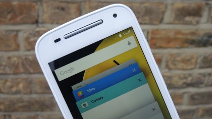
The bottom and top bezels are out of proportion here as the usual hardware buttons have been adapted into the screen this time around. It means the handset looks a little top heavy.
Video content doesn't look stunning, but it doesn't look down in the pits either and considering how little you're spending it's quite impressive.
The display is protected by Corning's Gorilla Glass 3 technology to help stiffen it up a little and after a quick drop onto paving slabs (by accident I must add) the display sustained no damage.
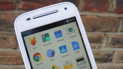
Putting the Moto E 2015 display onto maximum brightness was a bit of a let-down. I did that whilst outside and struggled to see the display well on a sunny day, otherwise brightness seemed pretty average and didn't really cause any problems.
If you've got poor eyesight this may not be your bag - I found myself squinting to see the display while outside, even though I've got what I consider to be 20/20 vision.
Viewing angles have never been strong on this range and once again I struggled to see some of the screen when at the wrong angle, but considering the price of the second gen Moto E you really can't complain too much.
James is the Editor-in-Chief at Android Police. Previously, he was Senior Phones Editor for TechRadar, and he has covered smartphones and the mobile space for the best part of a decade bringing you news on all the big announcements from top manufacturers making mobile phones and other portable gadgets. James is often testing out and reviewing the latest and greatest mobile phones, smartwatches, tablets, virtual reality headsets, fitness trackers and more. He once fell over.
