TechRadar Verdict
With an uncommonly tough screen and similarly robust battery life, Motorola has created a seriously solid flagship phone.
Pros
- +
Highly durable
- +
Stock Android UI
- +
Smooth performance
Cons
- -
Expensive
- -
Noticeable screen protector
- -
Underwhelming speaker
Why you can trust TechRadar
Update: Over half a year after Motorola released the Moto X Force, the latest in Android 6 software is now out for the phone. Read on as we take a look at how the Android Marshmallow goodness has treated the Moto X Force.
The Motorola Moto X Force arrives mere months after the Moto X Style and Moto X Play hit the shops. And while you might think Motorola's flagship duo are tough acts to follow, they're not half as tough as the Moto X Force.
If the Style is Motorola's classy party trick, and the Play its accessible all-rounder, then the Moto X Force is its safe pair of hands.
Known in the US as Moto Droid Turbo 2, the Moto X Force is the most expensive phone in the range, with prices starting from £479 (US$624, around AU$1,050) for the 32GB model. The 64GB variant, meanwhile, will set you back £514 (around US$720, around AU$1,150).
There has been £20 price drop in the UK recently. In the US Motorola isn't pushing the 32GB version anymore, but you can still easily buy the 64GB version of the phone. Motorola still hasn't announced an Australian release date and it looks like it may never come to the country.

This places the Moto X Force in some serious company. The 64GB version is around the same price as the Samsung Galaxy S7, and it's not far off iPhone 6S territory.
However, the Motorola Moto X Force isn't that easy to pigeonhole. It might be priced like smartphone aristocracy, but it's a phone that's best suited to the daily grind – a willing workhorse that won't scuff or crack under the strain of modern living.
Design
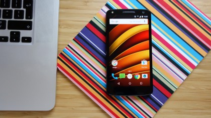
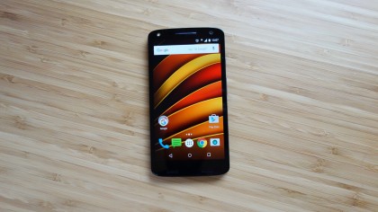
You can tell from the first glance that the Moto X Force belongs to the same family as the Moto X Style and Moto X Play. It has a familiar outline, with straight sides and a gently curved top and bottom.
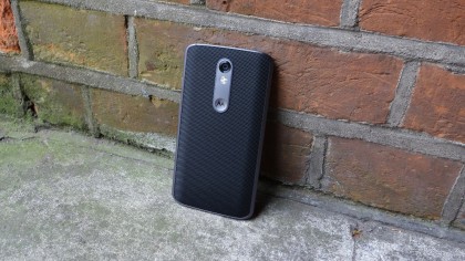
It has a familiar metal frame, which surrounds a customisable rear cover. My test unit's back is finished in a material Motorola calls 'Ballistic Nylon', which looks and feels a bit like a solid speaker grille. It feels a little cheap, and there are alternatives available, but it's undeniably grippy.

The camera placement is identical to its siblings too: top and central, and embedded in a lozenge-shaped metallic plate above a fondle-worthy Motorola badge indentation.
Button and port placement is the same as well, with the volume rocker and pleasingly textured power/sleep button located two-thirds of the way up the right-hand edge, and the headphone jack and microUSB port situated on the top and bottom edge of the phone respectively.
At 149.8 x 78 x 9.2mm, the Moto X Force is a little shorter and slimmer than the Moto X Style, although chunky screen bezels make it a little wider. It's a whole 10 grams lighter than that more fashion-focused handset too, at 169g.
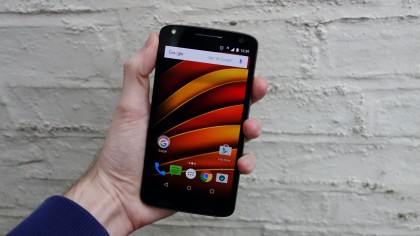
The reason the Force is generally more compact than the other Motos is because its display is the smallest, at 5.4 inches. Despite this, it retains the 5.7-inch Style's QHD resolution.
Packing 2560 x 1440 pixels into a smaller screen makes for the sharpest display Motorola has ever produced – we're talking 540ppi here.
Unlike the Style and the Play, which sport LCD displays, Motorola has gone back to using AMOLED panel technology, as it did with some of its 2014 phones.
Generally speaking, AMOLED displays allow for more vibrant colours and deeper blacks. Motorola's use of AMOLED tends to be a little behind that of rival Samsung though, and while the Moto X Force's screen doesn't suffer from the pronounced yellowy-red tint of last year's Moto X, it still has a slightly warm tone that might be off-putting if you're used to the chilly whites of Apple's or Sony's LCD displays.

In light of this, it's a shame that Motorola continues to omit the facility to adjust the screen temperature, as Samsung does.
Still, with the brightness cranked up past half way, I found the Moto X Force's screen to be perfectly pleasant to use. It doesn't quite have the pop that the very best phones from Samsung and Apple tend to have, though – and that's because of the Force's key feature.
We'll discuss the Moto X Force's toughened display in more detail in the next section. Suffice to say for now that it utilises multiple layers, and this approach has a slightly adverse effect on picture quality.
It's not a deal-breaker by any stretch, but Force's screen lacks that 'painted-on' quality of the Galaxy S6, which could almost convince you it was a static sticker rather than a live picture as you pass it in a phone shop display.

Motorola's implementation of these extra layers is hardly seamless, either. The edge of the outermost layer is visible around the front speaker grilles, rather like one of those cheap after-market screen protectors some people apply to their new phones.
Talking of speaker grilles, Motorola has altered the symmetrical design of previous models, and not for the better. You still get the metal-bar ear speaker at the top of the phone, but for media playback you get a couple of cheap-looking speakers along the bottom of the device. And yes, that means no stereo sound.
