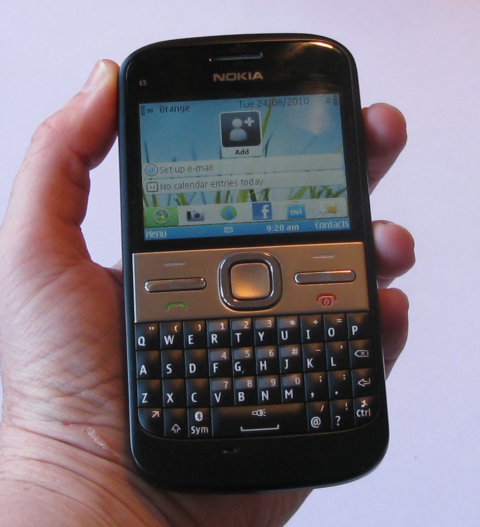
TechRadar Verdict
The Nokia E5 is a good phone for those who want one handset for work and play, but Symbian S60 feels increasingly behind the times.
Pros
- +
Good dual home screen system
- +
Good battery life
- +
Keyboard is well made
- +
Very customisable front screen features
- +
Ovi maps can be is very handy
Cons
- -
Screen is too small
- -
Web browsing is squint-inducing
- -
Camera is poor
- -
Ovi Maps doesn't do much for walkers
- -
Symbian S60's nested menu system irritates
Why you can trust TechRadar
The Nokia E5 is the latest handset from the mobile phone giant to try to straddle the professional and personal lives of its users. Once upon a time, Nokia's E series handsets were purely for the suited and booted. Remember the E55, for example?
But the great build quality and services of E-series handsets became popular with funsters too, and soon the likes of the E72 popped up – a mini keyboarded BlackBerry-a-like with a clever ability to switch between two home screens, the idea being you could set one screen up for staid old working, the other up for fun and freaky play.
Now with the E5, Nokia is continuing the trend. This is a phone that again offers switchable home screens – and you can choose to have the switching link on the home screen itself or buried deeper if you don't need to use it much. And there is a whole host of business and leisure related software built in.
For £259 from Nokia, the phone makes sense as an option for the small business user or the more frugal IT manager looking to equip their workers with an emailing handset - or just fans of the E-Series.
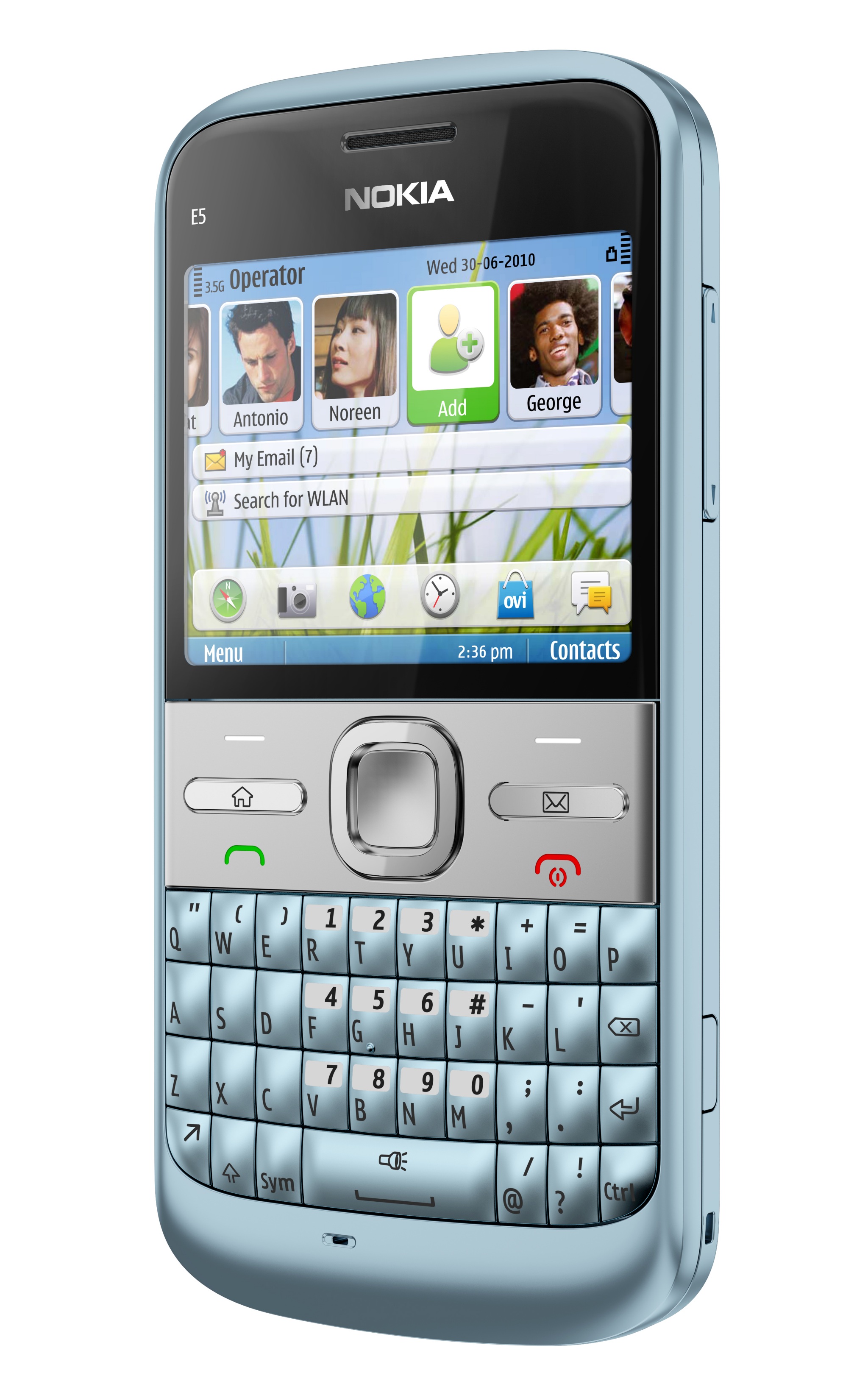
The question is, though, does the £259 SIM free Nokia E5, with its small old-fashioned letterbox main screen and lack of touch support, stand up against today's smartphones well enough to capture our hearts?
If you are thinking that the E5 is similar to the recently reviewed Nokia C3 then you are giving the presence of a QWERTY keyboard in both more credence than it really deserves. Even in the build it is clear that the E5 is streets ahead (and compare the C3's £120 SIM free price too, incidentally).
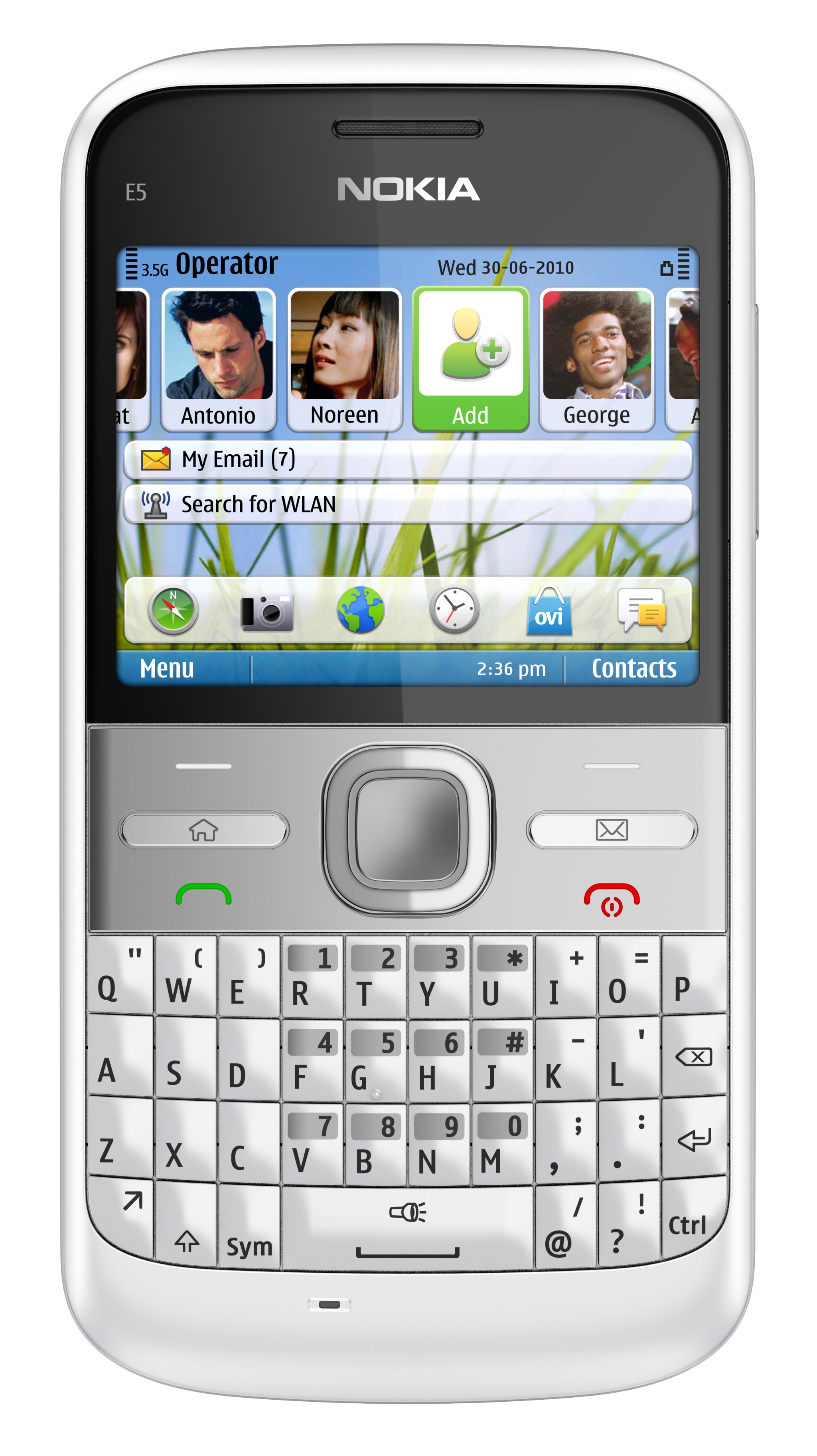
The E5 has the headline smartphone features of HSDPA, Wi-Fi and A-GPS, as well as a 5-megapixel camera with flash, and plenty of software. Symbian S60 3rd Edition is the operating system of choice, and you can bulk out the provided apps via the Ovi store.
The E5 sports a solid-feeling silver metal backplate that provides great protection, and enhances the black and silver colour scheme of our review sample. You can also opt for white, brown, grey and blue instead of the black, should you prefer.
The front houses a very well built mini QWERTY keyboard, which we found quite comfy to use. Fingertips or nails are best for tapping out the words, but pads will do at a pinch.
Like all well-behaved phones, if you start tapping out on the keys that share both letters and numbers while on the home screen the phone thinks you want to make a call and pops up a little dial box.
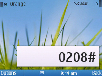
The keypad contains a couple of useful shortcuts too. There's one to turn Bluetooth on and off, a mute button, and if you long press the space bar, the camera's LED light, hidden on the back of the casing, turns on – doubling up from its main role with the camera to a secondary function as a flashlight.
This is something we've seen before and really like.
Above the keyboard on the Nokia E5 is a large area containing shortcut keys. The D-pad is large and comfortable, and the Call, End and two soft menu keys are all integrated into an easily accessible flat panel.
Two thin lozenge-shaped buttons, for quick access to the Home screen and messaging, are raised from their surroundings and so also easy to hit. We've no problems with any of this arrangement as it's comfortable to hold and use in the hand.
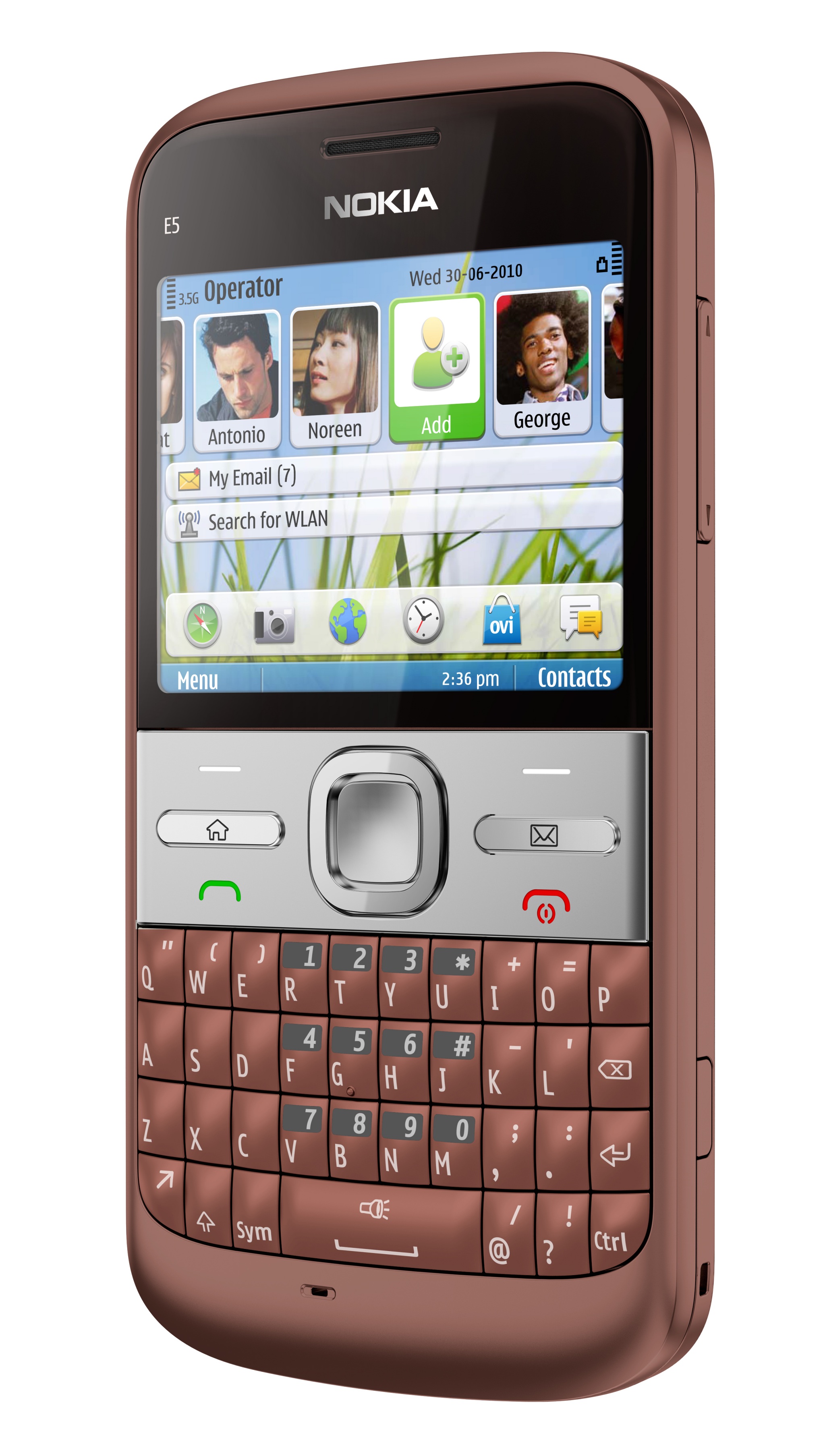
The screen, though, is potentially the weak link in the chain. It measures just 2.36 diagonal inches across, delivers 320 x 240 pixels, and is not touch sensitive.
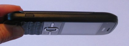
Perhaps because you can put a whole host of shortcuts on the home screen, Nokia hasn't bothered too much about side buttons.
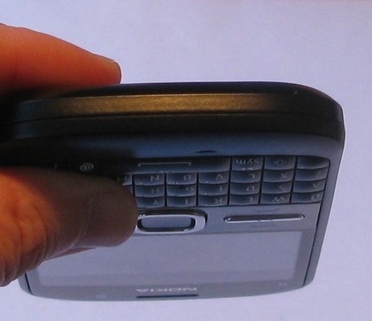
There are two quick release notches for the backplate on left and right edges, and a volume rocker on the right too. The bottom is clear, and the top houses 3.5mm headset connector, microUSB port and the main power connector. And that's your lot.
