Why you can trust TechRadar
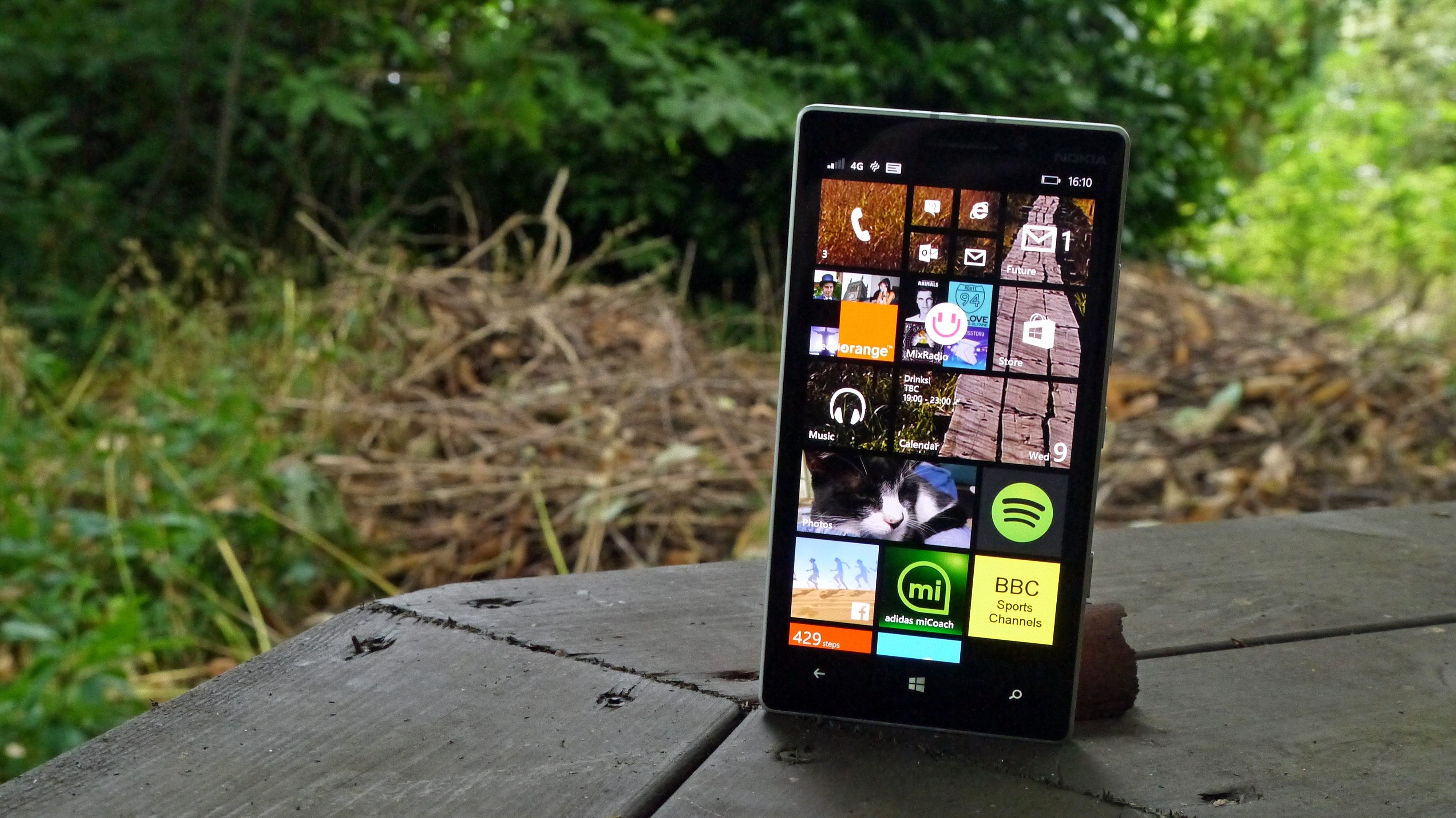
The design of the Nokia Lumia 930 is an odd combination of great build quality and confusing extra weight and depth.
The first time you clap eyes on the 930, you should be pretty impressed. The metal rim is an attractive light grey, and it complements the black front (with minimal bezel) and the coloured plastic rear very nicely.
You'll get a real sense that this is a premium phone, and picking it up does nothing to dispel that sensation.
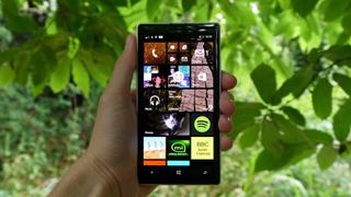
But then you'll hold the phone in your hand for a little while, and you'll realise something's a little amiss: this thing's pretty heavy.
There's a reason for that: this is a phone that's got dimensions of 137 x 71 x 9.8mm, which is pretty chunky by today's smartphone standards. It's also weighing in at 167g, which is heavier than even the power-camera Lumia 1020 and all the other flagship handsets on the market.
It's an odd choice, and as I mentioned before partly explained by the onboard wireless connectivity baked right in.
That said, with a smaller batter pack attached (only 2420mAh, compared to over 3000mAh from other top handsets) and you can understand my confusion – I'd have thought there was a massive battery pack in there to make up for the extra heft.
The rest of the Lumia 930 is a pretty standard affair from the ex-Finnish brand, with the polycarbonate back well fitted into the chassis, making it feel a lot less cheap than it might do otherwise.
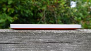
It's a tricky one to call, this: on the one hand, the metal rim really helps add to the overall feeling. On the other, brushing the back doesn't make it feel like I'm using an 'adult' phone, especially in the more lurid of the green or orange choices.
But this is very much Nokia's identity, one that asks its buyers to stand out from the crowd (and even a sensation that would continue with the black or white versions, as they're still quite striking held against the ear).
The metal outer is also quite sharp, as well as being deep. This makes it less ergonomic than it might be otherwise, if the band wasn't so industrially designed.
Given Nokia's been all about the curved, refined unibody chassis type in the past, this is an odd choice. It adds design flair, but reduces comfort.
The outer rim of the phone goes against a lot of design staples nowadays… but that's a good thing. The headphone jack is at the top, the right hand side of the phone holds the volume key and power button, as well as a camera shutter.
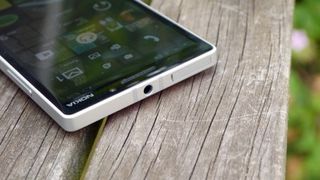
I'm a fan of this layout as it has all the things I like: a well-placed headphone jack (no, putting it at the bottom doesn't help me at all), a dedicated camera button and a power key that's at just the right height for both left- and right-handed users to hit simply.
Add to that the fact the buttons are well-raised and easy to hit (plus made of the same attractive metallic material) and it feels like Nokia really worked on finding the best place for each of these.
At the top of the phone you've also got a SIM tray that pulls out without the need for a dedicated tool. I assume this is one of the few good things about having a thicker phone, but it does take some prising to get open.
Inside you'll find nano-SIM technology, which means most of you will be on the phone to your network to get a new SIM shipped over. It's a trend that's going to get more regular in the next year, so you might as well make the jump as soon as you need to.
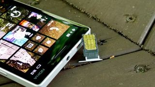
The only other big hitters to use this size are Apple, Motorola (in the Moto X) and HTC (in the One M8) but I'm pretty sure we'll see the same thing from Samsung, Sony et al pretty soon as the smaller size affords more design flexibility.
It's a nightmare to get into the tray though, with a small amount of bending needed to get it in snugly. Best you don't take it in and out too much.
There's no removable back cover here, nor a microSD slot to speak of – this will irk a few users, but the solid packaging makes up for it mostly. 32GB of onboard storage is a fair amount too – it's not going to satisfy those with loads of media, but will be acceptable for many.
While it might sound like there are a few elements of the Lumia 930 that I'm not enamoured with, it's still one of the most striking and well-designed phones on the market.
It binds heritage with high-end materials, and does it all with a phenomenal screen too. It might be too thick for some (and I think Nokia's overdone it a little with that) but for others that thickness is a hallmark of solid build quality.
It's too heavy though – that extra weight doesn't make the Lumia 930 feel any better in the hand. At least the battery doesn't shake around like it did in the 920… small mercies.

Gareth has been part of the consumer technology world in a career spanning three decades. He started life as a staff writer on the fledgling TechRadar, and has grown with the site (primarily as phones, tablets and wearables editor) until becoming Global Editor in Chief in 2018. Gareth has written over 4,000 articles for TechRadar, has contributed expert insight to a number of other publications, chaired panels on zeitgeist technologies, presented at the Gadget Show Live as well as representing the brand on TV and radio for multiple channels including Sky, BBC, ITV and Al-Jazeera. Passionate about fitness, he can bore anyone rigid about stress management, sleep tracking, heart rate variance as well as bemoaning something about the latest iPhone, Galaxy or OLED TV.
