TechRadar Verdict
As a budget mobile, the X3 has a lot going for it - but at times it tries to do too much. Decent for media but poor for calling, you might want to pay a little more to get a better mobile.
Pros
- +
Good quality music player software
- +
Decent in-ear bud earphones
- +
3.5mm headphone socket
- +
2GB MicroSD card supplied in-box
- +
Simple interface and email set-up
Cons
- -
Lacklustre call performance
- -
Lack of 3G or Wi-Fi
- -
Mediocre camera performance
- -
No GPS for Maps software
- -
Low-grade video capture
Why you can trust TechRadar
The Nokia X3 is a slim, budget offering from the Finns. With no touchscreen and modest memory, it still has pretensions of being an attractive music device with a low cost to boot.
While the recent Nokia X6 touchscreen topped the rebranded X-series music phone bill with smartphone functionality and a heavyweight 32GB of onboard memory, the Nokia X3 is a much more modest affair.
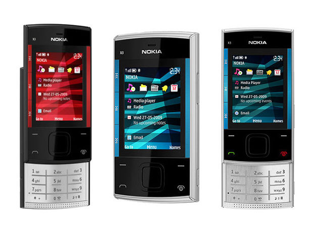
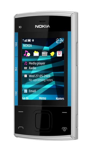
It works the signature Nokia XpressMusic design look again, sporting bright red or blue music player controls down the side of the display, and comes with a 2GB MicroSD memory card in-box, a standard 3.5mm headphone socket, in-ear earphones and an FM radio.
However, there's no high-speed 3G connectivity, let alone Wi-Fi or GPS functionality, and its onboard camera is an average 3.2MP shooter.
Initially available for around £90 with various pay as you go deals (or £129 SIM-free), the Nokia X3 is clearly aiming for the cash-conscious music phone buyer after a smart-looking device, pitching it squarely against the likes of the Sony Ericsson W395.
Design and handling
The Nokia X3's bodywork is tidily proportioned, measuring 96(h) x 49.3(w) x 14.1(d) mm closed and weighing 103g.
It has an average-sized 2.2-inch 262K-colour QVGA display dominating the front that's reasonable for this sort of handset.
There are no touchscreen controls – under the display is a regular navigation D-pad flanked by a standard issue quartet of soft key and call end buttons on a flat glossy black front control panel.
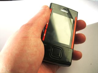
These buttons are adequately spaced for hassle- and error-free navigation, although the glossy front is a touch plasticky.
But the metallic red or blue music controls and trim bordering the display and the matt black bodywork used around the rest of the phone add a sharp look to the design – not HTC Legend levels of design, but not bad for 90 of your English pounds.
These three thin music control buttons (forward, rewind, play/pause) enable users to operate the music player when it's playing in the background, although they're aren't essential for controlling the phone - the navigation D-pad can take care of that too.
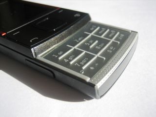
The slide-out keyboard is a bit of a throwback to Motorola RAZR styling, with a flat brushed metal pad separated by illuminated ridges. It's sufficient for texting at decent speeds, though it doesn't have the super-light touch of the best texting phones, and larger-fingered users should be wary of straying thumbs.
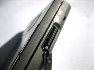
Around the sides are routine camera key and volume buttons plus a MicroSD card slot, covered by a fairly tight plastic bung.
The standard 3.5mm headphone socket sits correctly on top of the phone, next to a microUSB data connector and thin-pin charger socket.
All-in-all, it feels slim in the hand and pocket, and is comfortable to handle – what more do you really expect from a £90 handset? LG is doing the same thing with the LG Pop – so we're glad to see Nokia is playing in the right area as well.
Current page: Nokia X3: Overview, design and feel
Next Page Nokia X3: Interface