TechRadar Verdict
The Oppo N3 is a lot of phone for the price, with well executed features and a swivelling camera that is more than just a gimmick. But if you're a fan of stock Android this might not be the one for you.
Pros
- +
That spinny camera
- +
Quality IPS screen
- +
Dual SIM and microSD
- +
Novel O-Click accessory
Cons
- -
Ridiculous port positioning
- -
Dodgy auto-brightness
- -
Color OS is a marmite affair
- -
Slightly outdated internals
Why you can trust TechRadar
A few short months ago, Oppo was barely a blip on the international radar. After moving beyond the bounds of Blu-Ray players, it first garnered international attention with the Find 5 superphone. At the time it was the first smartphone to launch with a 1080p screen onboard, beating the HTC One and Samsung Galaxy S4 to the punch, and gaining Oppo the attention it rightly deserved.
Fast forward to the latter months of 2013 and Oppo had introduced the Oppo N1: another flagship to take over from where the Find 5 left off. This time, the headline spec was the rotating camera, a feature not seen since the Nokia N90.
Its latest flagship the N3, takes queues from the N1 and enhances the camera's rotational skills as well as bumping the other specifications all round.
Alongside the 16MP rotating camera, there's a 5.5-inch 1080p IPS LCD screen, a quad-core Qualcomm Snapdragon 801 processor clocked at 2.3GHz, 2GB of RAM, 32GB of onboard storage, fingerprint reader and dual-SIM capability (and one of the SIM slots also doubles as a micro-SD card reader).
These are most of the specs you'd expect, meaning the N3 matches up with most other 2014 top-end phones such as the Samsung Galaxy S5 and the budget-priced OnePlus One, but has the Chinese smartphone giant done enough to entice a Western audience to try a brand that is still relatively unknown?
Right off the bat there's a few things to notice; most other top smartphones of this size are now rocking a QHD-resolution screen, and while Oppo has skinned Android 4.4.4 with its very own Color OS interface, the downside means there's no Android 5.0 Lollipop onboard just yet.
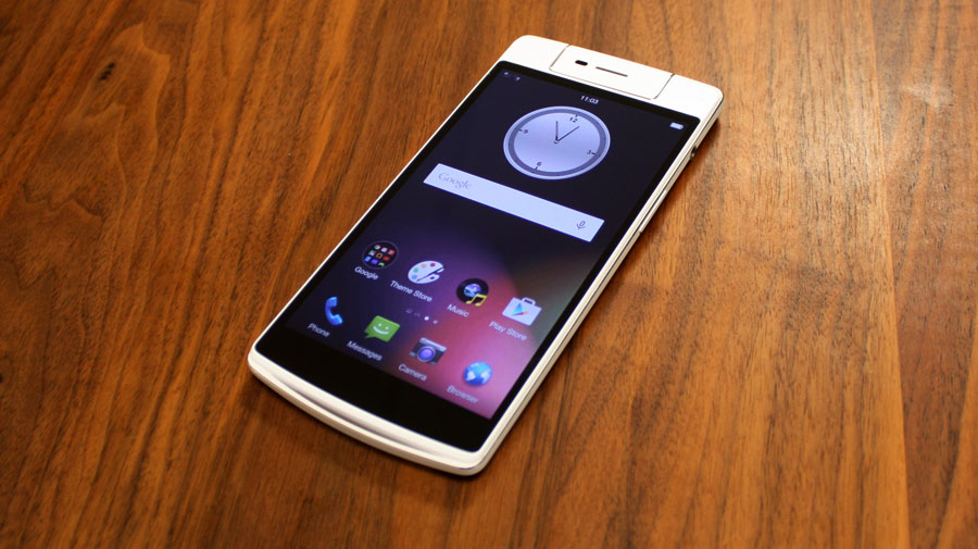
The swivelling camera and Chinese roots meant the Oppo N3 was never going to be totally down to earth, and the overall design is a bit of a mixed bag. I was impressed by the solid build quality and the premium feel that the circumferencing aluminium band lends it.
The rest of the phone however, is plastic. The back and front trim that surrounds the screen is made from a matte polycarbonate, which feels nice in the hand, but isn't overly exciting.
The faux leather stitching that borders the camera module is a visual styling ripped straight from the memories of Samsung's Galaxy Note 3. It's certainly not my idea of stylish, and I honestly think the N3 would have looked better sticking with the same matte plastic on the camera module as used on the rest of the body.
The N3's screen is a 1920 x 1080 5.5-inch IPS LCD which equates to a comfortable 403PPI resolution. Sure, some other flagships are running QHD displays, but that's for little other than bragging rights on screens of this size. There's a natural colour temperature and whites as bright as you would expect from an IPS panel.
Auto-brightness can be a little slow to respond, and isn't always smooth, but I suspect this could be fixed in a future software update. It could be something to do with the fact that the auto-brightness sensor is built into the camera module, so you need to always ensure it's the right way round in order for auto brightness to respond properly.
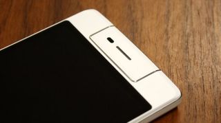
Oppo has chosen a combination of capacitive buttons below the touch-screen in lieu of on-screen adaptive icons, which is not necessarily a bad thing as it affords more usable screen real-estate. The downside is that they are only visible when the backlight is in operation, meaning you may well end up pressing the wrong button if used to an alternative button layout.
The backlight is also disappointingly weak; I don't want to be distracted from the screen by super-bright LEDs, but equally they could have been at least half as bright again.
On top of the right side of the phone you'll find a 3.5mm headphone socket and lower down, the curiously diminutive volume rocker. The left edge is home to the power/wake button with the SIM/micro-SD tray above it, and a micro-USB connector down at the bottom.
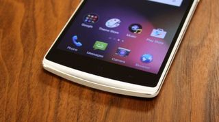
The buttons sit almost exactly where you'd want them to with the phone firmly positioned in your hand, but I'm at a total loss as to why Oppo would put the micro-USB and headphone sockets on opposing corners. It looks untidy when you dock it, means that the phone feels even more gigantic if you have it in a pocket with headphones plugged in, and generally seems like a compromise was made somewhere along the way.
The bottom has a curious 'bridge' that covers the primary microphone and speaker grille, from which the 'Skyline' notification LED also radiates. This bridge helps the glowing notification LED illuminate more widely, and possibly helps direct the sound from the speaker back towards the user, while making it almost impossible to inadvertently cover over.
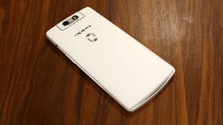
Oppo's reasoning behind this additional curve and choice of notification LED positioning means that the it's altogether less distracting and works whether the phone is facing up or down.
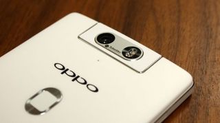
The back houses a secondary microphone just below the 16MP swivelling camera module, an embossed Oppo logo and recessed fingerprint reader in a similar position to that found on the HTC One Max.
