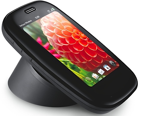
TechRadar Verdict
Still a good smartphone thanks to the webOS, but in dire need of more than just a tiny overhaul
Pros
- +
Great OS
- +
Improved keyboard
- +
More RAM
- +
Better memory
- +
Enjoyable gesture bar
Cons
- -
Not a lot of improvement in two years
- -
Sharp rim
- -
No Facebook chat
- -
Hard to reach power button
- -
No turn-by-turn navigation
Why you can trust TechRadar
One year ago, the world was awaiting the arrival of the first Palm Pre, like a foretold saviour from the boredom of smartphone monotony. This would be the handset to truly grasp the 'iPhone killer' title and run with it, but that plan didn't quite come together.
The device wouldn't arrive in the UK until October 2009, nine months after we first saw it, and by that time we had been wooed by the HTC Hero, Apple had again moved to the next level with the iPhone 3GS, Motorola was back on the scene with the Milestone and the Pre was yesterday's news.
The Palm Pre Plus is the first device the company has launched in the UK since it was forced to sell-up to HP, which, of course, came as a direct consequence of Pre's poor performance across the globe.
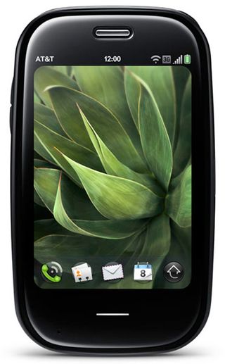
The new device we reviewed was on the O2 network, which has a period of exclusivity on the handset, as it did with the original. Now the company has lost its grip on the iPhone, maybe it'll give the Palm Pre Plus the push that the original deserved. O2 didn't seem to know what to do with it last year.
As the name of the device suggests, the Palm Pre Plus is a tweak – a step towards remedying faults, rather than a complete overhaul or the creation of a new model altogether.
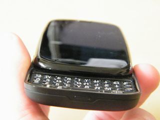
The phone's sleek form factor remains exactly the same, with a smooth pebble-esque design when closed, and a unique face-shaped curvature when opened.
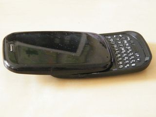
The slide-out full QWERTY keyboard remains, as does the 3.1-inch capacitive multi-touch screen. The software and UI is the same one original Pre owners enjoy and the intuitive gestures that helped to give the new web OS such a natural feel also remain.
Despite all that's the same on the outside, there are a few differences. The external centre button has gone from the device, with its menu-inducing functionality incorporated into the touch-sensitive 'gesture panel'.
Tthe QWERTY keyboard offers a more crisp feel than the squidgy original, and the back of the phone is now Touchstone wireless charging-ready, thanks to a new inductive covering.
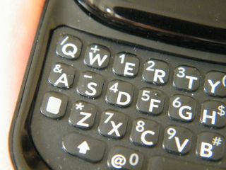
We'll go into these changes in more detail, but aside from those we're looking at the same handset. Unfortunately, that means the rim around the slide-out QWERTY remains sharp enough to have the latest Gillette Fusion razor running for cover.
Build quality is improved slightly with a more rigid hinge, which still doesn't feel as secure as it could.
In terms of buttons, there are still very few aside from the keyboard. There's the power button and sliding mute switch on top of the device (which are really hard to access when the phone is open) and the volume buttons on the left-hand side.

There's a 3.5mm jack at the top of the handset, a speaker on the back alongside the 3-megapixel camera lens and LED flash. There's no physical camera button – the touchscreen takes care of that.
The micro USB charging port hides behind a flip-out tap and the back of the screen is still mirrored. Handy for the photography and doing your make-up - we're metrosexual here.
The dimensions are also the same, measuring 59.5 x 100.5 x 16.9mm when closed, meaning it still fits handily in the pocket. It's almost six grams heavier, although this shouldn't be too much more of a burden.
The only other changes come on the inside. The Palm Pre Plus has the same 500MHz processor, which is half as fast as the HTC Desire, but it does come loaded with double the Pre's RAM at 512MB. Storage capacity has also increased from 8GB to 16GB (15GB of which is usable), but there's still no space for a microSD card.
The screen itself is unchanged, with the 320 x 480 HVGA display. It's still very bright and vibrant; decent in sunlight and farily resistant to fingerprints, but we'll get into that later.
Thankfully, the Pre Plus' box isn't loaded with unnecessary junk. There's a set of headphones that look very cheap, but actually aren't that bad compared to some of the buds that can be bundled in with mobiles, and they also work as a hands-free kit.
There's also a USB charging cable and the AC adapter, plus a pretty little black sock for the device.
There's no software CDs or anything, but everything you need can be obtained by plugging it into the computer.
Current page: Palm Pre Plus: Introduction and overview
Next Page Palm Pre Plus: InterfaceA technology journalist, writer and videographer of many magazines and websites including T3, Gadget Magazine and TechRadar.com. He specializes in applications for smartphones, tablets and handheld devices, with bylines also at The Guardian, WIRED, Trusted Reviews and Wareable. Chris is also the podcast host for The Liverpool Way. As well as tech and football, Chris is a pop-punk fan and enjoys the art of wrasslin'.
Most Popular


