TechRadar Verdict
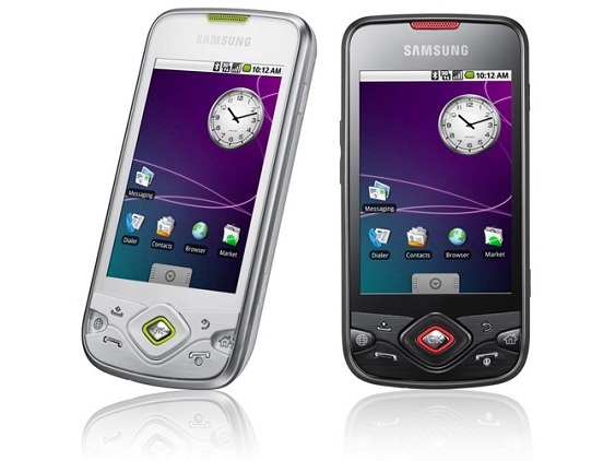
A decent-ish smartphone that does better than the original Galaxy - however, it badly needs an Android upgrade to be seen as a top buy
Pros
- +
Good battery life
- +
Bright, responsive screen
- +
Solid, weighty build
- +
Surprisingly good camera
Cons
- -
Very basic version of Android
- -
Messy button layout
- -
Small 1GB microSD card from T-Mobile
- -
No camera flash
Why you can trust TechRadar
Samsung, the famed Korean jack-of-all-technologies, is having another go at mastering the Android phone scene, after making a bit of a mess of it with last year's original Galaxy.
The i7500 Galaxy was a brave first attempt, but Samsung threw it away, alienating early adopters by not bothering to update the phone past its basic Android 1.5 operating system.
Seriously, there are petitions all over the place. Some men are still very angry about it all.
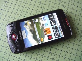
And now, learning from past mistakes, comes the Samsung Galaxy Portal - which looks pretty much identical and features... Android 1.5. Oh well. Let's give it a chance.
First impressions of the Portal are good. Nobody's going to be won over by black plastic in this day of hyper-alloy unibody combat cases and NASA-derived coatings, but at least the Portal feels solid - and the grippy, rubberised-effect of the back cover should minimise dropping/pavement catastrophes.
In fact, the Portal manages to be thicker and generally chunkier than last year's Galaxy, measuring 13.2mm thick compared to last year's model's 11.9mm.
The OLED screen of the previous Samsung Galaxy i7500 has been dumped, in favour of reliable old LCD technology - coming in at a thoroughly middle-of-the-road 3.2-inch in size.
It's bright and big enough, and if you haven't yet used a modern smartphone you'll be staggered by the HVGA resolution.
The phone's button layout is a slightly tweaked version of the original Galaxy's control array, which sees acres of the finest black plastic bent into a curved, yet unintelligible collection of icons you might expect to see on the command console of an alien space vessel.
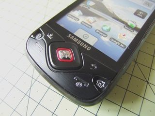
You don't get a trackball or optical pad - directional controls are taken care of by a clickable d-pad reminiscent of old video game controllers.
But this is actually fine - text editing is much easier with a reliable, clicky button.
Moving the cursor back three characters to correct a typo in an important, what-time-is-dinner-related text message is much easier when you can simply BASH-BASH-BASH a button three times, rather than fiddle about scrolling a little wheel into position - or even worse, trying to poke the screen at the relevant point.
The screen is also impressive to use - capacitive tech means it's solid and glassy, and it's every bit as occasionally patchy as most other touchscreens out there.
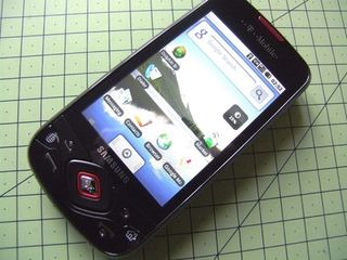
You'll soon get used to pressing a bit harder around the edges. Even Apple hasn't mastered that yet with the iPhone.
The standard Android buttons are all present, but there's no explanation of what they do. The 'Menu' button doesn't say 'Menu' - all you get is an icon that looks a bit like a tray with an arrow on it.
The Home button is easy to comprehend thanks to the little house illustration on it, but we can't help but pity some poor old dad who's going to get given one of these as a free upgrade and be left utterly confused by it all.
The handset also feels very 'bottom heavy' - trying to press back or home while holding it in one hand is fiddly, and worse still is the unintelligible approach to button placement - there's thousands of them. Metaphorically.
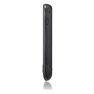
You get a separate 'lock' button on the top-right edge of the case to wake it up and send it to sleep, a camera button on the bottom-right side, and the volume up/down clicker to the left - picking the Portal up without accidentally pressing something requires forceps and a very steady hand.
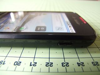
If only Samsung would bite the bullet and copy HTC's idea (like on the HTC Hero) of having the power buttons also acting as your screen lock - it'd then be possible to do away with at least one plasticky button, shaving fractions of a penny off the manufacturing cost, too.
At least there's a dedicated key for taking photos, which removes the utterly awful concept of operating a camera using a touchscreen button.
Current page: Samsung Galaxy Portal: Overview, design and feel
Next Page Samsung Galaxy Portal: Interface