TechRadar Verdict
Nice looks, shame about the rest
Pros
- +
Stylish design
- +
Handy touch screen
- +
5 megapixel camera
- +
HSDPA high speed data
Cons
- -
Touch screen is difficult to use
- -
Average pictures
- -
Poor video quality
- -
No Wi-Fi
Why you can trust TechRadar
The iPhone may not have sold as many units as Steve Jobs had hoped, but it certainly made the more traditional mobile phone manufacturers sit up and take notice.
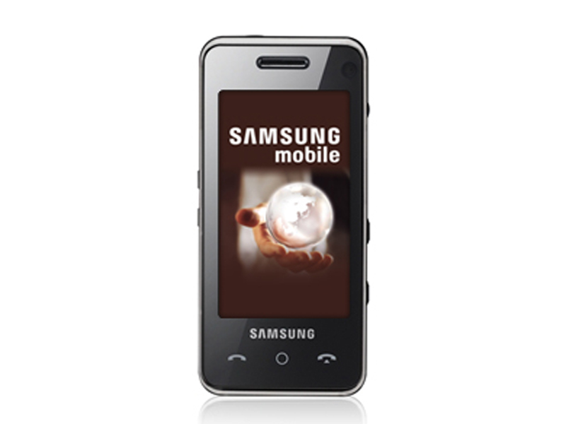
And in a Korean lab, Samsung’s engineers came up with the F490 – it’s got a really big touch screen like an iPhone, it’s quite slim like an iPhone, but oh dear, it’s just so far away from actually being an iPhone.
Slim and solid phone
First, the good stuff. It’s a great-looking slab of minimalist cool.
Its flush fascia promises much with its huge 72x40mm touch screen atop a trio of discreet buttons (call start, end and menu) and the smooth back is broken only by the 5 megapixel camera lens with flash and self-portrait mirror. It’s big, but because it’s relatively slim at 12mm it doesn’t really feel it, and sits comfortably in the hand.
But flip the slider button on the side to awaken the 262,000-colour touch screen and the problems begin.
Frustrating controls
It’s the latest Samsung phone to use the ‘Croix’ interface, so-called because you can drag the centre point of a cross around the screen with your thumb to the various menu icons. Scrolling through the menus you can do the stroking thing, where you rub your thumb across the screen either up or down to get around and access different menus.
This bit actually isn’t bad, but as soon as you need to do anything that requires precision pointing, like clicking on internet hot links or using the onscreen keyboard, the touch screen simply isn’t up to the job. It’s not very sensitive and requires quite a bit of pressure, not altogether intuitively.
The screen also locks up very quickly (maximum 15 seconds), requiring you to flick the slider again or press the camera shutter button to activate it again if you need it, say, in the middle of a phone call. And to finish a call you’ll need two button presses, once to wake the screen and another to finish the call. This gets really irritating very quickly.
The lack of sensitivity meant that we found ourselves making a lot of mis-keys, and having to do a lot of double and triple presses too. The ‘VibeTonez’ haptic feedback supposedly helps guide your thumb to the right button but the lack of accuracy meant that this just got irritating after a while and we switched it off.
Glossy screen
The screen has a nifty scrolling innovation in that if you brush your thumb down the left side it scrolls faster than if you brush the right side.
That’s if you can get it to work without accidentally activating the menu functions while you’re doing it – something we found to be well nigh impossible.
You can use the volume buttons on the side for scrolling, which helps but a better touch interface would certainly be a lot more fun. Also, the F490 is an extremely glossy brick, and even with the brightness turned up full the screen is very difficult to see in direct sunlight.
Another missed opportunity is the time and date on the home screen – you can click on each to view, but not edit. If you want to put a date in the diary or change the time, you’ll need to go through the standard menu route.
Underwhelming photos
The 5 megapixel camera is okay, but we couldn’t help thinking the high pixel count should have delivered better pictures. It’s not that they were bad, but certainly no better than the 3.2 megapixel one in Nokia’s N78, which we tried at the same time.
It’s also pretty slow to operate, and you’ll need two separate presses on the shutter button to open it in the first place – which cuts down on your chances of quick snaps.
There is a 3x optical zoom (as well as an additional 3x digital zoom, though it’s not available at high resolution), which is an all-too-rare option on cameraphones. There are a few post-snap editing options, allowing you to adjust brightness and contrast, add frames, clip art and text but it’s not a very sophisticated package.
Video quality is however quite poor, with painfully slurred movement, even at the highest quality setting. Even more distressing however is that there is no setting to allow you to take snaps or video that utilise the widescreen dimensions – they only come out in standard 240x320 resolution, which looks okay on most phones, but the outsize screen just makes them look titchy. Not good.
Skin-deep beauty?
The music player does the basics, though it’s easier to drag and drop your tunes from your PC rather than attempt the painfully slow PC Studio3 transfer software.
The onboard speaker is more powerful than most, though naturally there isn’t a great deal of bass and while the supplied headphones aren’t great, you can at least upgrade them since there’s a 3.5mm mini jack plug.
It comes with a 1GB microSD memory card which should hold around 300 songs on top of the 130MB onboard memory. And the battery didn’t disgrace itself, giving us a good two days of moderate use.
The F490 certainly looks great, but using it turned out to be a real pain and virtually all the functions could have worked better. If you love the look, you may be prepared to put up with its faults.
Looks: 8
Ease of use: 5
Features: 7
Call quality: 8
Value for money: 6
Network availability – Vodafone exclusive

