TechRadar Verdict
A decent idea from Vodafone, but ultimately needs some better applications and tighter social networking interaction to be a winner
Pros
- +
Great, vivid screen
- +
Good amount of storage
- +
Nice camera with 720p recording
- +
Unlimited music service
- +
Integrated contacts
Cons
- -
Complex 360 system
- -
No Facebook messaging
- -
Bluetooth won't sync
- -
Email is untidily sorted
- -
Video is hidden away in gallery
Why you can trust TechRadar
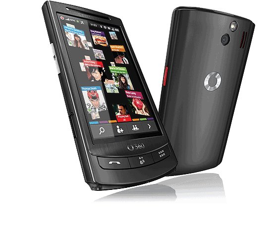
Vodafone's new 360 service is designed to make social networking a lot easier, and to kick off that campaign it's launched the Samsung H1, the flagship phone of Vodafone 360.
The phone is actually a decent model with some nice hardware on the spec sheet. Vodafone clearly wants to design 360 in its own image, and to that end it's developed its own operating system, based on Linux Mobile (the basis for Google's Android).
This means a phone with a new take on elements like contacts display and application interaction, as well as a strong leaning on cloud-based use too – but will it be too much for consumers to be bothered with?
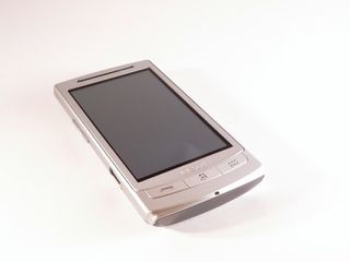
The Samsung H1, in its own right, is a decent model which would be competing at the sharp end of the Koreans' handset range.
The 3.5-inch OLED screen dominates the front of a phone that takes design cues from a lot of other devices in the Samsung range – if you've got an i8910HD or Tocco Ultra Edition, then you'll see how they're similar.
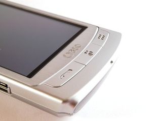
The phone is available in a variety of colours, but the brushed metal version looks pretty classy – the plastic back detracts from that impression when held in the hand, but overall it feels like a more premium phone.
Samsung has a tendency to go overboard with buttons on its phones, but whether it's had a change of heart or Vodafone has had a word in its ear, that's not the case with the H1.
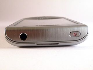
The phone has a power button on the top (which also doubles as a screen lock key, something that has been missing from a number of other Samsung phones, like the i7500 Galaxy) as well as a headphone jack.
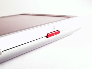
The right-hand side has the search button (weirdly in metallic red – we're not sure of the significance there. We just assume Vodafone wants you to know that you can flick through the phone with ease on the H1).
Below it is the camera shutter button, which has a pleasant action to it like so many other Samsung phones. It manages that difficult balance of easy to press but also lets you push halfway to auto focus without accidentally taking a picture, which is impressive.
The bottom of the phone looks like nothing very interesting, but look closer and you'll see a thin layer of plastic that glows white when receiving a message – very cool.
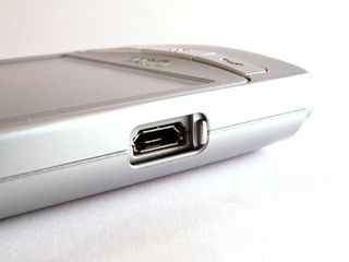
On the left-hand side there's a microUSB port with a little slide down cover to protect it from dust and the like. Above that is the volume/zoom switch, which is once again easy to press.
The front of the phone is, as we mentioned, mostly about the screen. However, above it is a proximity sensor and that dying breed – a video calling lens.
The front buttons of the phone are also nothing like you've seen before – there's a phone, contacts and applications key, and nothing else. This means no menu or terminate key, with these moving to the touchscreen instead.
The battery cover is a simple plastic affair, holding nothing more than a Vodafone logo, the 5MP camera lens and single LED flash. It's jolly hard to remove as well, with some people probably needing a leverage tool to get it off.
Under the hood is a pretty standard affair – the battery needs to be taken off to slot the SIM card in, and the microSD card is hot swappable, living just below the SIM.
It's a well put together device, and you can see why Vodafone chose Samsung for the job – the H1 has taken a lot of cues from previous models and feels very nice in the hand.
In the box
And continuing with the Samsung theme, the H1 comes with the standard range of accessories in the large and chunky cardboard box.
There's the microUSB charger and lead, a hands-free 3.5mm headphone adaptor (as well as some decent Samsung buds) and a miniature user manual and quick overview of the 360 service.
There's no CD containing the PC software in there – this is because it's on the whopping 16GB internal hard drive of the phone. However, such a big amount of flash memory seems to mean that Vodafone doesn't deem a microSD card necessary, despite there being a slot for one.
Current page: Samsung H1: Overview, design and feel
Next Page Samsung H1: Interface
Gareth has been part of the consumer technology world in a career spanning three decades. He started life as a staff writer on the fledgling TechRadar, and has grown with the site (primarily as phones, tablets and wearables editor) until becoming Global Editor in Chief in 2018. Gareth has written over 4,000 articles for TechRadar, has contributed expert insight to a number of other publications, chaired panels on zeitgeist technologies, presented at the Gadget Show Live as well as representing the brand on TV and radio for multiple channels including Sky, BBC, ITV and Al-Jazeera. Passionate about fitness, he can bore anyone rigid about stress management, sleep tracking, heart rate variance as well as bemoaning something about the latest iPhone, Galaxy or OLED TV.
