TechRadar Verdict
Vodafone has created another keenly priced smartphone that punches above its weight, but the Smart Ultra 7 launches into an increasingly competitive crowd.
Pros
- +
Low, low price
- +
Large and sharp display
- +
Near-stock Android 6.0
Cons
- -
Ugly design
- -
Vodafone bloatware
- -
Camera is just OK
Why you can trust TechRadar
The Vodafone Smart Ultra 7 hits the market at an interesting time. Here in the middle of 2016, we've reached the point where it's no longer a surprise when a really good, really cheap phone comes along.
The Moto G family set the tone several years ago, and we've since seen a whole bunch of top-value Chinese phones flood the low-end market.
Not to be undercut, UK mobile networks like EE and Vodafone have stepped up with surprisingly decent cheap efforts of their own. In fact, last year's Vodafone Smart Ultra 6 was one of the better sub-£150 phones of the year.
So how does its successor fare in an even more competitive market?

Costing just £135 on Pay As You Go, the Vodafone Smart Ultra 7 appears well equipped for the fight. It's got a decent lower-mid-range processor, a large and bright display, and a well-spec'd camera.
But as I've already said, this is an incredibly competitive market, with the Moto G4 resetting the parameters for what we expect from our affordable smartphones.
Vodafone's going to need to do something special once again with this year's effort - especially if it requires you to switch to the network from your current provider.
Design
Vodafone's Smart Ultra 7 looks quite different to last year's model, despite essentially boiling down to the same combination of plastic and glass.
You get those faux-metal-effect plastic edges that are bafflingly common on this kind of phone. They're fine, and hard-wearing enough, but they can only ever really disappoint whenever you get within touching distance of the handset.

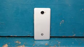
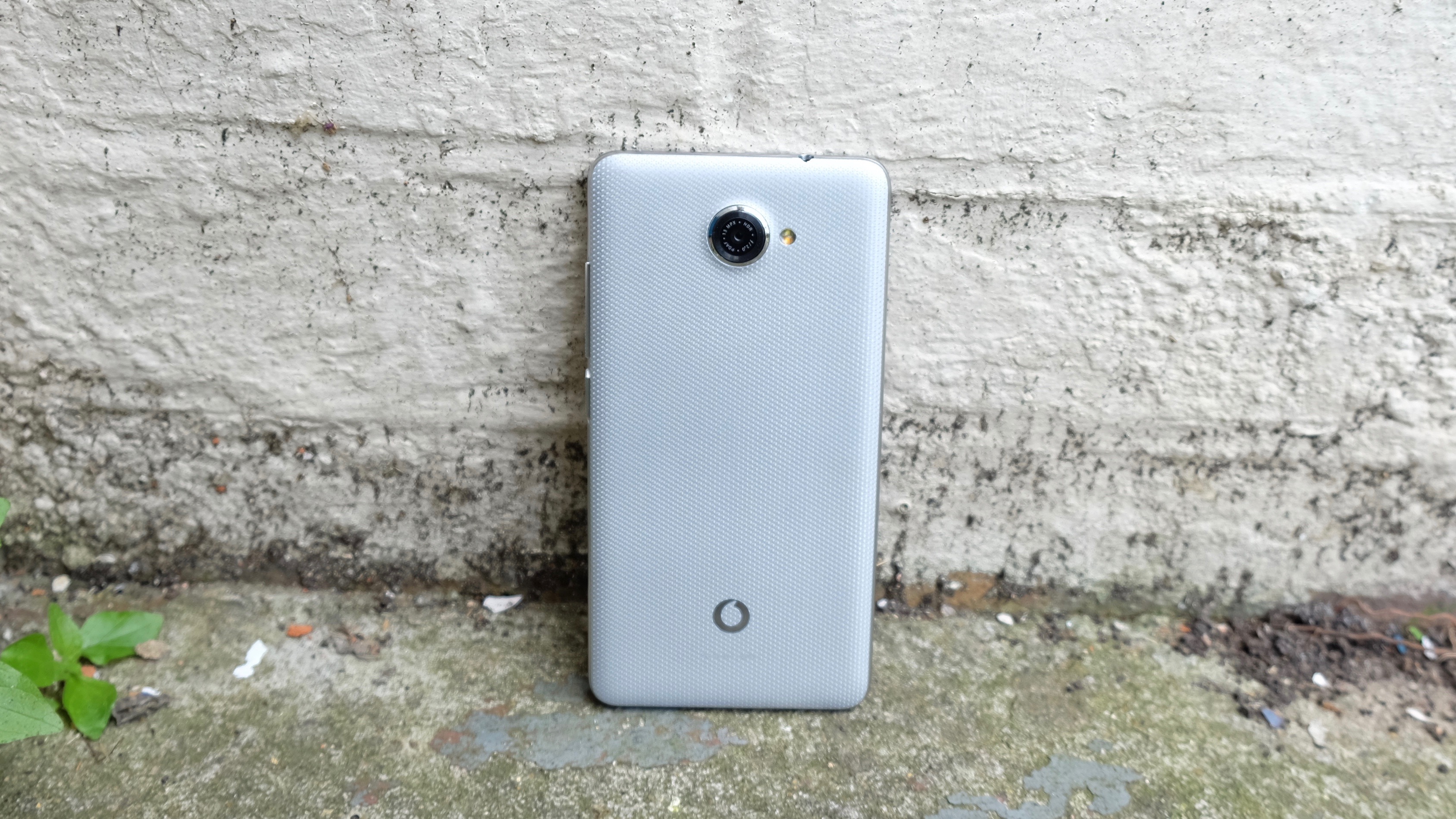
Around back, Vodafone has opted for a curious textured plastic finish. It's slightly pearlescent from a distance, and more than a little odd to look at close-up. The truth is, I'm still not sure whether I like it or not a week into my time with the phone - but at least it's a bit different from the norm.
The side power and volume buttons are pleasantly - or at least usefully - textured, so they're easy to distinguish and activate quickly by feel alone. Meanwhile, around front there are more changes from the Vodafone Smart Ultra 6.

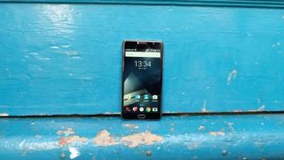
It's pretty similar in a blank-slate, black-slab-of-glass kind of way, but the key area to focus on is just below the display. Whereas last year's model had a set of dedicated capacitive keys, the Smart Ultra 7 adds a physical home button.
In shape and function it's quite similar to the home button on the Samsung Galaxy S range - albeit with a slightly less satisfying click. It's a shame there's no similar double-click camera shortcut, though.
Either side of this home button you get the familiar back and recent apps capacitive keys. This serves to remove the functions from the UI itself, which means a diversion from the default setup for stock Android. Both approaches have their merits, and I can't say I have a massive preference either way.

At 150g the Vodafone Smart Ultra 7 sits nicely in the hand, and is actually 9g lighter than the Smart Ultra 6. However, a thickness of 8.7mm means it's a fraction chunkier. Still, it's both lighter and thinner than its big rival, the Moto G4 (which is 155g and 9.8mm thick).
On the bottom of the phone you get the standard micro USB port and a solitary, somewhat tinny speaker. The top edge simply contains a 3.5mm headphone jack.
And that's about it for external features. It's simultaneously a rather plain and slightly curious design, and one that fails to ignite much in the way of admiration. But it's perfectly functional, which is all you can really ask for in an affordable phone.

