TechRadar Verdict
The Yotaphone 2 is a huge leap forward from the original and it's certainly a product which can appeal to a wider consumer base, but ultimately it still feels like a work in progress.
Pros
- +
Innovative second touchscreen
- +
Potential for long battery life
- +
Decent colour display
Cons
- -
Expensive
- -
Still a work in progress
- -
Average camera
Why you can trust TechRadar
It's not often you come across a truly unique device in the smartphone market, but the Yotaphone 2 is exactly that. Unique.
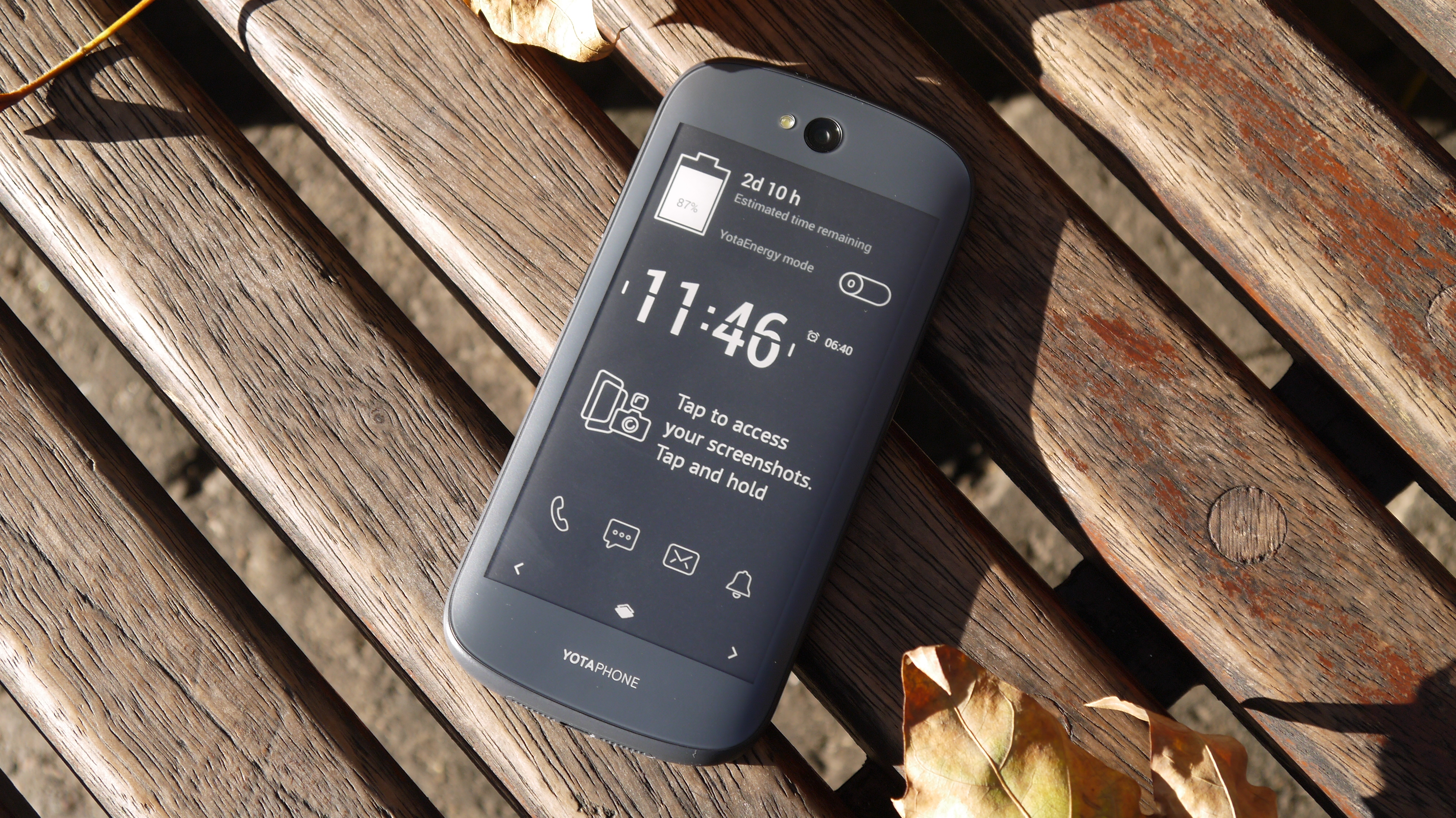
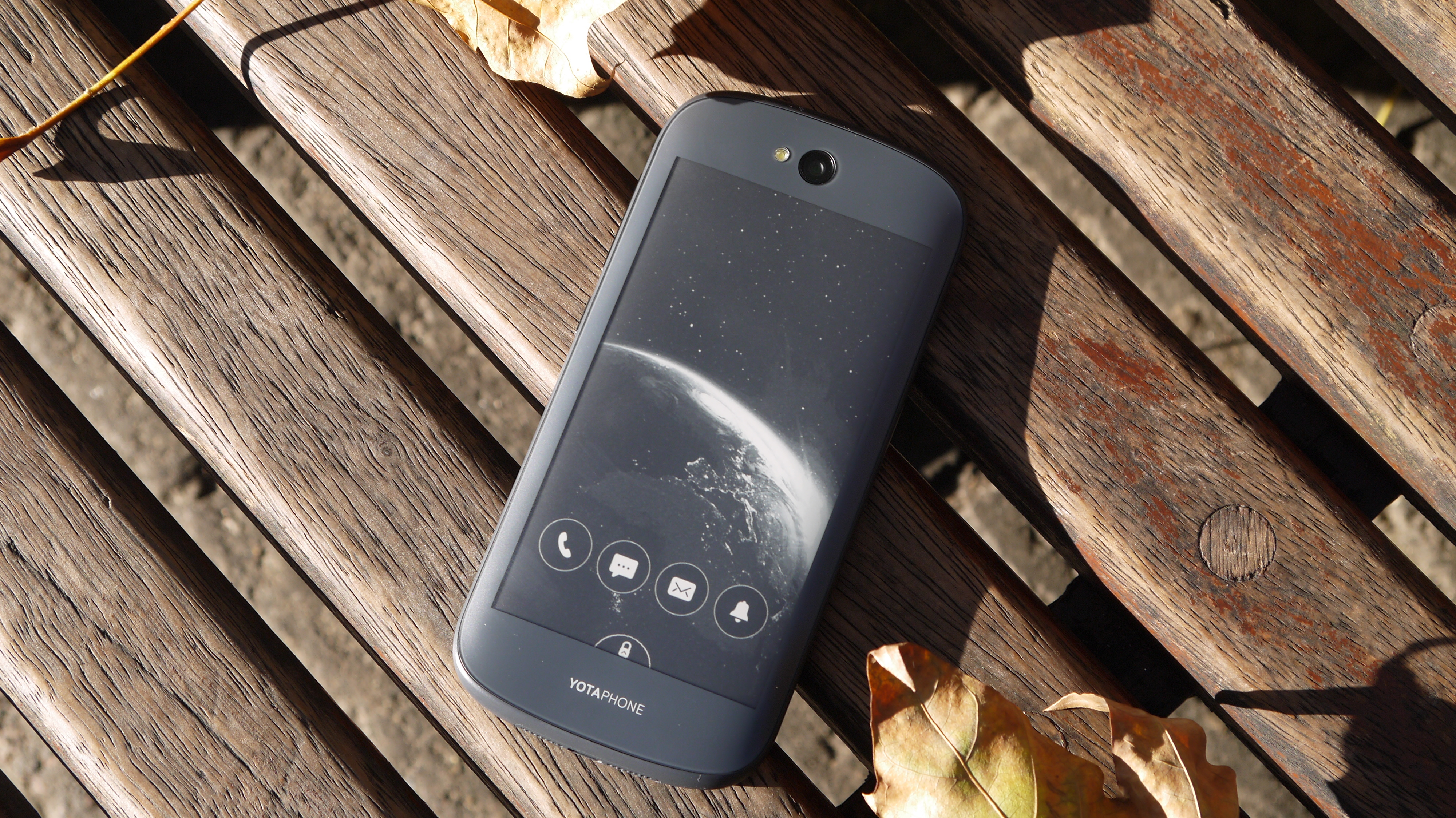
From the front it looks like any other Android smartphone, but flip it over and you're greeted with a second, all-touch display - only it's an e-ink screen similar to those found on ereaders.
The Yotaphone 2 is the Russian brand's second entry into the market following on from the original, proof of concept, Yotaphone which launched in 2013 and aimed squarely at early adopters.
This time round Yota Devices means business. This is a global device aimed at the average consumer rather than those sitting at the forefront of technology. It's even opened a dedicated store in London to really drive home the intent.
The Yotaphone 2 release date was December 4, where it went on sale in over 20 countries, including the UK. Asia Pacific and China joined the party earlier this year, while the US saw a successful, but ultimately canceled YotaPhone 2 crowd-funding campaign.
Fitting two screens into one device no thicker than 9mm while overcoming potential heat sync issues was no mean feat and the Yotaphone 2 carries a price tag which reflects the engineering complexity of its design.
SIM-free it'll set you back £555 (around $870, AU$1035), which places it up there with the top smartphones of the moment including the Samsung Galaxy S5, HTC One M8 and Sony Xperia Z3.
There's a decent level of tech included though, with a full HD 5-inch AMOLED display, 4.7-inch e-ink rear screen, 2.2GHz Snapdragon 800 processor, 2GB of RAM, 32GB internal storage, 8MP rear camera and 2.1MP front snapper.
Place the Yotaphone 2 face up (coloured screen up) on a table and it looks like any run of the mill Android - there's no indication of what lies on the other side.
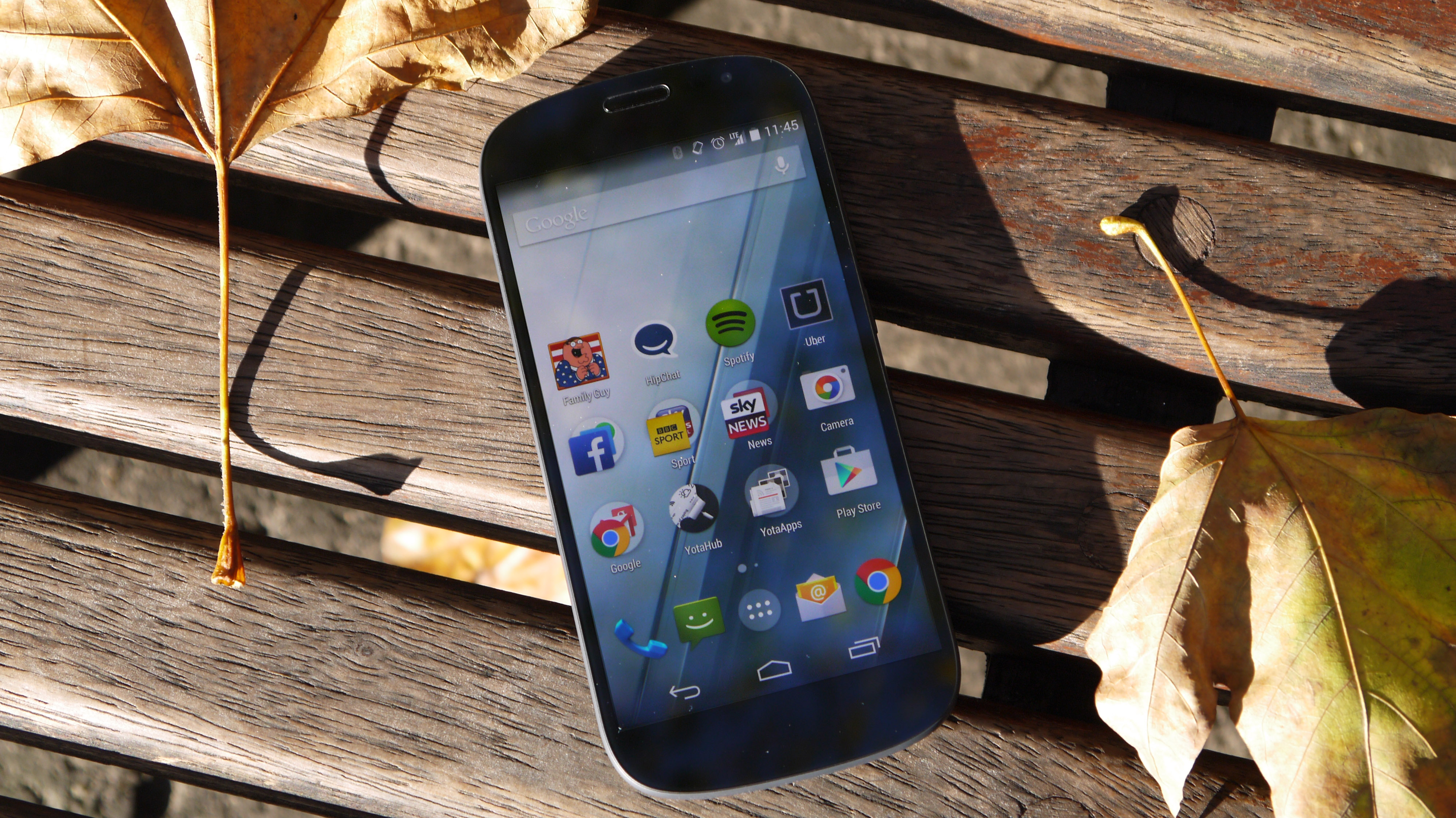
There's no logo or navigation keys below the screen, and its rounded design reminds me of a cross between the Samsung Galaxy S3 and Galaxy Nexus.
It's simple, yet I'm oddly drawn to the clean, fuss free design. With Gorilla Glass 3 front and back it feels supremely solid and the plastic frame which runs round the circumference has a textured rubberised feel providing a welcome level of grip.
The power/lock and volume keys are on the right side of the Yotaphone 2, and both fall nicely under thumb/finger during one handed operation.
The volume key has a pretty neat party trick which it's learnt from its predecessor - it doubles as the nanoSIM tray.
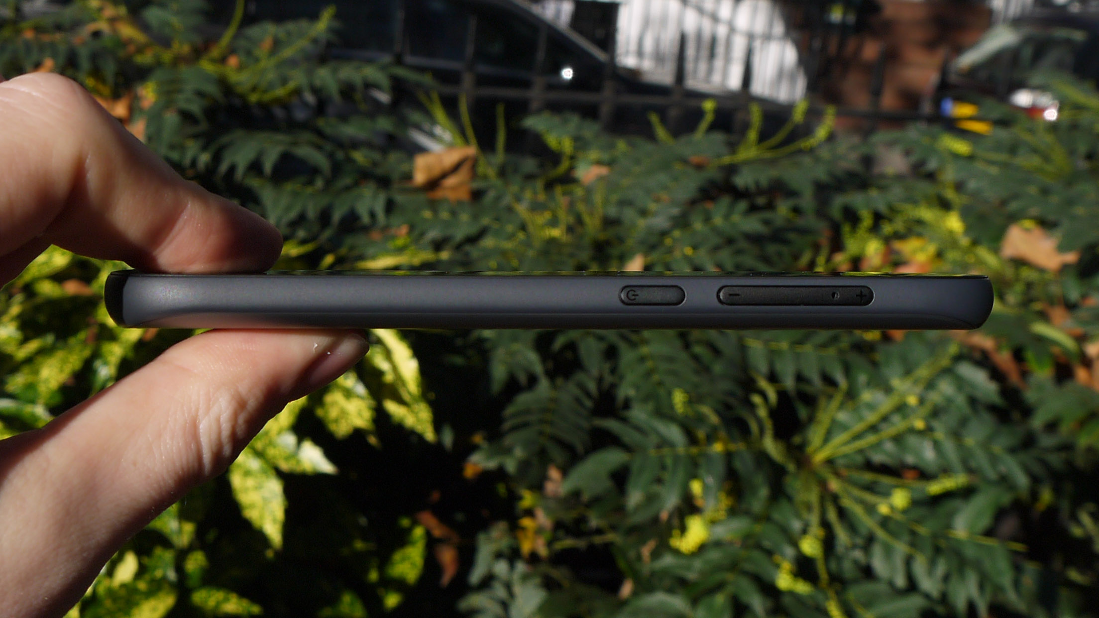
Your standard SIM tool won't be long enough to dislodge it from the handset though, you'll have to use Yota's elongated tool which arrives in the box, or in my case a slender paper clip.
There is a fear that if used frequently you could end up damaging the volume keys and/or SIM tray, but for most users it's unlikely that you'll access the SIM particularly often.
The handset is only a touch taller than the Galaxy S5 (142mm) and not as wide, while the metal framed Lumia 930 is wider (71mm), thicker (9.8mm) and heavier (167g) than the 145g Yotaphone.
Considering it's packing two fully touchscreen displays the fact Yotaphone 2 is just 8.95mm thick is impressive and the 144.9 x 69.4mm body means it sits comfortably in the hand.
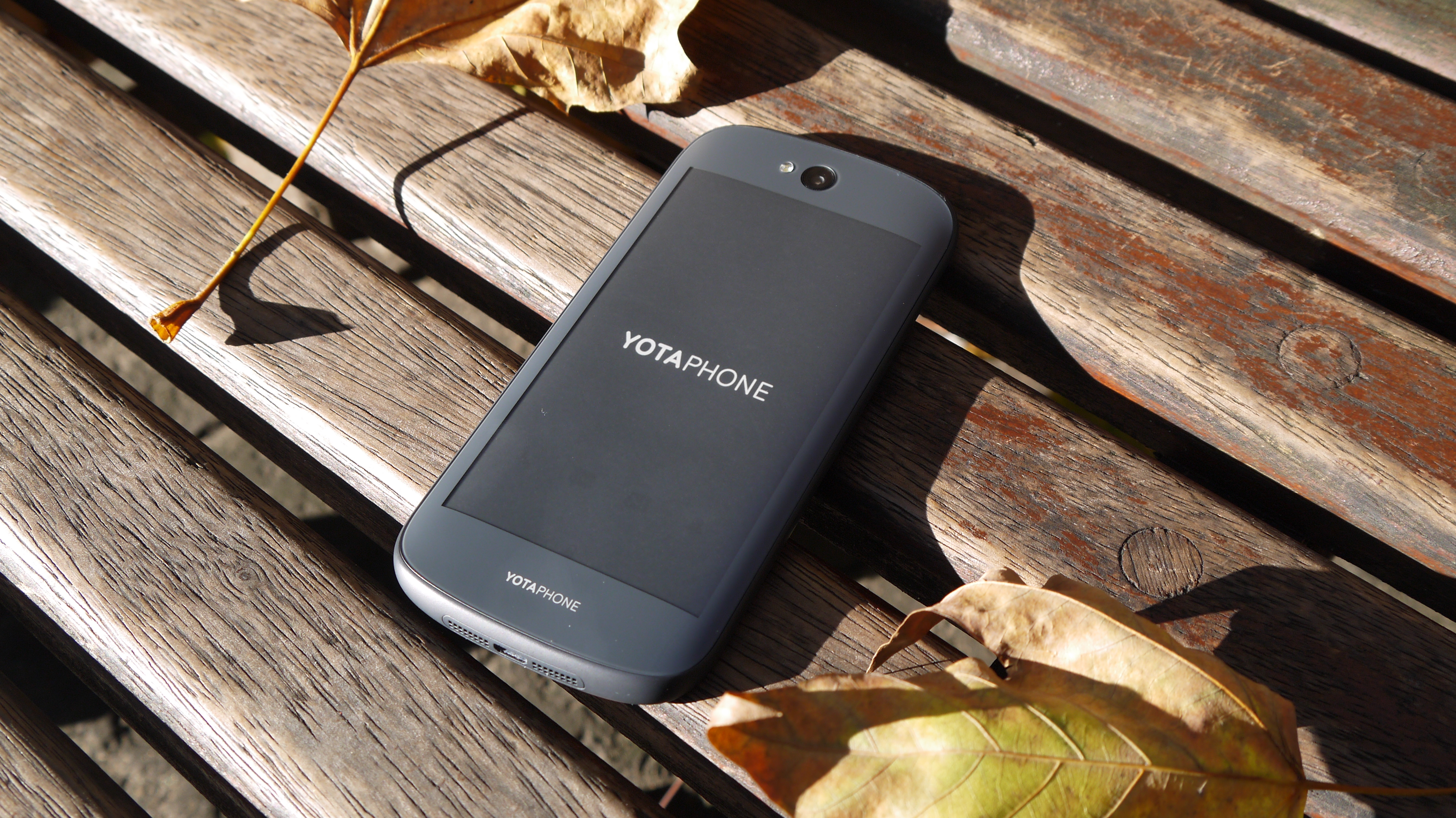
It's a vast improvement on the blocky original Yotaphone, and the positioning of the rear camera clearly trumps the bottom corner location of its predecessor.
I'm not talking iPhone 6 levels of quality and premium appeal here, but pick up the Yotaphone 2 and it feels like a well made piece of kit rather than a cheap knockoff from a brand you've hardly heard of.
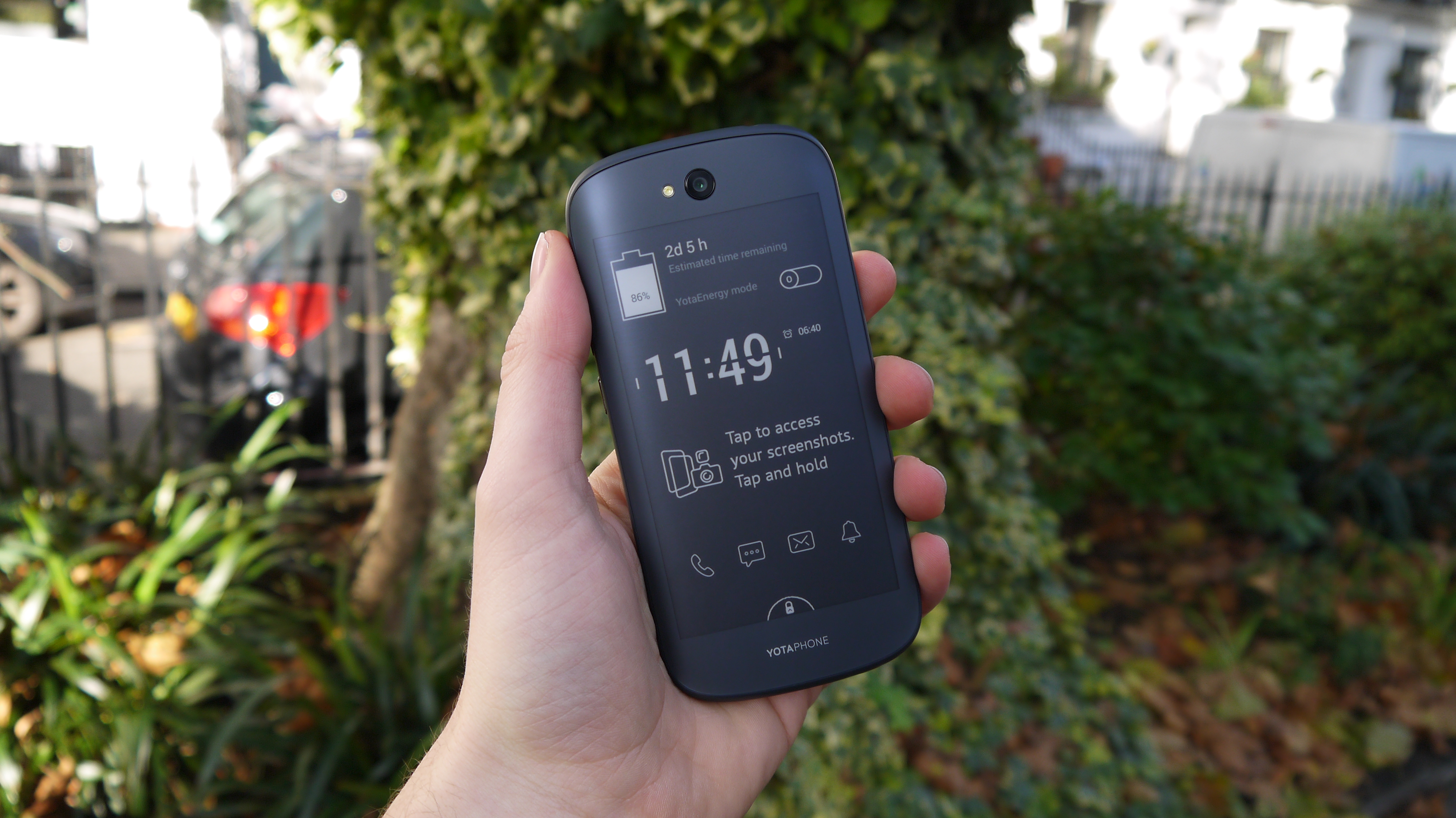
Unsurprisingly you can't take the back off this phone thanks to the fact there's a screen in the way, so the 2500mAh battery is locked away. That shouldn't be a huge issue though, as one of the key reasons there's an e-ink screen in play here is to suck less battery during mundane tasks such as texting, reading and updating social media.
There's also the dedicated YotaEnergy power saving mode to help extend battery life further, but more on that later in this review.
The dual screen setup means the speaker is shunted to the base of the handset, with a centralised microUSB port for company making for a tidy setup. Meanwhile the headphone jack is the only feature on the top edge.
With 32GB of internal storage there's enough space to store a decent number of apps, games, movies and music, but power users may be disappointed to learn there's no microSD slot to expand on this.
However the main attraction here is that rear e-ink display, which is always-on and slightly curved at the edges, making the Yotaphone 2 fit more snugly into your palm when using the coloured display.
There's plenty going on with this always-on display. Want to find out what? Then head over to the next page.
Current page: Introduction and design
Next Page The EPD: Electronic Paper Display
TechRadar's former Global Managing Editor, John has been a technology journalist for more than a decade, and over the years has built up a vast knowledge of the tech industry. He’s interviewed CEOs from some of the world’s biggest tech firms, visited their HQs, and appeared on live TV and radio, including Sky News, BBC News, BBC World News, Al Jazeera, LBC, and BBC Radio 4.
