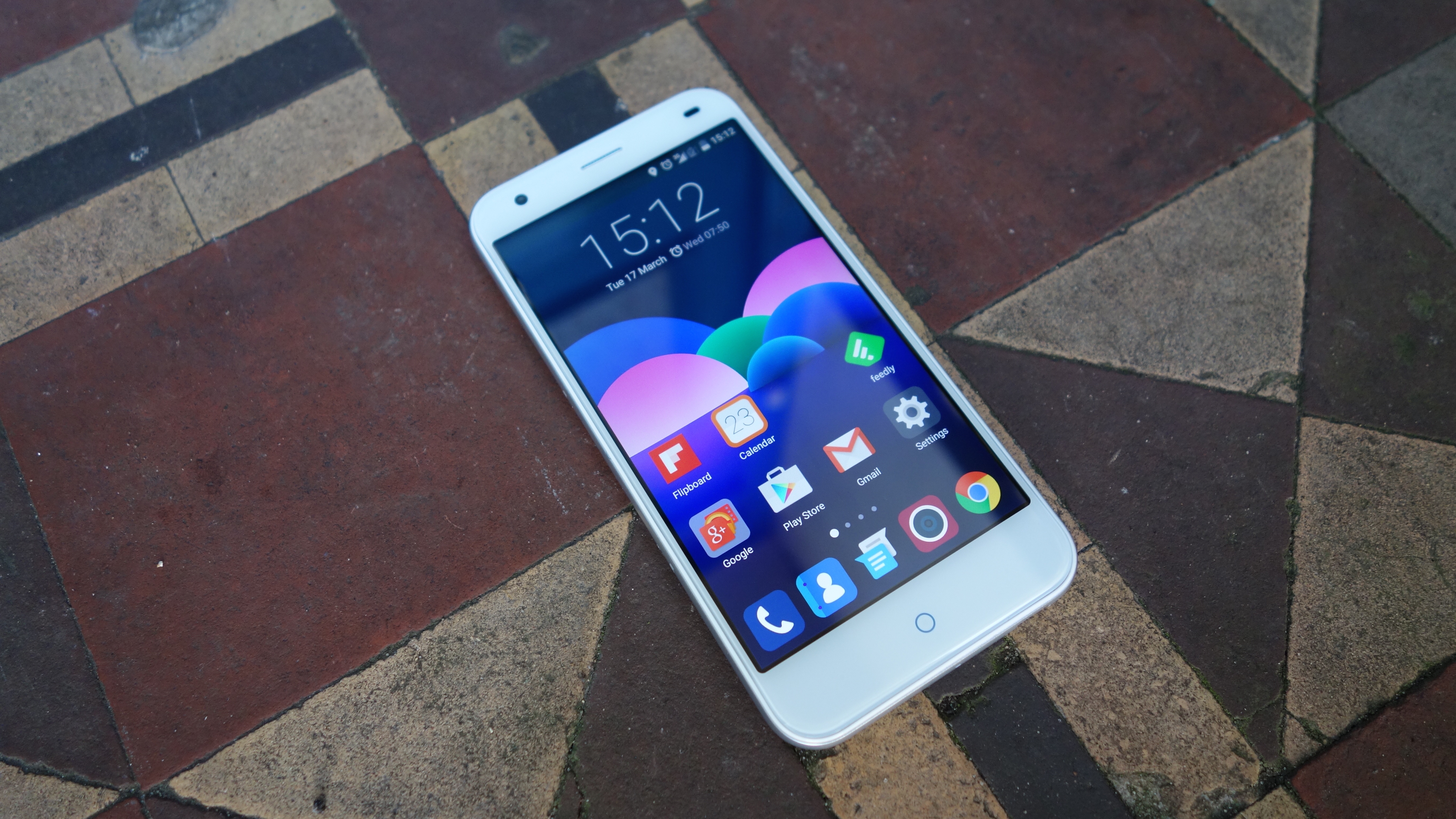
TechRadar Verdict
Decent specs and a lightly skinned Android 5.0 Lollipop are spoiled by a cheap and nasty design, but the ZTE Blade S6 remains good value for those who can look beyond its external flaws.
Pros
- +
Strong performance
- +
Capable camera
- +
Good price
- +
Decent screen
Cons
- -
Cheap design
- -
Bad speaker
- -
Mediocre battery
- -
Iffy capacitive keys
Why you can trust TechRadar
The Android mid-range is a varied and wonderful place to be shopping in 2015. At one end, the Motorola Moto G is punching above its weight, while at the other, the Sony Xperia Z3 Compact is mixing it with the flagships.
In particular, an injection of talent from China has really boosted and stimulated this portion of the market – which is where the ZTE Blade S6 comes in.
At just £170 ($250, AU$314), the Blade S6 slips comfortably into that lower-mid range alongside the Moto G and under the OnePlus One.
ZTE's well-specced 5-inch phone has the raw ingredients to be a real contender at this price point, but lazy design could prove to be its downfall in an increasingly competitive market.
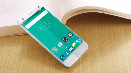
Let's not pretend here – the ZTE Blade S6 design is a blatant copy of the iPhone 6.
From its rounded corners and tapered display to its curved metal-effect edges and back, an initial glance is all that's necessary to see through ZTE's act.
Unfortunately, a closer look reveals the folly of taking such a shameless approach in a cut-price handset. The inevitable unflattering comparison can only lead to disappointment and a far more critical appraisal than a more modest or generic design might elicit.
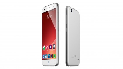
That tapered display turns out to be ringed by a naff plastic rim, while the back and sides of the Blade S6 are formed of a tacky silver-painted plastic that's both slippery and unpleasant to hold.
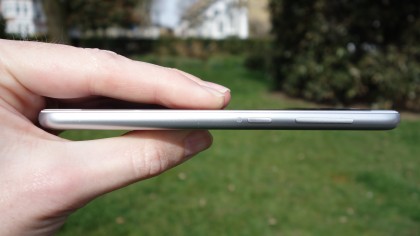
The power and volume buttons are well situated on the right hand edge, and reasonably tactile in a clicky kind of way, but the capacitive keys below the display are just plain weird.
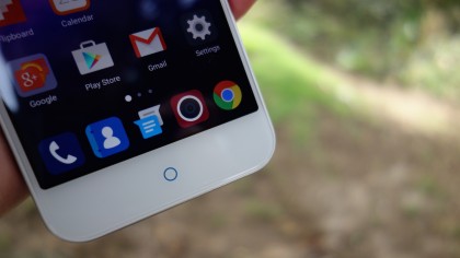
There's a permanently visible circular home key that seems to suggest iPhone-like functionality, but pressing it won't wake the phone from sleep, despite that being your instinctive response. This home button doubles as a blue notification light, which also looks a little cheap and out of place.
Either side of that home button are two dots that occasionally light up, providing the standard Android back and menu buttons. They've been left as dots because you can swap around their assigned functions, but it feels a little counter-intuitive not having them properly labeled.
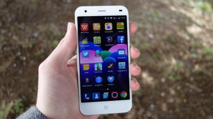
Matters improve with the ZTE Blade S6's display. It's only a relatively modest 5-inch 720p LCD effort, so it's not particularly sharp compared to the 1080p efforts that are now making their way into mid-range fare such as the Honor 6 and (of course) the OnePlus One.
However, it's sharp enough for most tasks. The picture is nice and clear, thanks to in-cell technology that combines the digitiser and the LCD components into a single layer. Viewing angles are decent too, as befits an IPS screen.
It's not so long ago that in-cell and IPS screen technologies were signs of a premium handset.
If I was to pick a nit here, it would be that the ZTE Blade S6 display's maximum brightness setting seems a little on the low side. It's not dim, but it only just feels like enough.
Storage of 16GB is okay for a phone of this class, and you also get a microSD slot for expansion. This is accessed through a slightly ugly tray that requires a SIM tool, and is situated right alongside the SIM tray itself.
