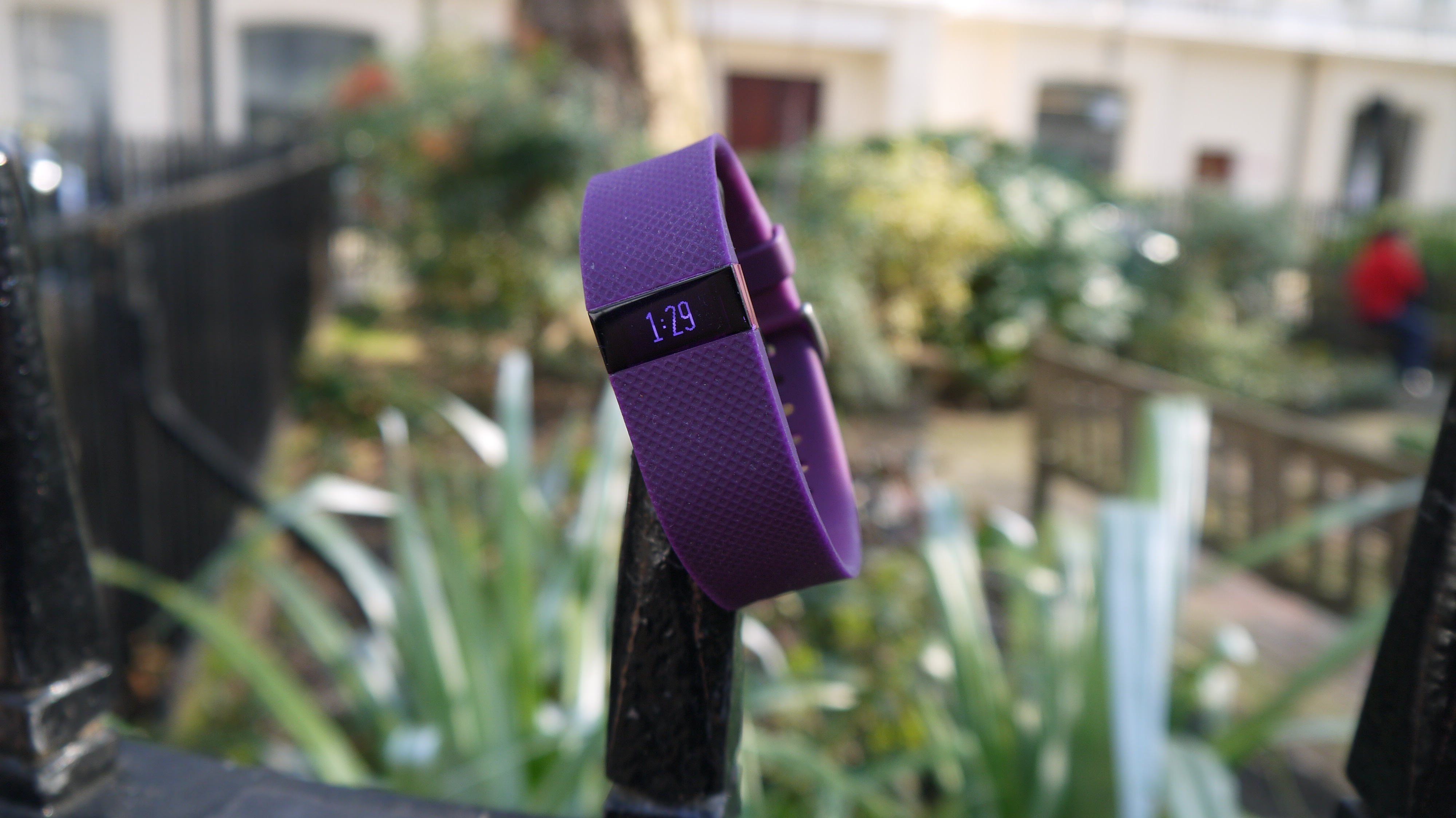
TechRadar Verdict
This is a weird one. It fails as tech on certain levels, yet does genuinely motivate and works as a lifestyle product. We love it, anyway…
Pros
- +
Comfortable to wear
- +
Stylish, discreet look
- +
Solid, "fun" fitness tracking
Cons
- -
The heart-rate monitor adds little
- -
Looking for rigorous accuracy? Look elsewhere
- -
Expensive for what you get
Why you can trust TechRadar
Update: The Fitbit Charge HR is still a recommended device for those looking to track their heart rate and monitor workouts. But Fitbit has now released its successor, the Fitbit Charge 2. It rocks a similar look to the original, but heart rate monitoring is now a standard feature, and the screen has been expanded to show off much more information.
If you're still onboard, you can snag this one for next to nothing, at least, as far as fitness trackers are concerned.
Original review follows below.
I've been scratching my head for a while trying to figure out how to review the Fitbit Charge HR. In fact, fitness trackers of this kind, from the Garmin Vivosmart to the Jawbone Up, to the ostensibly more sophisticated likes of the Microsoft Band are a very troublesome area.
Here's why: on a fairly profound level, the Fitbit Charge HR and its ilk just don't work. Anyone who's used as many as I have in the last few months is aware that their step counting is generally wrong, that the sleep tracking is both shallow and of minimal use.
Oh, and also frequently wrong. And don't even get me started on their feeble attempts to track exercise that doesn't involve walking.
- Take a look at our list of the best Fitbit bands
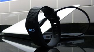
Actually, scratch that. You don't need to have tried as many of them as I have; just a quick glance at the step-counting or calorie-burn screens of just about any fitness tracker, as you stroll along, tells you all you need to know.
So why have I given the Fitbit Charge HR four stars? This, after all, is a tracker that costs US$105 (£80, AU$200) that's not expensive in the great scheme of things (and it's now cheaper than ever), but it's also certainly not a trivial amount, and it's at the top end of what you can pay for this kind of tracker.
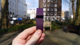
There are three reasons. First, Fitbits in general and this one in particular are more accurate than most rival products. Secondly, for this kind of tracker, strict accuracy per se is actually less important than consistency. Even if it's just consistently wrong in the same way, by the same degree.
The third reason is more difficult to explain because it's an emotional response: the Fitbit feels like a good product. It gets enough right to make me less peeved about what it gets wrong.
Design
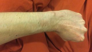
What does that look like to you? That's right: it's a wrist that doesn't have a rash on it. That's despite me wearing the Charge HR non-stop for three weeks, apart from showering – it's not waterproof, which is ridiculous – and charging it up.
Some users, however, have reported rashes, and Fitbit advises us to regularly take it off. But I ignored that advice and appear to be fine. If it's true that the straps on the Charge HR and other Fitbit devices can be problematic because they contain nickel, that is also ridiculous.
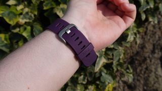
It's well known that nickel is toxic to human skin and, correct me if I'm wrong, is not generally considered an essential ingredient in watch straps.
However, for whatever reason, my arm is fine. Perhaps I have super powers.
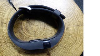
Now what does that look like to you? Correct: a proper watch strap, with a proper buckle. Not two little pointy bits that must be engaged into two lugs, in an exercise only slightly less frustrating that attempting to nail jelly to a tree. This is a classic watch strap and it works.
Actually, it's better than a classic watch strap. What you can't see above is that the little band around the strap (far left) also has a little retainer that goes into the last hole on said strap to hold it in place. This seems to me about as perfect a system for attaching something to your wrist as it's possible to make.
Every other fitness tracker maker: copy the Fitbit Charge HR. And that includes you, Fitbit; I remember the original Fitbit Charge had a different, crappier strap.
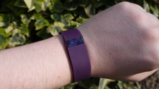
Now this, right here, is the optimum position for your Fitbit Charge HR. The manual suggests about a finger's width from your wrist bone but I found it actually worked better for heart-rate reading a little further up.
I know everyone has different tastes but this, for me, is perfect fitness band design. It's black, it's the right width, it's discreet, the screen is small but super-bright and legible in any lighting conditions, and it doesn't scream, "Look at me, I'm a big idiot counting my steps!"
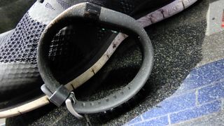
Speaking of light, under these, rather bright photographic conditions, you can see that the Charge HR weathers rather like a pair of expensive, technical trainers.
You may find this form of wear a cool feature that will eventually leave your device as charmingly gnarled as a 40-something ultramarathon runner. Or you may find it a bit irritating in a device that costs 80 quid. Up to you. It isn't very noticeable in day-to-day use anyway, if I'm being honest.
