TechRadar Verdict
Pros
- +
Great fitness and activity tracking
- +
Top battery life
- +
Good comfort
Cons
- -
Kinda drab design
- -
Less slick than Android Wear alternatives
- -
It looks like a smartwatch, but kinda isn't
Why you can trust TechRadar
Most smartwatches aren't all that great for people who actually exercise: runners, swimmers and cyclists. Without GPS, a watch is just left guessing your speed and distance based on how fast you move your arms. Even the ones that currently have GPS don't often make great use of it.
Smartwatches with, ahem, athletic support such as this, the GPS-enabled Garmin Vivoactive, and Fitbit's Surge HR are out to fill the big gap between a basic fitness tracker band and true smartwatches such as the Apple Watch and LG G Watch R. They're a bit bigger than your average fitness band and cram in smartwatch features like notifications, music control and a few basic apps.
However, the interface still prioritises kicking-off a GPS-tracked run over playing a game or checking out your latest WhatsApp message. Think running is a waste of life and Uber has made walking redundant? The Garmin Vivoactive isn't for you. For exercise addicts, though, this £180/US$250 fitness watch is among the best out there.
Design
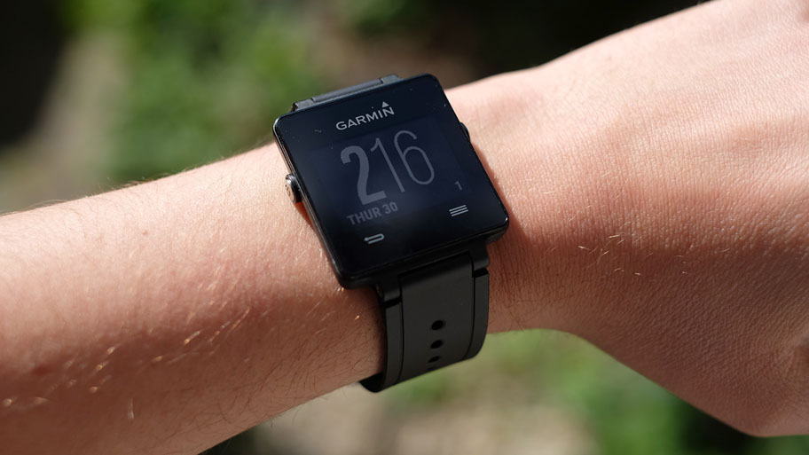
Excited? Well be prepared to be brought down to Earth with a bump because we're starting with some of the bad stuff. This is definitely not one of the more striking smartwatches. A plain black square on an anonymous rubbery strap, it's not going to make your friends immediately jealous.
Garmin even chucks away the minimalist vibe it could have gone for, by plastering a pair of soft key icons on the front. The Vivoactive is not a flat-out bad-looking watch. It's just a bit boring.
How come? This is Garmin's toning down of designs like the Epix and Forerunner 920XT. They're serious, chunky sport watches that cost around twice the price are are liable to make you look a classic case of "all the gear, no idea" unless you have your marathon training patter down. The Vivoactive is a more accessible version of these, not an Apple Watch rival.

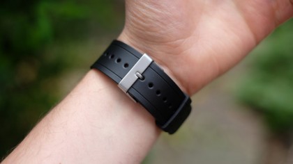
It's thoroughly watch-like. The strap is the same sort of simple design you'd find on one of those old digital Casios everyone seems to have owned at some point or another. It's a low-fuss watch for people who don't need others to make a fuss to feel like the price is justified.
Get over the lack of brag points, and the Vivoactive is very easy to live with. The watch face is surprisingly slim, avoiding the wrist eyesore factor that affects some smartwatches. Even the futuristic-looking Motorola Moto 360 is that bit too chunky for many.
It's comfortable too. Some smartwatch straps cause quite a lot of skin irritation, this one doesn't. After wearing the thing for a couple of weeks, there was no sign of a rash on our dainty(ish) wrist. Sure it gets a bit sweaty when it's hot, and you need to be sure not to over-tighten the strap, but that's true of any watch.
We wore it side-by-side with the Withings Activite Pop for a few days, and the Garmin was easier on the skin. That's no surprise, mind: Garmin has been making runners' watches for years now. It's a pro.
Battery life
One other amazingly convenient aspect is battery life. Somehow Garmin has managed to squeeze up to three weeks' use out of a charge from this fairly dinky device.
We say "somehow," but a closer look at the tech inside tells you an awful lot more about why. First, there's the screen.
It's a 1.13-inch display that looks much closer to a Pebble than an Apple Watch. It is colour, though, making this one of the first ultra-low energy smartwatch screens with colour, pipping the Pebble Time, which is due later this year.
There are little accents throughout the interface to let you know colour is in, but they're not exactly eye-bustlingly vibrant because the display's spectrum doesn't range from black to pure white. It's more like black to light grey, a bit like a Kindle e-reader. Without great contrast, you don't get great colour.
Just like a Kindle, the Garmin Vivoactive screen isn't natively lit either. Most of the time it relies on ambient light, although there is a blue-ish front light you can activate by pressing a button on the left edge of the watch face.
In a rather silly battery-saving move, Garmin has made it so this light only comes on when this button is pressed, at least to start with. But you'll get a much more rewarding experience if you set it to come on when there's any interaction with the Vivoactive (it's an option in the settings). It doesn't kill battery life either: the light is only a weedy little LED after all. Without it, the screens looks way too dim in anything but strong, direct light.

At the best of times the Garmin Vivoactive screen isn't going to wow you as an Apple Watch might, but then it's not meant to. And it has something else we find incredibly useful.
This is an always-on screen, meaning you can check out the time without having to press any buttons or play the role of arm-waggling, gesture-performing monkey just to get the display to activate. It's most refreshing. There are loads of custom watch faces you can use too, some of which pack in extra details like the watch's battery level and how close you are to meeting your daily steps goal.
Factors like this ramp up the Garmin Vivoactive's likability immeasurably. Other smartwatches may be status symbols, but this one is like a low-maintenance friend. Zero stress. And even with the backlight turned on and a decent chunk of GPS tracking used each day, we still got through a week on a single charge.
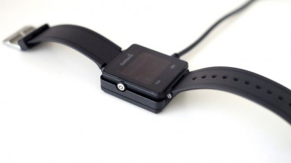
When you do need to charge, you just plonk the watch into a little magnetised dock, which can be plugged into a computer or just about any USB charger, including your phone's one.
Andrew is a freelance journalist and has been writing and editing for some of the UK's top tech and lifestyle publications including TrustedReviews, Stuff, T3, TechRadar, Lifehacker and others.

