TechRadar Verdict
A great device for runners, Garmin packs GPS smarts and spot-on tracking into a simple band that favors substance over style.
Pros
- +
Six day battery life
- +
GPS and heart rate monitor
Cons
- -
Design is lacking
- -
Data could have more depth
Why you can trust TechRadar
Garmin has always been known as a sports and performance powerhouse, which is why it may seem like you have a mild case of déjà vu every time the brand launches yet another new wearable device.
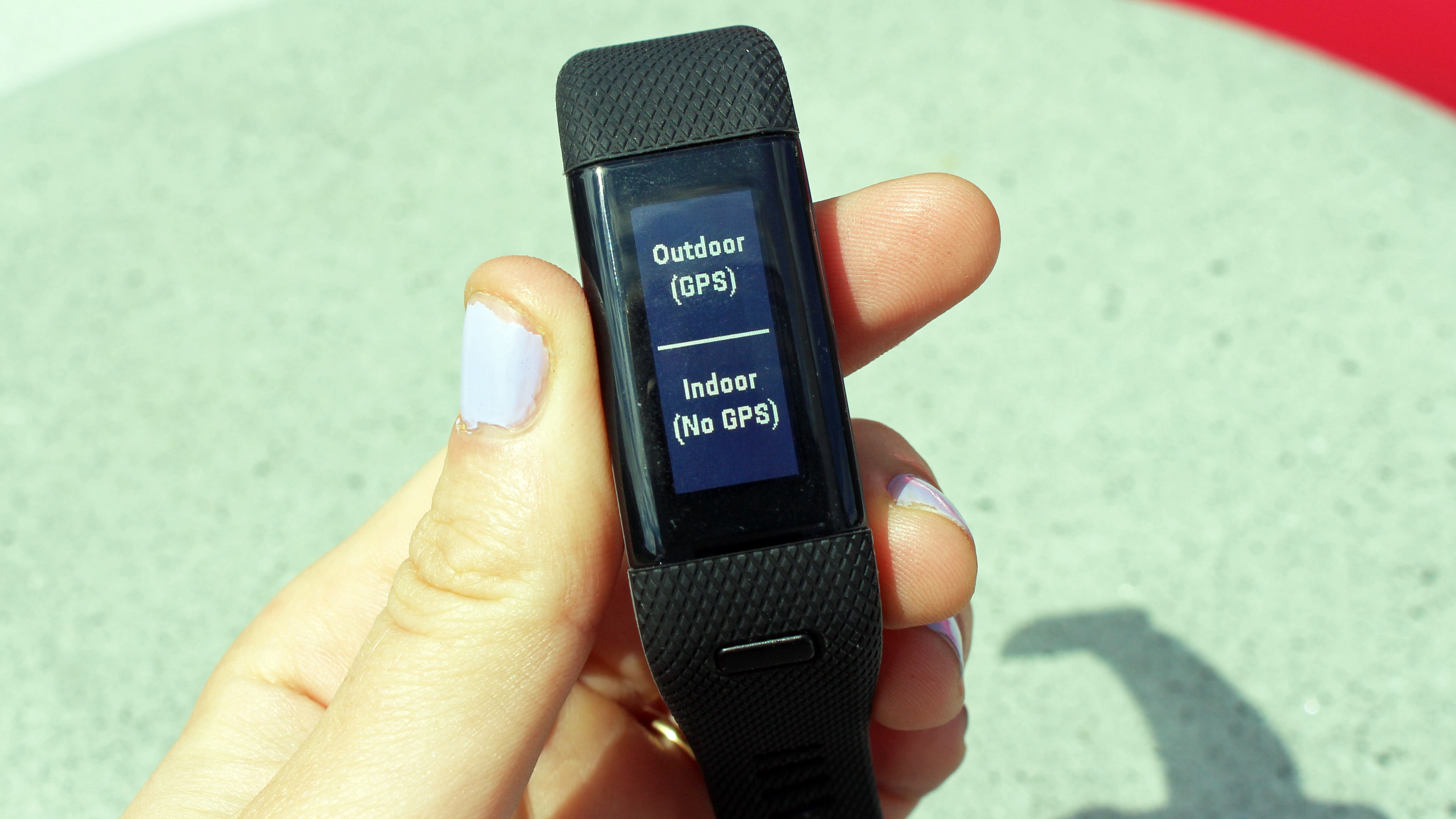
The Garmin Vivosmart HR+ is no exception, as it's an updated version of the slightly dumbed-down Vivosmart HR, which launched in late 2015. The HR+ has had a small yet substantial upgrade on the original, because not only is it packing a heart rate sensor, but it's GPS-enabled too, which means it really is a runner's best friend.
These are two huge pulls for those who are currently using a simple wearable like the Fitbit Alta or Misfit Shine, but feel like they need to take a step up to a device that's much smarter and built for fitness rather than activity tracking. This explains why the Garmin Vivosmart HR+ sits on the more expensive end of the activity tracker spectrum at £169.99/US$219.99/AU$349.
But in many ways it's not a device solely built for fitness (even though we think runners will get the most out of it). With the Vivosmart HR+, Garmin is definitely making a play to compete with all-singing and all-dancing devices like the Apple Watch and Fitbit Blaze, which can handle activity tracking, sleep and fitness, as well as notifications to boot.
Read on to find out whether we think the Garmin Vivosmart HR+ is a souped-up activity tracker or can compete with the smartwatch elite.
Design
- Durable plastic and rubber body
- Not the most attractive device

Compatibility: Android and iOS
Display size: 2.5 x 1.1cm
Display resolution: 160 x 68
Battery: up to 5 days
Charging method: USB via cradle
Water resistant: up to 5ATM
Connectivity: Bluetooth, GPS
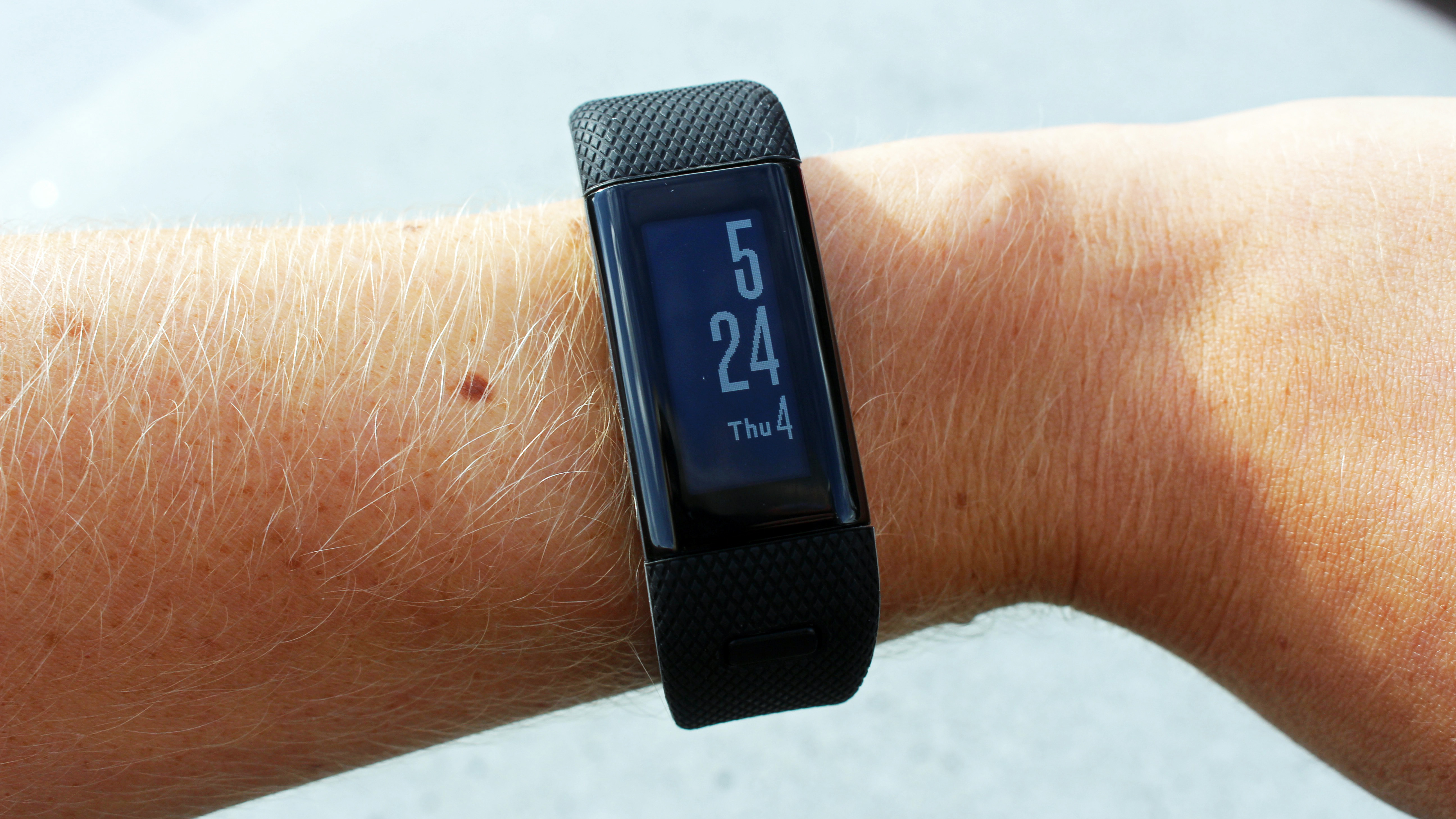
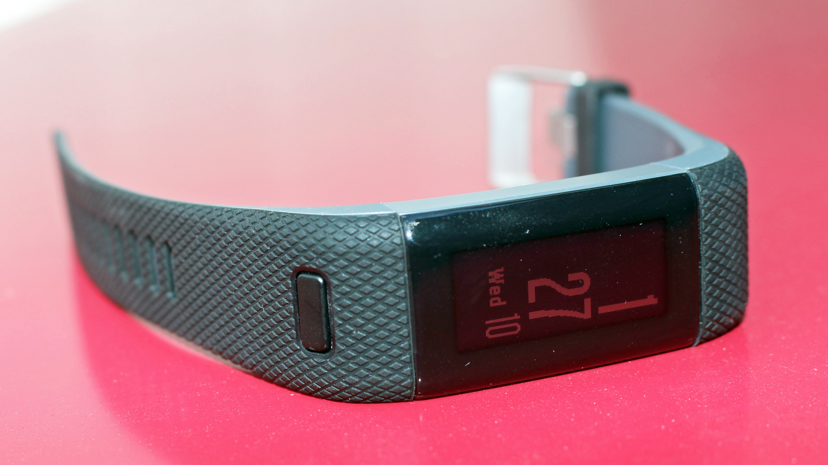
Like most of Garmin's other products, the Vivosmart HR+ isn't pretending to be a modern take on the classic watch - a style we've seen touted by a number of similar brands. Instead, it's a device built for fitness through and through.
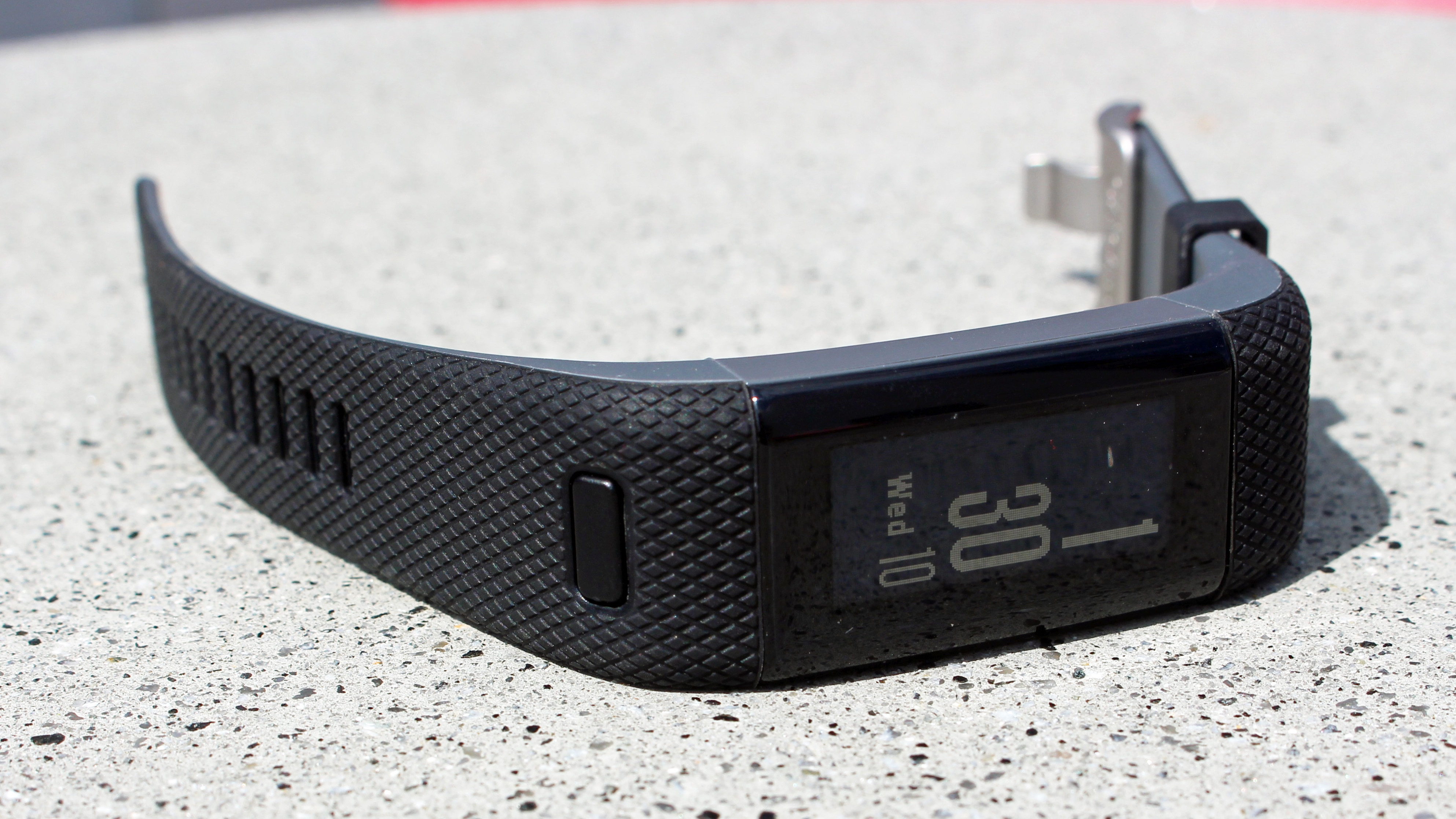
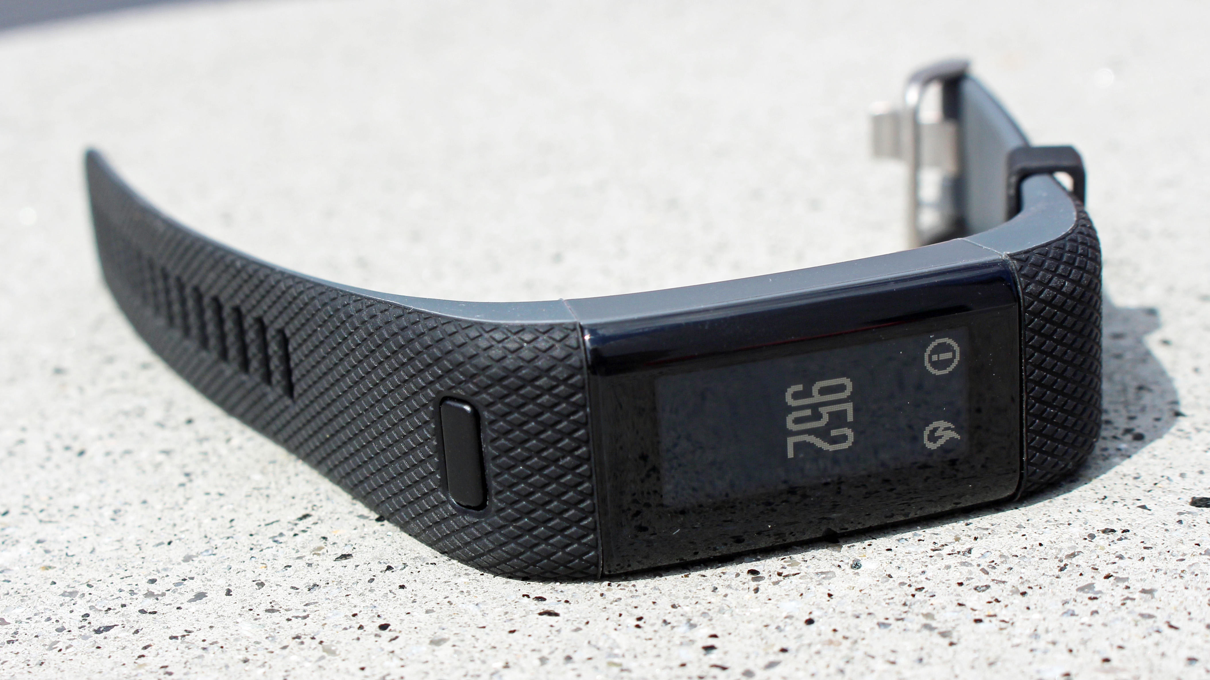
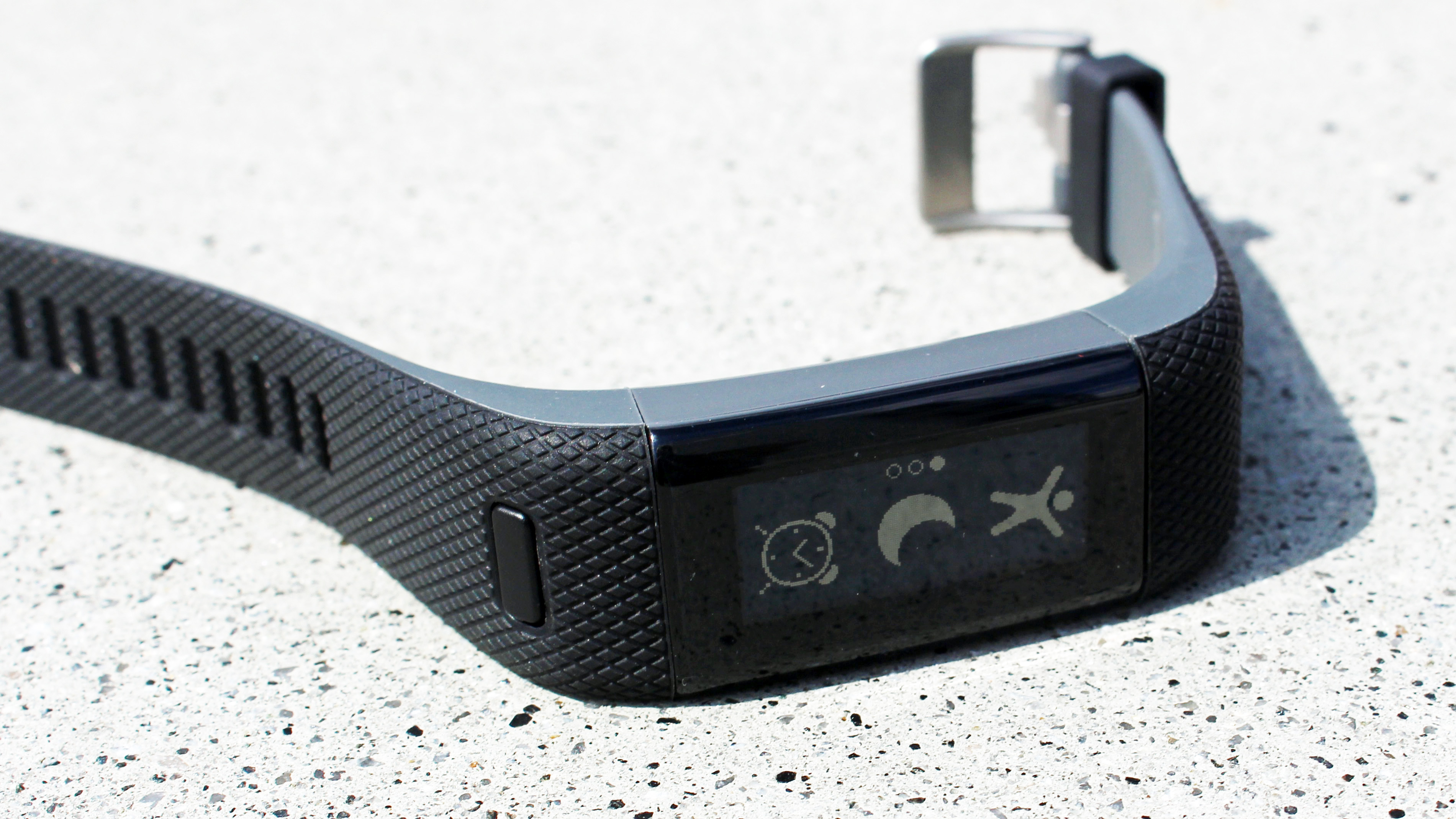
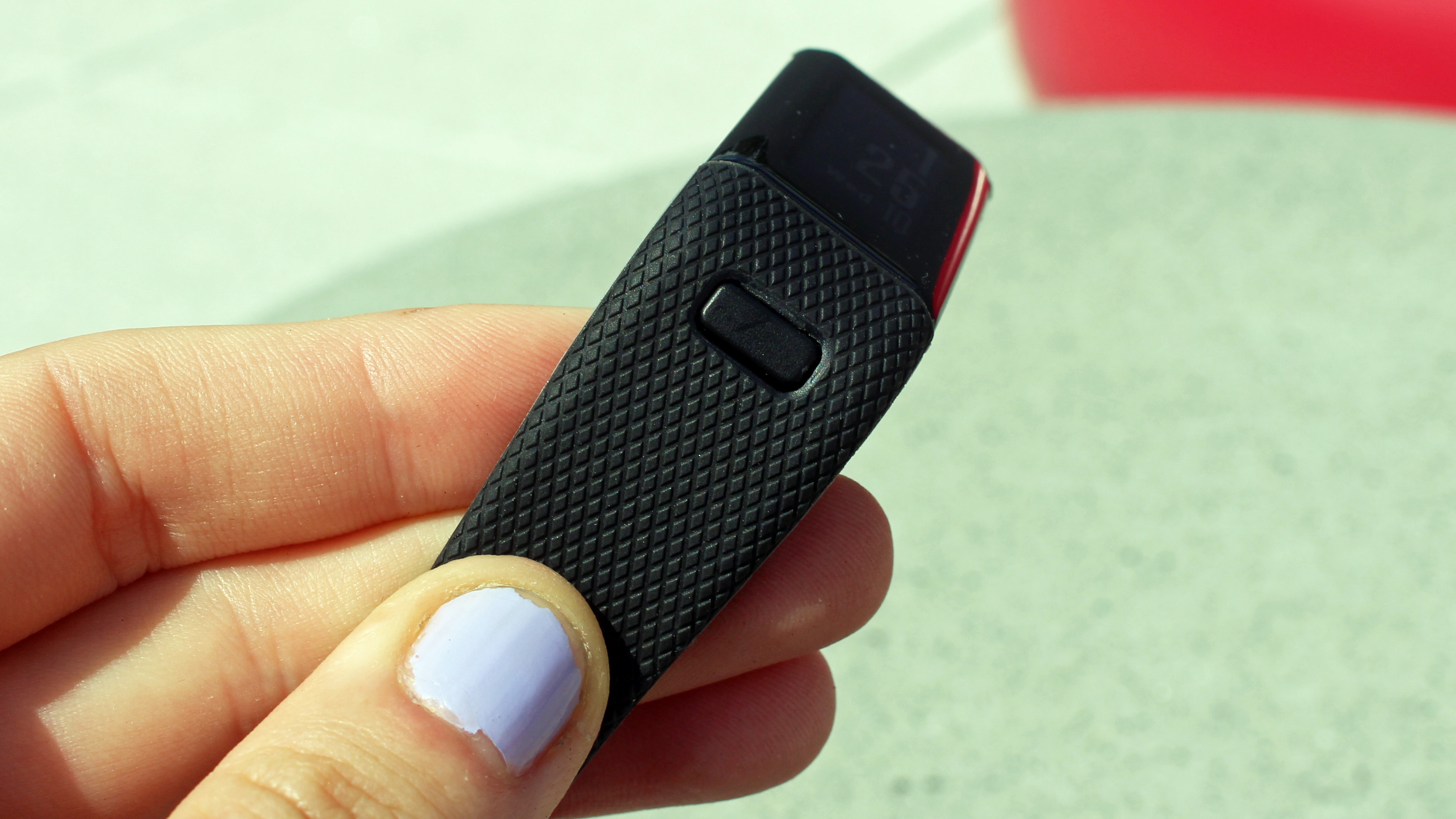
Made from plastic encased in a rubber strap and body, the durable design ensures the HR+ withstands knocks and drops to the floor (yes, we accidentally dropped it more than once and can safely say it survived intact).
Sign up for breaking news, reviews, opinion, top tech deals, and more.
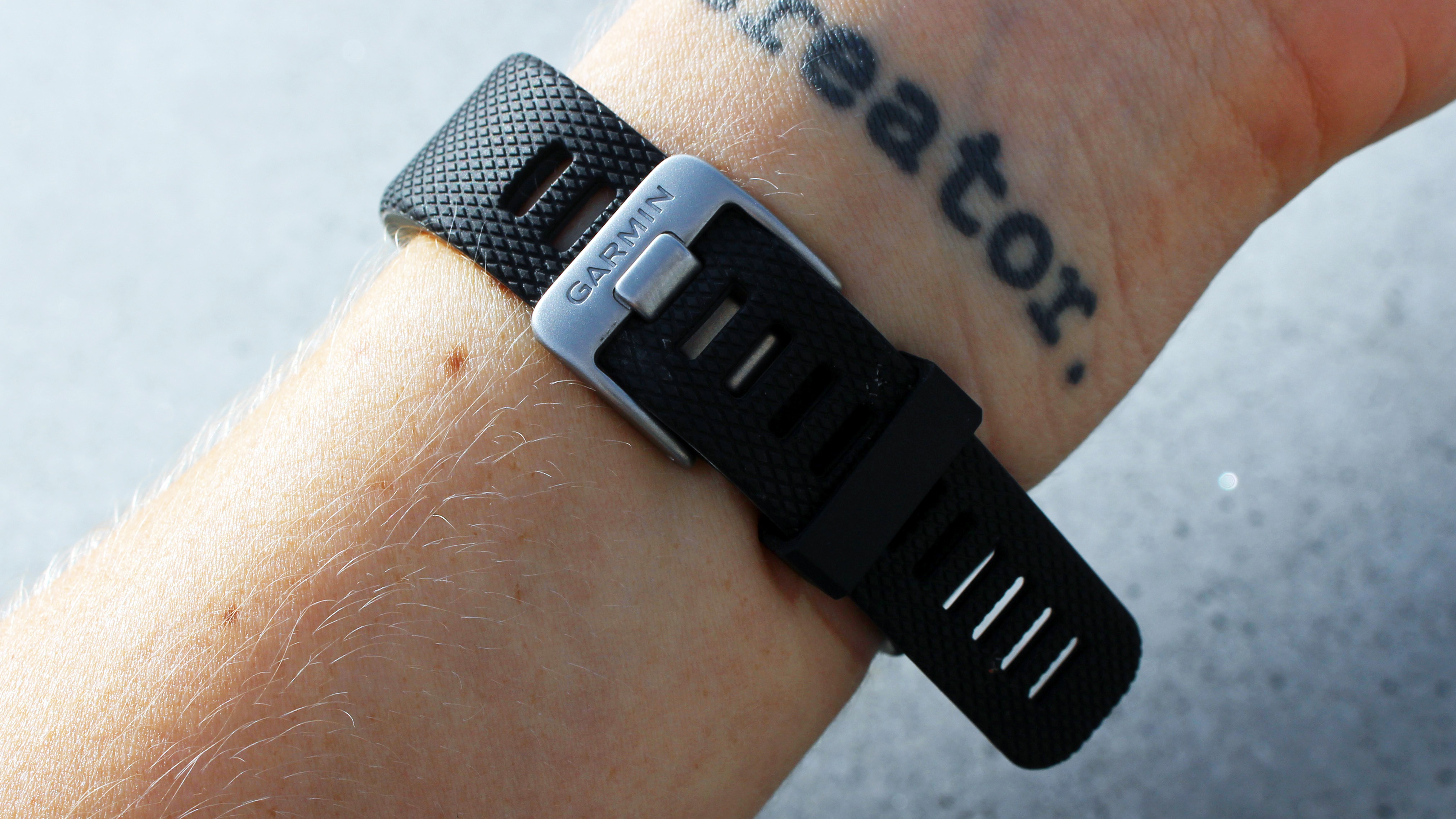
Its traditional buckle-style strap means it stays super secure, even running on the roughest terrain.
At first this feels a little heavy duty in comparison to other wearables, but the fact it barely moves is a huge advantage over the style adopted by the likes of the Jawbone UP3, which is prone to sliding around during particularly grueling workouts.

Sure this sensible, durable and unashamedly fitness-driven style will be a huge turn-off for some. But a device that's built to get the job done and values a simple, tried-and-tested aesthetic over an achingly stylish one actually feels refreshing, (although that's maybe a sign we're getting older and more boring.)
But once you delve deeper, you find that the HR+ really does favor substance over style. For example, the rubber exterior and sunken home button mean the device has a decent amount of waterproofing.
Just like Garmin's other wearables, the Vivosmart HR+ is water resistant to 5ATM, which is around 50 meters. This means you don't have to worry about it in the bath or the shower and can even take it swimming - even though there's no dedicated swimming mode. Sad face.

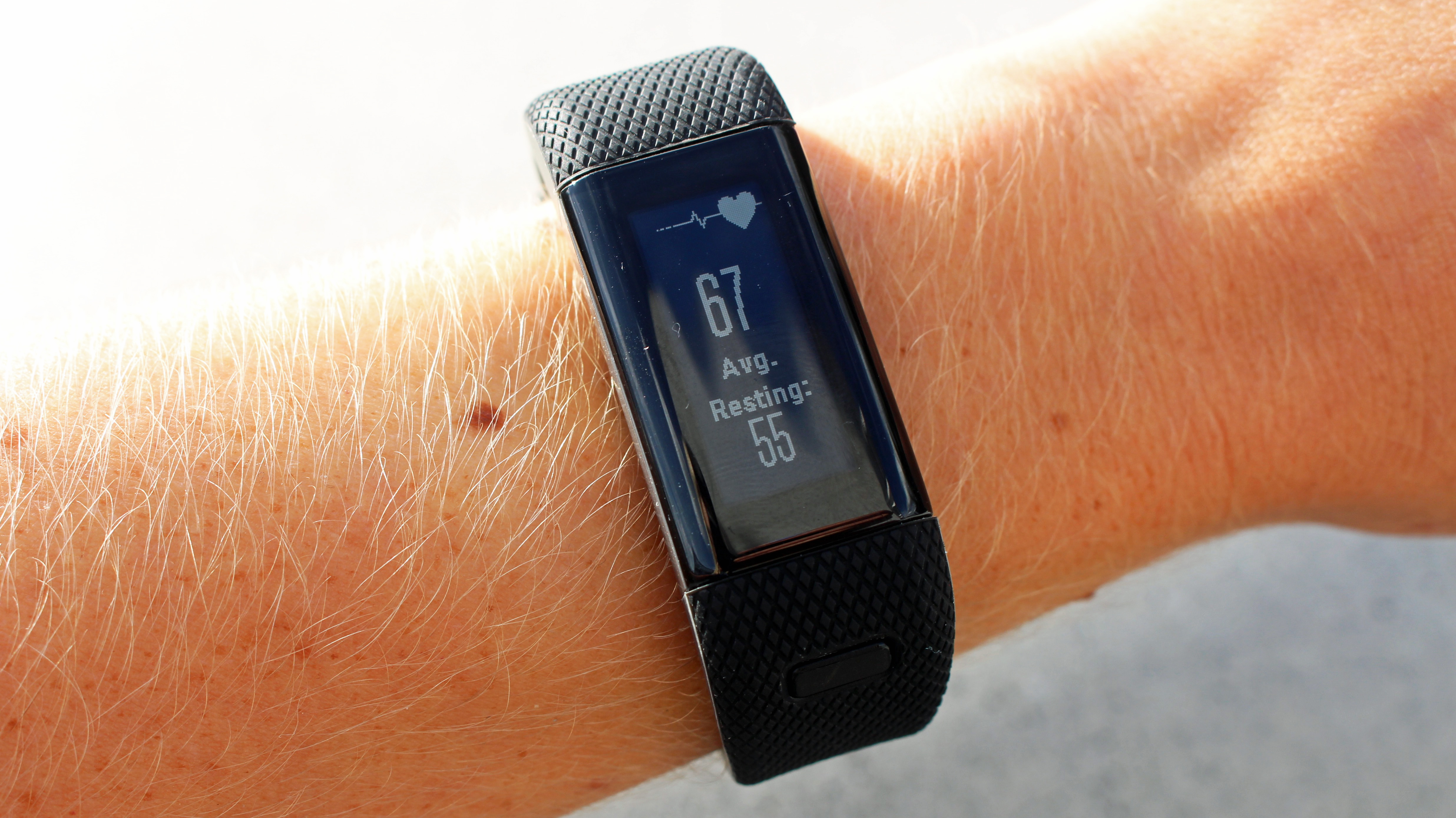
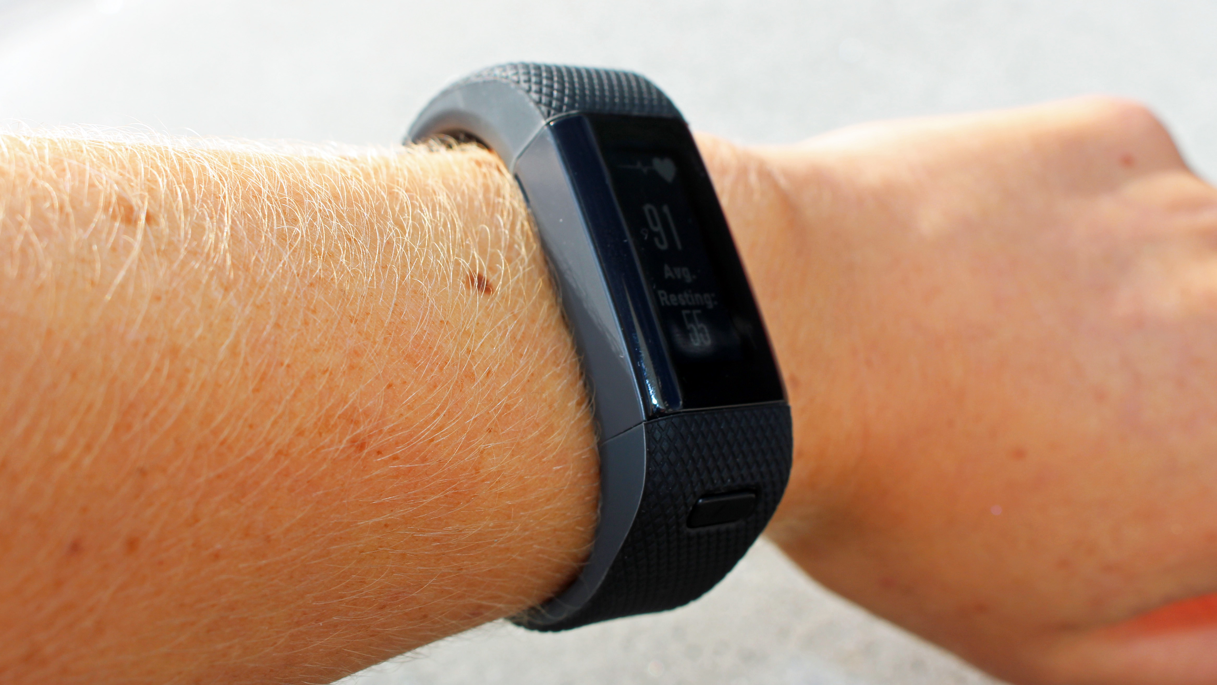
We were sent the HR+ in black, but it comes in a few different shades, like purple and blue. The wearable appears slim, but it's very chunky depth-wise. Its subtle style means it works well at work, home and in the gym, but those with smaller wrists be warned: it doesn't always play nice with sleeves.
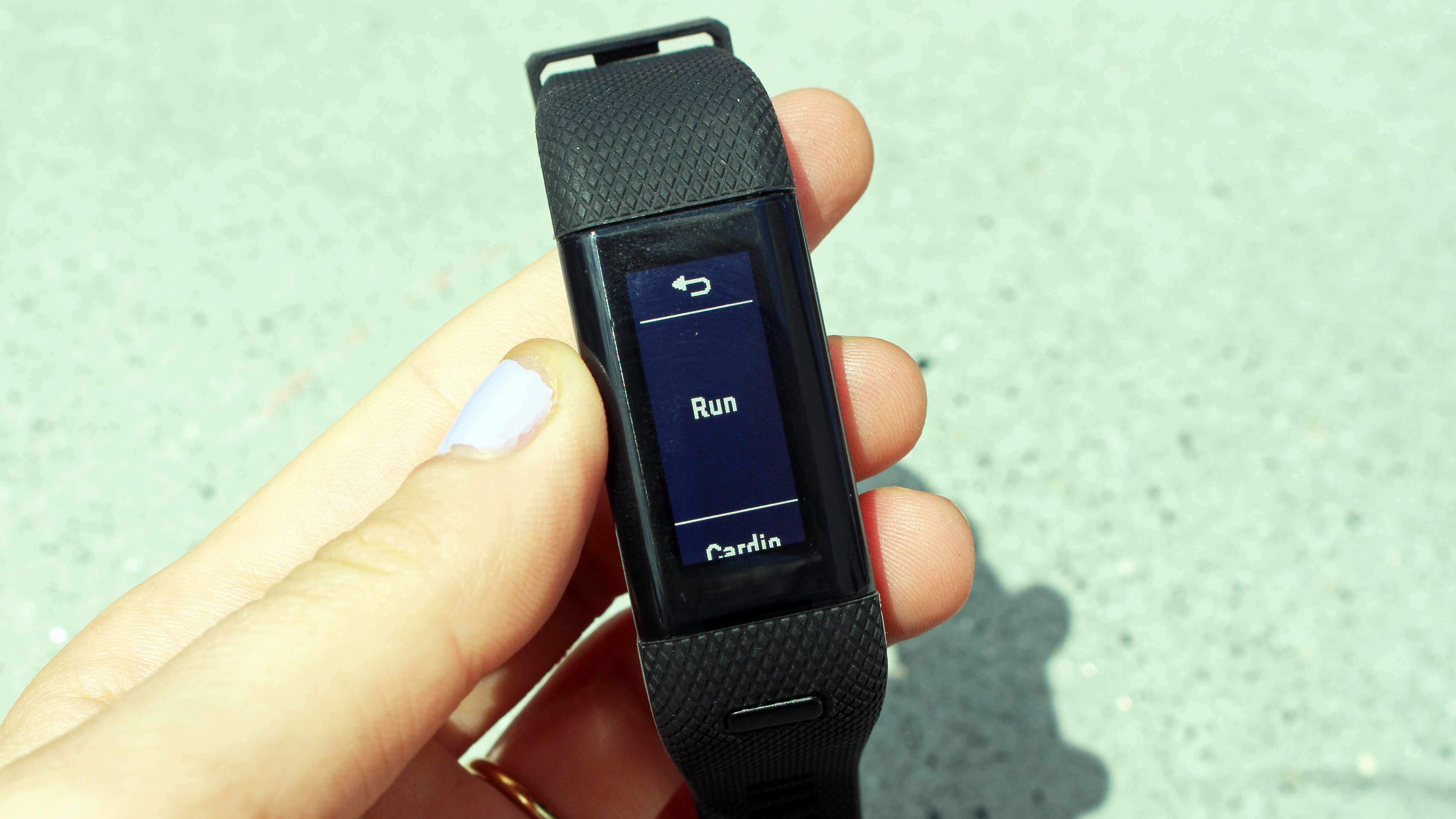
At 160 x 68 pixels the screen is fairly small with a low resolution. This means it doesn't feel particularly sharp and it doesn't have a backlight either. But funnily enough this doesn't affect the user experience at all (more on this later).
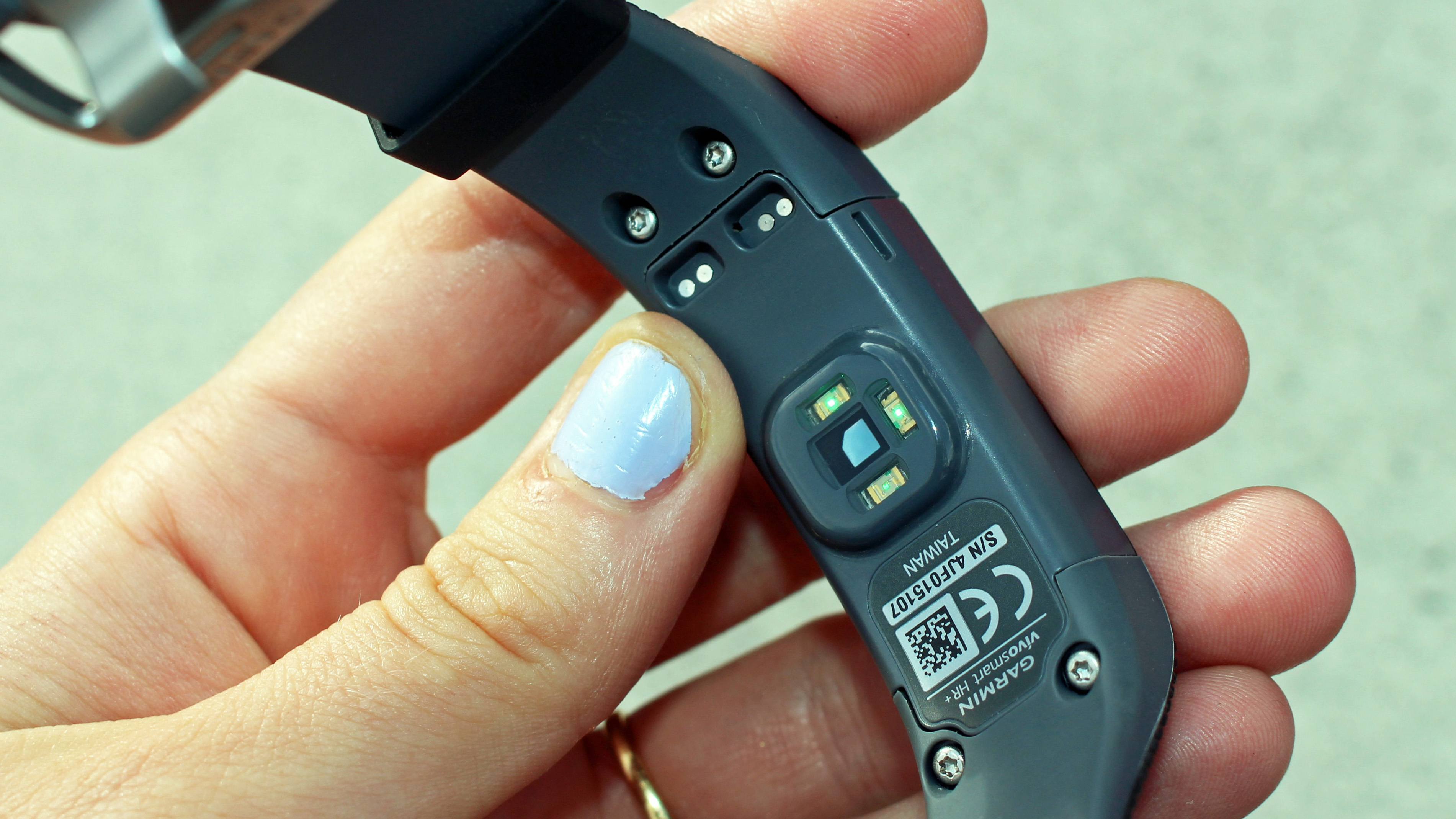
The main button under the screen, which you use to bring up the main menu, is slightly indented. This makes it easy to press, but on the flip side, I never accidentally pressed it either. On the underside of the device you'll find the heart rate sensor, as well as a charging dock.

Becca is a contributor to TechRadar, a freelance journalist and author. She’s been writing about consumer tech and popular science for more than ten years, covering all kinds of topics, including why robots have eyes and whether we’ll experience the overview effect one day. She’s particularly interested in VR/AR, wearables, digital health, space tech and chatting to experts and academics about the future. She’s contributed to TechRadar, T3, Wired, New Scientist, The Guardian, Inverse and many more. Her first book, Screen Time, came out in January 2021 with Bonnier Books. She loves science-fiction, brutalist architecture, and spending too much time floating through space in virtual reality.