TechRadar Verdict
If you loved the first Moto 360, you'll love the new model's major design improvements along with some new, minor added features.
Pros
- +
Beautiful design
- +
Improved performance
- +
iPhone compatibility
Cons
- -
Battery life remains subpar
- -
iPhone compatibility limiting
- -
Flat tire bezel is back
Why you can trust TechRadar
The first Moto 360 was one of the most popular Android Wear smartwatches on the market. It was the first to really catch the public's attention to the burgeoning tech, and represents some of the best that Android Wear has to offer, with enough chops to go head to head with the Apple Watch, and then some.
It definitely had annoyances – like its flat tire-looking display, middling battery life – but in terms of design, comfort and overall functionality, the watch still stands up to the most recent releases.
Then about a year later, its highly anticipated sequel arrived, not in one, but two sizes and three unique styles: Moto 360, Moto 360 for Women and Moto 360 Sport.
There's still no word of a sequel watch from Motorola, but the second generation Moto 360 is still worth the purchase in 2017 because the Android Wear 2.0 update is available, bringing native apps and a generally slicker user interface to the forefront. Better yet, you can pick up this stylish watch at a more discounted price than we've seen before.
Moto 360 price and release date
The Moto 360 has now been removed from the Google Play Store, which makes it a lot harder to buy one. You'll be able to find it at a number of third party retailers, but it's certainly not as easy to find now.
It originally launched at $299 (£229, AU$329), which was the same cost as the Samsung Gear S2 but much pricier than the $129 (about £110, AU$179) Asus ZenWatch 2.
You'll likely be able to find it for a touch cheaper now as some retailers are offering up better deals.
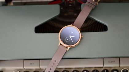
We previously tested the Moto 360 for Women, which is a slightly sleeker version of the 42mm "Men" version. As a guy, I actually find it a bit more attractive, despite being "for Women."
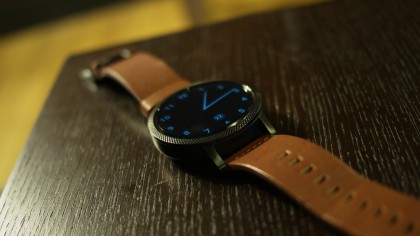
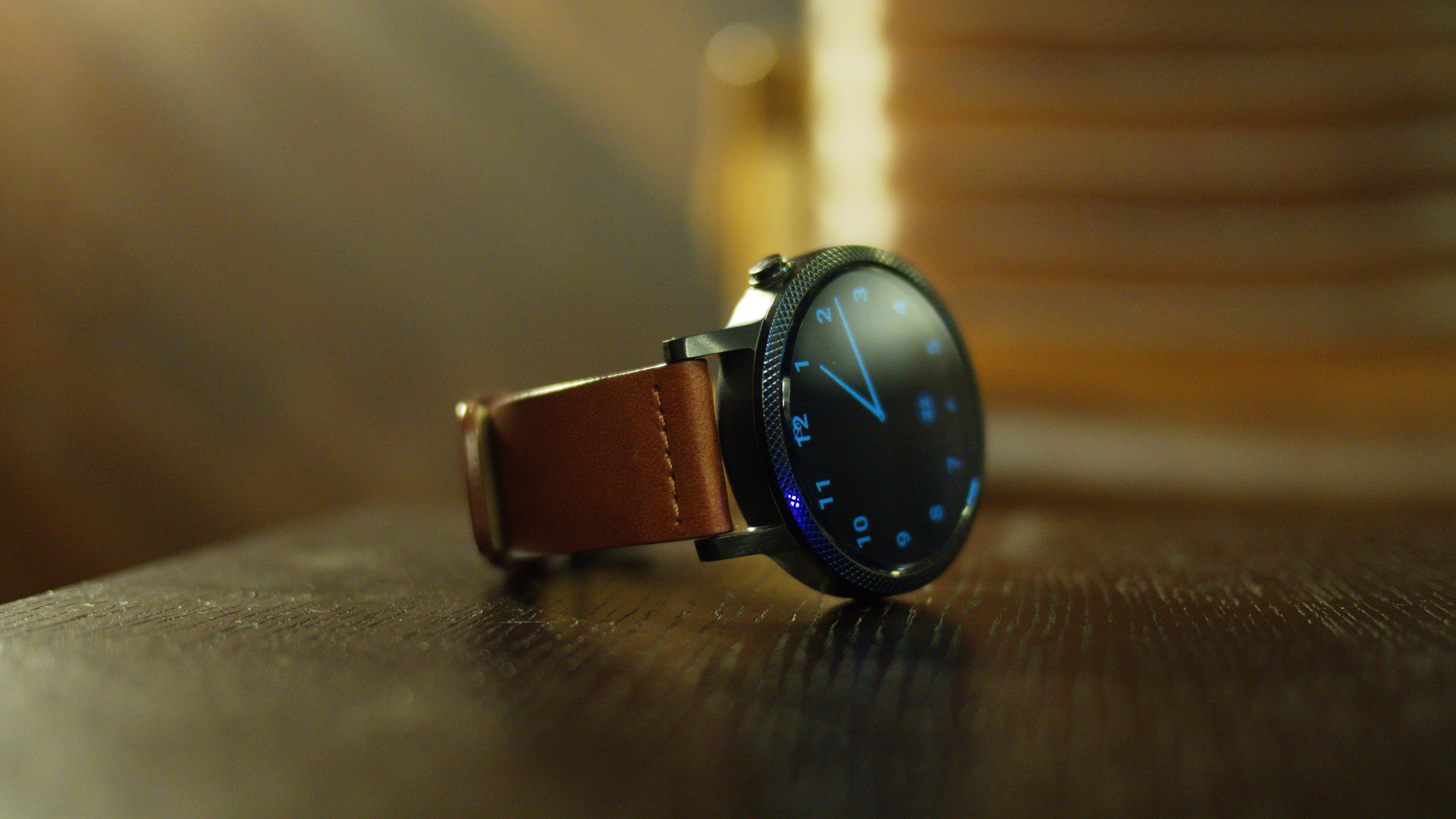
Now, we're trying out the 46mm variation, with some of the optional features, like micro knurl and a cognac leather strap. As you can see, it's quite a looker, too.
Display


OS: Android Wear
Compatibility: Android and iOS
Display: 1.56
CPU: Qualcomm Snapdragon 400
Band Sizes: 46mm, 42mm
Storage: 4GB
Battery life: up to one and a half days
Charger: Wireless
Connectivity: Wi-Fi, Bluetooth
The new Moto 360 screen has a higher pixel density than last year's version, which extends to each of the new size variations.
The 46mm watch measures in at 1.56 inches, with a resolution of 360 x 330 and 233 pixels per inch (ppi), while the 42mm watch has a 1.37-inch display with a resolution of 360 x 325 and 263ppi.
Compare these with the original Moto 360's 320 x 290 resolution and 205ppi, and it's no surprise there's a clear difference between the new and old displays. Switching between different apps and various watch faces shows that the new Moto is crisp and bright, but there's still some pixelation I can detect.
Gorilla Glass 3 protects the face from scratches, and a thin bezel surrounds it. However, the tradeoff for protection has resulted in the return of dreaded flat tire bezel on the bottom of the screen – though, we'll take it over the rather enormous bezels found on the Asus ZenWatch 2.
The Chicago-based company explained that the small black bar hides multiple key sensors, while providing space for the LCD to fold underneath, to maintain the wearable's compact size. Motorola also highlighted that its smartwatch has the most screen-to-body ratio, at 71.7% compared to its rivals. As time has passed, I wonder if this statistic has any merit, as competitors like the Huawei Watch rock a full, seamless display.
Cameron is a writer at The Verge, focused on reviews, deals coverage, and news. He wrote for magazines and websites such as The Verge, TechRadar, Practical Photoshop, Polygon, Eater and Al Bawaba.

