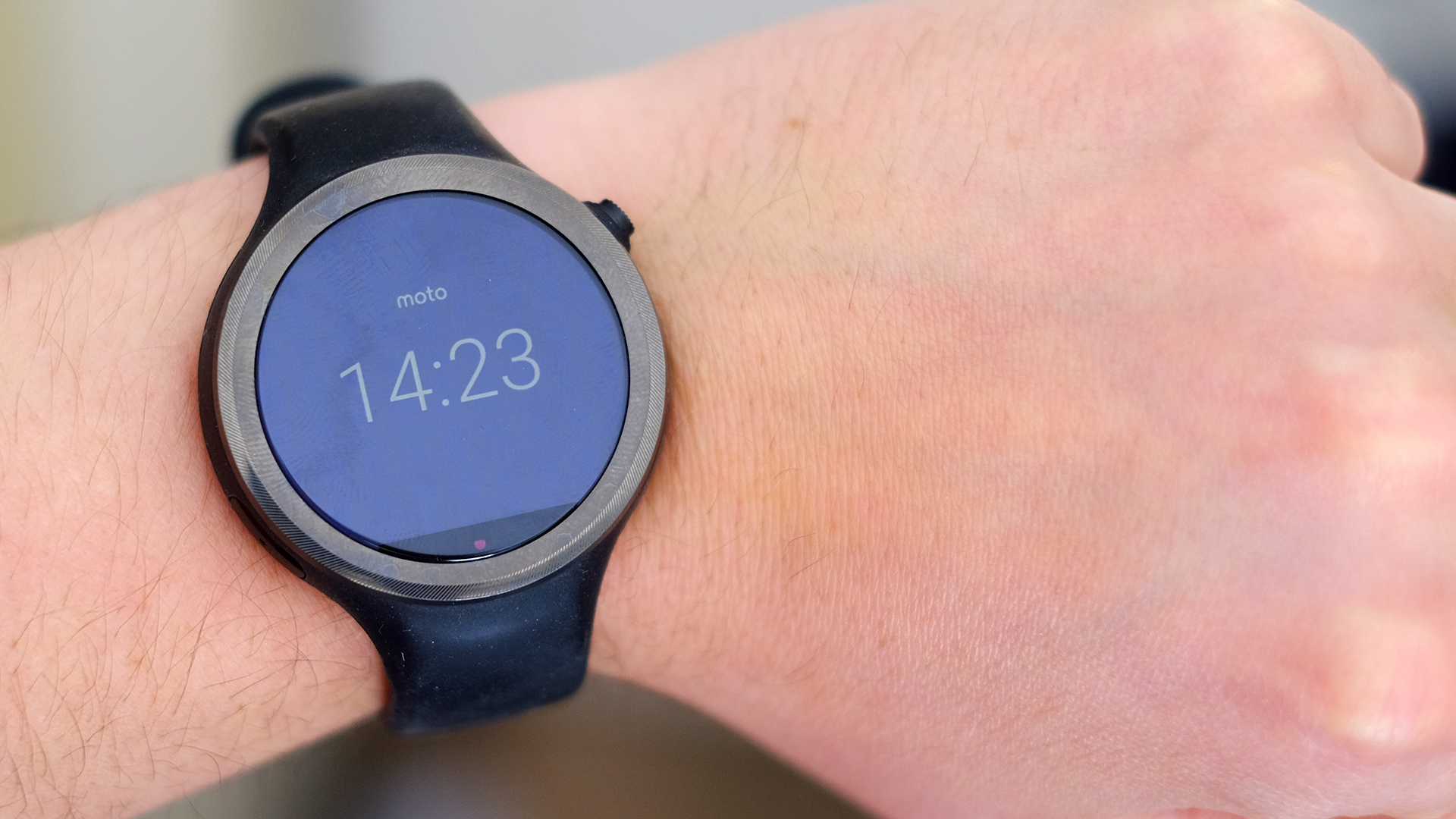
TechRadar Verdict
The Moto 360 Sport has a screen to envy and better sports skills than most smartwatches, but its battery life is lacking and as a tracker it still can't compete with fitness wearables.
Pros
- +
GPS and easy run tracking
- +
Smart screen tech
Cons
- -
Poor battery life
- -
Unreliable HR sensor
- -
No multi-sport tracking
Why you can trust TechRadar
Update: Moto's sportier take on the regal 360 has earned a spot on our list of best Android Wear smartwatches. Its rugged build, built-in GPS and rather affordable price make it an easy choice for fitness-focused people. You may struggle to find it now though considering Google isn't selling it directly now.
Original review follows below.
The Moto 360 Sport looks like a 'sporty' version of the Moto 360 (2015), but it's much more than that. This is only the second Android Wear watch to have GPS, and the tech is much better implemented than it was in the first, the Sony Smartwatch 3.
It also has a new kind of screen – and it's one that we're likely to see plenty of others emulate in the future because it works so well on a smartwatch, with its style changing depending on how bright the conditions are.
However, it doesn't have the good looks of the Moto 360 (2015), and for the price you can get a much better run-tracker. It marks progress, but not quite enough to make jaws drop.
Moto 360 Sport price and release date
The Moto 360 Sport now costs $199 (£150, around AU$292), which makes it a lot more palatable than its launch price. It originally launched at £219/$299 (around AU$359), which is more where you'd expect a high-end Android Wear smartwatch to land.
Google has now dropped the Moto 360 Sport from its Play Store selection, so you'll have to search around some third-party retailers to be able to grab Motorola's sportier watch.
Design and features
Motorola's smartwatches are usually very pretty, style-oriented things. At launch the original Moto 360 seemed an almost sci-fi take on the smartwatch, while the Moto 360 (2015) brought it into the present with a more practical – frankly more normal – yet still stunning look.
The Moto 360 Sport is different, though. While the round screen and dimensions are comparable to its predecessors, this watch looks plainer and more ordinary.
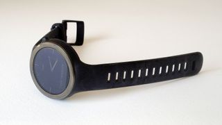
It has a chunky rubber strap built in, and you can't swap it for something sleeker or slimmer; the design inspiration is less Cartier, more TomTom Runner. There's nothing wrong with that when this is meant to be a smartwatch/runner's watch hybrid, but the strap design could be a bit smarter.
OS: Android Wear
Compatibility: Android and iOS
Display: 1.37
CPU: Qualcomm Snapdragon 400
Band Sizes: 45mm
Storage: 4GB
Battery life: up to a full day
Charger: Wireless
Connectivity: Wi-Fi, Bluetooth
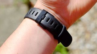
Motorola has peppered the strap with ventilation holes, but the silicone used doesn't feel anywhere near as nice as that used in, for example, the Garmin Fenix 3. This is higher-friction material, with a more rubbery feel; it's not flat-out uncomfortable, but it picks up a lot of dust and dirt, and causes undue marks and sweating on my wrist when it's done up as tightly as it needs to be for the heart rate sensor to work.
You can tell that Motorola hasn't been working with rubber watch strap designs for as long as more established sports watch makers – but it's not as comfortable as the Moto 360 (2015) either.
The Moto 360 Sport is certified to IP67 standard, meaning you can wear it in the shower – I have, and it's still working. However Motorola says it's not meant to be used while swimming.
To quote the Motorola website: "Withstands immersion in up to 3 feet of fresh water for up to 30 minutes. Not designed to work while submerged underwater. Do not use while swimming, or subject it to pressurized streams of water."
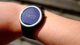
If there's a major design win for the Moto 360 Sport it's that it doesn't attract too much attention. Wearing the Sony SmartWatch 3 earned me flat-out ridicule from friends, while this device barely got a reaction at all. People are more accustomed to smartwatches these days, sure, but this is also a pleasantly innocuous visual design.
The two slightly awkward features of the design are only noticeable on closer inspection. First, there's a plastic cut-out in the rubbery side, which is where the mic lives, and second, Motorola still uses the same 'flat tire' screen style as on other Moto watches.
This looks pretty bad if you're flicking through Android Wear's white-background apps menu, or if you use a white clock display, but in other respects the screen is unusually good.
Display
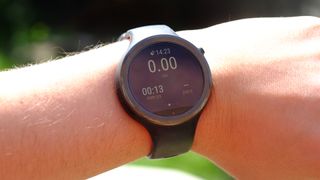
The Moto 360 Sport has what Motorola calls an AnyLight display, and it's pretty clever. This looks like a normal LCD display when you're actively using the watch in normal light, but switches to a Pebble Time-like transflective style when it's very bright, or when the watch is idle and just displaying the time.
I've found this to be a near-perfect combo, at least in terms of how the screen looks. It doesn't seem dim or colour-sapped indoors, like a Garmin Fenix 3 or Pebble Time Steel, and is entirely clear when you're running, or when you just want to check the time, outside on a sunny day.
The Moto 360 Sport switches between its two screen styles abruptly – there's no half-way setting, but it chooses the right point to switch over, and does so without any awkward delays. This AnyLight 'switching' screen is the one good excuse for the screen cut-out down the bottom, as it's where the ambient light sensor lives.
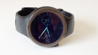
One issue with AnyLight is that when it switches to the 'outdoors' display, which feeds off ambient light rather than a backlight, it's very nearly monochrome. The tone is sepia-tinged, with just the slightest suggestion of color tones, but it's nothing like the colors you get with a Pebble Time.
After struggling to see the time at all on a normal LCD Android Wear watch in the past, though, this is a big improvement.
Andrew is a freelance journalist and has been writing and editing for some of the UK's top tech and lifestyle publications including TrustedReviews, Stuff, T3, TechRadar, Lifehacker and others.
