Windows 11 finally makes a big change to the right-click menu
Opinion: A right-click remake

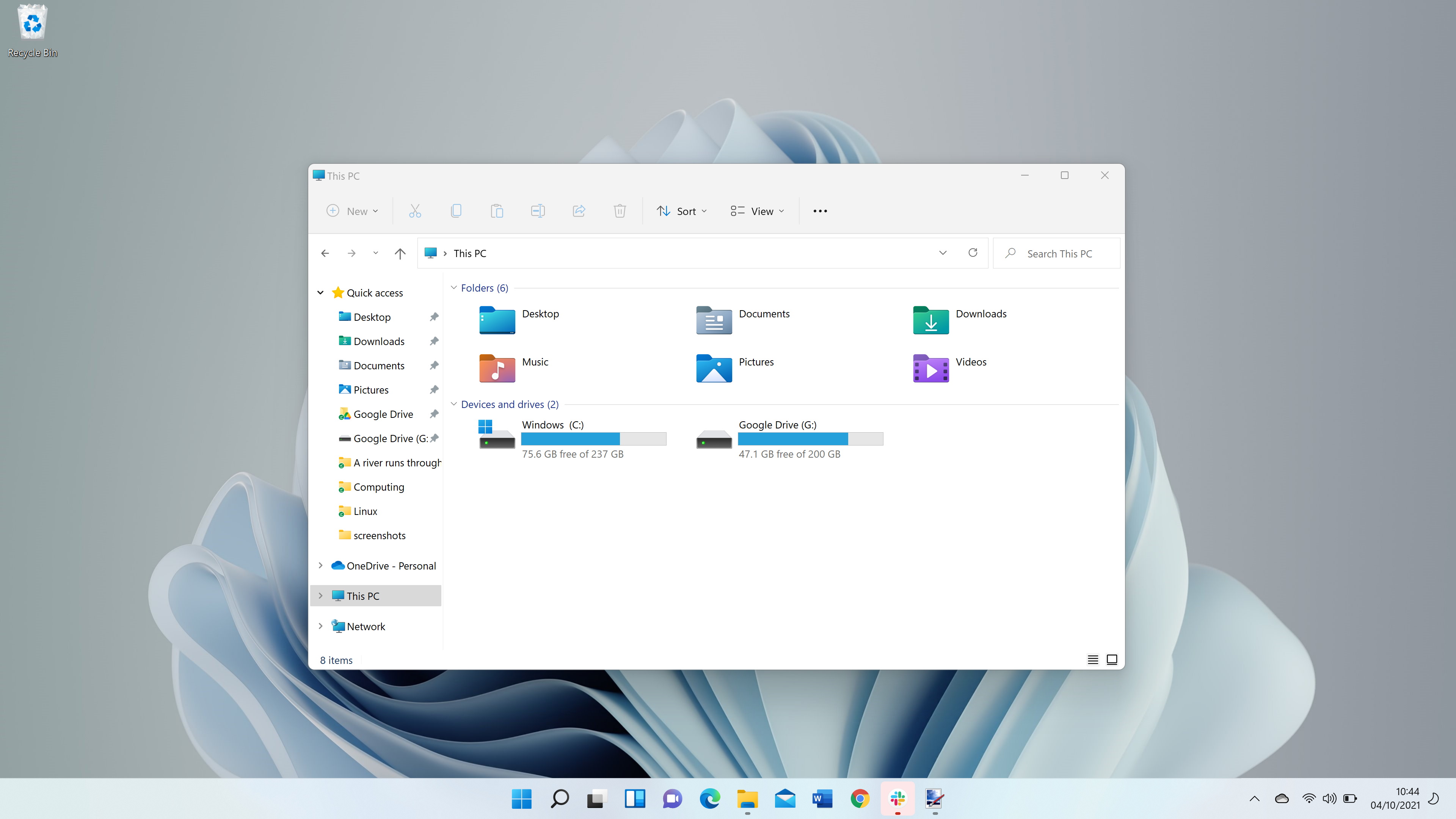
As Windows 11 continues to be updated on many PCs and tablet devices since its launch in October, users are now becoming familiar with what the new release brings and how it benefits them.
Yet Microsoft is taking the same approach in how Windows 10 was updated over the years, with seasonal updates that look to enhance the functionality of Windows 11 even more.
While some are awaiting Android apps to arrive in the redesigned Microsoft Store, the company is looking at ways to improve aspects of the operating system that have been left by the wayside - such as the context menu when you right-click.
This relatively small update to something we use every day could end up being one of the biggest changes Windows 11 brings to its users.
A right-click remake 20 years overdue
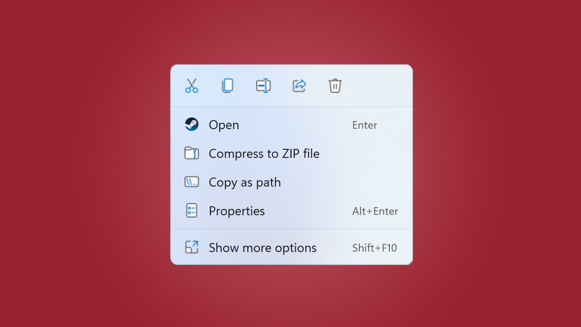
When you right-click in Windows 11, you’re brought to a menu that’s already improved from what came before, with useful icons and new options to reduce the time it takes to perform certain tasks.
According to Windows Latest, recent Insider Build updates are improving on this further, with a bluer gradient when you’re highlighting an option, alongside better commands for when you right-click on a storage device or a folder, for example.
There’s going to be more improvements in these builds as Microsoft gets more feedback from Windows Insiders, but already it’s a step in the right direction.
Get daily insight, inspiration and deals in your inbox
Sign up for breaking news, reviews, opinion, top tech deals, and more.
The context menus in Windows have been a hindrance at worst, and an annoyance at best. You may still right-click when you need to copy a file or create a folder, while other available options in the menu seem redundant.
Third-party apps throughout the years have allowed you to add or remove commands in the context menu, but they’ve always felt very hacky. CCleaner works well for this, but it doesn’t have the most friendly user interface.

It’s also a challenge to remove some of the commands that feel hard-wired into Windows without dedicating an evening to the task, which we’ve done in the past.
But Microsoft’s efforts in other areas with Windows 11, such as a new version of Paint and Snipping Tool, alongside a new Focus feature, tells us that the company is aware that certain areas are starting to show their age.
The context menu is a great sign that Microsoft wants to refresh the user interface across the board, not just on the surface. While there’s a long road to go on this, especially for power users and apps like Disk Management in need of a big upgrade, it’s encouraging that Microsoft is laying the groundwork for the future.

Daryl had been freelancing for 3 years before joining TechRadar, now reporting on everything software-related. In his spare time, he's written a book, 'The Making of Tomb Raider'. His second book, '50 Years of Boss Fights', came out in 2024, with a third book coming in 2026. He also has a newsletter called 'Springboard'. He's usually found playing games old and new on his Steam Deck, Nintendo Switch, and MacBook Pro. If you have a story about an updated app, one that's about to launch, or just anything Software-related, drop him a line.