Google Assistant is getting a major makeover
With a focus on touch

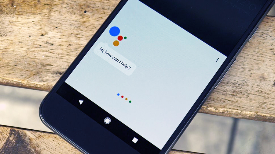
Google Assistant is already arguably the smartest digital assistant available, but it’s now getting even better, as Google has rolled out a makeover for it on phones.
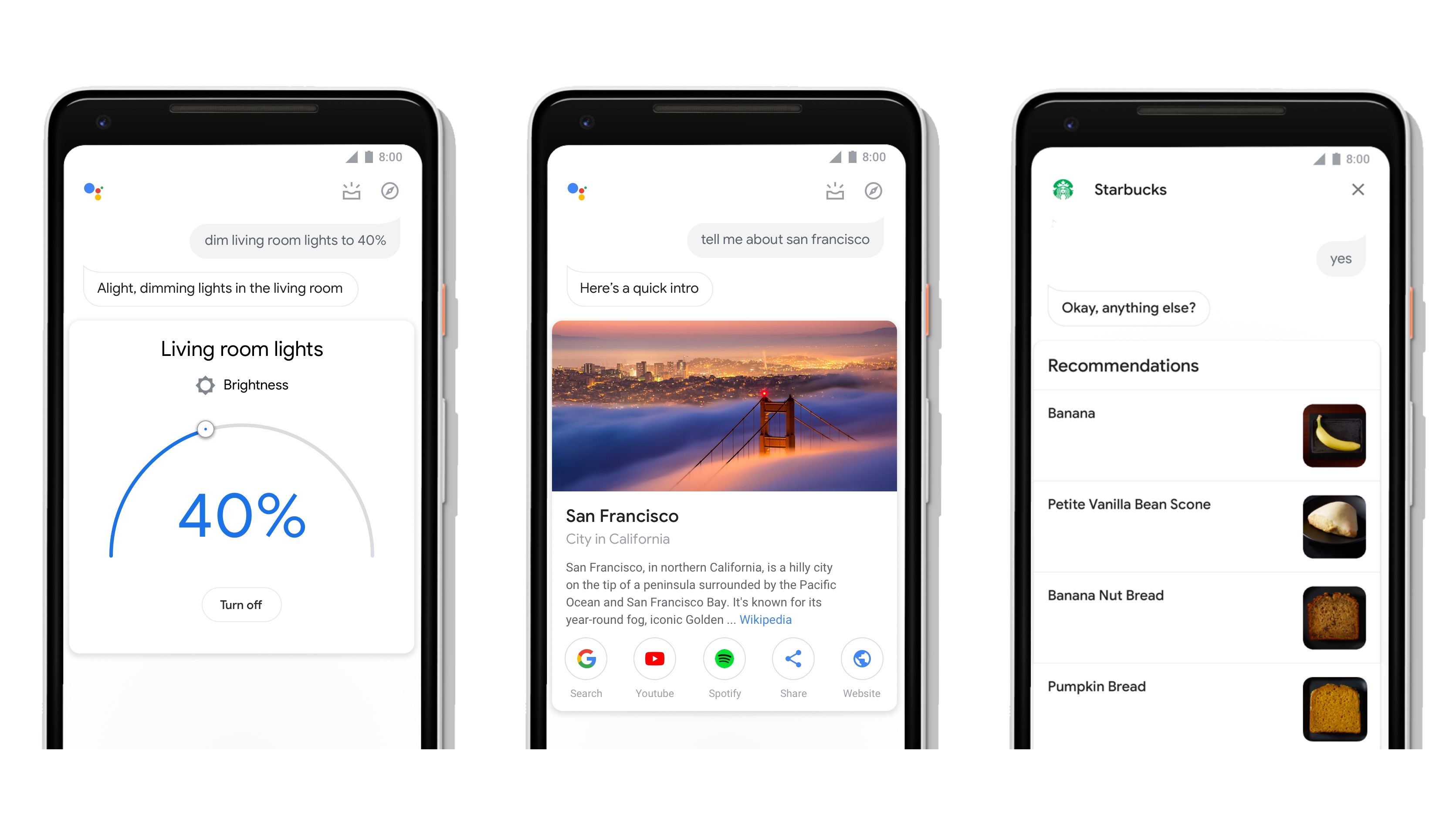
The changes come as a result of realizing that nearly half of all Google Assistant interactions involve both voice and touch, so it’s now a lot more visual.
That means larger images, GIFs, and new controls and sliders that let you manage your smart home devices by touch, such as using a slider to adjust the brightness of your smart lights.

Your day is now more visible
The messaging interface is also changing, allowing you to use your fingers to quickly edit messages that you’ve dictated, such as to add a comma or change a word.
You’ll also now be able to see an overview of your day simply by swiping up on the Google Assistant screen.
Plus, the update is giving third-party developers new tools to take advantage of the space on your screen, with FitStar for example now using GIFs to give you a preview of a workout, and Starbucks using thumbnails to let you select items on its menu.
So in short Google Assistant should be just as good as before when using your voice, but with a more appealing interface and more control during those times when you’d rather get things done the old-fashioned way – with taps and swipes.
Get daily insight, inspiration and deals in your inbox
Sign up for breaking news, reviews, opinion, top tech deals, and more.
James is a freelance phones, tablets and wearables writer and sub-editor at TechRadar. He has a love for everything ‘smart’, from watches to lights, and can often be found arguing with AI assistants or drowning in the latest apps. James also contributes to 3G.co.uk, 4G.co.uk and 5G.co.uk and has written for T3, Digital Camera World, Clarity Media and others, with work on the web, in print and on TV.