Google has been steadily redesigning its apps – such as Gmail to Google Calendar – with Material Design in mind, and now it seems Chrome is finally getting an overhaul.
The search company has rolled out an update to Chrome Canary, aka the developer version of Chrome, that enables a new Material Design UI by default on Windows, Linux and Chrome OS.
Enabling Material Design on macOS is a little more involved, but users merely need to set experimental flags “chrome://flags/#top-chrome-md” to “Refresh” and enable “chrome://flags/#views-browser-windows,” according to Chromium evangelist François Beaufort.
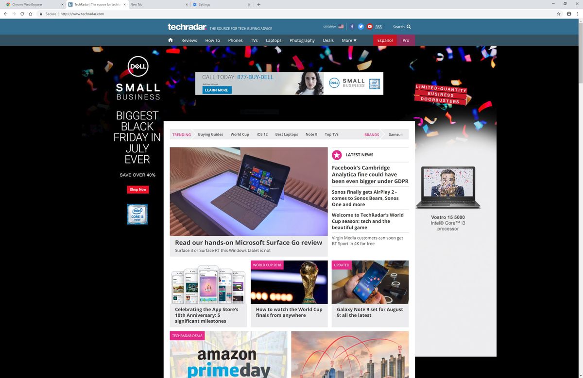
Upon installation or updating the app, users should notice rounded corners on their tabs rather than the trapezoids you’ll find on the tab bar today. The update also introduces a brighter color palette by shading the active tab and the window surrounding it white, instead of its current gray hue.
The Material Design update also adds favicons to the omnibox suggestions, so users will see small icons next to websites as they enter text into the combined address and search bar. Other small changes include tab strip coloring, pinned tabs and alert indicators.
- Not feeling Chrome? We’ve rounded up all of the best web browsers here
Via Engadget
Get daily insight, inspiration and deals in your inbox
Sign up for breaking news, reviews, opinion, top tech deals, and more.
Kevin Lee was a former computing reporter at TechRadar. Kevin is now the SEO Updates Editor at IGN based in New York. He handles all of the best of tech buying guides while also dipping his hand in the entertainment and games evergreen content. Kevin has over eight years of experience in the tech and games publications with previous bylines at Polygon, PC World, and more. Outside of work, Kevin is major movie buff of cult and bad films. He also regularly plays flight & space sim and racing games. IRL he's a fan of archery, axe throwing, and board games.

