Spotify cuts the fat from its Premium app with streamlined overhaul
New update fine-tunes the user interface

Spotify’s Premium app hasn’t seen too much of a shake-up in the last few years, but the music streaming platform has announced the roll-out of a streamlined overhaul to its otherwise-familiar interface.
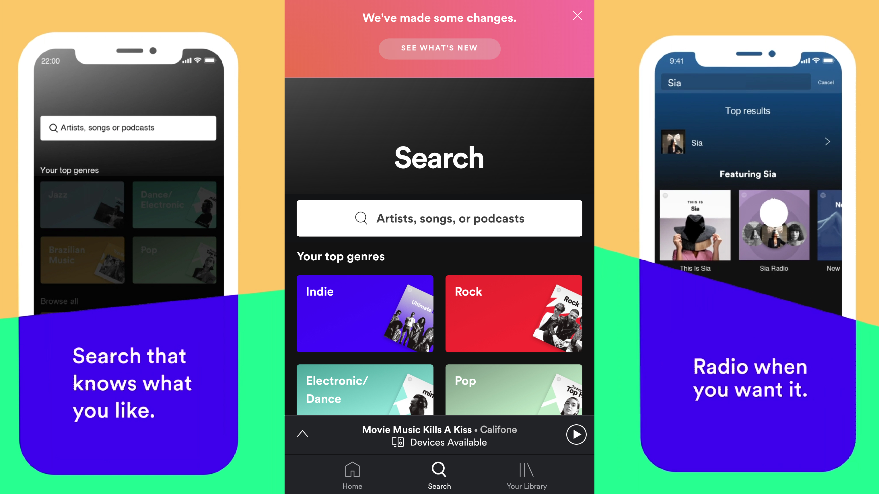
Spotify says the refresh is intended to “give subscribers an even more personal and intuitive experience”. In essence, it does this by removing two of the five menu tabs that appear at the bottom of the app – Browse and Radio.
The remaining tabs (Home, Search and Library) still play the same roles they previously did, but the Browse and Radio tabs have been integrated in various ways within them.
Ch-ch-ch-ch-changes
When you tap on the Search tab now, you’ll be greeted with a search bar (obviously) and the same array of curated genre tiles that previously comprised the Browse tab. Once you click into the search field, you’ll get the familiar list of “recent searches”, so you can quickly find that artist or track you previously looked up.
The Radio integration, however, is a little more complicated. If you navigate to your Library, you’ll see Stations appear along with your playlists, songs, artists and so on, but you can also access a radio station from any song, artist, album or playlist via its option menu.
A neat new feature added to Spotify’s Radio functionality is the ability to save these curated playlists to your Library and make them available offline by downloading them for later listening.
The latest update have already begun rolling out globally to both Android and iOS users with a Premium account, so expect it to land on your device in the coming days if it hasn’t already.
Get daily insight, inspiration and deals in your inbox
Sign up for breaking news, reviews, opinion, top tech deals, and more.
