TechRadar Verdict
A good free service, offering many options to help you design images, webpages and short videos with ease. Much more streamlined than it used to be.
Pros
- +
Very easy to use
- +
Nice features
- +
Useful style suggestions
Cons
- -
Limited customisability for webpages and video
- -
The best looking templates aren’t free
Why you can trust TechRadar
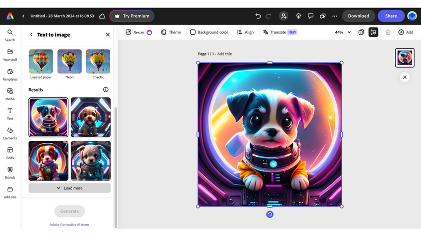
Adobe Spark has now been rolled into Adobe Express - a browser-based design site for creating social media posts, flyers, posters, and more. Small businesses can take advantage of the Adobe Express Logo Creator. There’s even an Adobe Express free online video editor for content creators.
You can read our full thoughts in the latest Adobe Express review
---
Adobe Spark - as it was once known - has long been a popular choice with those looking for simple-to-use graphic design software.
It’s nowhere near as powerful as the likes of Photoshop, Illustrator, or even Adobe Fresco. But the results (and absolute level of control over the design) is surprisingly strong in this streamlined digital art tool. Think of Adobe Spark as more akin to the Canva design app.
- Try Adobe Express here
Getting started
This service is part of Adobe, but you don’t actually need a Creative Cloud account and therefore don’t need to fork out a monthly subscription in order to use this service - well there’s a proviso to this (more on that later). However, you do need to login somehow which you can do using your Google, Facebook or Apple accounts, or just your email if you prefer. Teachers and students have a separate login option.
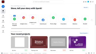
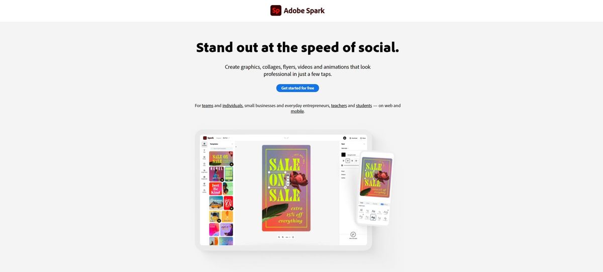
Once you’ve created an account, you’re graced with your front page. From there, you’re offered a series of templates, depending on where your project is destined for: an Instagram story or a post, a Facebook post, a photo collage, a presentation, a slideshow, or a custom sized project, for instance. Mouse over each thumbnail though and you’ll see the three original options are still very much present: graphic, web page, and video, depending on which Spark you’ll be creating.
The whole concept is there to make content creation as easy and as quick as possible for those who need to advertise and promote their work but don’t have the time nor the skill to do this. We’ll look at each in turn.
Graphics
Select any graphic option and you’re greeted with a good number of templates to choose from. This is where you may encounter a bit of a pickle: not all templates are available for free. Any with a little yellow tag top right of the thumbnail can only be accessed if you have a Creative Cloud subscription.
What’s annoying is that this yellow tag isn’t immediately obvious when scrolling through brightly coloured templates, and they’re sprinkled throughout the list - they’re not sorted between free, and paid for. However, there are still a good number of free templates to work with should you wish to remain in the free section.
Once you’ve made your selection, this is where the fun begins.
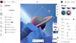
The template is fully customisable. You can obviously select any text box and alter the wording - that’s a given - but you also have access to dozens of fonts, alter the spacing, and have resize and rotate options.
There’s a handy representation of all the layers that make up your creation, making it easy to see what’s on each and to alter their order, and as there’s also an Opacity slider, you have the ability to make selected objects semi-transparent.
Perhaps the most imaginative - but also quite frustrating - feature is the ‘Find a new style’ button. It allows you to go through a huge number of different styles for your text box, changing font, colour, shape, you name it. As long as you keep clicking on that button, Spark will keep offering you new options.
Although this is fun to start with, there’s no option to go back in reverse should a previous random design you liked was the one you wanted to use. Thankfully there’s a multiple undo feature which you access through your computer’s usual keyboard shortcut. However, it would’ve been good to perhaps have a way to tag styles you like as you see them, or at the very least go back to your original selection without hitting Undo until you eventually get back to it manually.
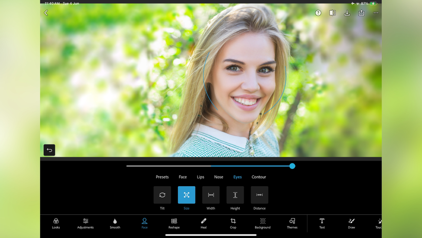
If you need to add photos, you have access to any stored on your hard drive or your Lightroom libraries of course. Connecting to your Dropbox, Google Photos or Google Drive accounts is also supported. Spark’s search field is quite powerful, scouring sites for any images tagged as ‘Creative Commons-licensed’. You also have access to Adobe Stock for images as well. The inclusion of image enhancing tools and filters is most welcome.
Webpages
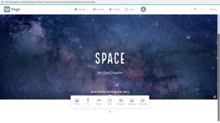
You start with a blank page and a couple of text boxes. Click on ‘Themes’ to get a few font and colour options, but you’re much more on your own with Web Pages than you are with Graphics. These themes help give your page a consistent look. You have no control over those presets however, but at least you can switch themes at any time until to find the one that works best for you.
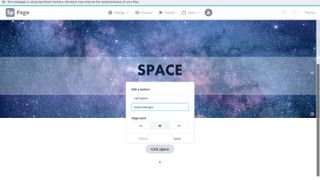
As you scroll down you’ll see that you can add photos, text boxes, create a photo grid or a slideshow, even add a video, or make a section with a split layout. In a way, this is the basis for many website builder services out there, only simplified. Creating links to other pages or other websites is done with the use of buttons - you have no say in the shape and style of them, as this is determined by the theme you chose.
Although your options are very limited, the end result does look crisp and fresh, giving you a nice-looking web presence in minutes.
Video
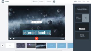
Creating a video starts by giving your project a title. Once you’ve done this, you’re offered a selection of templates. You’re then granted access to a basic video editing layout based around the concept of slides. Each slide is an edit, and each one is represented by a rectangular thumbnail, irrespective of the length of the video contained within it.
Unlike with images and photos, Adobe Spark doesn’t provide you with a video library to select clips from; you have to provide your own.
You’re offered trimming tools to select just the section you need, and you can choose from four different types of slides - one offering your clip full screen, another splitting the screen between your video and text, one with an animated caption over the screen, and lastly, a large title over the screen.
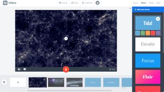
As with Webpages, your creative options are much more limited than for Graphics: you can’t select your font, and you don’t even have access to a full colour palette - just the ones offered by whichever Theme you’ve chosen.
You can’t colour correct your videos, and the most you can do aside from trimming them, is zooming into them. Barely worth writing home about.
You can also add photos and the import process is the same as for the Graphics or Web Page sections above, but as with videos, you have no image enhancing options, and although you can zoom in or out, you can’t set it to pan and zoom across your photo.
By default, a musical score is added to your project, which you can change in the Music section - you have just under three dozen tracks to choose from, but if none of these appeal, it’s possible for you to upload your own.
Should you choose to, you can add a voice over to your project, although your narration is confined within a slide. It’s good that the slide’s duration will automatically lengthen should you overrun on its originally set length, but you have no editing control over your recording. You can’t trim it, or cut out portions you didn’t need. It’s got to be a perfect take, or nothing. At least you can overwrite that recording with another.
Invite and share
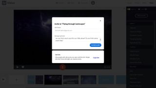
A welcome addition is the ability to invite others to your projects. Not only can they see your work in progress, they also have full editing control.
People you invite can only see the project you’ve granted them access to, and you can rescind that invitation at any time.
Once your work is complete, you can share it in one of two ways. The first is by uploading it to spark.adobe.com - you’re given a unique URL for your creation. Alternatively, you can download your work and be free to share it anywhere you choose.
Wepages can’t be downloaded, and are solely hosted by Spark.
Final verdict
Even though Spark merges three services into one, they are clearly still three separate services. There’s a lot to like here, and the features will help you create a graphic, a webpage or a video very quickly. For a free service, it’s definitely worth checking out.
- We've also featured the best website builder
Steve has been writing about technology since 2003. Starting with Digital Creative Arts, he's since added his tech expertise at titles such as iCreate, MacFormat, MacWorld, MacLife, and TechRadar. His focus is on the creative arts, like website builders, image manipulation, and filmmaking software, but he hasn’t shied away from more business-oriented software either. He uses many of the apps he writes about in his personal and professional life. Steve loves how computers have enabled everyone to delve into creative possibilities, and is always delighted to share his knowledge, expertise, and experience with readers.
Most Popular


