TechRadar Verdict
Google Daydream View (2017) is well built and offers a decent VR experience piped in from your phone. Key changes make it an improvement over the original, though the changes aren’t quite enough to justify the price increase. And with higher-end, PC-powered VR headsets becoming less expensive and the arrival of new standalone devices, mobile VR headsets like Daydream View may soon be obsolete.
Pros
- +
Decent VR for a smartphone-powered headset
- +
Less light comes through the bottom than before
- +
Feels good in the hand
Cons
- -
Compelling content is lacking
- -
Heavy in the front
- -
Pricier than the older model
Why you can trust TechRadar
Update: Google Daydream View only supports a single controller at present, but in July Google released a software update that adds support for a second.
In future, you'll be able to hold two controllers – a primary one in your dominant hand and a secondary one in the other – and the software will track input from both.
Not all Google Daydream hardware will support two controllers, but for those that do, it'll be much easier for developers to port games and apps.
Sadly there was no mention of a next generation Google Daydream View at the company's big Google I/O developer conference in May. That means Google is likely going to keep to a one-year release cycle, meaning we probably won't see Google Daydream View (2018) until this October.
Just what improvements can Google offer? Better lenses and a more comfortable fit are two areas where Daydream View can stand to improve, especially if it wants to compete with standalone headsets like the Lenovo Mirage Solo and Oculus Go, which we recently added to our best VR headset list.
Original article continues below...
With price cuts making high-end virtual reality (VR) headsets more affordable than ever, and new standalone devices that don’t require a PC or smartphone to run already on the market, the question of where smartphone-powered headsets fit into the larger VR landscape is thrown into sharp relief.
The Google Daydream View (2017) is from the early mobile VR guard, the kind of headsets that require a smartphone slotted into them to be of any use; it counts the Samsung Gear VR among its cohorts.
Mobile headsets stood as pocket-friendly, proletarian alternatives to the PC-tethered Oculus Rift and HTC Vive in terms of both specs and price, long before standalone VR ever came on the scene.
And while the Daydream View (2017) is a well-built device that improves upon its predecessor in a number of ways, it will likely be pushed into the background as the likes of Oculus Go, HTC Vive Focus and the Daydream-backed Lenovo Mirage Solo come to the fore.
We haven’t tested the HTC Vive Focus out yet, but have now fully reviewed the Lenovo Mirage Solo and Oculus Go. Our tests have shown that not only is this new band of VR headset relatively affordable, but also more than capable of providing enjoyable VR experiences without a PC connection or a smartphone slotted in.
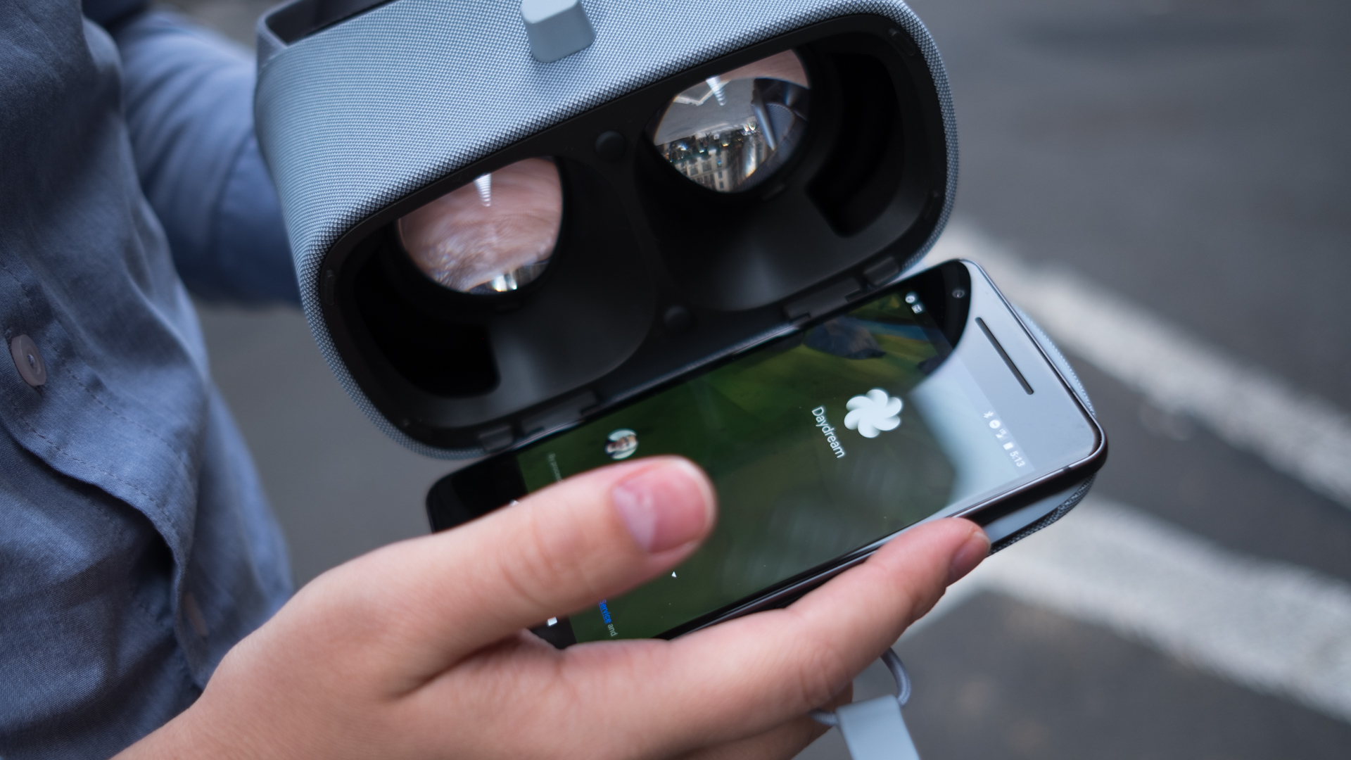
Google Daydream View (2017) is essentially a vessel for VR, a housing that, on its own, is nothing more than a cloth-covered shell with lenses. It’s the conduit through which you experience VR piped in from your phone, via the Daydream app and the various apps and games available through it.
In that sense, you’re paying for a way to use your phone to play around in VR. And because smartphones are the lifeblood of Daydream View, your experience is dependent on the resolution, processing power and battery life of your phone.
The new Daydream View list price is more expensive than the first Daydream View, though it’s not entirely clear where that extra cost comes from, save for added materials on the new headset.
The Daydream View (2017) price at launch was $99 / £99 (around AU$125), versus the original headset’s price of $79 / £69 (around AU$100). However, Google currently has the Daydream View (2017) on sale for $49 (around £35 / AU$63), which could be a sign that a 2018 Daydream View is on the way soon.
Is it worth investing in Daydream View? The answer could go either way, depending on how important experiencing VR is to you, and whether you’re willing to throw your cash into a PC-tethered headset for a superior experience (at a much higher price), or opt for a standalone headset that doesn't offer quite as good an experience, but is still superior to mobile VR.
Design
The Google Daydream View (2017) has a number of notable design changes over its predecessor.
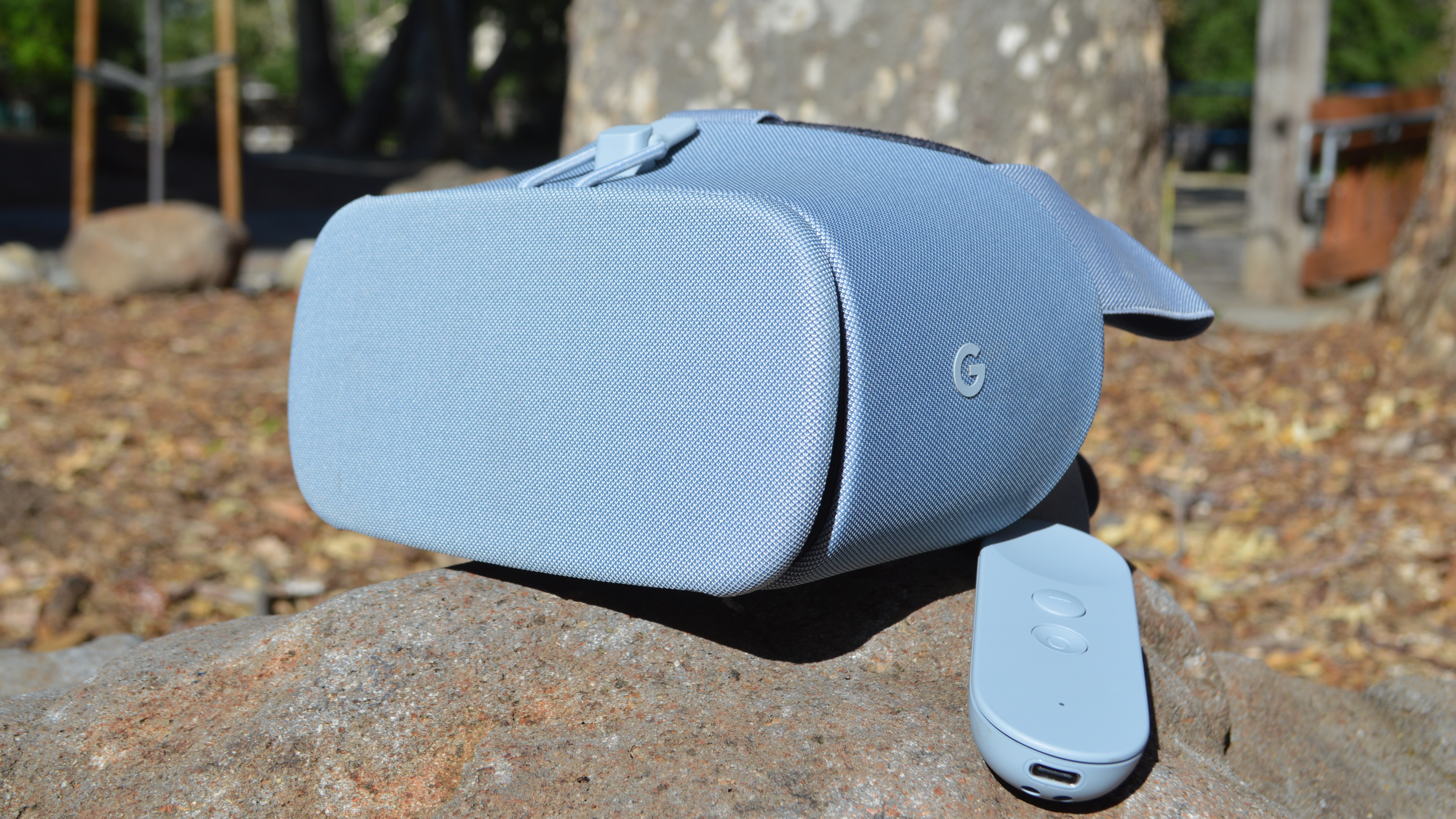
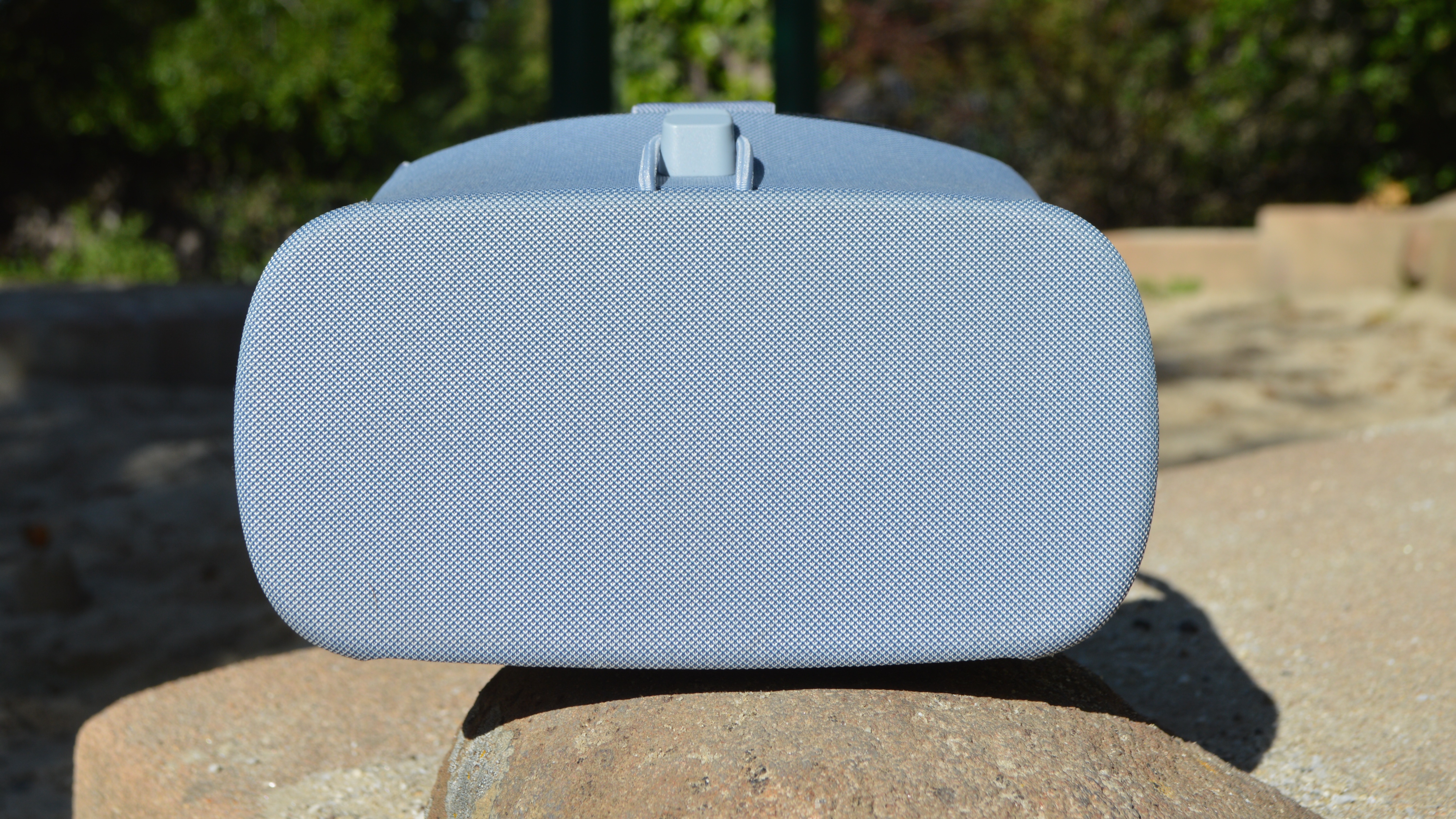
For starters the new Daydream View is made of a different material than the older edition. Where that one was covered in a soft, cloth-like fabric, the Google Daydream View (2017) is sheathed in a courser material – like the kind you’d find on an office waiting room chair versus the soft couch in your living room.
The new fabric feels more durable than the older stuff, yet it still maintains some style due to the patterned stitchwork and new color options. The headset is light on its own, though we’ll address weight further in a minute.
Daydream View (2017) is available in three colors: Fog, Charcoal and Coral. Fog is basically light gray, and fairly nondescript in our book.
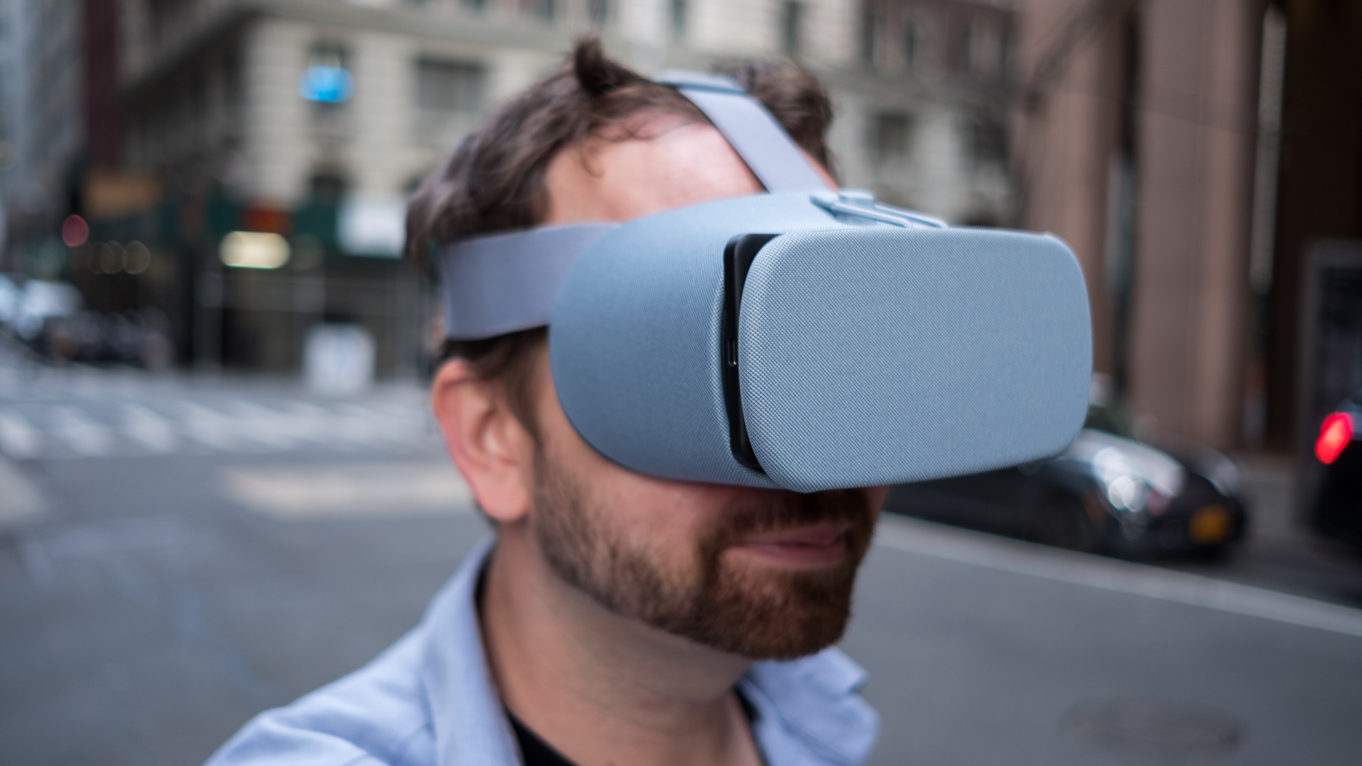
Also new on the headset is a removable third strap that extends from the top of your forehead to the back of your head. The older Daydream View only had two straps that went around the sides of your head.
Now, the third strap allows the headset to slip over your dome, like a baseball cap, though you can remove it to go back to the two-strap style.
We actually preferred the two strap configuration because these didn’t cinch around our head as tightly as when we used three.
One critique of Daydream View, which can be said about most other VR headsets, is that it sits heavy on the front. It’s well supported with the third strap, but no matter how you wear it, weight on the front of your head is undeniable. This also causes the straps to dig into the back of your head a little.
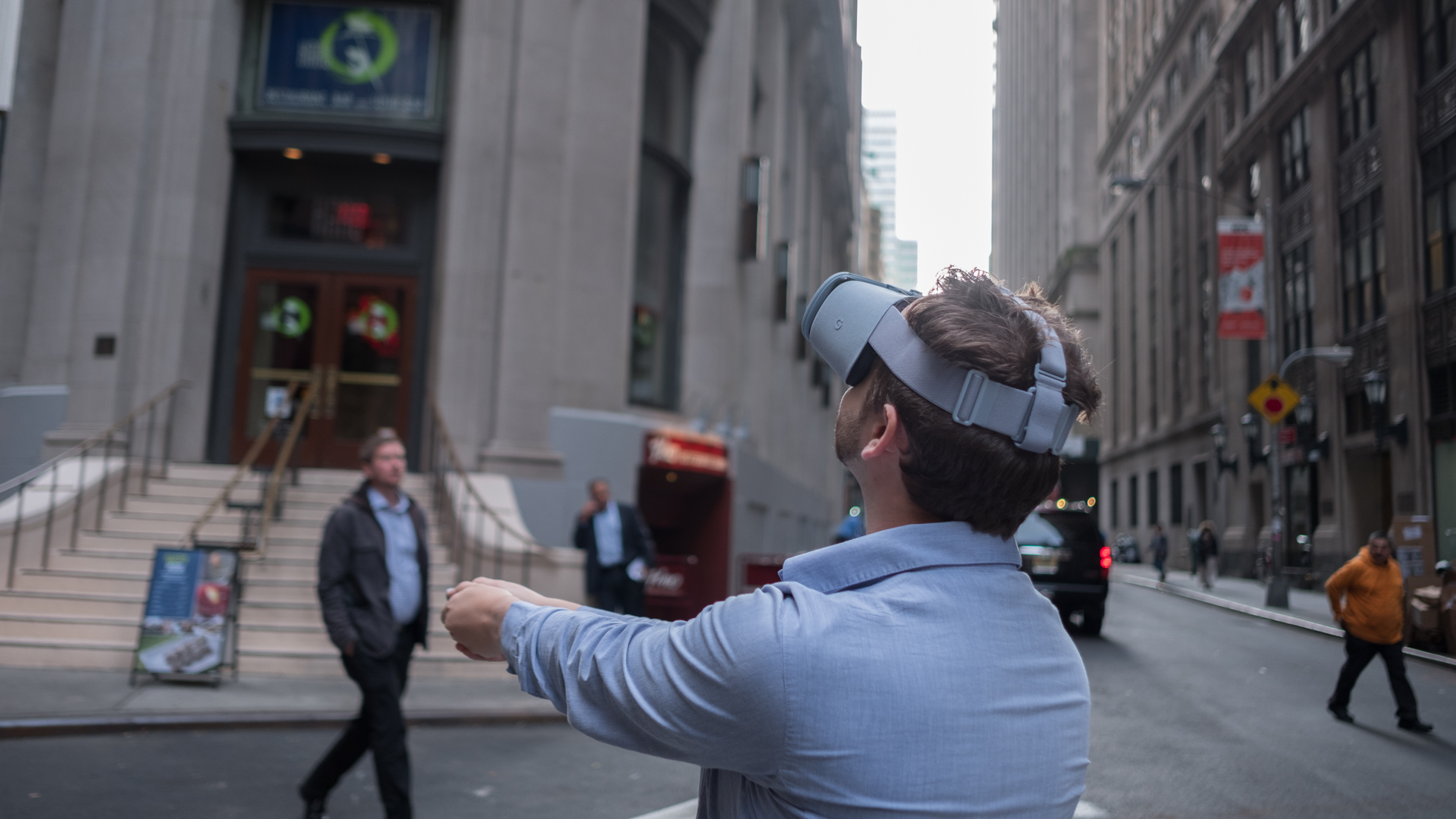
The headset has to sit fairly high on your head to get the focus right, and this puts pressure on your forehead and temples in addition to the back of your head.
After a lot of fiddling to get the right fit, we eventually found that we had to cinch the headset fairly snug to keep it secure and in the optimal position for proper focus, but the result was that once we took the Daydream View off, it felt like we’d been wearing a hat or visor that was two sizes too small, and the sensation lingered for a few minutes afterward.
Plus, there was an unsightly red line across our forehead when we took the Daydream View (2017) off after about 20 minutes of extended use, so that’s something to be aware of as well.
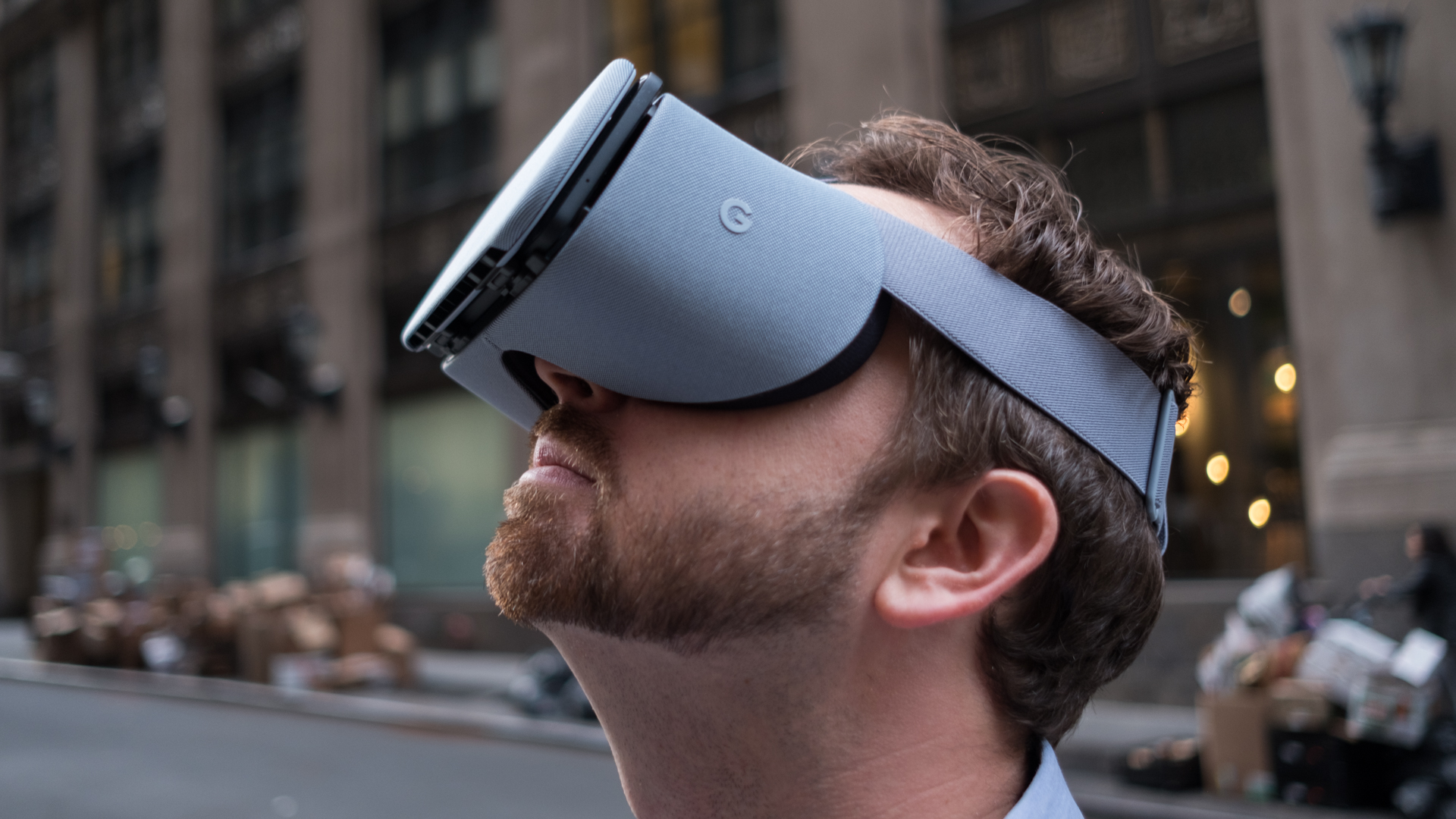
The inside of the headset is soft and cushiony, and feels good on the face. It fit well over our glasses, and the inside cushion is removable, which allows you to attach or remove the third headstrap.
The bottom part of the headset lets in less light than we experienced with the first Daydream View, though some still leaks through. Small amounts of light also come in through the sides, where the phone rests but a gap remains.
There was a lens flare effect as the outside light hit the lenses, which was distracting. We tended to be able to ignore it after awhile, but it made us think we should move to a dark room to get to the best VR viewing experience, not our sunlit living room.
Meanwhile, the light coming through the bottom, around the nose wasn’t as distracting when we were in a VR experience, so Daydream View has improved here.
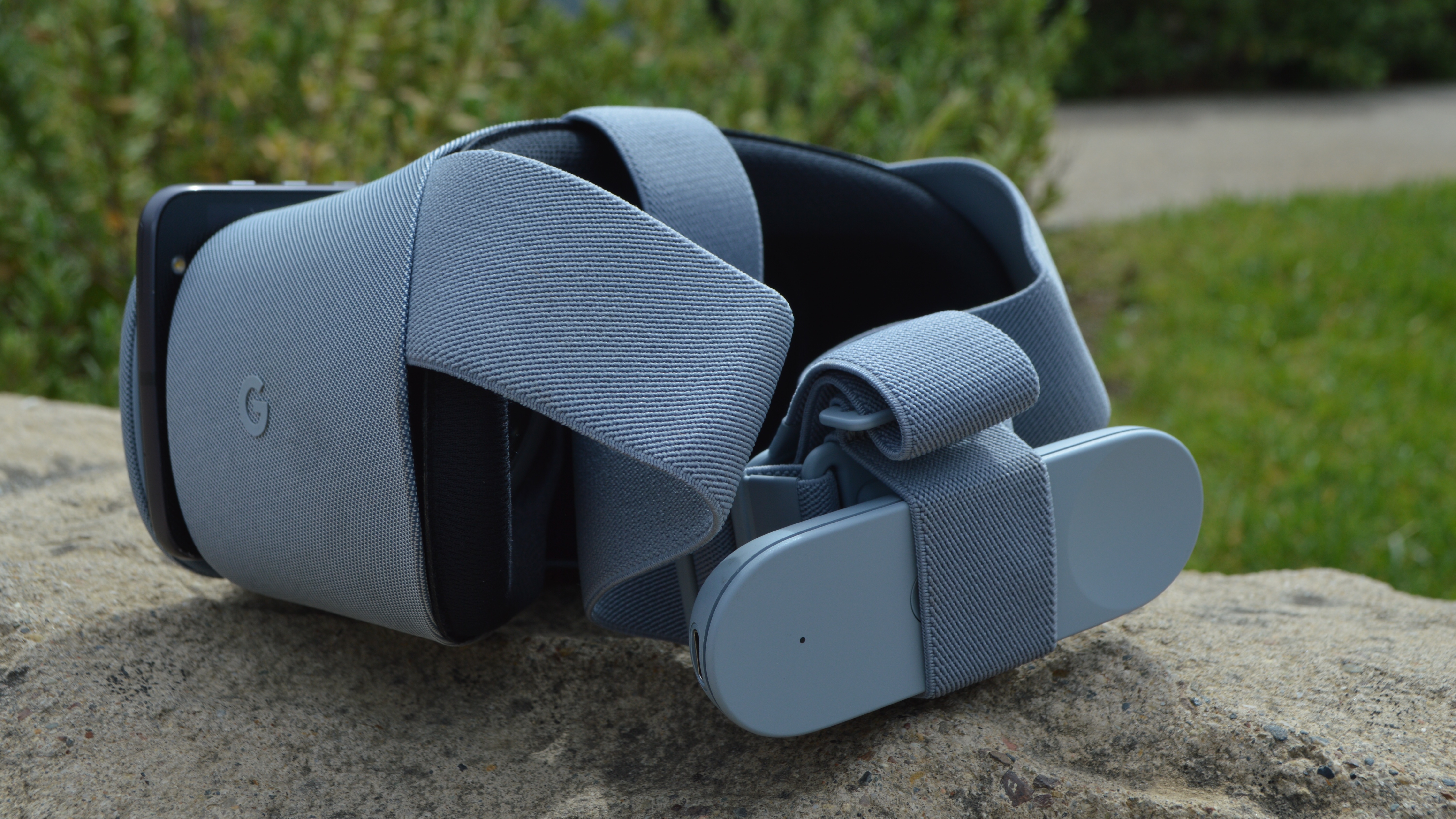
One final design change to note is that the controller is now stored in the back portion of the headset and not behind the front flap. A loop where the straps meet lets you tuck the controller away when not in use.
It’s perhaps not the most elegant solution in the world of where to put your controller when you’re not using it, but we didn’t lose the controller, so that has to count for something.
Again, it’s not really clear where the extra cost came from with the headset considering how basic the construction is. It’s a well-built product, to be sure, but on its own it’s like a car without an engine. You get the basic form, but you need something else that’s not included to actually run the thing.
That additional something, of course, is your smartphone.
Michelle was previously a news editor at TechRadar, leading consumer tech news and reviews. Michelle is now a Content Strategist at Facebook. A versatile, highly effective content writer and skilled editor with a keen eye for detail, Michelle is a collaborative problem solver and covered everything from smartwatches and microprocessors to VR and self-driving cars.
