TechRadar Verdict
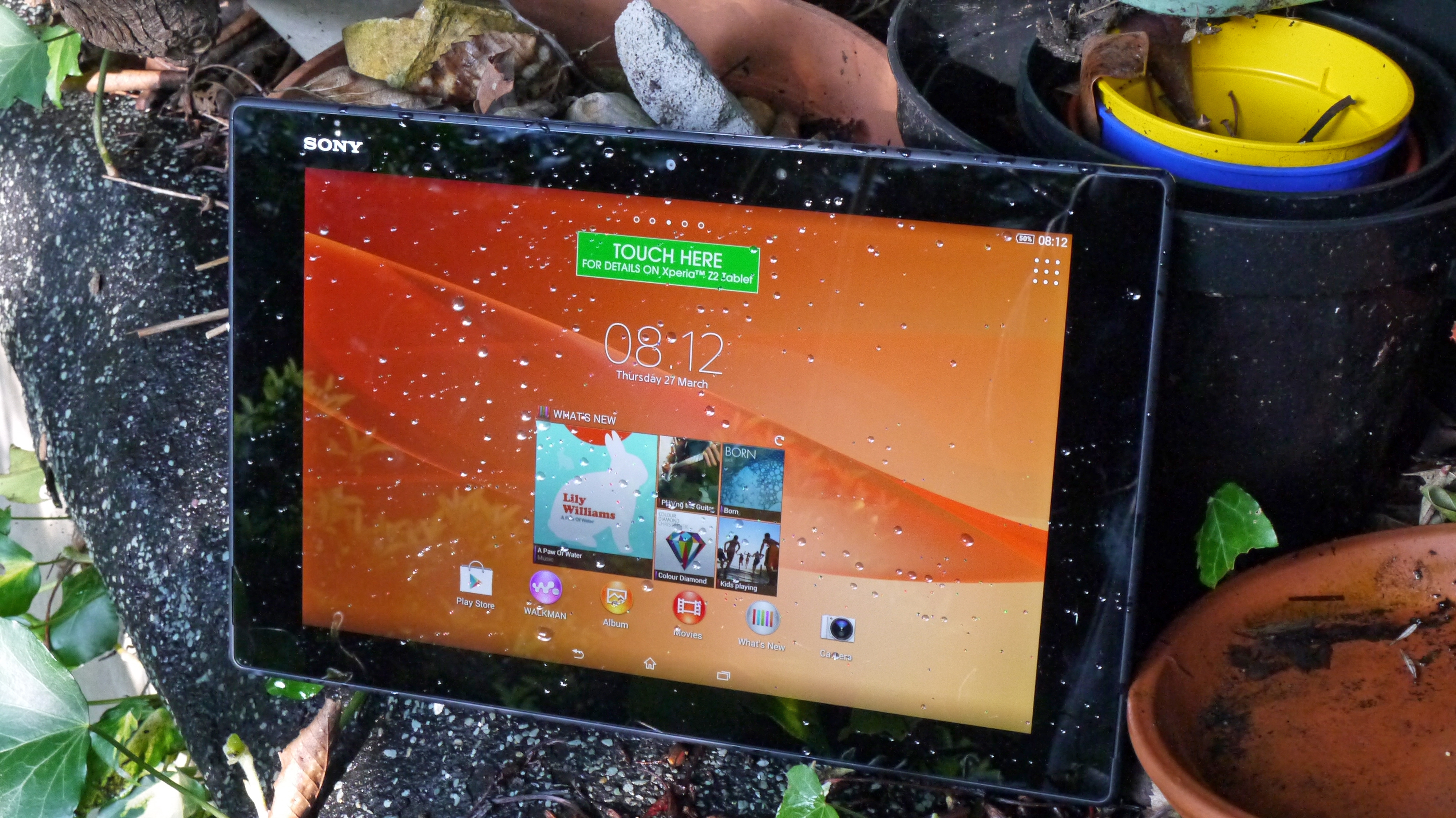
The Sony Xperia Z2 Tablet is a powerful, well-balanced slate that needed a slight bump in screen quality to truly compete with the best.
Pros
- +
High-power
- +
Live Color screen
- +
Great design
Cons
- -
Screen too low-res
- -
Sharper edges
Why you can trust TechRadar
It's become a bit of a cliche, but a year really is a long time in technology. Less than 12 months ago, Sony launched the ridiculously slim, light, and powerful Sony Xperia Tablet Z, and it seemed like a tablet ahead of its time.
Now the Sony Xperia Z2 Tablet is here with subtle improvements across the board. But while it remains a stylish and accomplished 10.1-inch tablet, the arrival of some outstanding competition in the intervening months has left it feeling a little less special.
The Xperia Z2 Tablet is competing at the top of the full-sized tablet tree, with prices starting from $598 for the 16GB model, and the 32GB unit costing $699.
There's also a 16GB 4G version on sale for $749, or for $60 on a $35 business plan through Telstra.
That's the same price as the iPad Air, and is a similar price to the Samsung Galaxy Tab Pro 10.1 (which you can currently get online for less than its RRP). With two of the strongest full-sized tablets around as its main competitors, the Sony Xperia Z2 Tablet really needs to step up its game.
Interestingly, the Sony Xperia Z2 Tablet faces pressure from these rivals in different ways. The iPad Air challenges it for desirability and premium feel, while the Samsung Galaxy Tab Pro 10.1 competes more directly on raw specs and numerous software features.
Sony has won a couple of these battles, but perhaps not as many as it would have hoped for.
Sony hasn't messed with the basic design of the Sony Xperia Tablet Z here, and that's just fine by us. Now in a slightly slimmer, lighter shell, we have no compunction with calling the Sony Xperia Z2 Tablet the best-looking Android tablet on the market.
You can spot a modern Sony smart device from a mile off. They tend to be a lot squarer than rival offerings, with sharp corners and uniform, parallel surfaces. The Xperia Z2 Tablet sticks to this template.
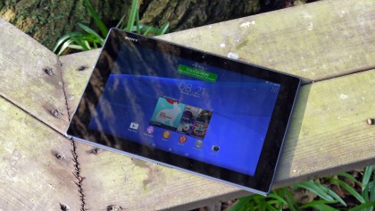
From the front, the Xperia Z2 Tablet looks quite chunky, thanks to its thick screen bezel, which perversely makes the screen seem smaller.
With the left and right sides (in landscape, the Z2 Tablet's default orientation) especially pronounced, its lack of fascia buttons, and Sony's subtle branding in the top left hand corner, it almost looks like a tiny Bravia TV.
One telltale sign that it isn't is the white matte plastic edging that extends from the rear of the device and creeps around to meet the surface glass. This unique frame, which contains strips of flat silver plastic along the length of each edge, is another trademark of the current Xperia range.
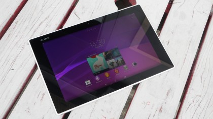
I found that this plastic edging was susceptible to marking. A relatively light contact with my MacBook when carrying both together left an unusual dink running across both white and silver plastic sections - something you feel probably would not have happened with a Samsung tablet, and certainly not with an iPad.
Close examination reveals these materials to be a little flimsy, then, but the overall effect is a pleasing one. There's a hard-to-define sense of quality that Sony manages to imbue in its plastic devices that Samsung (for example) doesn't always manage.
It's all the more impressive given just how slim the device is. At just 6.4mm, it's half a centimetre thinner than its predecessor, and more than a millimetre thinner than the iPad Air.
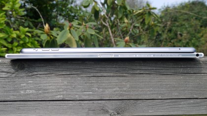
The Xperia Z2 Tablet is also surprisingly light. With a weight of just 426g, it's almost 70g lighter than the Sony Xperia Tablet Z, and some 43g lighter than the iPad Air.
Sure, you can cause the device to bend and flex if you apply some pressure, but when simply sat in your hands normally it feels great.
The only physical buttons here are the power and volume keys, and they're well situated mid-way up the left-hand side. It sounds like a silly thing to say, but Sony makes the best power buttons in the business. The Sony Xperia Z2 Tablet's is predictably round, pronounced and moreishly clicky, and it's very easy to feel out in a darkened room.
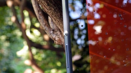
Its nubbin design is a great reference point in such situations - you locate the power button, then slide your finger down a centimetre to the flatter volume rocker. Simple.
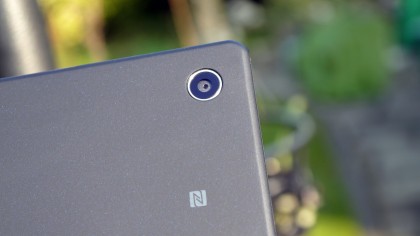
The tablet's main camera lens is placed right in the top left corner. In other, bulkier tablets this can lead to some irritating finger-in-shot moments, but thanks to the Xperia Z2 Tablet's slight build, I never found this to be a problem here.
Elsewhere, the Sony Xperia Z2 Tablet's edges are unusually featureless. Other than the 3.5mm jack on the bottom left (which can be awkward if you want to prop up the tablet on a table with a set of headphones plugged in), and the slightest of ingresses for the charging dock connector (sold separately) to the right, it's all pretty much flush.
There's an infra-red emitter on the top alongside a tiny mic, but it still feels like something's missing.
That's because to the left of the infrared sensor you'll find two chunky covers concealing the microUSB and microSD slots.
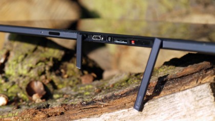
This helps with Xperia Z2 Tablet's tidy looks, but it can be a little irritating when you're scrabbling around to put it on charge - especially when you have the tablet's software warning you every time a port is opened.
Of course, there's an important reason behind these covers, which we'll discuss in the next section.
