Why you can trust TechRadar
Display
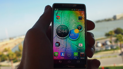
The Razr M's screen is very impressive despite some relatively low stats. Given that it only has 256 ppi and a resolution of 540x960, it's insane how vibrant the display is. Colours pop and games shine thanks to the AMOLED screen.

The handset also boasts fantastic viewing angles. We needed to turn the phone until it was almost in profile in order to distort visuals.
While someone who is obsessed with video watching might want to wait for the 720x1280 resolution Razr HD, the Razr M's 4.3 inch screen is nice balance between size and portability, and it's surprisingly vibrant.
However, streaming high-quality videos can be disappointing, especially since this is a 4G capable phone. You'll get the kind of high-data speeds needed for HD video, but the phone's 540x960 won't do them justice. Watching the trailer for "The Avengers," Thor and friends looked rather blocky.

Still, this isn't a phone that's meant for high-end media consumption, and Motorola has offered a good trade off with the Razr M's compact design and affordable price. And while the phone isn't HD, we can't underplay the vibrancy of the colours when playing games or just staring hypnotically at an animated wallpaper.
The 4.3-inch screen, which can remove those virtual Android buttons whenever they're not needed, provides plenty of real estate for touch screen gaming. Playing Plants vs. Zombies, Cut the Rope and Bad Piggies, our fingers never felt cramped and touches always registered precisely.
Interface
The Razr M runs Android 4.0: Ice Cream Sandwich, version 4.0.4. You're right, that's not the latest version of Google's OS, which would be Android 4.1: Jelly Bean. However, it's running the most updated version of ICS you can find on any Android handset.
On the Razr M it's slick, responsive and extremely functional, thanks to Motorola's own UI that's been laid over the stock Android software, and that 1GB of RAM.

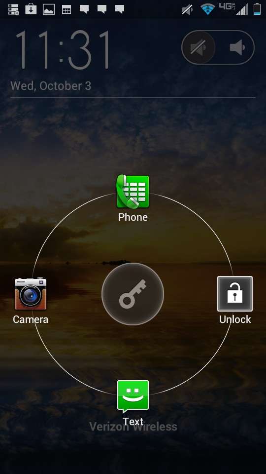
Motorola has promised to provide a Jelly Bean update before the year ends, but early adopters won't live in anticipation of it. The UI on the Razr M is useful right from the lock screen, providing quick access to the phone, text messaging or camera depending on which way you slide the unlock key. There's also an easy mute toggle in the upper right corner.
Users are allowed up to seven home screens, which they can fill to their heart's content with widgets, applications and shortcuts. Even when filled to the brim, you can flip across these home screens at a satisfying speed.
We must say, Motorola's Circles widget is about the most attractive way we've ever seen text messages, weather, time and battery life displayed. Other widgets include Smartdrive, which is meant to help drivers keep their eyes on the road. It will automatically reply to incoming calls and messages with a custom "I'm driving" text message.
From the primary home screen, users can swipe to the right to access more other home screens, or swipe the left to access a Quick Settings menu. From there you can control your ringer mode, toggle WiFi, bluetooth and GPS service or go into airplane mode.
The Razr M also has a drop down menu that can be accessed from any home screen and most apps. From there you can see alerts relating to emails, text messages, Facebook and Twitter, or any updates available for your apps.

There's also support for folders, which allows you to quickly group together apps without having them clutter up a home screen. By default, the primary home screen features a Tools folder, which provides a good example by collecting Calculator, Calendar Gallery in one place.
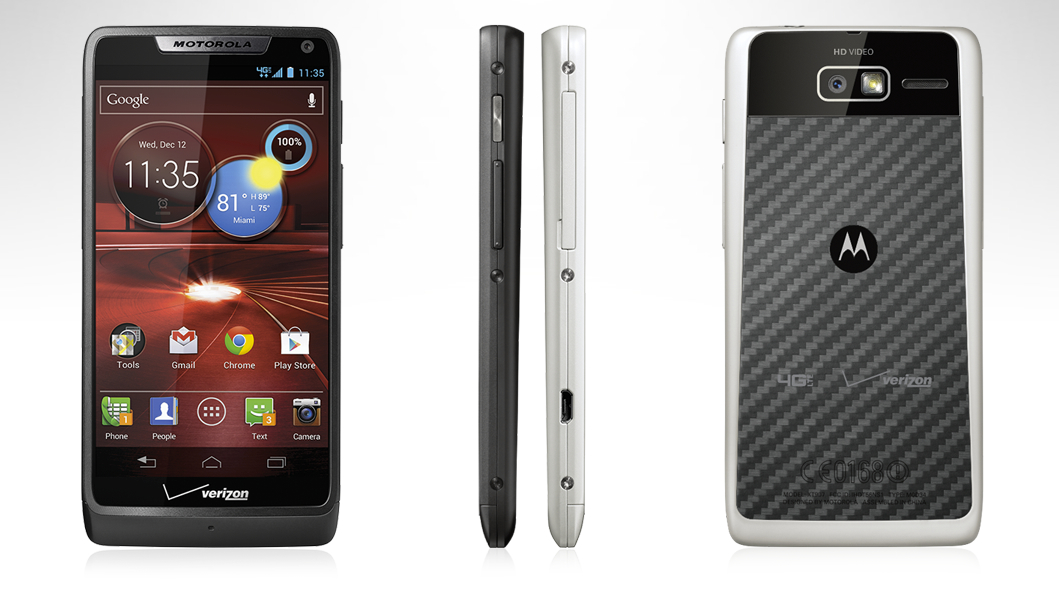
One of our favorite little tweaks on the Razr M had to do with those virtual Android buttons. Not only do they disappear when not needed, freeing up more screen space, they actually turn depending on how you hold the phone. Hold the phone in landscape mode and the buttons go horizontal.
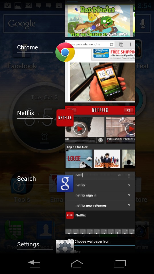
We also love the way the phone displays recent apps as visual previews. It makes it easy to multitask, and it's just pleasing to look at. Of course, running too many games or videos at once will hurt performance, but it's easy to dump applications right from this menu. Just give it a long press and select "remove from this list."
Current page: Display and Interface
Prev Page Introduction and Design Next Page 4G, calling and contacts