TechRadar Verdict
A solid smartphone that's worth a look if you're after something on a budget
Pros
- +
Superb screen
- +
Cheaper price
- +
Slim chassis
- +
Great audio quality
- +
HD video recording
Cons
- -
No unified inbox
- -
No more updates?
- -
Wi-Fi not too strong
- -
No camera flash
Why you can trust TechRadar
This Samsung Galaxy S review has been updated to include the Android 2.3 Gingerbread operating system update.
A long time ago, in a Galaxy far, far away... (OK, not that far – South Korea), a new smartphone set Samsung's mobile fortunes alight: the Galaxy S.
If you're in the market for a new smartphone, you can check out our quick video guide to what to look out for:
It may have been less than a year ago, but that's a long time in mobile phone world. And this one has shipped by the bucket load. Samsung surpassed its aim of selling ten million Galaxy S units back in January, and for the South Korean technology legend, it's the gift that just keeps giving.
Originally shipping with 2.1 Eclair, then upgraded to 2.2 Froyo and now given a new lease of life, rocking 2.3 Gingerbread, the Galaxy S is no longer Samsung's flagship – its big brother, the Galaxy S2, takes that crown.
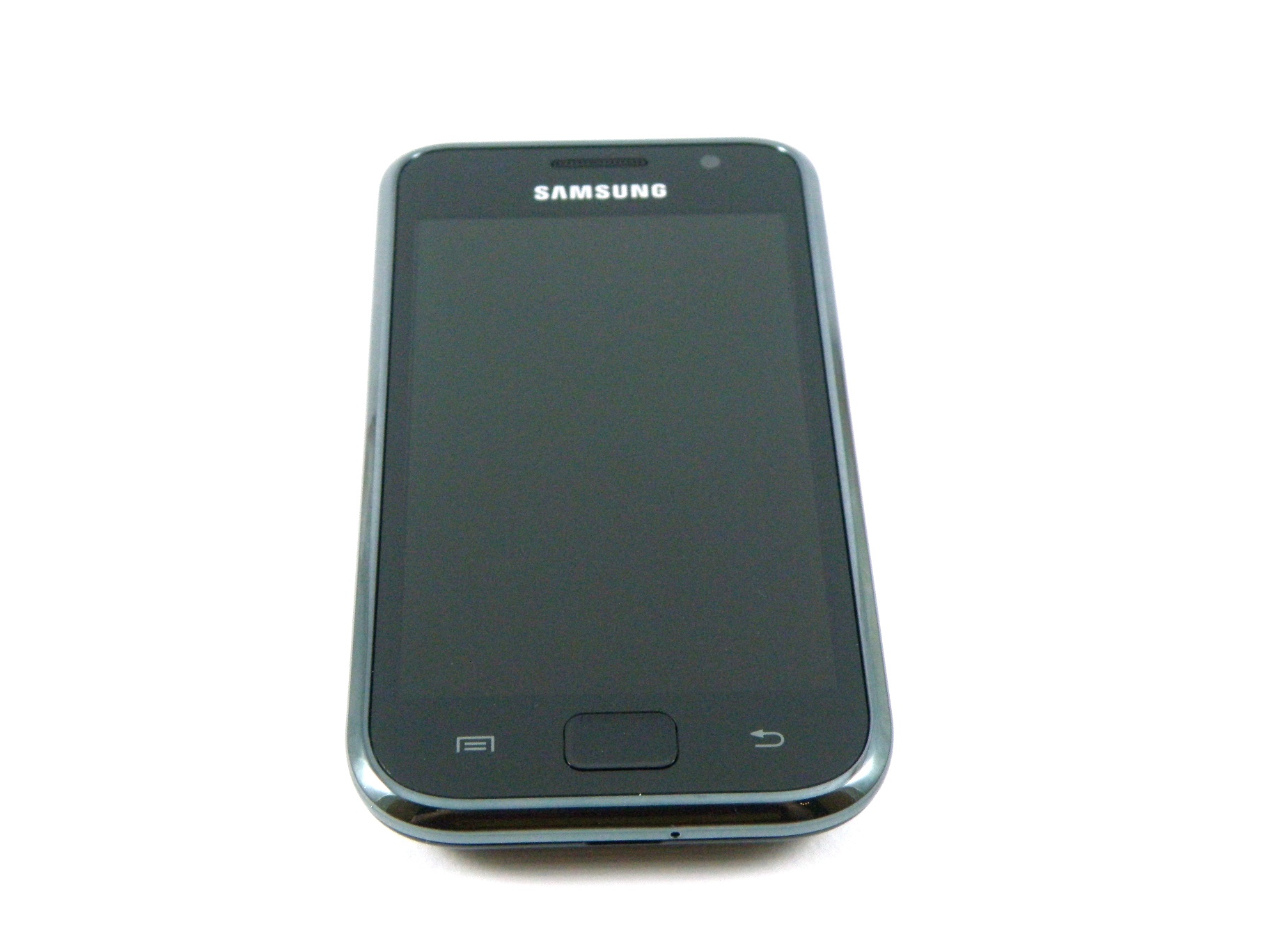
But retailers are still selling it and punters are still buying it. A fantastic screen, surfing experience that really works and 5MP camera are just a few attributes that make the Samsung Galaxy S at least looklike it ticks all the boxes.
But is it really out of this world?
We know some Android fans won't like this, but sorry, there's one word we have to bring up here and we can't help it: iPhone.
Like it or not, the Samsung Galaxy S will be compared to Apple's offering.
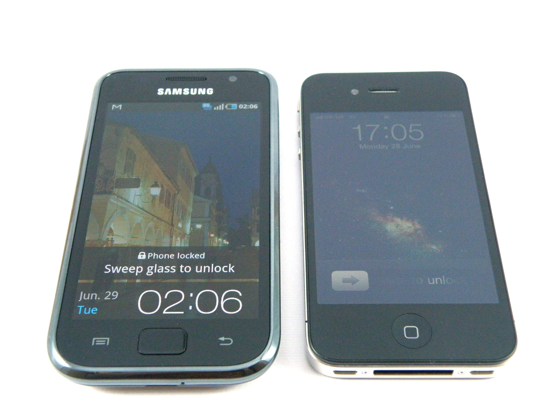
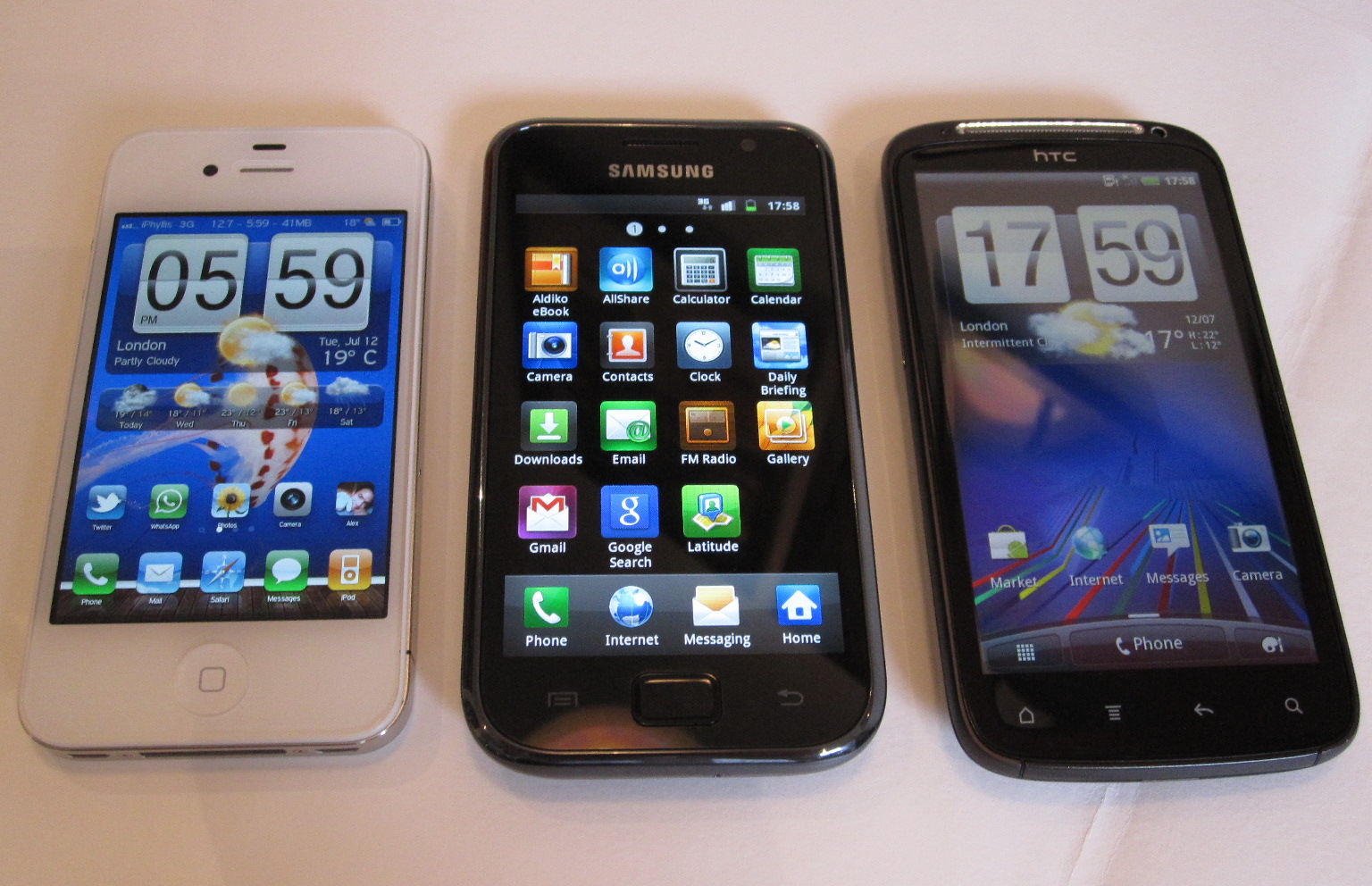
In fact, when it was launched last year as Samsung's flagship device, it was probably the main challenger to the iPhone and the choice of those who didn't want to be locked into Apple's way of doing things, yet still wanted the benefits of a touchscreen smartphone with all mod cons.
More recently, it's been knocked out the spotlight by its own replacement, the Samsung Galaxy S2, but Samsung clearly believes this is a popular handset and it's now being marketed as a higher mid-level phone to those who don't want to compromise on features and go for a budget smartphone (such as the Galaxy Mini) but can't necessarily afford to go premium.
With a 1GHz processor, GPS, HSDPA/HSUPA, HD video recorder, generous built-in memory (8GB or 16GB) and the latest Android operating system, this could never be considered a slouch of a phone.
We found one retailer selling it SIM-free for £309 (not far off £200 cheaper than the Samsung Galaxy S2) and contract-wise, you can pick it up for free at £20 per month on certain network deals.
Back to Apple, though, and there's no mistaking it – the Samsung Galaxy S and iPhone 3G/3GS could very easily have been separated at birth.
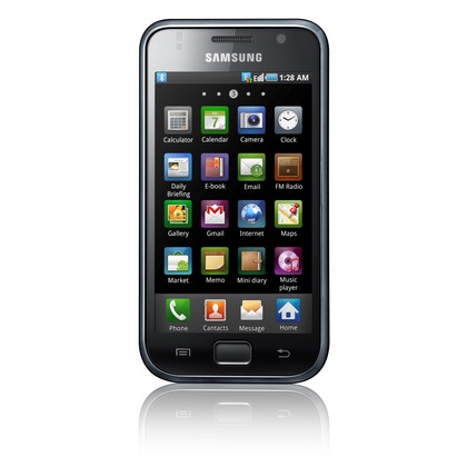
From the all-black shiny front, to the curved bezel around the frame, to the single physical button (albeit a rounded square rather than a circle) and even the glossy back in a choice of white or black, there is no way Jonathan Ive wouldn't have felt at least a little miffed (or flattered) when he saw the Samsung Galaxy S design for the first time.
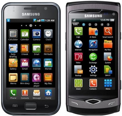
It's not a bad thing – but apart from the Samsung logo just beneath the earpiece and a slightly larger screen, there's not much difference in the Samsung Galaxy S's appearance.
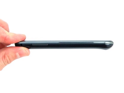
In terms of size, the handset measures 64.2 x 122.4 x 9.9mm. It feels significantly smaller than the Samsung Galaxy S2 – which it is due to the fact that it doesn't have the latter's huge screen.
Despite our love for the Samsung Galaxy S2, we actually found we preferred holding the Galaxy S, because the smaller size made it easier to grip. But it's definitely a trade off, and one that each buyer can evaluate, based on their own needs.
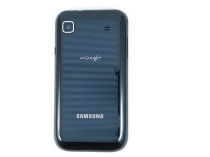
The Samsung Galaxy S does feel like a quality device in the hand – but it's also very plasticky. The glossy plastic rear cover is a fingerprint magnet, but at least it all keeps the weight down.
Because when we first picked up the Samsung Galaxy S, coming from an iPhone 4, we couldn't believe just how light it was. In fact, we opened the back thinking the battery must have been missing, but it was in there. At 119g, it feels great and not something you're likely to notice in your pocket.
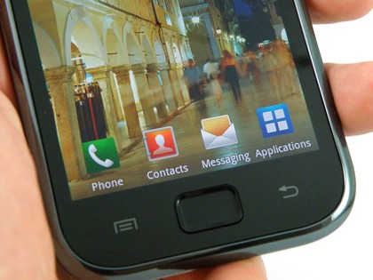
With the Home button on the front, you also have two soft keys either side of it. They light up when the screen is on and register your interest with a little haptic vibration when pressed. The one to the left is the Menu/Options button, and a Back button is located to the right.
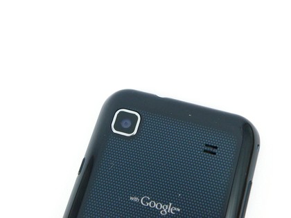
There's no dedicated search button like you might find on some other Android handsets. Likewise there is no dedicated camera button on the side of the Samsung Galaxy S, which is something we'd like to see because it makes the startup process and actual picture taking a lot easier, but we'll not hold that one against Samsung too much.
On the left side is a simple volume rocker, and the right-hand edge houses the lock button about two thirds of the way up. If you're left handed, you'll have no problems because you can hold the Samsung Galaxy S in your palm and reach around to press it with your index finger.
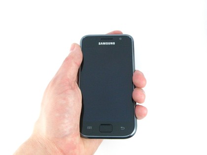
If you're right handed, you'll have no such luck. In fact, this was our first gripe with the Samsung Galaxy S that we found really irked us. The problem is, if you hold it one-handed in your right hand, it's natural to press the button in with your thumb - although you can tap the home button to wake the phone back up too.
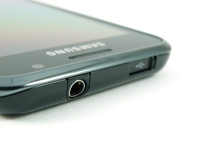
The top holds a standard 3.5mm headphone jack and a micro USB port for charging/syncing. Thoughtfully, Samsung has also fitted that port with a little sliding door – presumably to keep rain out because it's at the top of the phone.
It hasn't put one over the headphone jack though – we assume it thinks you'll have your headphones plugged in most of the time. Or it would be just too annoying to have it there.
The back holds the camera lens (5MP) and a speaker grill. There's no flash. Yes, no flash. On what was Samsung's flagship handset – and is still a mid-to-top level mobile phone – there's no light. Not even a little LED. Zilch. We'll go onto that in more detail in the Camera section. It won't be pretty.
There's also a rather curious bump along the bottom that protrudes – think the HTC chin found on various handsets such as the Salsa but on the back and sticking out the other way. Heaven knows why.
The MicroSD slot is located under the cover. But it's not behind the battery (hurrah!), which means it's fully hot-swappable.
The real surprise is when you turn this baby on. The Samsung Galaxy S screen is a belter – a 4-inch WVGA Super AMOLED – and it's so vibrant. Not that we'd expect any less.
Samsung's screens have always been probably the best out there on mobile handsets – even back in the days of the T100 and D410 (we're speaking relatively, of course, compared to the competition at the time.)
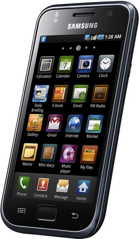
Pixel-wise, it's not 100 per cent perfect – close up you don't get the clarity of, say, a retina display or the updated Super AMOLED Plus. But as for those colours, you really can't take your eyes off them. Vivid, bright and full of life is how we'd describe them.
We installed a free HD wallpaper on our review unit and thought it looked amazing. So much so, we kept fiddling and turning the screen on to look at it. It's probably the first sign of madness.
Current page: Samsung Galaxy S: Overview, design and feel
Next Page Samsung Galaxy S: Interface