Why you can trust TechRadar
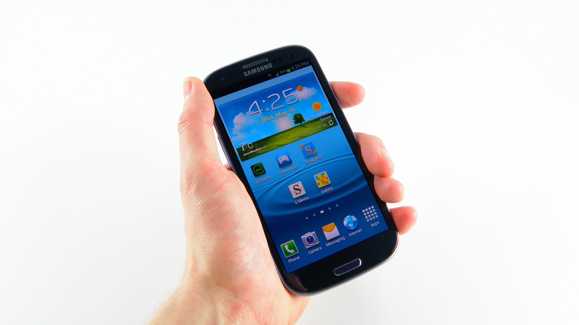
Let's take a minute and talk about the screen: it's beautiful. We almost feel sad that this isn't the first HD screen we've seen on a mobile phone, as it's kind of lost its lustre since the likes of the Nexus, Note and One X have all managed the same trick – but if you've not seen one before and you compare it to a Galaxy S2, it's worlds apart.
If we think back to just four years ago, when HVGA (320 x 480) resolution screens were the norm on phones and 720p TVs were still the plaything of the bigger spenders, it's incredible to think that pixel count has been shrunk down to fit into your palm.
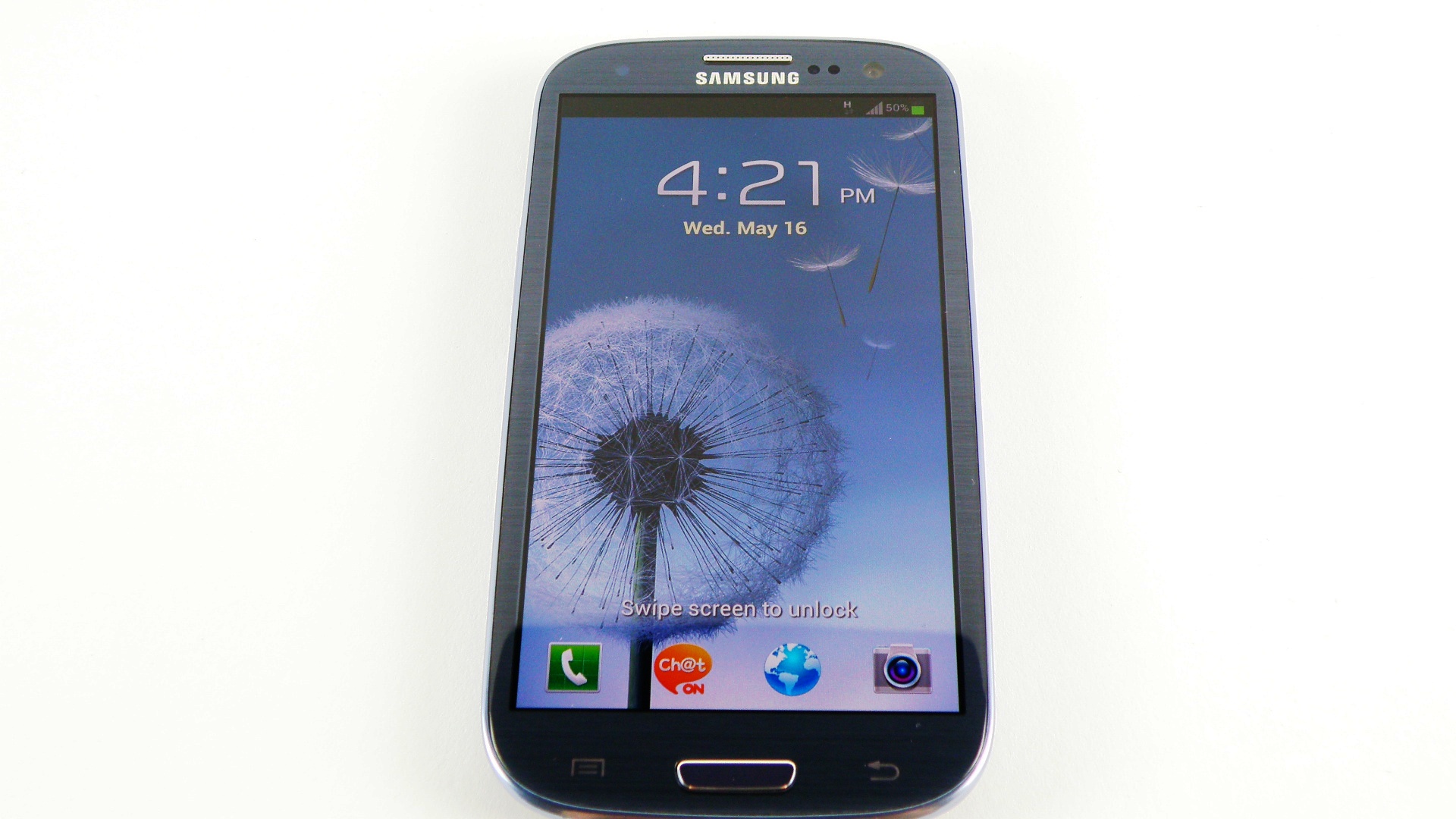
And that means the 309ppi pixel density is up there with the sharpness of the iPhone 4S, and it makes us realise that while a Retina Display is lovely, 3.5-inch screens just don't cut it any more.
We'll be mightily surprised if the combined popularity of the HTC One X and Samsung Galaxy S3 don't prompt Apple into a re-tooling of the screen with the iPhone 5, as the contrast ratio, large display and excellent colour reproduction will definitely wow users on the shelves.
It seems Samsung has tweaked the colour balance on the Galaxy S3 as well – things don't look as saturated as before, which will certainly help entice those that previously were against Super AMOLED before due to the harshness of colours.
There is an issue here for those that like to let the phone handle the display management - the auto-brightness level is too low for our eyes. It's like Samsung is trying to protect the battery a little too much here, and we'd rather have a variety of auto-brightness settings like in the internet browser.

This has been overhauled with the new update, giving you a notifications bar option to change the brightness or select auto mode. It's not perfect by a long way - we can't count the amount of times each day we get frustrated with the automatic mode not catching up to the conditions.
Sign up for breaking news, reviews, opinion, top tech deals, and more.
When it does work, the brightness is great... but when the brightness drops mid-Temple Run we get hugely frustrated.
It's not too bad in direct sunlight though - the contrast ratio of 3.5:1 Samsung is touting in direct sunlight is just about enough to see what you're doing, and if you're using the camera you can fire the brightness even higher to see what you're snapping.
The same option has been sadly removed from the Video player, so sitting in the sunshine watching Robocop is now no longer a thing to be done with your new Galaxy.
In terms of comparisons to previous iterations of Super AMOLED screens, this is where it gets a little bit technical - we'll try to keep it simple.
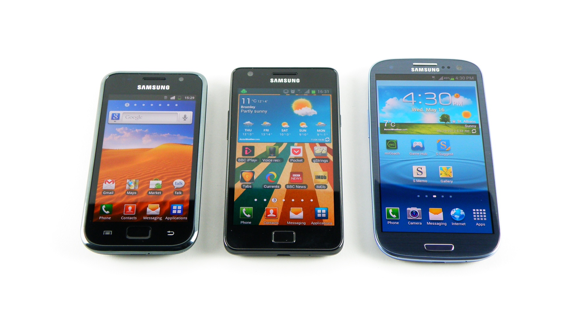
The Galaxy S2 packed a Super AMOLED Plus screen, which means that for every pixel, there were three subpixels - red, green and blue. This meant lovely contrast ratios and cleaner whites - this was noticeable close up.
However, in order to facilitate the much higher resolution, Samsung has crammed in fewer sub pixels per pixel, which means a slightly less 'clean' colour close up.
But what does this mean to you, the user? In truth, not a lot. Power efficiency seems to be very similar to that on the original S2 when it comes to firing the screen, and while there might be more of a skew towards green and blue on the colour scale, in practice this simply results in more natural-looking hues.
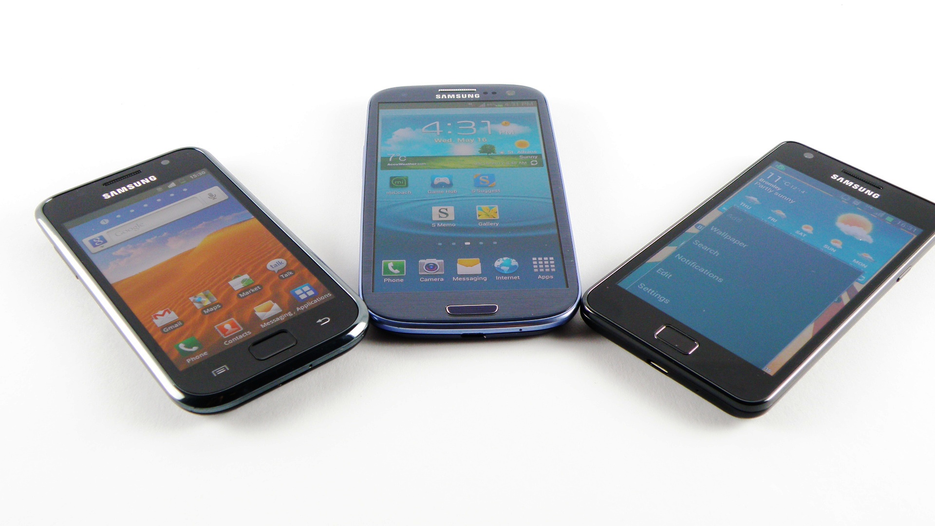
The sharpness is also technically affected, but with such a high resolution there's very little chance of this affecting the way you get to watch your movies or see the web.
Check out our comparison from Galaxy S to S2 to S3 to see what we mean - close up, the colours are more noticeable on the S3 compared to the S2, but this is unlikely to bother most users.
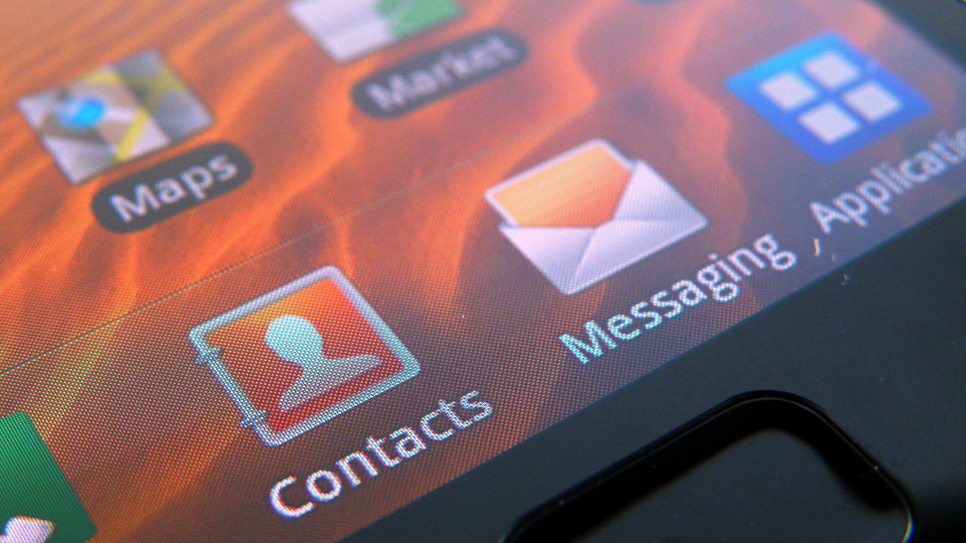
Click here for the full resolution image
The original Samsung Galaxy S used a standard Super AMOLED display, which was impressive two years ago.
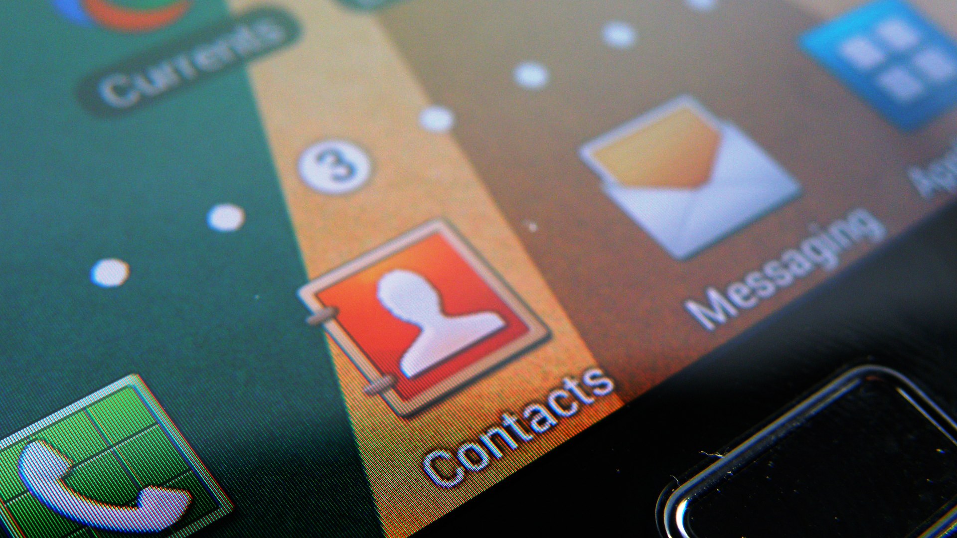
Click here for the full resolution image
Here's the Samsung Galaxy S2 - as you can see, the Super AMOLED Plus offers some very clear colour reproduction.
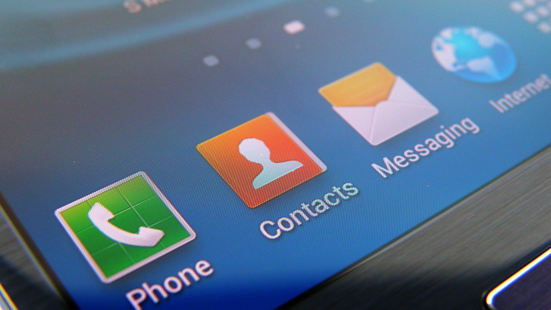
Click here for the full resolution image
The Galaxy S3 does have more visible colour sections within each pixel, but only when viewed at very close range. As you can see, the sharpness is much higher.
Gareth has been part of the consumer technology world in a career spanning three decades. He started life as a staff writer on the fledgling TechRadar, and has grew with the site (primarily as phones, tablets and wearables editor) until becoming Global Editor in Chief in 2018. Gareth has written over 4,000 articles for TechRadar, has contributed expert insight to a number of other publications, chaired panels on zeitgeist technologies, presented at the Gadget Show Live as well as representing the brand on TV and radio for multiple channels including Sky, BBC, ITV and Al-Jazeera. Passionate about fitness, he can bore anyone rigid about stress management, sleep tracking, heart rate variance as well as bemoaning something about the latest iPhone, Galaxy or OLED TV.
