Why you can trust TechRadar
There's no doubt that the Samsung Galaxy S3 is much faster with the Android Jelly Bean update; thanks to the inclusion of Google's Project Butter everything is just that little bit quicker under the finger.
However, we'll get this caveat out of the way: upgrading to Jelly Bean can slow your Galaxy S3 down dramatically. From what we can gather, this is due to some elements of Android 4.0 still pervading through the OS and eating up resources.

Here's the kicker: you can either reset your device to factory settings to clean things up and get the super whizz-bang fast motion for the user interface, or leave it on Android 4.0 to preserve your data. You can back up most things before the change, but in reality there will always be something you lose, be it the saved game or some text messages – so be warned that could be a problem.
It's not all phones that have this issue of course, but we experienced it on our network-free handset and it proved to be quite an issue. However, for most people it's going to be fine but let's run through the key differences with the interface.
On top of the dairy-based slipperiness of the interface, the notifications bar will be one of the key areas where most notice a big change. Like on the Galaxy Note 2, the information when dragging your finger down from the top of the screen is far richer than before. You've still got the same brightness alteration bar, but the settings icon is more prevalent, the clock is larger and the network connectivity status is now at the bottom of the sliding bar.
This last element might not sound like much, but now you can tap the top of the screen in any app and see the date, time and the network you're connected to – not just the signal strength.
For a company that, just a few years ago, was seemingly haphazardly throwing together user interfaces we're incredibly impressed with the level of detail offered from this area.
On top of that, we've still got the same power and connectivity management icons for easy turning off and on of the key elements in the phone. However, the move to Android 4.1 has facilitated a change in the way you get your messages, with everything presented in a fuller manner.
Instead of just being told you have multiple messages, the names are listed. Contact pictures are included next the sender, and the uppermost missive (be it an SMS, an email or other kind) will be displayed in full. Essentially, the screen space is used more effectively, and while there's a lot of information the layout is impressively clear.
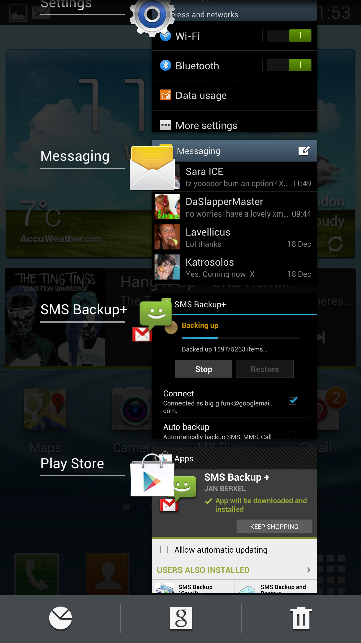
One of the features of Android 4.0 was the multi-tasking window: and this is an area of big improvement for the Galaxy S3. We weren't alone in our criticism of how long it takes to activate once you've long-pressed the home button when the S3 first launched - we were disgusted that a key action was so poorly implemented. However Samsung has finally pulled its finger out here and given us an instantly-acting pop-up, and it's also got some new friends at the bottom. The aforementioned Googke Now is also flanked by an icon to shut down all the open applications, as well as being able to jump into your RAM usage and cut that down as well.
It's a useful trick, but it would be even better if we could customise those icons so you've always got the apps you want at your fingertips... it's not really an effort to jump into settings from the notifications bar once in a while to clean our RAM usage, and many people will never even bother.
Blocking mode
Another new feature of the S3 Android 4.1 update is the addition of Blocking Mode, which is the equivalent of Apple's Do Not Disturb.
It works as you'd expect, shutting the phone down when turned on, and you can no only specify what style of communication you want to receive (no calls during a meeting, for instance) but you can also set up the people you want to be able to break through the barrier, which is helpful if your wife is set to go into labour and you're watching the football peacefully.
The ability to time-set it is excellent as well, but the only iffy point is that if you have blocking mode activated, it shows as an icon in the notification bar. We want to use it every night to stop being woken up by a buzzing handset, but we can't bring ourselves to clutter that icon bar at all times.

Also, it would be nice to set meetings in your calendar with blocking mode engaged when created - come on Samsung, you know you can do that one.
The Samsung Galaxy S3 has proved to be an immensely popular phone, and despite its power has been picked up by a number of users with a wide range of usage models. This means some people don't want to set icons and widgets all over the place, which is why Home Screen Modes have been added in.
This option, found in the settings and offered when you first boot up the Jelly Bean update, will allow you to have the obvious functions of the phone to the fore so it's a more simple process to use it day by day. We can't see a huge amount of people shelling out for this phone and not wanting to have a little tinker with the UI from time to time, but the mode is there for those that want it.
Another of our early bugbears has been fixed with the Jelly Bean update: the auto brightness. The first iteration wobbled all over the place, and it was fixed from there, meaning a more even glow. However even if you had the phone brightness bar right down, the auto brightness didn't move much.
Now it seems there are gradients within the system so that the phone will never fire to full brightness if you want things a little darker, limiting itself to around 60% or so.
The lock screen on the Samsung Galaxy S3 is now a much more interactive place, with the ability to unlock it in so many different ways.
You can have loads of information on there, such as a news ticker or the weather in your local region, and now you can unlock using face, face and voice, the familiar swipe and holding the display and picking up the phone.
We tried to get on board with the latter method, but in practice it's not useful, as there are many times when you want to unlock the phone and view it on the desk or on a dock. If Samsung could combine the two of these, it would be a much better idea.
Voice unlock was a little tricky to use as well as being a real hassle to do just to unlock the phone… if you're that worried about security then just use a pin code or pattern. The Face Unlock function is really just a novelty that will quickly wear in day to day life.
The final update we think should be brought to the attention of users is the icon management, borrowed directly from the stock Android 4.1 OS.
Before, dragging and dropping an icon on top of others would just see the phone digitally shaking its head at you, meaning you'd have to 'drop' the app you wanted and create space for it.
Now everything obligingly shuffles around where you want to place it (the same being true of widgets) and you can organise things visually, rather than having to draw a schematic on a notepad just to know where your space is.
It's annoying that you still have to create folders though - stock Google allows you to drop icons on top of one another to create clusters of similar apps, but with the Samsung Galaxy S3 you still need to manually make a folder before you can lob stuff into it.
Google Now
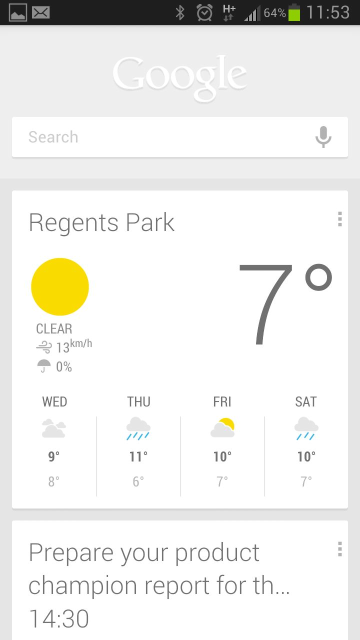
The other big addition to Android 4.1 is Google Now, which is a way of searching without search. The idea uses cards to give you information on travel times (based on real-time information on disruptions or traffic) or nearby weather – you can see a more in-depth look at the list over at our Android Jelly Bean review.
The service is pretty unobtrusive as well, meaning while you can get a little too much information at times (we don't want to know the timetable of EVERY bus stop we pass and stand near) there is some really helpful stuff in there.

And of course you can choose the things that you want to see, so if you don't want to be told when there's some decent stuff to photograph nearby you don't have to.
The updates land in the same notifications bar as everything else, but the Google Now screen is a different application altogether.
It's the new kicking off screen for any Google searches too; get to it either by hitting the relevant update or long-pressing the home button to bring up the multi-tasking window.
Of course this system is designed to be used with a virtual home key, but Samsung has thankfully moved away from that idea on the Galaxy S3 and as such had to come up with an alternative.
Google Now works very well in practice, and things like being told when to leave to arrive for upcoming appointments are really useful. However, there's not a lot of quality control on offer, meaning you can be told to go anywhere with an address attached, which is no use if you have a shared work calendar.

Gareth has been part of the consumer technology world in a career spanning three decades. He started life as a staff writer on the fledgling TechRadar, and has grew with the site (primarily as phones, tablets and wearables editor) until becoming Global Editor in Chief in 2018. Gareth has written over 4,000 articles for TechRadar, has contributed expert insight to a number of other publications, chaired panels on zeitgeist technologies, presented at the Gadget Show Live as well as representing the brand on TV and radio for multiple channels including Sky, BBC, ITV and Al-Jazeera. Passionate about fitness, he can bore anyone rigid about stress management, sleep tracking, heart rate variance as well as bemoaning something about the latest iPhone, Galaxy or OLED TV.
