Why you can trust TechRadar
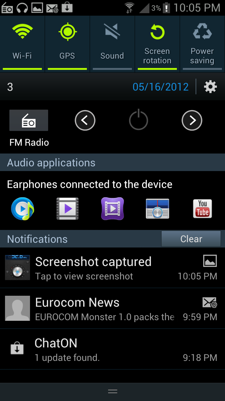
As with many new Android phones, Ice Cream Sandwich is embedded out of the box, meaning you've got a plethora of options when it comes to notification management. You can easily get rid of anything that you don't care about by simply swiping the alert left or right – it's a really neat system that means you can leave the bits you really care about.

The trick is reproduced in the application management pane: when holding down the Home button at the bottom of the phone you're presented with a long list of all the applications you've recently opened – another flick of the finger and they're shut down.
Opening this up used to be a really, really slow process. It's still not as sprightly as the same option on iOS, but it's a lot faster with the software update.
However, this is different to the task manager Samsung has installed in the Galaxy S3, where you can look at running applications and the amount of power (and therefore battery) they're sucking down at any one time, which is very handy for when you're wondering why your phone is overheating so much – not that we noticed that very much during our review.
There's also the option to clear the RAM as well – while it's tempting to keep closing all the running programs you might find this has an adverse effect on your overall power management as key software needs to keep rebooting, so use it sparingly.
In terms of management options, there are more than ever before – the battery usage meter is joined by the data management tool that allows you to see which apps are sucking down the most bytes, and also (and quite neatly, using sliding bars) allows you to set warnings for when you're getting close to your data limit and when you've reached it.
You can even tell the phone to stop connecting to the internet over 3G if you're worried about your data charges after a certain period – this is certainly going to satisfy those that don't ever know how much data they're using as you're in total control.
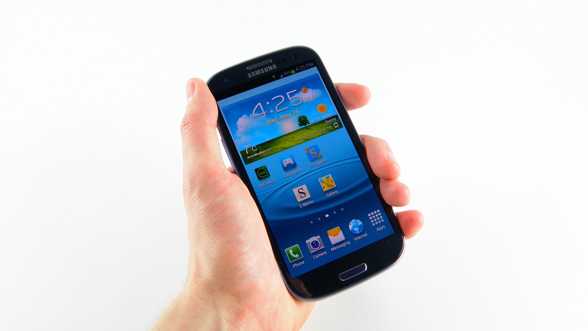
The menu system is very easy to use as before – sort your apps chronologically or alphabetically – and if you're not a fan of the standard grid system you can chuck them all into one long list.

There's a tab for apps (which you can filter to just those you've downloaded) and also widgets too – with the seven allowed home screens on the top to chuck them into. There are loads to choose from (with more to come as you download applications) which can get a bit chaotic when you're scrolling through.
And if you want to uninstall apps, simply open up the option from the menu in the App drawer - much easier than messing about through the innards of the phone or heading through Play Store.
We noticed one issue with the interface speed: namely when pushing the graphics chip harder (perhaps loads of internet tabs or a pretty game) and the interface will have to redraw when pressing the home key.
It's a really bad feature as it detracts from the quality of the phone - Samsung has improved this with the update, but not to the point where we don't notice it.
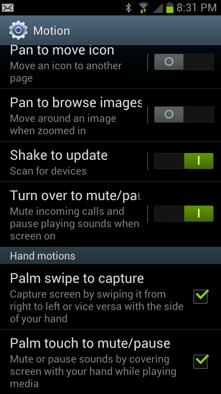
The other big feature for the S3 is the addition of motion control – not necessarily a new idea, but one that's been pushed to a whole new level in the phone.
This means that not only does turning over the phone or placing your hand over it mute a call, but also performs the same trick when playing music. It can even do it when turning the phone over in mid-air… which is quite impressive when you think the handset can tell the difference between the pocket and a desk.

Other features, such as tapping the top of the phone to move to the top of a list, are pretty cool, but ultimately pale in comparison to Apple's (likely patented) tapping at the top of the screen – and the S3's effort is nowhere near universal, so you can find yourself tapping the phone to no avail on more than one occasion.
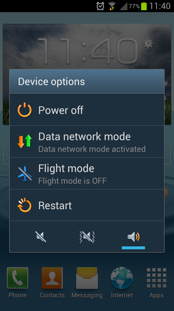
There's another new feature with the software update: you can press the power key and change the sound settings.
It feels a little redundant as the same thing can be done with a drag down of the notification bar, but it harks back nicely to the Nokia days when this was the only way to change sound settings.
But overall the good news is the large screen looks great, the slick operation under the finger is exactly what we wanted and the little touches like the rippling lock screen do actually feel quite natural.

Gareth has been part of the consumer technology world in a career spanning three decades. He started life as a staff writer on the fledgling TechRadar, and has grew with the site (primarily as phones, tablets and wearables editor) until becoming Global Editor in Chief in 2018. Gareth has written over 4,000 articles for TechRadar, has contributed expert insight to a number of other publications, chaired panels on zeitgeist technologies, presented at the Gadget Show Live as well as representing the brand on TV and radio for multiple channels including Sky, BBC, ITV and Al-Jazeera. Passionate about fitness, he can bore anyone rigid about stress management, sleep tracking, heart rate variance as well as bemoaning something about the latest iPhone, Galaxy or OLED TV.
