Why you can trust TechRadar
The interface on the Samsung Galaxy S4 isn't an officially new release of TouchWiz, the Korean brand's name for its Android overlay, but it does bring a whole host of new features to the Galaxy range, working best on the S4.
It's built on top of Android Jelly Bean 4.2, which means there are several significant upgrades from the previous version, found on most of the other top-end Galaxy devices and, crucially, ahead of the likes of the HTC One and the Sony Xperia Z.
One gets the feeling Samsung has delayed Android 4.2 for the Galaxy S3 simply so it can offer differentiation with the new model – things like split menus mean you feel like you're greeted with a different phone, despite both the S3 and S4 doing roughly the same thing.

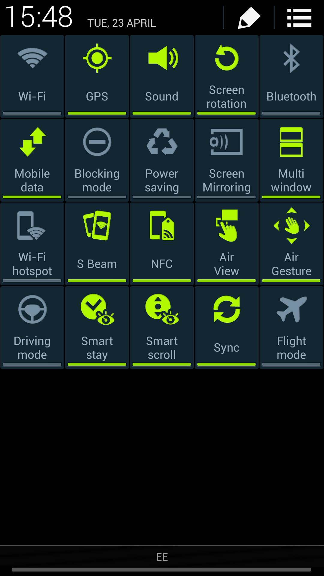
So, for instance, in the drag down notification bar, you're now greeted with two icons in the top right-hand corner; one takes you to the internal settings from anywhere in the phone, and the other gives you quick shortcuts to turn elements within the S4 off and on.
You can also get access to the full grid of options instantly by dragging down from the notifications bar using two fingers instead of one. Tricksy.
This is an idea Google pushed with the new iteration of Android, and works well. However, it's a little redundant here, as the phone already has these in a long line in the notification bar. You can also edit these quick toggles too, so it means that you'll rarely push the other button to get the full list.
Android 4.2 promises further smoothness upgrades too, and while this works on the likes of the Nexus 4, we're not sure what it's really added with the Samsung Galaxy S4.
Considering that this phone is running the quad-core Qualcomm 600 chip, clocked at 1.9GHz and combined with 2GB of RAM, we would have expected this phone to run faster than anything we'd ever seen before.
While that is true for the most part, it's only a touch more than we've seen on the Galaxy S3. Apps will open and close faster, but elements like the time taken to open the multi-taking menu (triggered by holding down the home key from anywhere in the phone) still take a beat to activate.
It makes us hanker for the octa-core processor that other parts of the world are getting - the reason being that 4G can't apparently be added to that chip very easily, so we have to make do with a quad core option. It's not as simple as saying that other version is twice as fast, as it's essentially two quad core chips doing different tasks when needed, but there's no doubt that the other version is faster.
In case you're wondering, there are two versions of the Galaxy S4: one with the Exynos 5 octa-core, and this one (model number GT-1905) that has the Qualcomm Snapdragon quad core. This version is clocked at 1.9GHz, which means it runs faster in general - however, the octa core has two sets of four cores, with one for day to day stuff and the other for heavy lifting, such as photo processing and such.
While we're miffed we don't have the option of this other version (it's smashed the benchmarks in many tests) there are questions about whether the battery will hold up as well as the device flicks between the two quad core processors inside - it could improve efficiency or deplete it, depending on the implementation, so perhaps bigger isn't always better.

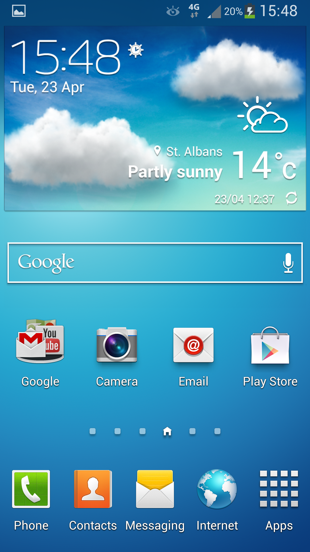
The general Android / TouchWiz interface is still the same as ever: this means that you can throw as many widgets and apps all over the seven home screens that you like.
It's still a great way of doing things, and since Android Jelly Bean has been used you can now flick items out of the way just by dragging them onto the screen and holding them in the place you want.
What is interesting is that Samsung still hasn't added the functionality to drag and drop app icons on top of one another to create a folder. We're pretty sure Apple is trying to patent such an idea, but given rivals have managed to use this method (such as HTC with the One) we'd have expected Samsung to do the same.
It's not a big deal, but having to drag an app to the top of the screen, create a folder, name it, then drag other apps in is a bit of a hassle.
Another huge frustration is the fact that Australian models of the handset don't allow users to customise the bottom row of icons on the device. So if you prefer the Chrome app to the Internet app, you have no way of switching it over in the tray, short of installing a brand new launcher on the phone.
For some reason, this is a completely arbitrary decision for the Australian market, with international versions lacking the locked tray apps.
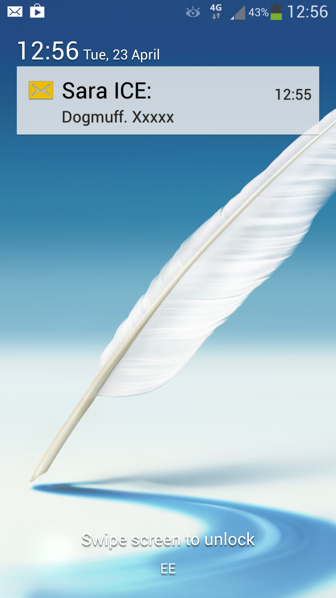
One area that has been changed massively from S3 to S4 is the lock screen. Firstly, there's a new way to mess around with this UI: where once you could only touch the screen and watch the water ripple around, now you can choose to have your finger trigger a little light that hovers under your finger.
Combined with the S4's improved screen technology that's been super-boosted, in terms of sensitivity, to allow you to use gloves with it, you can now hold your finger a centimetre or so above the display and watch the light flicker along under your digit. It's not a big thing, but one that we found ourselves constantly playing with like tiny children.
The lock screen, thanks to the Android 4.2 update, now allows you to have widgets on there before you open the phone, allowing music control, remotes to display and messages to preview.
While there are some useful implementations of these (the music player is really handy to have, and can be resized by dragging the track list up and down) others, like favourite apps, really don't help as much. You can still thankfully have all the lockscreen shortcuts, which means you can interact in the same way as before. To open the phone into a widget you just tap it then swipe below. We initially wanted to criticise the phone for this, but after a few days it really becomes second nature.
To open the phone from a widget you just tap it then swipe below. We initially wanted to criticise the phone for this, but after a few days it really becomes second nature.
There are a number of issues we found with the interface though: for instance, Page Buddy being removed, which is available in the Galaxy S3 and Note 2. This function would display a new home screen when certain actions are initiated, such as connecting a pair of headphones or roaming in another country.
You can't get this on the Galaxy S4, and its omission is terrible, as it was one of our favourite features of the S3. You can get recommended apps when you plug in headphones in the notification window; however, these are ludicrous in their inability to be relevant.
Plugging in headphones and being recommended to check Facebook, Chrome or Email? Doesn't make sense to us at all, but apparently it's based on 'what we do when headphones are plugged in.' Yeah, whatever, Samsung.
Another issue is the volume bar - for some reason, using this causes terrible lag on the phone, with it taking a long time to appear on the screen when pressed, and at times not responding to input - then deciding a few seconds later to blast right up to full volume.
It's clearly a software issue, and one that Samsung will sort out in the near future, but it's definitely an issue.

We would say the blocky nature of the UI really isn't attractive. It basically adds a load of features into a previously simple experience, which may or may not please some people. Thankfully, all this is switched off by default - and you can even have your own message saying hello every time you open the phone.
It's clear that Samsung has toed the Google line in using Android 4.2 on the Galaxy S4, as this lock screen functionality is straight from the search giant's design board (with a few Samsung design ideals placed on top).
It's also present in the menu system, which, rather than one long list of all your options, is divided into four screens: Connectivity, My Device, Accounts, and More. It's a neat way of packaging things all up, but it can be hard to hit the categories on the top given the size of the screen.
The interface on the Samsung Galaxy S4, to the uninitiated or the Galaxy S2 user looking for their next upgrade, is great. It has loads of innovative ideas and works blazingly fast. We can see why some people find TouchWiz a little cartoony and convoluted at times, but in our eyes this is a great combination of power and simplicity in a smartphone.

Gareth has been part of the consumer technology world in a career spanning three decades. He started life as a staff writer on the fledgling TechRadar, and has grew with the site (primarily as phones, tablets and wearables editor) until becoming Global Editor in Chief in 2018. Gareth has written over 4,000 articles for TechRadar, has contributed expert insight to a number of other publications, chaired panels on zeitgeist technologies, presented at the Gadget Show Live as well as representing the brand on TV and radio for multiple channels including Sky, BBC, ITV and Al-Jazeera. Passionate about fitness, he can bore anyone rigid about stress management, sleep tracking, heart rate variance as well as bemoaning something about the latest iPhone, Galaxy or OLED TV.
