Why you can trust TechRadar
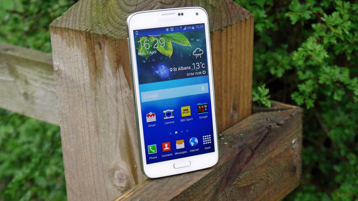
Elements of the interface on the Samsung Galaxy S5 have improved quite a lot over the S4 and previous iterations of the Galaxy family, but there are still some arbitrary decisions on Samsung's part that are exceptionally frustrating for Australian users.
The improvements are mostly do with the new circular icons and geometric layout allowing everything to look a bit more premium and fluid - you could argue that it's relying a little less on skeumorphism, but then that would insinuate that it's trying to look like Apple again, which I don't think Samsung is trying to do here.
At least, I hope not. I don't want to write about any more court cases.
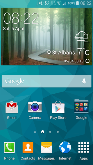
The lock screen is the first place to get an overhaul, with the weather and pedometer steps now part of the furniture. There's a camera swiper in the corner as well, allowing easy access to snapping without having to open the phone (although it's very hard to work out if this has been hit correctly or not). When it works, this is particularly helpful when you've got the fingerprint scanner as the lock.
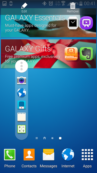
But for some reason, which the company has never quite bothered to explain, the bottom dock of apps – the caller, contacts, messages, internet and apps icons – are all locked for Australian handsets.
This frustration is made worse by the fact that it's not the same case for international versions of the handset.
So instead of being able to do simple things, like replace the default browser icon with Chrome, or bring in a frequently used app like Facebook or Twitter for example, you quite simply can't do it without rooting the device, or installing a completely different Launcher.
Given the dialer and contacts icons essentially launch the same app, it's just a stupidly poor design decision on Samsung's part that, frankly, isn't good enough for a fifth generation device.
Customising the homepage is also an exercise in frustration compared to pretty much every other phone on the market.
Generally, you would expect that a long press on an app or widget would allow you to customise the layout of your handset. But not so with Samsung, which instead pops up a window to tell you to press the edit button to customise your device.
So in other words, it knows what you want to do, but instead of letting you do it, tells you to do it a different, less intuitive way.
What's worse is that this is entirely Samsung's doing – the Korean company has decided to overrule Android's native customisation options and implement its own, unintuitive method. Sure, you can do it, and it's not too hard, but it's so frustrating.
It's not all frustration though. One of the best parts of the new homescreen is the increased snappiness in Touchwiz - I've never been one to really notice the lag in an interface, more preferring a stable feel under the finger, but those that tried the S5 said that it was speedier.
The animation transitions between homescreens is a little slow still, as the pages stack on top of one another, but it's a negligible wait.
The notifications area is one of the places that have been tweaked quite heavily, as it's now got that circular font that I mentioned, and looks a lot nicer.
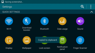
The settings menu is the same, and has been divided up into better sections to get to where you want more easily, although this does take some getting used to if you're already familiar with Android.
Samsung has clearly noted the trend towards news aggregation on other handsets and has continued its own integration with Flipboard with 'My Magazine', which lives to the left of the main home screen.
It's basically taking the Flipboard topics and methods of integration and showing them in categories - and it's really not a great implementation at all.
Once you've opened it up, you're asked to choose topics that might interest you... but what is 'New and Noteworthy'? Which 'Sports' are being covered? There's no way to drill down, and instantly I'm greeted with a glut of content I don't care about.
If you drill in a little further, you'll confusingly find that Flipboard's Magazine interface is right there under the surface, allowing you to set custom feeds etc - and it's much better.
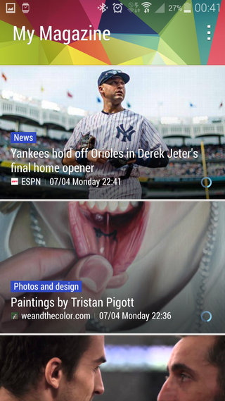
Samsung has really confused things here, and My Magazine needs an awful, awful lot of work to be considered a plus point - or let me turn it off.
It's a shame, as news aggregation from most parties isn't great or intuitive enough yet - but I can see a time in the not-too-distant future where it does find content I care about, so it would have been nice to see Samsung push that message on.
But that's not to say Samsung doesn't have some other new features to like: for instance, the Toolbox icon, which is a little floating circle on your front screen, allows you to choose five applications that can be accessed by tapping wherever you are in the phone.
I didn't want this activated all the time, but you can see situations where you need quick access in and out of things like the calculator or voice recorder, and this is a great way to offer such a thing.
Multi-Window still is kicking around, but I'd suggest you turn it off generally in the options. The reason is that if you're trying to watch a video, the main app won't let you... you can only have some of the videos previewed and the one you're trying to watch taking up the other half of the screen.
The same trick is repeated through the internet browser and apps, and is really rather annoying when you don't want it.
Overall, I'm a bit confused about the interface of the Galaxy S5. The power is there: a 2.5GHz CPU from the excellent Qualcomm 801 chip should be market leading, and yet I found a lot of slowdown in places.
The camera takes an age to start up, playing a graphically intensive game like Real Racing 3 has a slower frame rate when many cars are in shot (although a reboot did reduce this problem somewhat) and opening the gallery when you've got cloud storage activated takes a long time too.
This smacks of Samsung not having optimised its software for these areas, as oddly things like RR3 will actually warm up as the game goes on, which hints of a phone that can't rouse itself from sleep mode effectively.
This confusion is compounded by the fact that in the GeekBench 3 tests, the phone manages to get a respectable 2909, which is slightly better than the HTC One M8. It should be noted that the HTC has admitted to adding in a 'High Power Mode' that will allow these apps to get the best out of the performance, a practice Samsung has said it has ceased.
There was very little to choose between these two phones in terms of general speed, but that issue with the slowdown in gaming was odd. The gallery speed has been a problem for Samsung over a number of models, so I doubt that's going to change - but for a phone that's meant to have a speedy camera I hope things get altered soon.
I wanted to put out a special mention of the storage, given Samsung came under such fire for the weight of its OS with the Samsung Galaxy S4. Of the 16GB of internal space, you get to use over 11GB, which is comparable with the best on the market having been the worst.
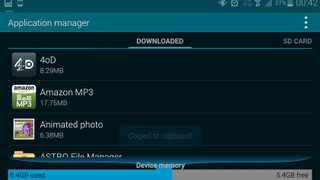
This is slightly helped by the fact Samsung has stripped out some of the less essential apps and made them available instantly for download from its own app store – meaning you've got more control over the internal space.
