TechRadar Verdict
Pros
- +
Good battery life
- +
Waterproof
- +
Some clever Sony additions
Cons
- -
Loads of Sony bloatware
- -
Disappointing indoor photos
- -
Erratic screen technology
Why you can trust TechRadar
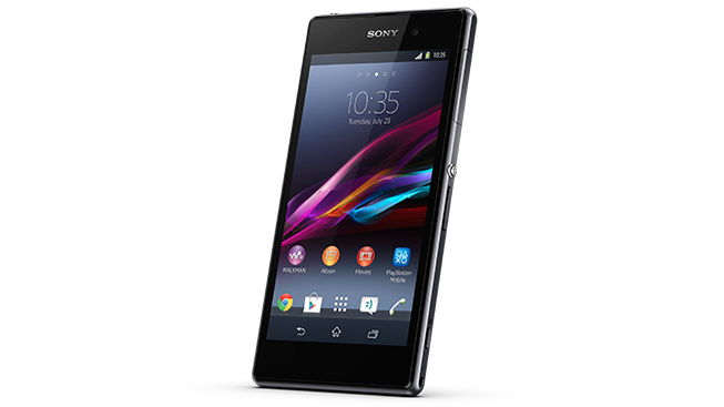
Sony was the first of the big-name manufacturers to launch a new 2013 flagship smartphone back in March, with the Sony Xperia Z, a 5-inch model outwardly rather similar to the new Sony Xperia Z1.
The Xperia Z beat the HTC One and Samsung Galaxy S4 to market, offering a quad-core processor, 1080p display, 13 megapixel camera, 2GB of RAM, and water and dust resistance. It was awesome. And still is, seeing as so little time has passed since it arrived.
But now there's a new Sony flagship for the spring/summer season, in the large, glossy shape of the Xperia Z1. There's a more powerful processor inside, a higher-spec camera and a new metal chassis, but it's still recognisably related to the older Z, both in design terms and the software it runs.
It's a premium model too, with the Z1 currently being sold direct from Sony for a stonking great $779 in Australia, the price you pay for a metallic, 5-inch machine, powered by what's generally agreed to be the fastest and most capable mobile processor available today. Given the Xperia Z's only seven months old and was no slouch, is there really a need for the Z1 upgrade so soon after?
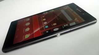
As with the Xperia Z, the Z1's 5-inch screen displays at full HD 1920 x 1080 resolution. The key upgrades here are hidden inside, with the Z1 powered by a faster Qualcomm Snapdragon 800 chipset clocked at 2.2GHz and backed up by the same 2GB of working RAM as the Z, plus an upgraded aluminium chassis that rounds off the sharp edges of the Z in favour of a gentler, colder, metallic feel. The headline feature is the 20.7 megapixel camera sensor, on paper a vast upgrade over the 13MP unit inside the older Z.
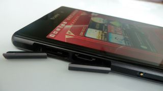
As with the Xperia Z, the Z1 is certified to IP standards for dust and water resistance, so ought to be 100 per cent impervious to the more mundane threat of pocket fluff. Indeed, the phone's ports – microSD, USB and micro-SIM – are all hidden behind rubber stoppers, to keep water, dust and fluff at bay. The Z1's 3.5mm headphone jack is open to the elements on the top-left corner of the phone, so Sony's done a bit of useful work here to waterproof that and do away with the rubber stopper.
We thought the addition of a flap over the USB connector would be a textbook first-world problem causing frustration on a daily basis, but no. It pops out easily. It pops back in easily. It's a second and a half worth investing each day in return for a fully waterproof phone.
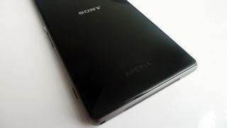
Holding the Sony Xperia Z1 is a treat to the senses too, as the Z1 features a full glass exterior as well as a smooth, featureless and button-free front. The back's so shiny you could mistake it for a display, albeit a broken display that's stuck showing the Sony logo in the middle.
Sony's designers have ensured that the Z1's plastic sides extend by a fraction of a millimetre over the phone's glassy rear. This acts as a shock absorber and means the glass should be protected from casual tosses onto hard surfaces - although we've scratched the back a little already. But that was probably from chucking it in the sea to check its water resistance, so we have only ourselves to blame.
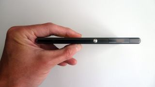
It feels big and wide, although thanks to also being rather tall as well it manages to balance pretty nicely in the hand. It's also cool to the touch, with the aluminium sides giving your hand the odd chill when it's been out on a table for a while.
Sony's also stuck with its idea of putting the power button on the side of the phone a little above the middle, meaning it's easy to find and naturally appears where your fingers tend to sit when holding a phone of this size.
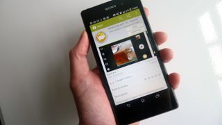
But being so slim and smooth has you worrying. Putting it in a pocket makes you stress that it's so slick it's surely only a matter of time before it somehow works itself up and out onto the floor. But that's not happened to us yet. We are probably just worrying too much. It encourages you to worry, as it's such a large lump of a phone you're always aware of its presence.
Thanks to the positioning of the power button it is just about possible to use the Xperia Z1 in one hand. It's not entirely comfortable to hold, though, as the angular slab design and glass back has you panicking that it's a very droppable item. Your fingers end up seeking out the docking port as the only gripping spot, as that's the only feature on the left-hand side of the Z1 that isn't completely smooth and flush.
The front... no, wait, this is the back. The back looks like the front. It's all glass and smooth, although we suspect it's not made from stuff as tough as that which covers the front, as a fair few tiny scratches have developed in a little over a week of use.
The right-hand edge features the microSIM card tray - which can be pulled out with a fingernail - power button, volume up/down toggle and the camera shutter button, the latter of which can be used to open up the camera by holding it down for a second or so.
The SIM tray is peculiar, housing an impossibly flimsy piece of plastic that's used to insert the SIM, which is so thin it's bordering on paper-like. If you're a regular SIM-swapper it'll be a nightmare, as this teeny holder is definitely one of the few weak spots in the Z1's design.
The left-hand side has the microSD slot and USB connectors, which sit above the docking station pins, while the bottom edge is all speaker grill. It's not the best place for a speaker as, what with this being such a huge phone, you often end up supporting it with a finger or thumb while using it - blocking or at least changing the level of the audio when simply adjusting your grip. Not a massive flaw, but a minor annoyance all the same.
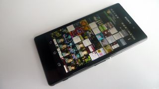
The bottom of the display is allocated for Android's software buttons, which are presented here in standard Back, Home and the Recent Apps multitasking button. There's enough chin beneath the display to ensure these software buttons aren't too low down the Z1's body, again helping to make one-handed use a little easier. No mean feat when dealing with a 5-inch monster.
