TechRadar Verdict
Sony's new small form phone is the hidden gem of the Xperia Z5 range - it's just a shame there isn't a Full HD screen.
Pros
- +
Compact design
- +
Impressive camera
- +
Long lasting battery
Cons
- -
Still a 720p screen
- -
No wireless charging
Why you can trust TechRadar
Update: It's now quite difficult to find the Sony Xperia Z5 Compact on sale because the company is focusing its small phone attention on the newer Xperia X Compact. If you're after a smaller phone from Sony, be sure to check that more recent device out.
The Xperia Z5 Compact stands alone: Sony is the only Android manufacturer making a small high-end phone right now.
Like the Xperia Z3 Compact before it, the Xperia Z5 Compact puts an impressive array of features comfortably into the palm of your hand, and makes you wonder why no other brands are interested in this niche.
Not everyone wants a giant phone, and who could be blamed for wanting to use their whole screen without needing both hands?
The Xperia Z5 Compact sits alongside two other phones from Sony. There's the Sony Xperia Z5, which offers a 5.2-inch 1,080p screen and 3GB of RAM that you don't get here. Then there's the Xperia Z5 Premium, which will be here in November with a 5.5-inch screen and a 4K resolution screen.
These have since been superseded by Sony's new X line of handsets, including the Sony Xperia X Compact - although it fails to hit the same heights as the Z5 Compact.
Sony Xperia Z5 Compact price
- Price has dropped since launch to £350, $400 (around AU$580)
Weight: 138g
Dimensions: 127 x 65 x 8.9mm
OS: Android 5.1.1 (upgrades to Android 6)
Screen size: 4.6-inch
Resolution: 720 x 1280
CPU: Snapdragon 810
RAM: 2GB
Storage: 32GB
Battery: 2,700mAh
Rear camera: 23MP
Front camera: 5.1MP
One early problem was the Sony Xperia Z5 Compact price. High-end specs require a high-end price, even if the reduced frame might lead purchasers to expect a bargain.
At launch the Xperia Z5 Compact price was £429 in the UK (about AU$710) – but since launch that's dropped and it can now be picked up SIM-free for as little as £350 (around AU$580).
Meanwhile, in the US the Z5 Compact unlocked now retails for $400 - down from $500 at launch. It's not available via popular US carrier subsidies, which will blunt its success.
It's now quite difficult to find a store selling the Xperia Z5 Compact, but the price may be even lower if you do find a retailer stocking the aging phone. If you can't find this phone, we'd recommend checking out our guide to the best compact phones out right now.
Design
- Traditional Xperia styling at a palm-friendly size
- Frosted glass rear provides premium appeal
The Xperia Z5 Compact follows closely the excellent design established by the Xperia Z5. It isn't drastically smaller than the Z5 – the Compact is 127 x 65 x 8.9mm, compared to 146 x 72 x 7.3mm. But it's enough to make a difference.
The Xperia Z5 Compact has lost a lot of the bezel space that felt so redundant on the Z5, and feels a lot more concise than its bigger sibling.
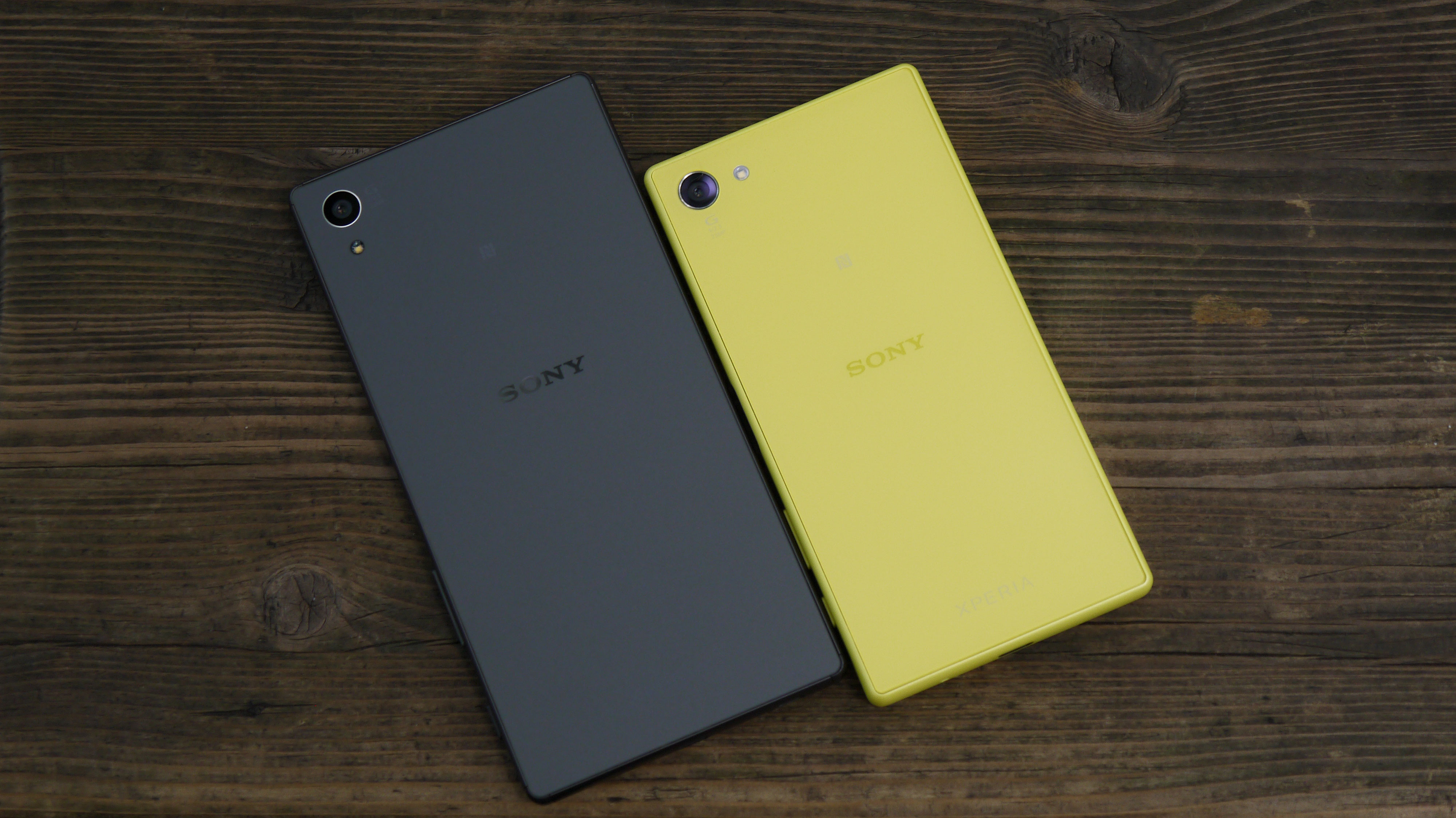
You might have noticed that the Z5 Compact is actually bigger than the Z5 in one dimension: it's a little thicker.
That's to fit in all those high-end specs and a bigger battery than the larger phone. I barely noticed the difference in thickness until I put them next to each other, and even then it wasn't all that shocking.
The Sony Xperia Z5 Compact weighs in at 138g, 16g lighter than the Z5. Build wise, it's a similar size and weight to the iPhone 6S.
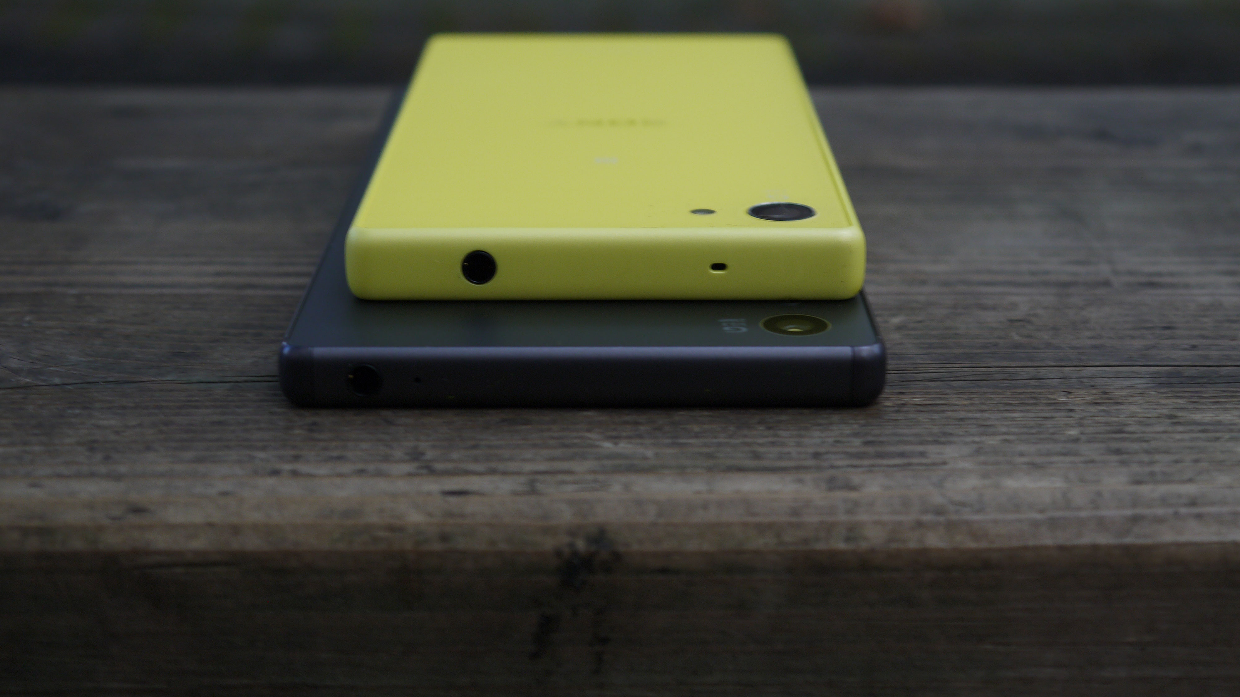
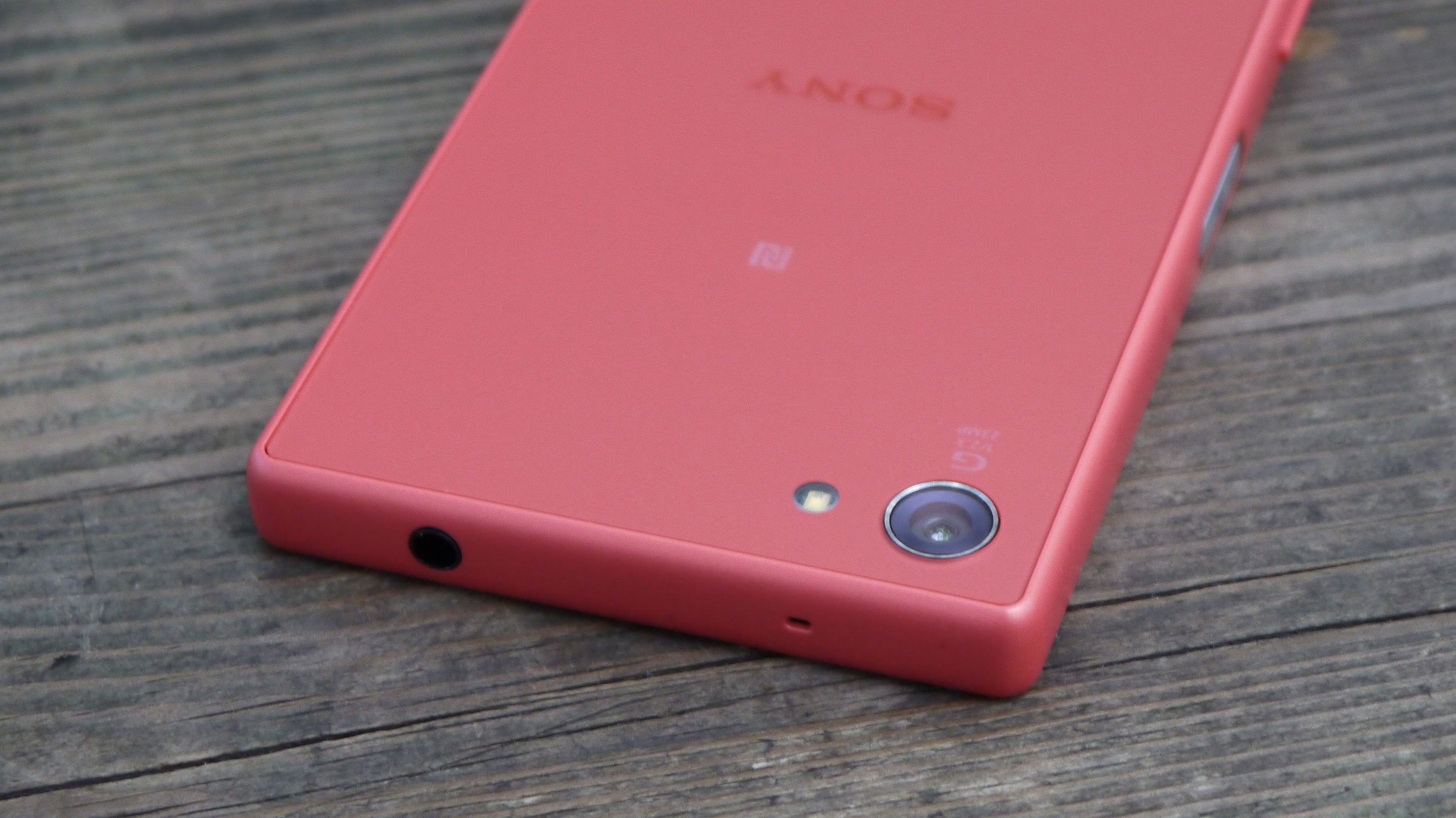
The back panel is much nicer on this new version of the Compact model. Instead of the clear glass back from previous handsets, it's now a frosted glass that feels good against the palm and looks stylish.
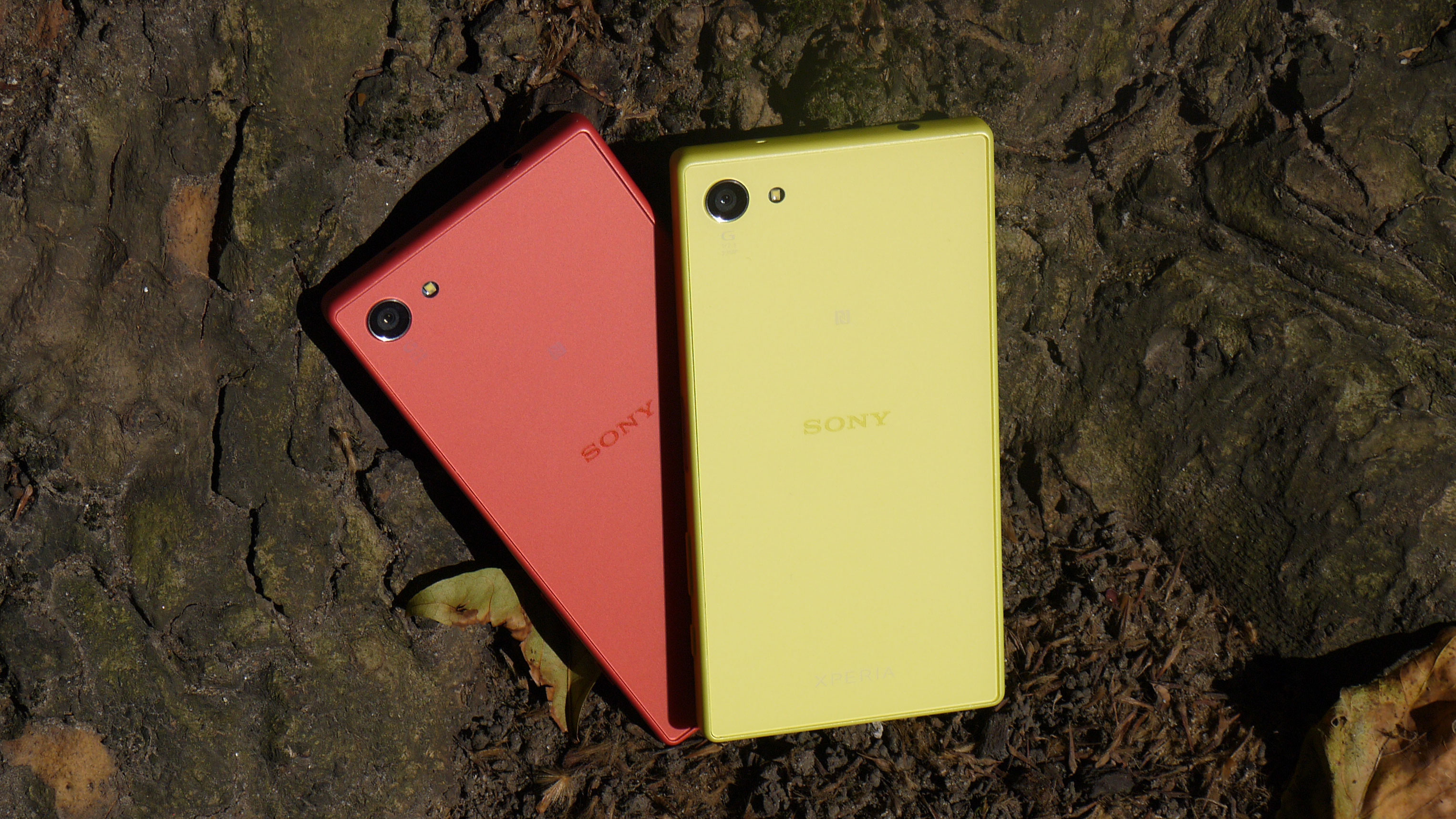
Colour options are white, black, yellow or coral – I was able to use all versions but the white for this review. The black version feels the most stylish, while the yellow and coral are particularly bright. They wouldn't be my choice of phone, but for those who liked the colour-pop aesthetic of the iPhone 5C, they're perfect.
The corners have been rounded off even further on the Xperia Z5 Compact than on the Z3 Compact, making it a much more comfortable fit in the hand.
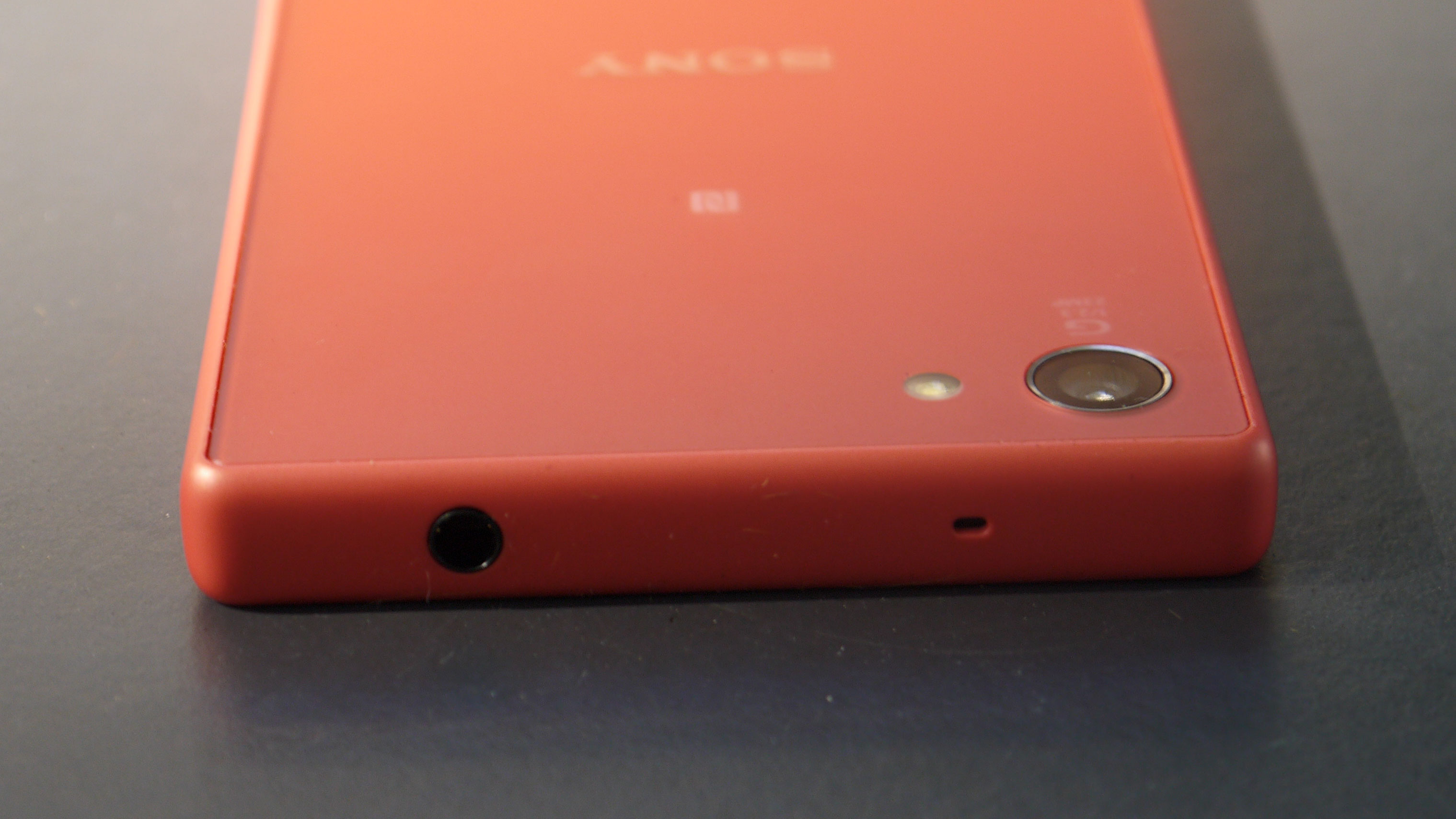
The anti-break bumpers of the Xperia Z5 aren't included here, so the Compact is more likely to shatter if it falls on one of the four corners. It's unclear why Sony made this decision – they would have been easy to implement, and would make a big difference to the durability of the phone.
At the top of the left hand edge of the phone, there's the indented Xperia logo, which actually looks good this time around. On the bottom of that edge is the only flap on the handset, covering the microSD and nanoSIM slot.
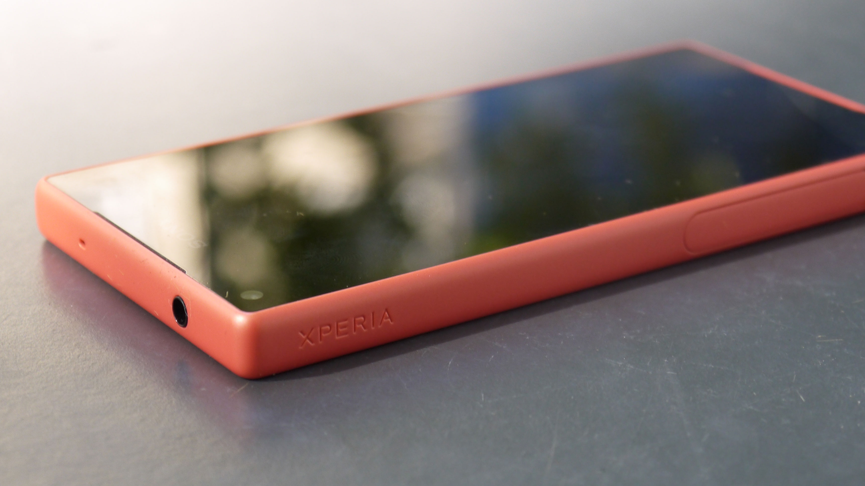
It's easier to open this up than it has been on previous Xperia phones, and as you'll only need to on the rare occasions that you're swapping a SIM or microSD.
In the centre of the bottom edge sits the micro USB port for charging and data transfer. It's a shame that Sony hasn't moved on to USB-C to minimise fumbling when plugging in, but at least the inconvenience of the flap has been removed.
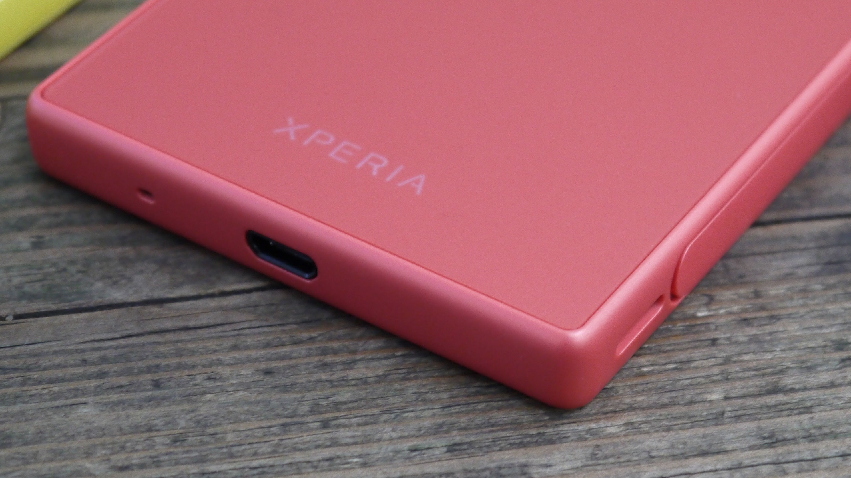
And Sony isn't behind the pack on USB standards, even if it would have been nice for it to get ahead. In a few years, smartphones will have moved on and USB-C will become the norm, but for now most still use micro USB.
The 3.5mm headphone jack sits at the top of the phone on the left hand side, which is the best place for it as it means the phone can sit in your pocket while you use a wired headset
At the bottom of the right hand edge is the camera button, in the perfect position for taking landscape shots. Just above that is the volume rocker, which has been moved since the Xperia Z3 Compact. This relocation is less successful, and some fumbling is required to reach down to it.
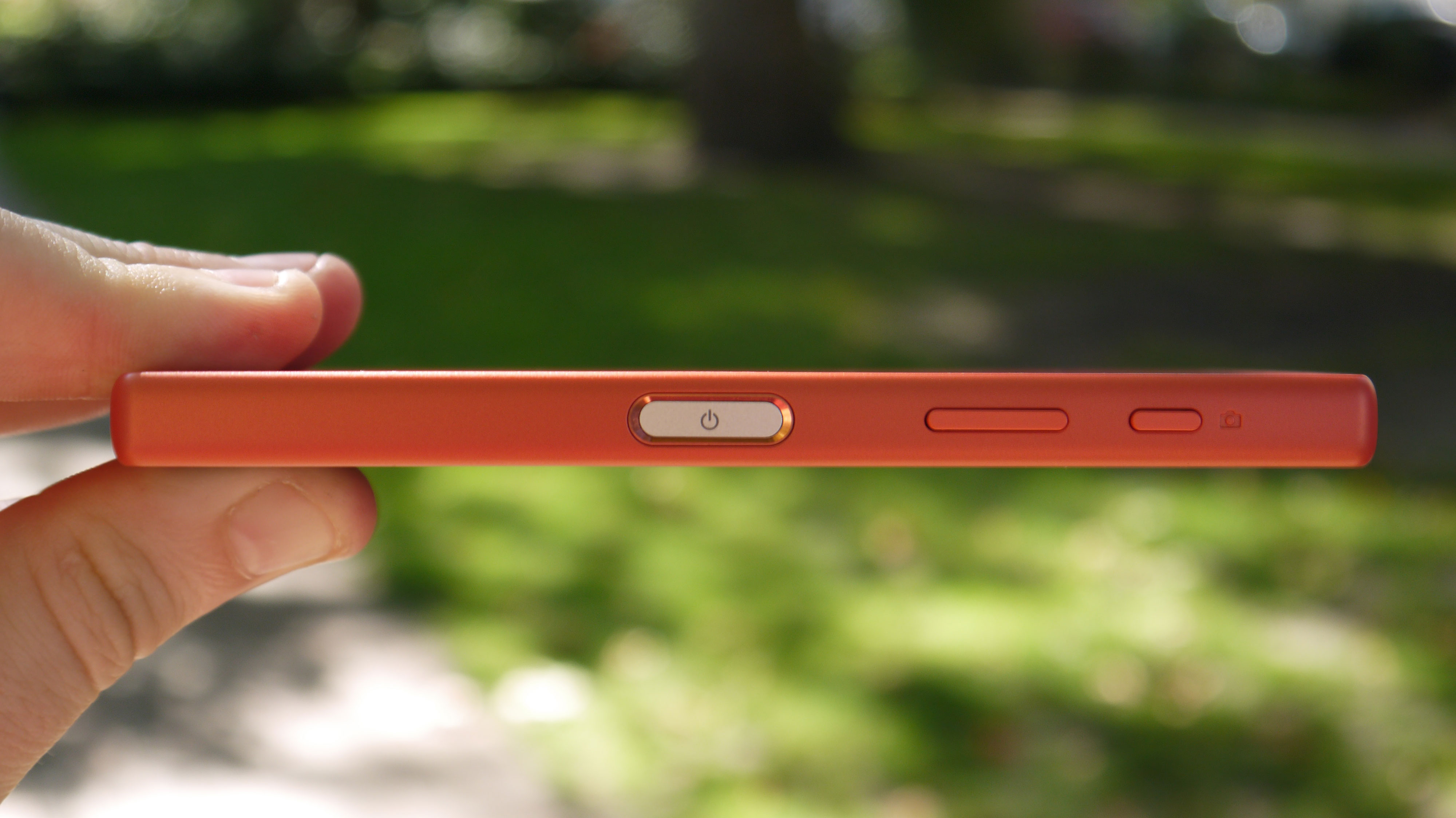
It would have been to put the volume rocker just above the power button on the same side, but at least it's not as bad as it is on the Xperia Z5. On the larger phone it's really hard to reach and the handset flips out of the hand easily.

The power button itself sits flush with the design. This is metal with the on/off symbol engraved on it. It looks good, but the exciting part is that this now features the fingerprint scanner – a new addition to the Xperia Z series, except in the hobbled US variant.
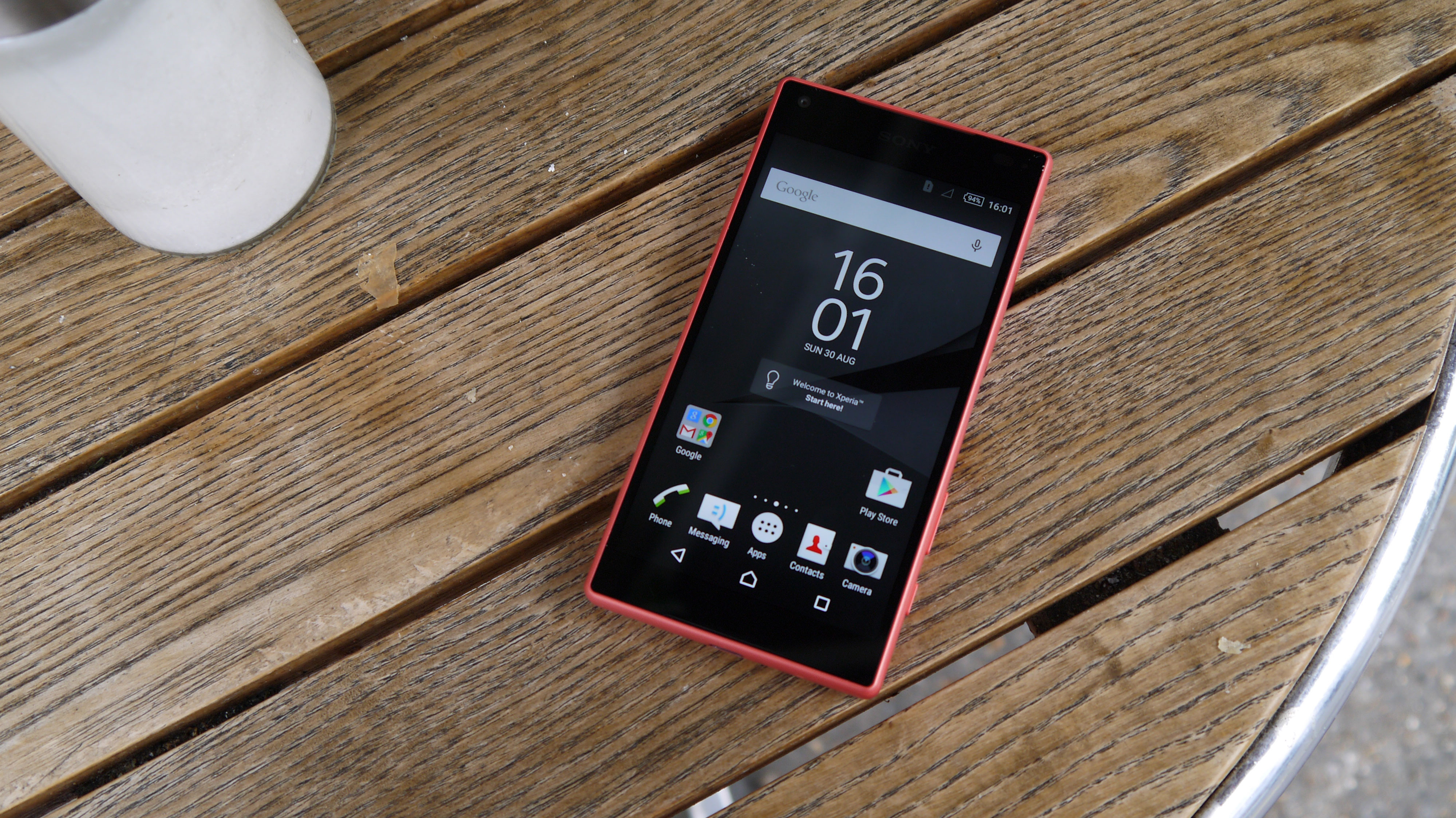
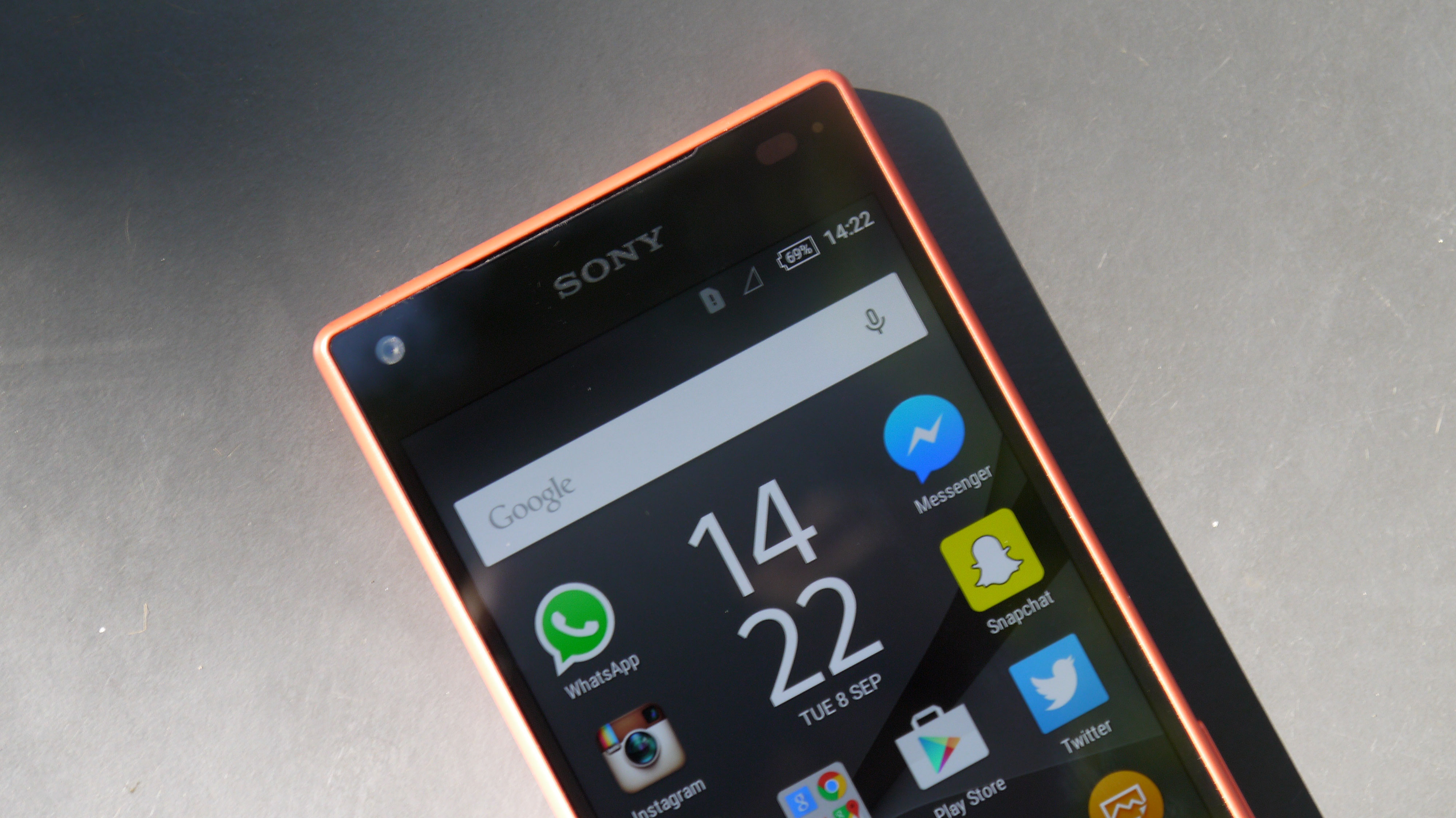
On the front of the phone, there are bezels above and below the display to house the front-facing speakers, microphone and front-facing camera. These are thinner on the Xperia Z5 Compact than on the Xperia Z5 and that means a better screen-to-body ratio.
James is the Editor-in-Chief at Android Police. Previously, he was Senior Phones Editor for TechRadar, and he has covered smartphones and the mobile space for the best part of a decade bringing you news on all the big announcements from top manufacturers making mobile phones and other portable gadgets. James is often testing out and reviewing the latest and greatest mobile phones, smartwatches, tablets, virtual reality headsets, fitness trackers and more. He once fell over.
