Sonos' new app is a smarter, slicker music center that's perfect for, say, a pair of headphones
All your audio in one smart home screen

Sign up for breaking news, reviews, opinion, top tech deals, and more.
You are now subscribed
Your newsletter sign-up was successful
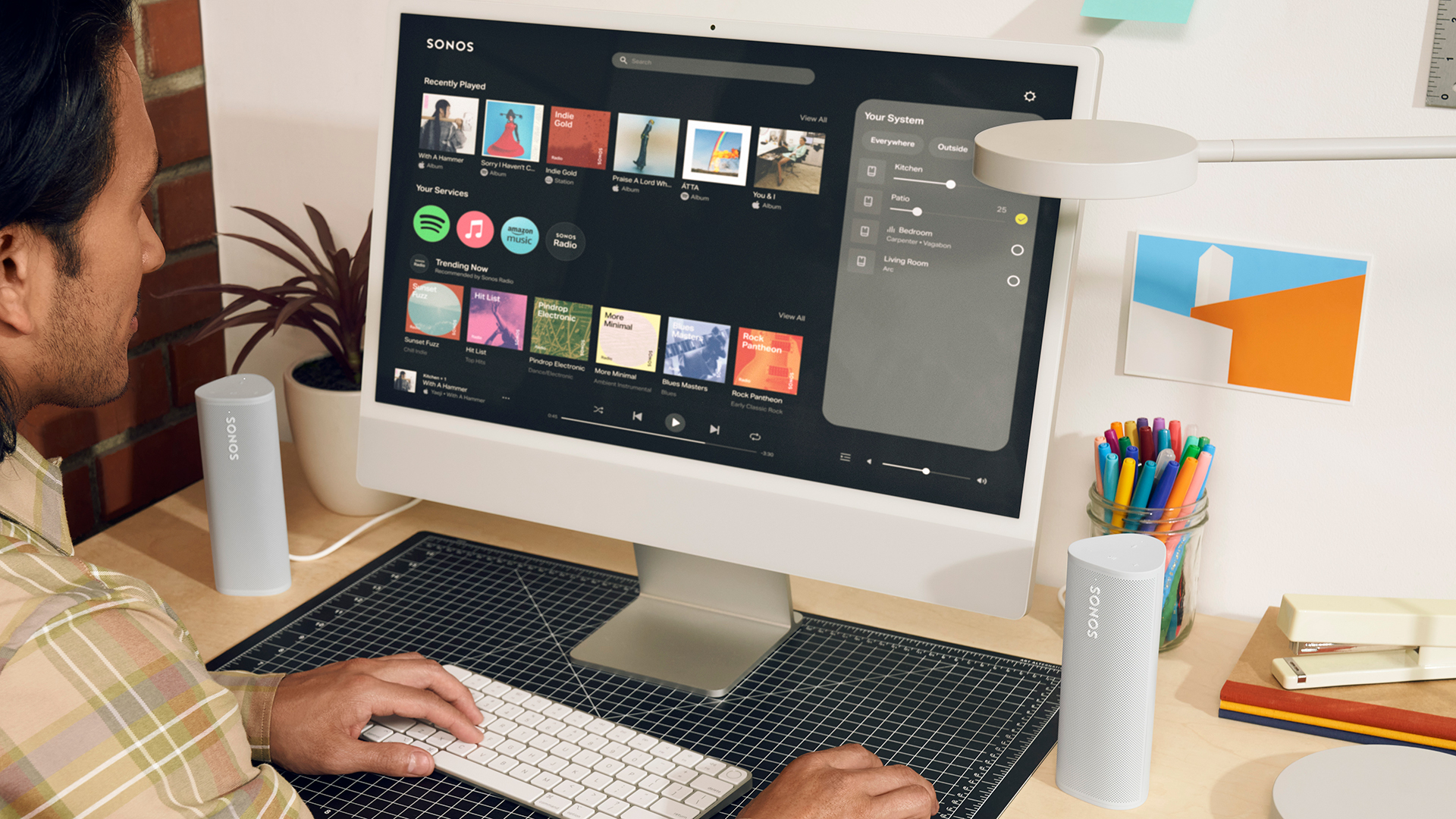
Sonos has unveiled a next-gen version of its app with a totally new look and functionality, which will launch worldwide on May 7, 2024, both as an update to its phone app and in a new web app you can use in any modern browser.
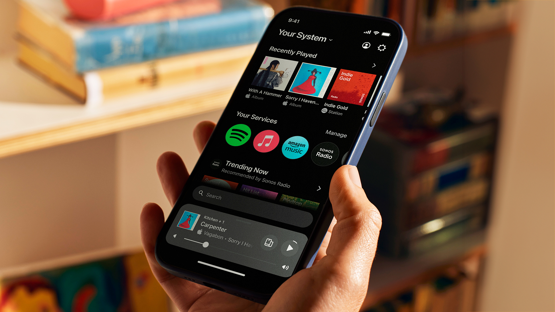
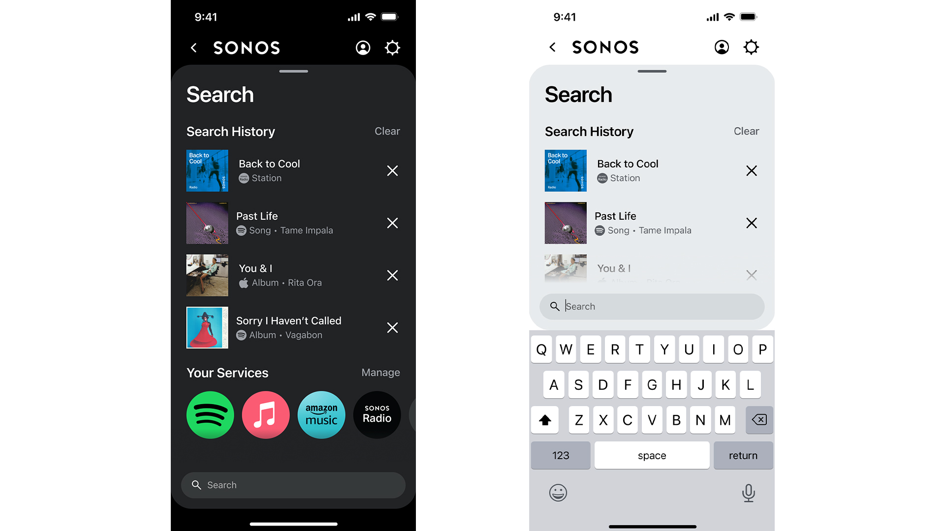
Naturally, the new Sonos app will make it easier to control the best Sonos speakers – but the goal for it is to become a single hub for all your listening needs. At the heart of it is a new home screen that brings together favorites and recommendations from any services you use (from over 100 supported by Sonos), as well as a universal search feature that enables you to instantly search your podcasts, audiobooks and music for any term.
I've seen the app in action, and it looks very much inspired by the smart TV software you get on the best TVs. Those are designed to pull in recently played items so that you can resume watching quickly, and to recommend movies and shows from the sea of options out there – and that's exactly what this will do, but for music. And just like all smart TV platforms these days (and similar to most music apps too, of course) it works through a series of sliding rows of options.
Article continues below 
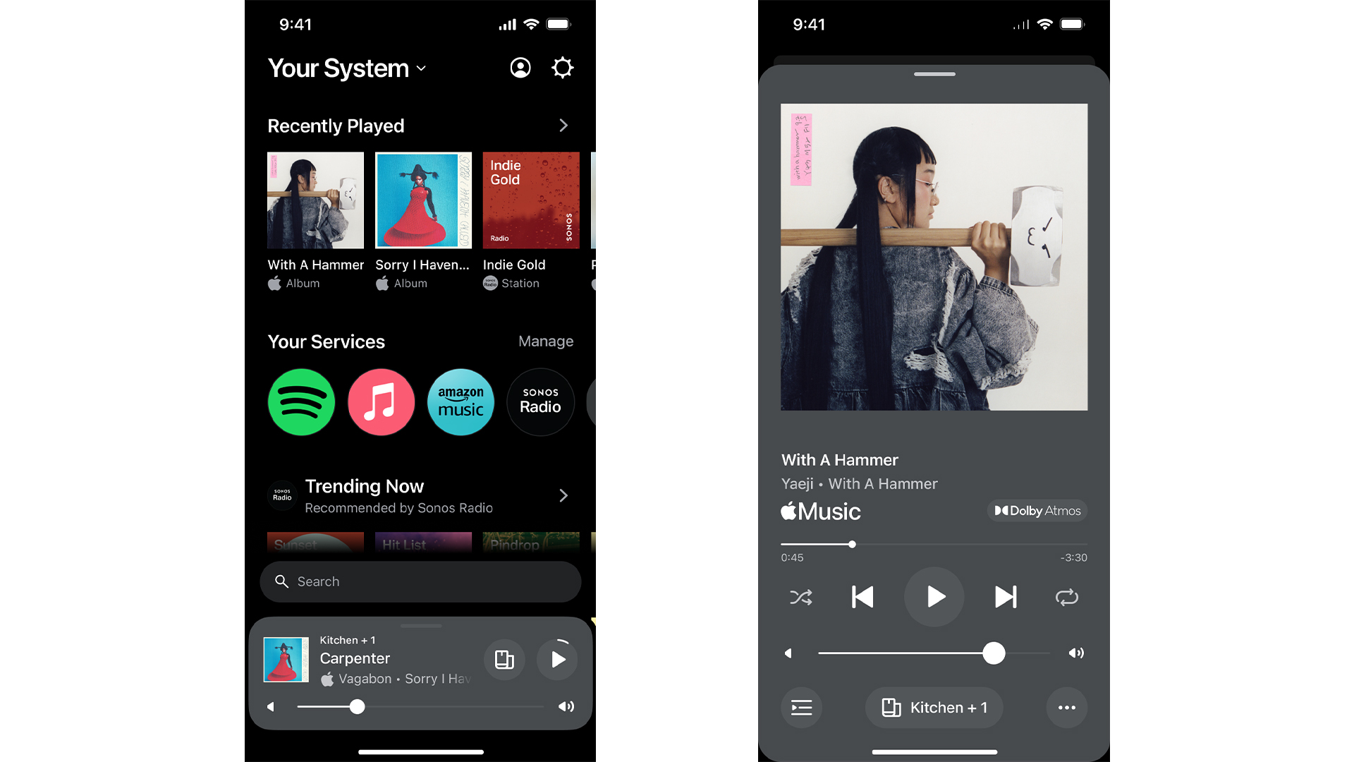
By default, what you'll see on the home screen is a Recently Played section at the top, a Your Sources section that includes line-in (or TV audio if you have a soundbar), a Your Services section that's basically a list of shortcuts to open different services and browse in them directly, and then a Favorites section. On top of this, services can offer their own rows to be added here beyond Favorites.
This is totally customizable, though – you can change the order, and add in particular types of Favorites or other ways to directly access music. What's on offer depends partly on what the services themselves offer for this home screen – pretty much anything can be added as a Favorite, but services can make other elements available to pin to the home screen, so for example Spotify could push personal suggestions straight there, or you could pin something like a 'More like Queen' recommendations list if you want a constant flow of that kind of music. Every user in your home gets their own home screen, and can customize it to make it specific to them.
The Recently Played section will include anything played on any Sonos speaker in the household, whether that's by you or anyone else – that's the one area where your kids' delightful musical tastes will bleed into your screen.
In the Favorites section, you can save artists, albums, playlists and songs, with little logos showing what service they're from. Browse to something you want in that service's section of the app, tap the three-buttons icon, hit Save To Sonos Favorites, now it's in the Faves.
Sign up for breaking news, reviews, opinion, top tech deals, and more.
To edit these options, there's an Edit Home button, and then you can re-order things, or remove optional things, such as your pinned recommendations. You just drag things up and down the list to change the order, like editing a playlist.
At the bottom of all this, but just above the new small 'Mini player' at the bottom is the Search bar. Tap in here and it'll show your recently searched options, or you can start typing to see results from every service you have connected.
You can set your 'preferred service' in the Settings, and this will always float to the top of search results, and will be first in the Your Services list. So, if you want Apple Music results 90% of the time, make that your preferences and the app will prioritize it over anything else.

Easier control
Just as important as all these changes to how you find music are updates to how you manage what's playing in the app. That includes multi-room management, as well as just quick play/pause options.
There's a smarter, simpler view of all your speakers, which you can access either by tapping the name of your system at the top-left of the Home screen, or by swiping up from the mini player at the bottom while anywhere in the app. This basically shows you a bunch of mini players, in which you can instantly start/stop the music of different speakers, or tap on one to go into it and choose new music. If you tap a symbol that looks like a couple of Sonos speakers you can can group speakers, or split them.
It's so much easier to parse than a lot of multi-room setups. It's very clear what's playing on different parts of your system, and what you should do to change things – it's just more intuitive.
If you want more control options for a speaker, when you tap on it you get a full-screen player, which includes shuffle, repeat and other options, including grouping options right there.

Analysis: it's got to make you want to use it
With the long-rumored Sonos headphones said to be set for a launch soon, this app redesign makes total sense. The existing Sonos app has all the functionality it needs, but it's the kind of app you only visit because you have to. The new app needs to be something you use because it works well if it's going to power a pair of headphones.
It's important that the new app is slicker, because the existing app has never been in competition with anything – if you have Sonos speakers and you want to play music on them, you have to use it. Sure, the experience should be pleasant and reliable, but ultimately it just had to work.
But when it comes to headphones, the Sonos app is now in competition with the convenience of just using Bluetooth directly. The alternative is to simply not use an app at all. So Sonos has to provide a better experience than not using a hub app – one that makes you want to spend your audio time there to get the most out of Sonos’ headphones – and it appears that Sonos is betting on the ability to search multiple services, and bring your podcasts, audiobooks and music all together for really easy access, as the way to provide that experience.
While I've seen this app being used, I haven't used it myself, so until I can do that I'll have to reserve judgment on whether it really works as a hub that I'm happy to rely on – but I like the principle of the idea a lot. Having instant playback of my favorite podcasts next to quick access to my personalized music streaming recommendations seems nice, regardless of the Sonos-ness of it all.
Of course, outside of unreleased headphones products that remain theoretical for now, the update is still very welcome, especially for users of the best Android phones. For iPhone users, the Apple AirPlay support in Sonos products means it's super-easy to send audio to them from whatever app you like – it's already pretty slick. But it's not the same on Android, as there's no Chromecast support on Sonos speakers, and this app looks like it'll make using Sonos a lot more inviting on Android.
You might also like

Matt is TechRadar's Managing Editor for Entertainment, meaning he's in charge of persuading our team of writers and reviewers to watch the latest TV shows and movies on gorgeous TVs and listen to fantastic speakers and headphones. It's a tough task, as you can imagine. Matt has over a decade of experience in tech publishing, and previously ran the TV & audio coverage for our colleagues at T3.com, and before that he edited T3 magazine. During his career, he's also contributed to places as varied as Creative Bloq, PC Gamer, PetsRadar, MacLife, and Edge. TV and movie nerdism is his speciality, and he goes to the cinema three times a week. He's always happy to explain the virtues of Dolby Vision over a drink, but he might need to use props, like he's explaining the offside rule.