macOS Sonoma is better without being hugely different and I'm here for it
Hands-on with all the best changes
Sign up for breaking news, reviews, opinion, top tech deals, and more.
You are now subscribed
Your newsletter sign-up was successful
Apple’s macOS Sonoma is the kind of platform update I like: Keep most things unchanged but sprinkle the entire system with fresh, fun, and especially useful enhancements.
For me, the best of them fall into three key areas:
- Desktop management
- Browser enhancements
- Video conferencing
I know the last one seems rather specific but if you spend as much time as I do on video calls, you’ll appreciate Sonoma’s new video software-agnostic updates.
Article continues belowNot every Mac owner can enjoy every update. There are a handful of changes that won’t work without Apple Silicon. This may frustrate those still running Intel Macs or maybe, as I’m sure Apple hopes, it will prompt them to finally update to one of the new best Macs running Apple Silicon (gotta say I recommend them).
I’ll highlight what doesn’t work for all but for now, let’s start with the desktop.
A more useful and beautiful desktop
Apple brought back the screen saver. We don’t really need screen savers anymore because modern screen technology isn’t as susceptible to screen burn-in. On the other hand, our lives are filled with gorgeous big screens that look sad and dull when we’re not working or enjoying content on them.
In much the same way Apple TV brought mesmerizing screen savers to your Apple TV-connected HDTVs (all those flyovers where you play the game, “What city is that?”), macOS Sonoma is bringing them to your desktop. Sadly, there are no Flying Toasters in sight.
Sign up for breaking news, reviews, opinion, top tech deals, and more.
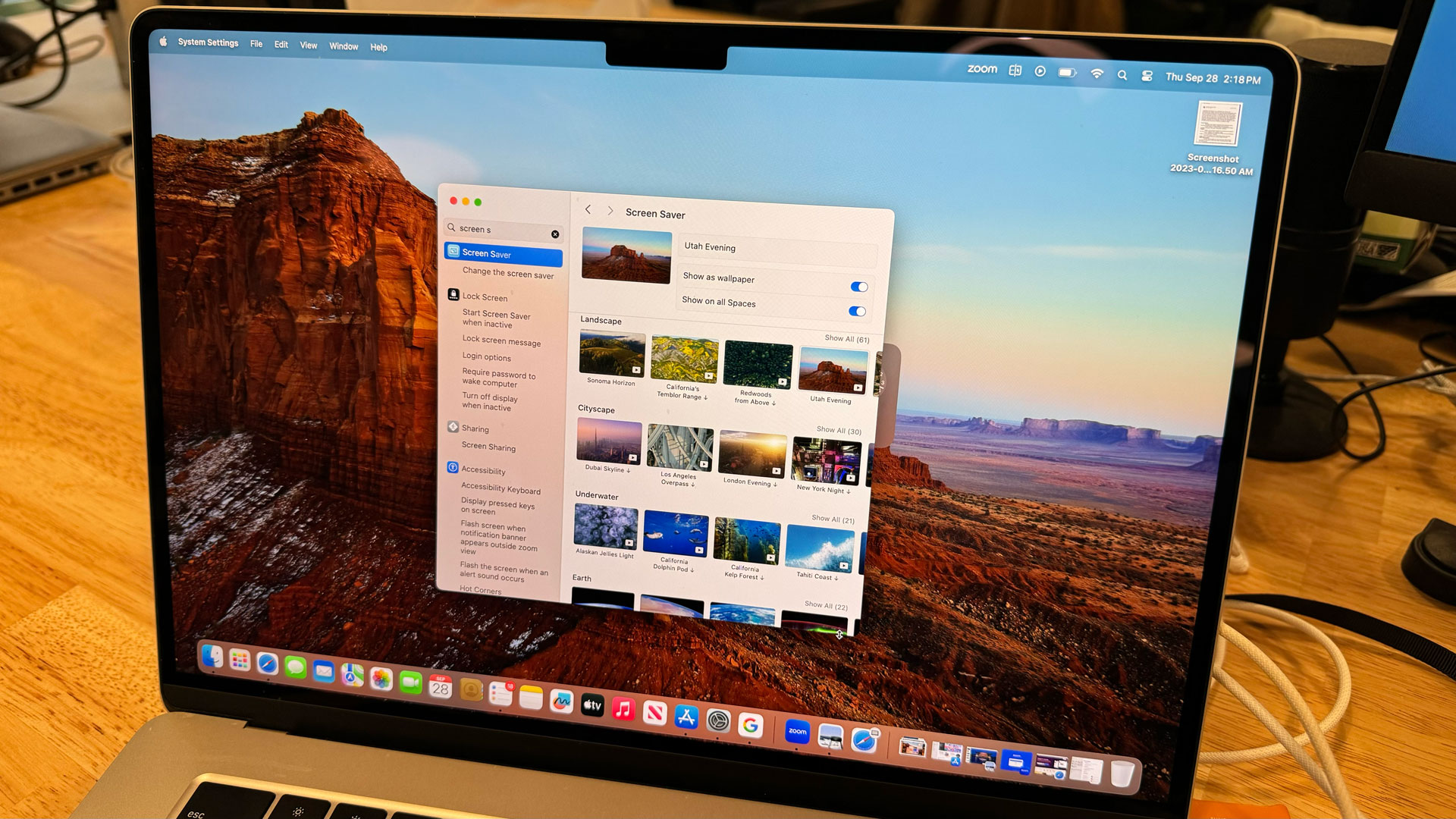
The new collection of downloadable screen savers combines some classics from Apple TV with a bunch of new options that include underwater seascapes and a new Sonoma collection, which is specific to macOS Sonoma. It has some gorgeous flyovers of, obviously, Sonoma, California.
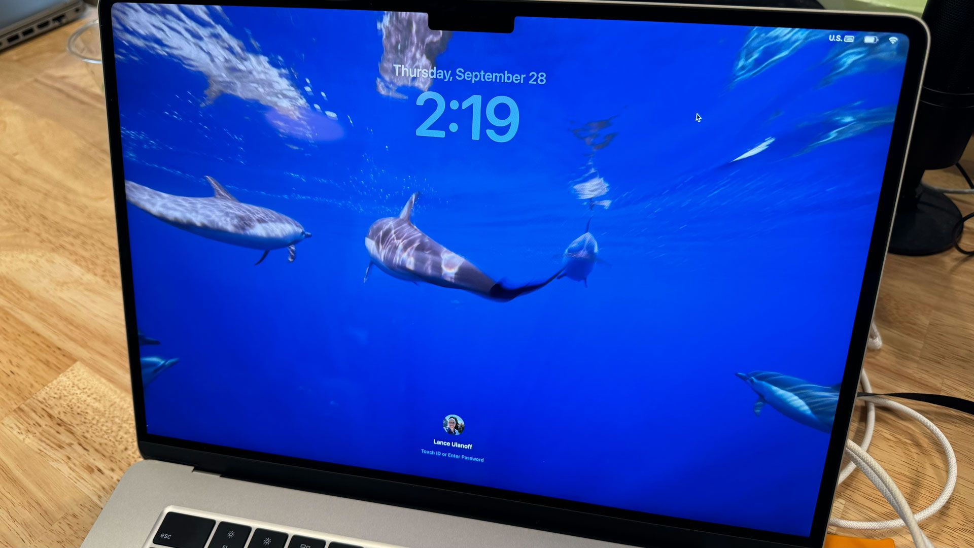
You can choose from a varied library that runs from looping landscape and nature videos (dolphins from California and Costa Rica) to more graphical treatments. I chose one from the Sonoma collection. You can set it as your default background for the desktop or to only run when the system is in sleep mode. In the former, the screen saver freezes on the most recent video frame and uses that as the desktop background.
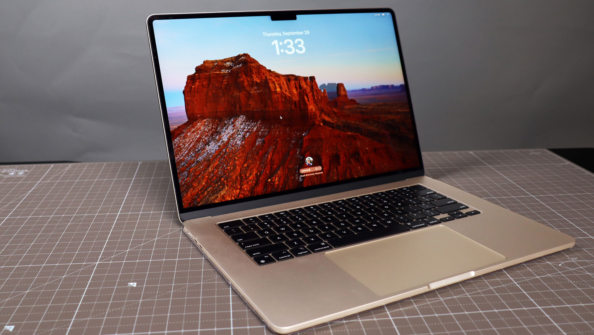
It’s a nice use for my M2 MacBook Air 15-inch's lovely liquid retina display. However, the screen saver alone is not the only difference. With Apple’s eye toward aesthetic appeal, it naturally decided to move the system login, which used to sit dead center on the screen, to the bottom of the display. Since I log in with either my best Apple Watch or a fingerprint, this doesn’t bother me. Traditionalists may wonder for a second where the login went.
At the top now is the date and the much larger time. It’s essentially a duplicate of what you see on your iOS 16 and iOS 17 iPhone.
I like the new look and am just as entranced by these new macOS Sonoma screen savers as I was by the ones on tvOS.
The more substantive desktop change is widgets. macOS has had widgets for a long time but Sonoma finally lets you move them from their hidden space off to the right of the visible desktop to the main space on your desktop.
If you’ve never used macOS widgets before (or like me almost never used them), they are accessed by clicking on the time in the upper right-hand corner. With Sonoma, though, you can finally drag and drop widgets from that tray onto the desktop. I pulled a bunch and placed them wherever I wanted. There are little visual guides that pop up to help you position each one in what might be a more organized fashion, but you can also ignore that guidance.
There are a lot more widgets available than you’ll find initially in the widget tray. I right-clicked on the desktop to access the Widget Editor where I found dozens of widget options. I selected Reminders and then dragged and dropped the largest one (you can choose from a few different sizes) on my screen. Every widget, by the way, is interactive so you can click on them and take action.
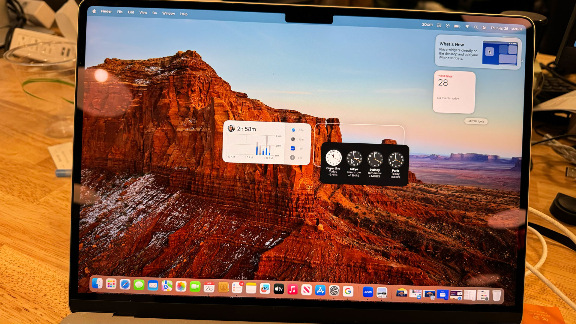
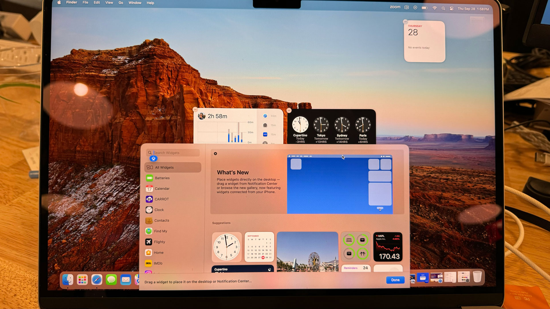
Yes, you can fill your screen with widgets and if you have lots of app and doc icons all over your desktop, they’ll move around to accommodate the new widgets. My suggestion, though, is to use macOS’s stacking capability to clean up your desktop before dragging on any widgets.
I worried that these widgets might make my desktop overly busy but when you shift focus to an app or multiple open windows, they fade to a uniformly muted color based on your current desktop background. So, all the widgets on my desktop are now a reddish Sonoma hue.
I’m intrigued by Apple’s decision to open widgets up to iOS apps or more specifically connection to iOS apps you have installed on your iPhone. As long as both devices are on the same iCloud account, you can open a widget for an iOS app like Kahoot! quiz app and even interact with it – in a limited fashion – on the Sonoma desktop. It’s a nice continuity-style feature, though I don’t know how often I’ll use it.
Will this be the update that finally makes desktop widgets a real thing on macOS? It’s certainly an improvement (to be fair, Windows 11 has done an equally abysmal job of inspiring people to use their hidden widgets).
A new kind of Safari
To be honest, I don’t use Safari very much on my Mac. So much of what I do is through Chrome so it’s just easier to live there instead. Even so, I like much of the work Apple’s done with Safari, though I do have notes about a few changes that jump out at me.
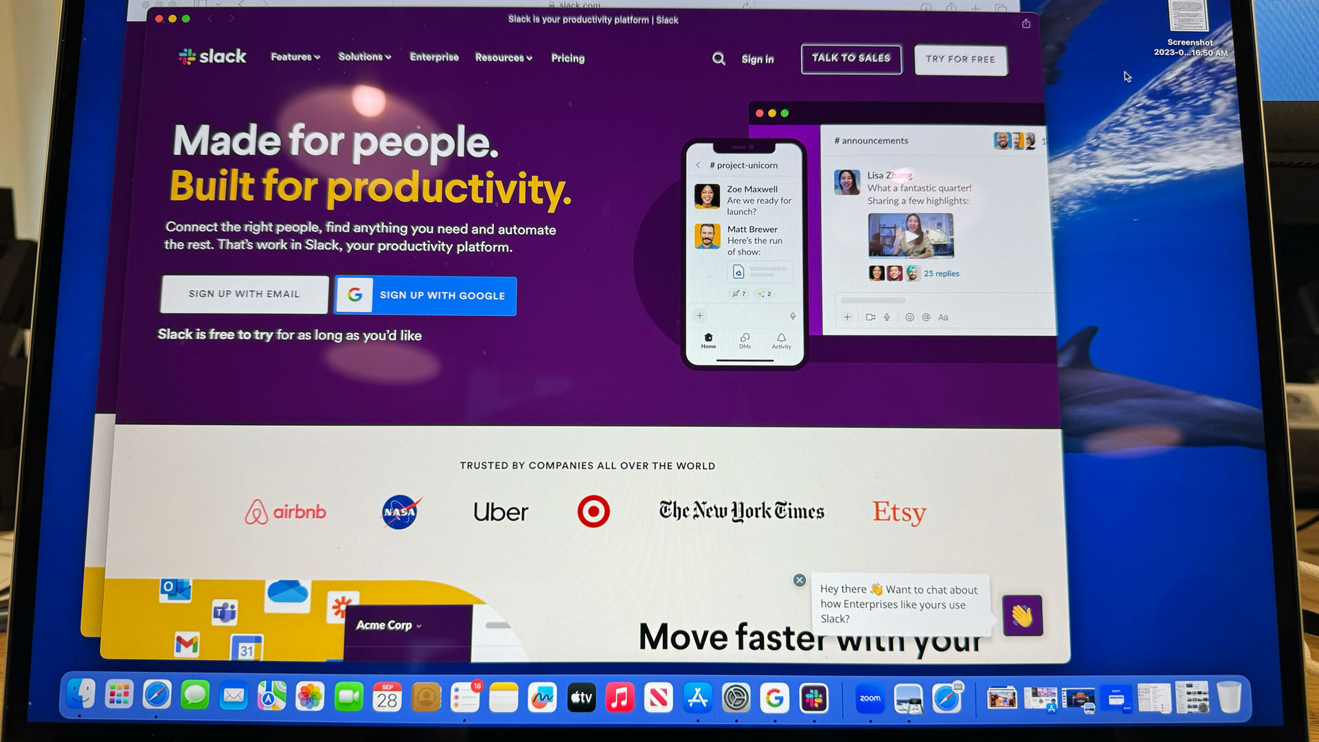
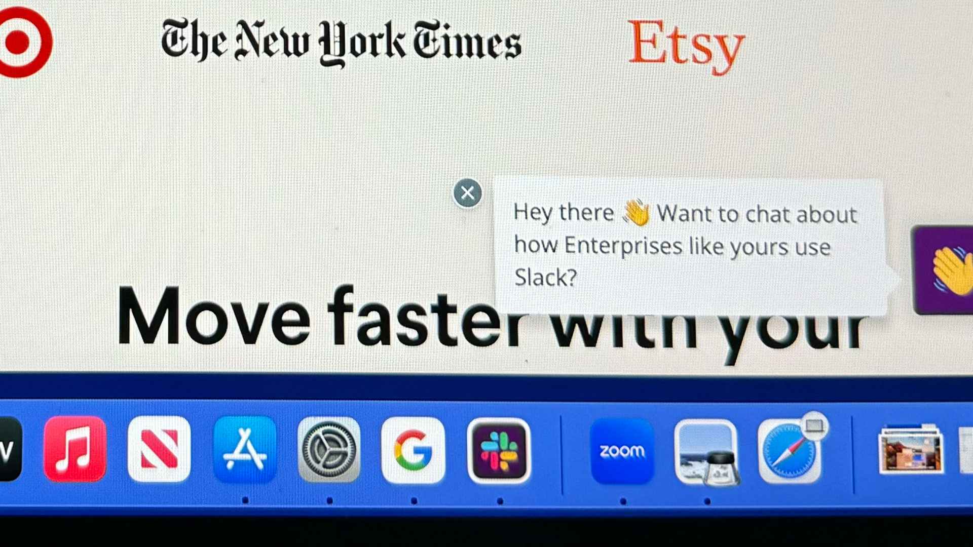
Web apps are a really smart way of managing often-used sites. Imagine, for instance, you’re like me and you all but live in Slack. macOS Sonoma’s Safari lets you open it, and then add it to not only your dock (with a "Slack" and not Safari icon) but as a proto app that lives in macOS's Launcher.
Interestingly, it’s not just a link to a web page. Web Apps creates a stripped-down and sandboxed instance of Safari that sits in its own container and only shares, say, the initial login with the broader Safari app but no other information.
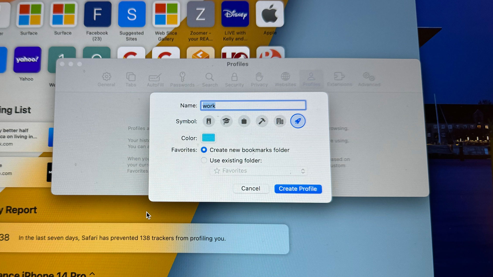
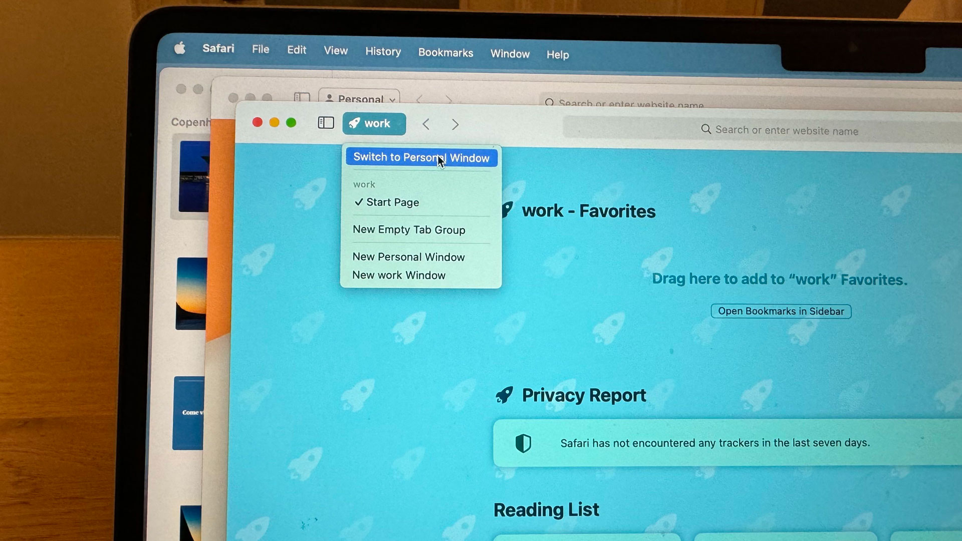
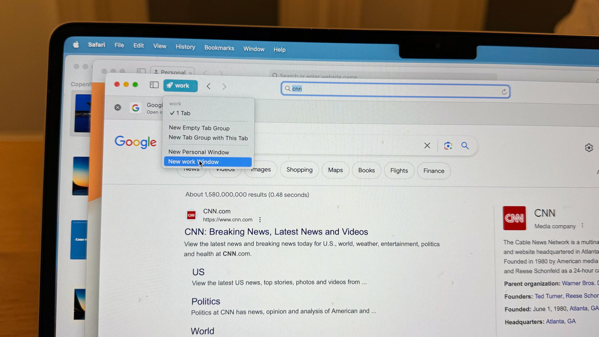
Safari is also catching up with Chrome in finally helping you set up and manage multiple profiles. Chrome has done this for ages, though I don’t know that it does enough to help you separate browser extensions between each profile.
The new Safari, though, seems to take profile separation very seriously. Each profile, which I found easy to create (and delete), lets you have separate favorites, extensions, and browser history. I could imagine using it for work and personal, but also for creating temporary Browser profiles attached to specific projects or even travel plans (maybe a bit similar to how I use Microsoft Edge Collections).
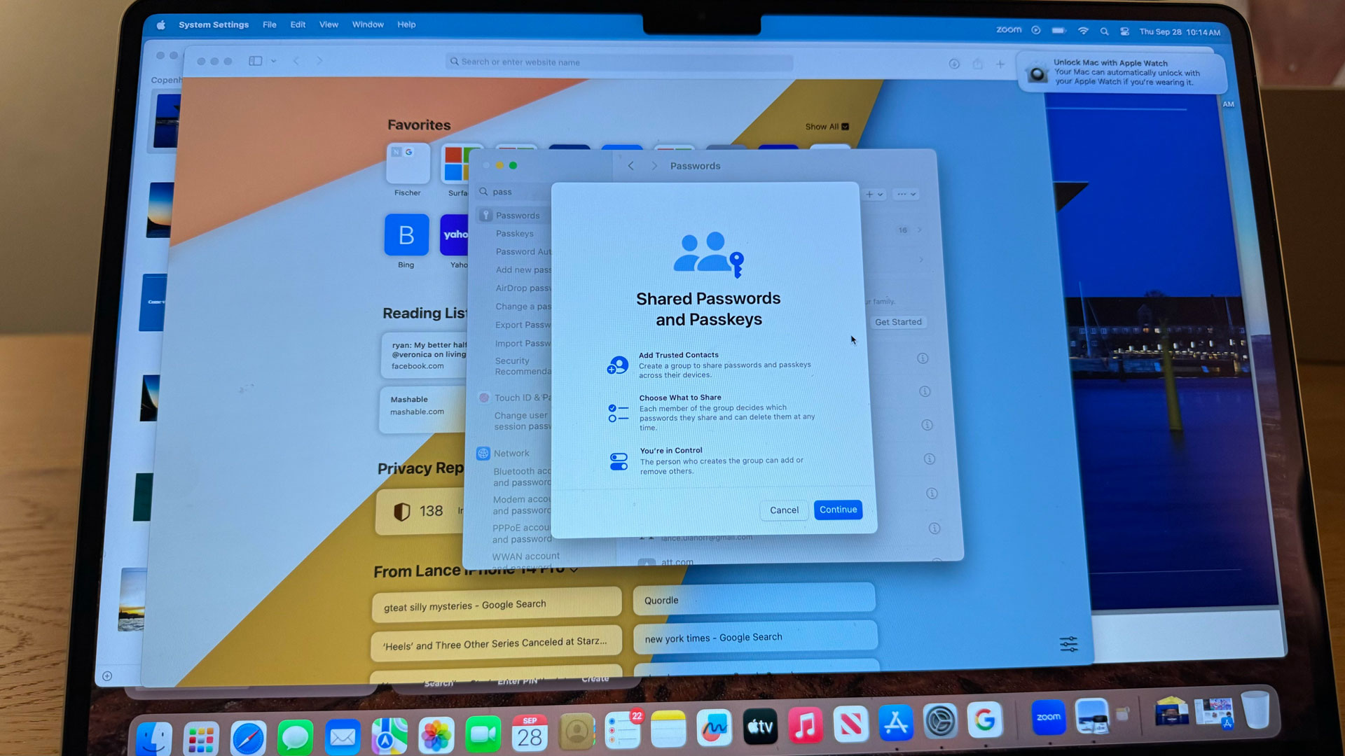
Adjacent to these Safari updates is a new way of handling and sharing passwords. Mostly, this is good news. You can create a password-sharing group (members must be running iOS 17 and/or macOS Sonoma), name it, and then select passwords to share. The system, which is based on Apple’s end-to-end encrypted Keychain system will let anyone in the group create new shared passwords, and use all the passwords within (including using autofill in Safari).
My only concern with the system as designed is that anyone in the group can also delete passwords. They do not disappear instantly. You have 30 days to bring them back and will get weekly reminders about their status. However, the current system lets anyone in the group delete passwords. It doesn’t have an “administrator” for right management or at least an understanding that the person who created the password is the administrator and should be the only one who can truly delete a password.
What if I share a dozen passwords with the group, someone deletes a few, I don’t notice and, yes, even miss the multiple notifications, and then they’re gone? I’m sure Apple can make a small change here that assumes that whoever created the passwords is the administrator for them.
Video conferencing FTW
I don’t know about you, but video conferencing is a big part of my work and home life. Ever since the pandemic, many people are still working remote at least part of the week and we meet via Google Meet every single day. That’s why I’m kind of excited about macOS Sonoma’s video conferencing updates.
And, yes, the best of them do require Apple Silicon (cue the legacy Intel system frustration).
What Apple has done here, though is really smart. Instead of updating FaceTime and trying to force people to use it across their work and personal lives, Apple integrated some powerful video conferencing tools at a system level that actually apply to virtually every video app under the sun, including Google Meet, Zoom, Microsoft Teams, and Skype.
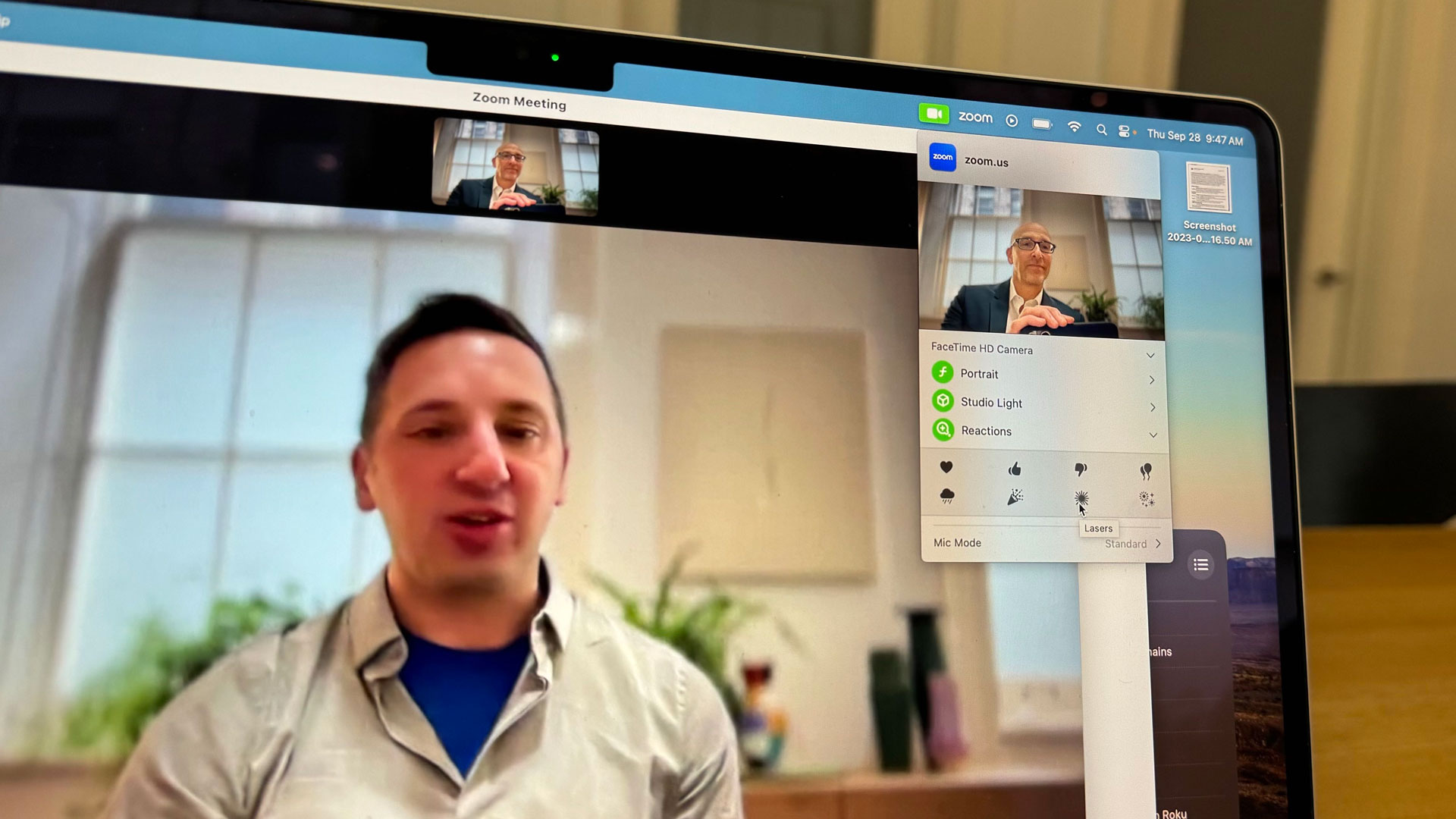
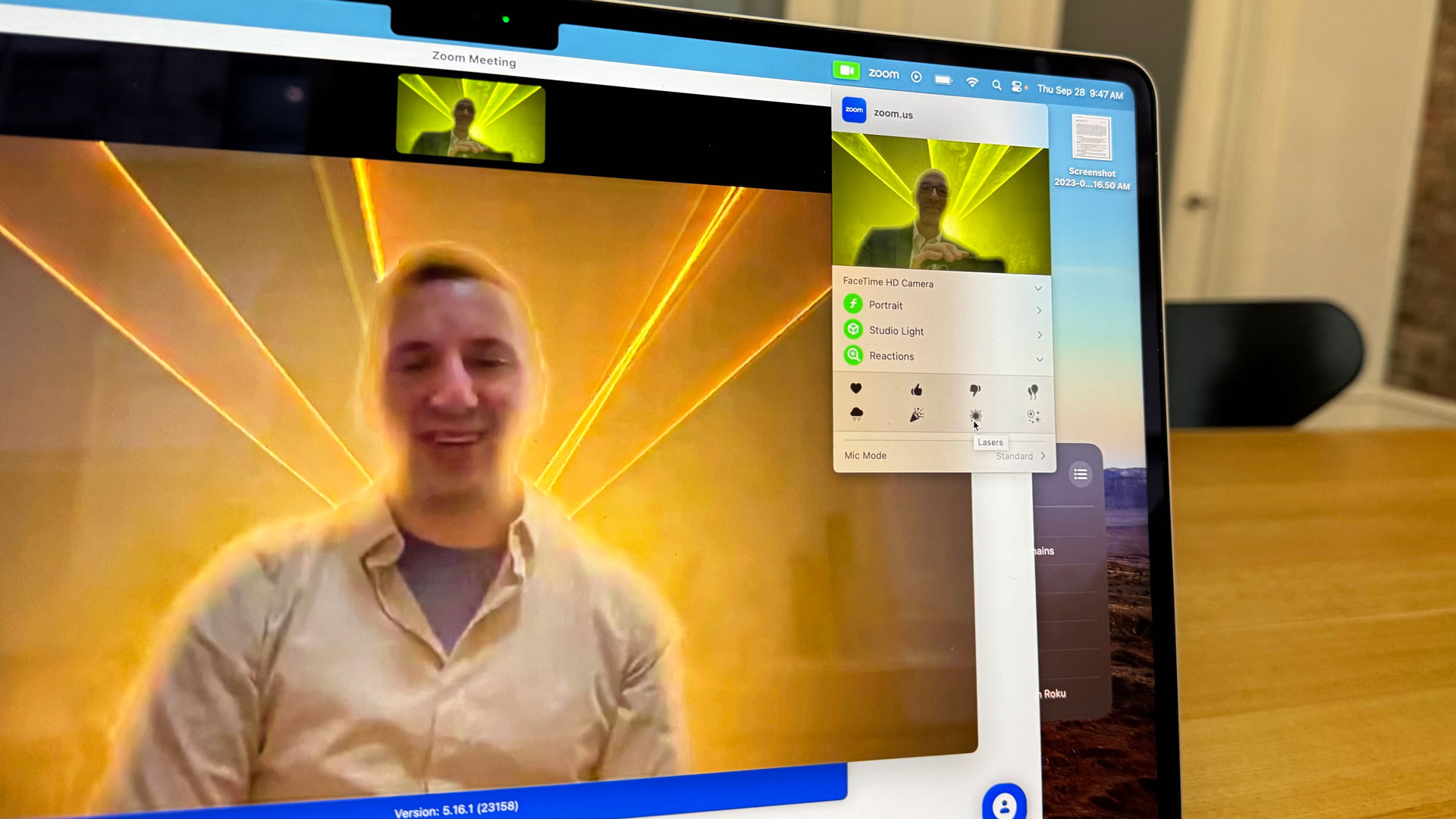
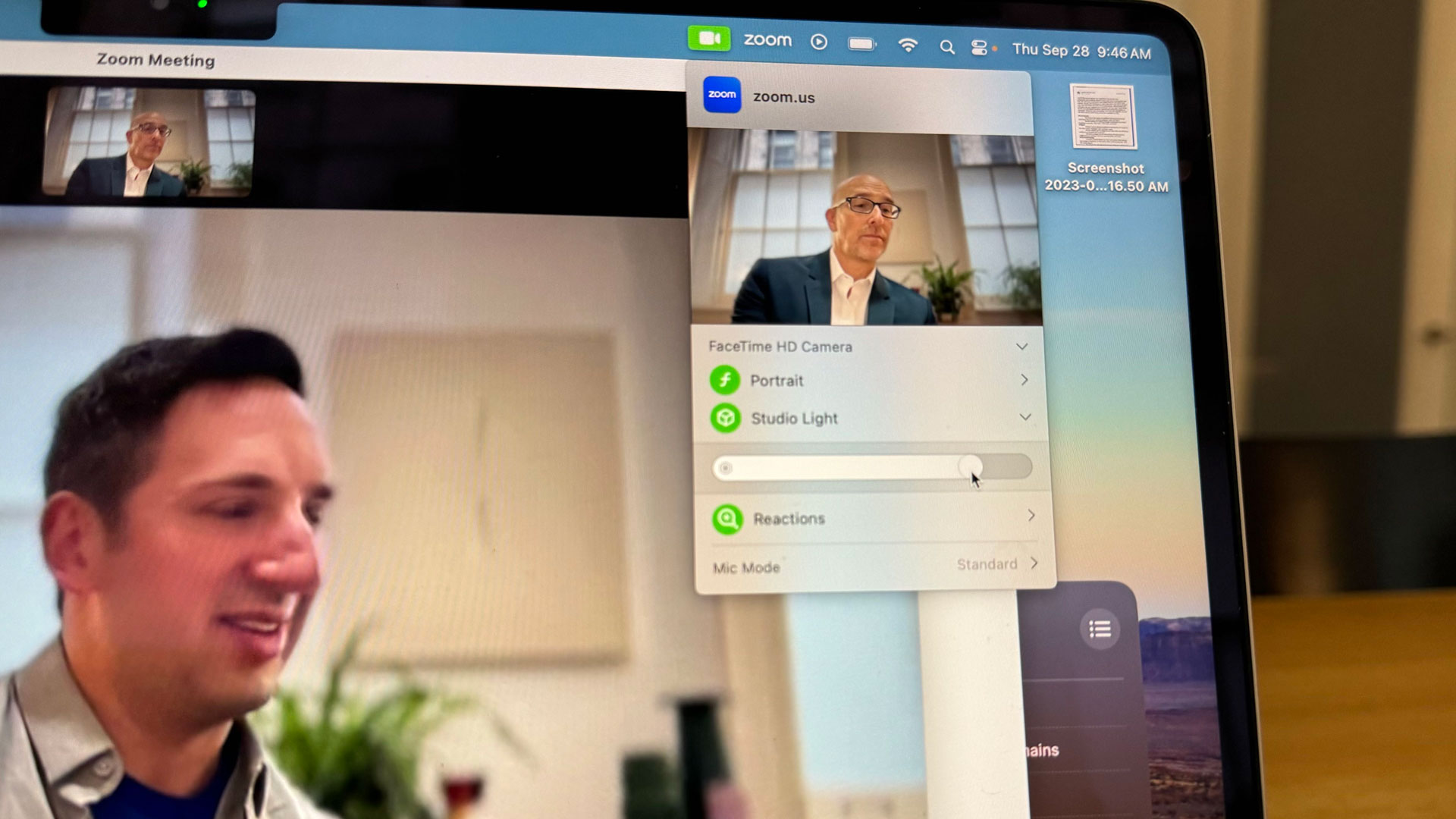

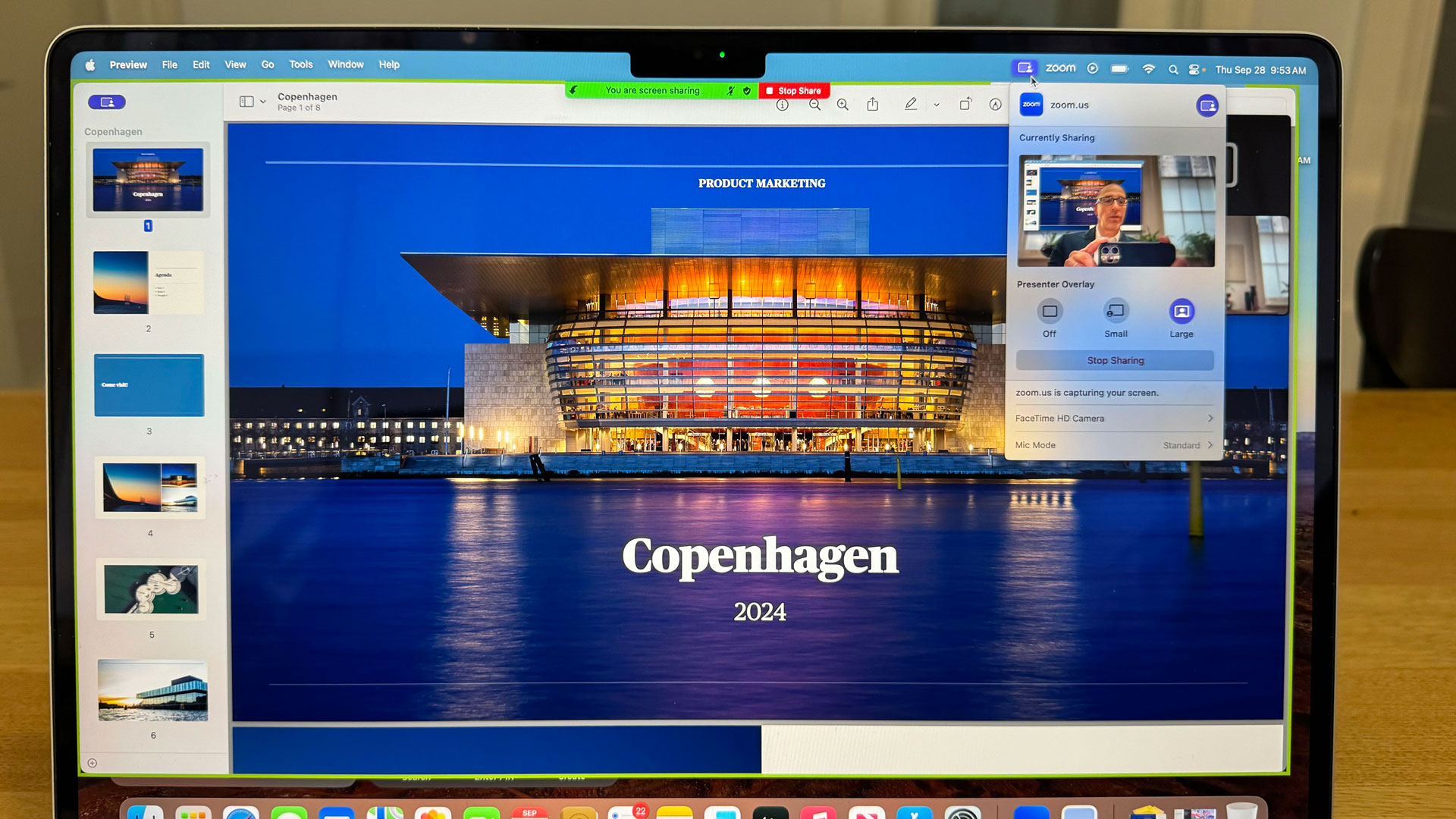
Many of the best tools, which live in a menu at the top of the screen (to the left of the battery) rely on the 3D effects and image segmentation powered by Apple Silicon’s neural network.
For example, there is now a new collection of on-screen reactions like balloons, confetti, hearts, thumbs up, and more that can appear in front, behind, and around you. I found I could add them through the video drop-down menu or through a series of hand gestures (just like you can in iOS 17 FaceTime calls).
The video tools also integrate adjustable video filters (that also rely on Apple Silicon) to put you in portrait mode or, my preference, Studio Light.
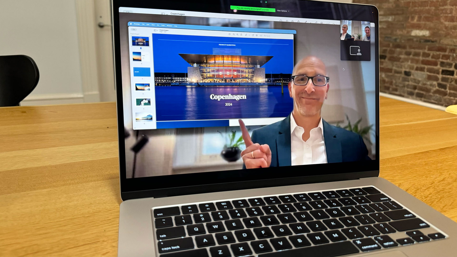
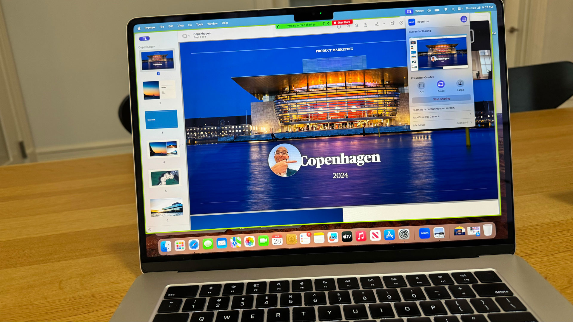
For business users, Sonoma adds powerful presentation features that I used to put a live video of my head (and even my hands so I could point to things) in a floating and moveable bubble on top of a shared-screen presentation. There's also a nice sort of TV presenter mode where I was shown in full (sans my real background) on top of the presentation.
In both instances, Sonoma does an excellent job of segmenting me from my background and in relation to the presentation.
Best of all, I can use these features with the video conferencing tool that I use every day.
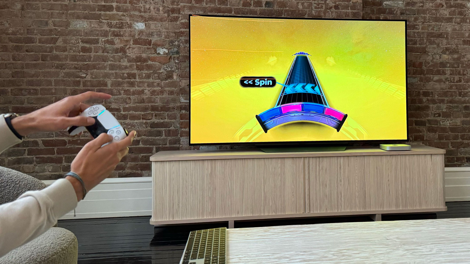
Naturally, these are just a handful of useful macOS Sonoma updates. I didn’t even mention Game Mode, which automatically does exactly what you expect a system-level game mode to do: it prioritizes your gameplay over all other background tasks to keep your framerates high and latency low (it’s something I barely notice but true gamers will love).
Based on this sampling, would I recommend upgrading to macOS Sonoma? Absolutely, it leaves the good stuff and updates or improves numerous touchpoints I use every day. That’s enough for me.
You might also like

A 38-year industry veteran and award-winning journalist, Lance has covered technology since PCs were the size of suitcases and “on line” meant “waiting.” He’s a former Lifewire Editor-in-Chief, Mashable Editor-in-Chief, and, before that, Editor in Chief of PCMag.com and Senior Vice President of Content for Ziff Davis, Inc. He also wrote a popular, weekly tech column for Medium called The Upgrade.
Lance Ulanoff makes frequent appearances on national, international, and local news programs including Live with Kelly and Mark, the Today Show, Good Morning America, CNBC, CNN, and the BBC.