Google Maps now looks more like Apple Maps – and a lot of people aren’t happy
A wrong turn with the new colors?

Google Maps has had a rejig of the colors used to denote different elements, and a significant portion of its regular users aren't happy about the change.
As you may have seen, this change in color palette was first spotted back in September, but now it’s widely rolling out to users of Google’s navigation app.
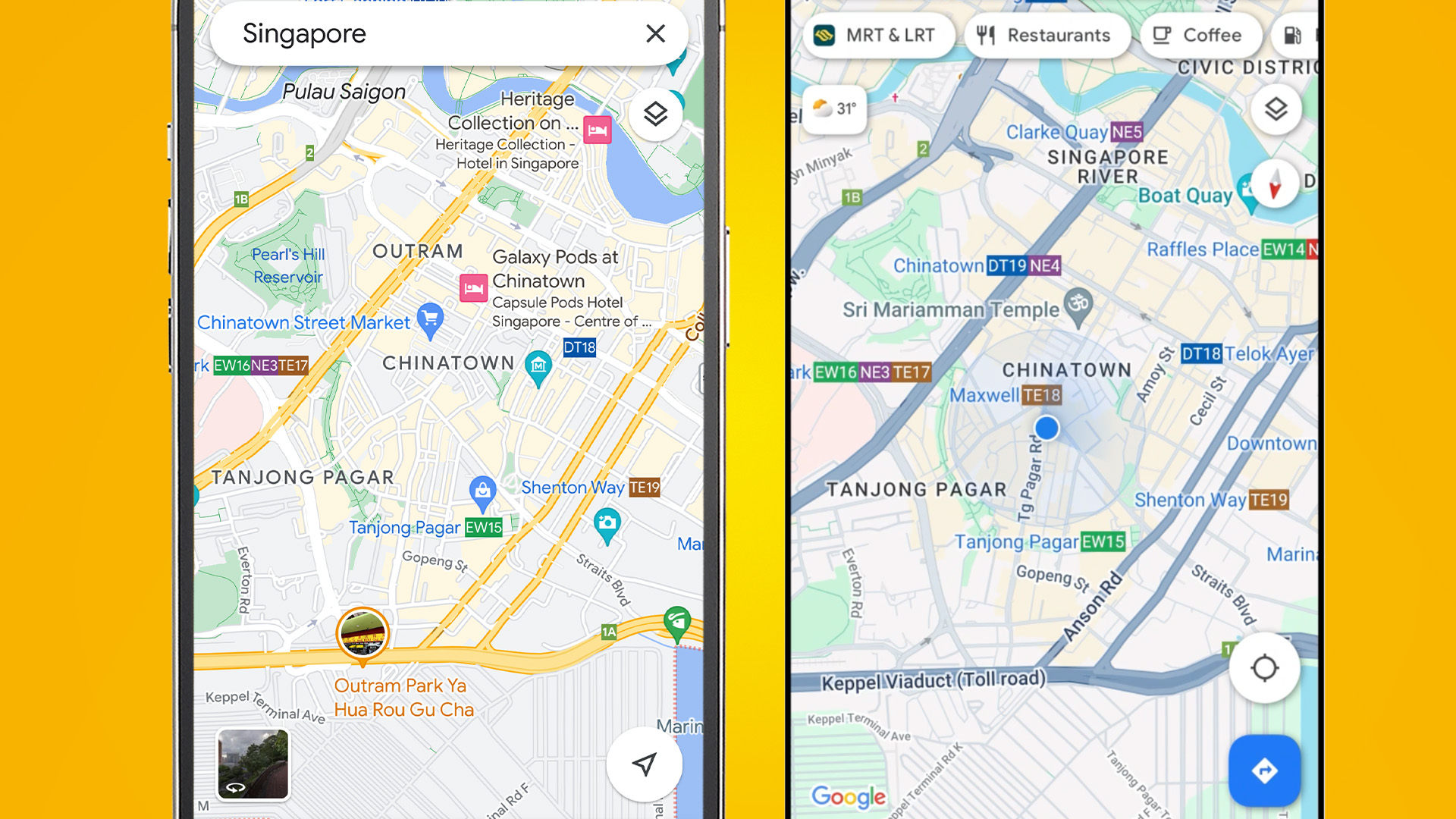
Google Maps now has gray roads like Apple, rather than white or yellow roads as before, and forests are a darker green. On the other hand, the shade of blue used for water is lighter.
However, the active route is a much darker blue, with alternate routes shown in lighter blue (these used to be gray).
See the pic above for a comparison of the old (left) and new (right) design, and the one below (in the tweet) for another look at the freshly revamped colors.
These may not sound like massive changes – and to be fair, they aren’t, they’re essentially tweaks. But they have rubbed a number of users up the wrong way. As Android Authority points out, there’s some quite spicy feedback on the new Google Maps on Reddit, X (formerly Twitter) and other online forums.
So my Google Maps looks like this now and my question is, why would you fix something that wasn't broken? 🙈 The bright colors and low contrast are breaking my brain. Please, at least let me choose old color scheme 🥲 pic.twitter.com/Co1ZDaoPW4November 16, 2023
Analysis: Lacking clarity?
Some of this is unfamiliarity, as no one likes change, and it takes time to acclimatize to a new look – but there are some consistent and well-observed pieces of feedback on the redeployment of colors for Google Maps.
Get daily insight, inspiration and deals in your inbox
Sign up for breaking news, reviews, opinion, top tech deals, and more.
One common thread is criticism of the new colors lacking clarity, and making it trickier to see what’s what at a glance (and when driving obviously you will just be glancing at the display).
As one Redditor put it: “I’m finding it a little hard to read as quickly as I used to. The toned down look is cute but not practical.”
Another problem highlighted by multiple users on Reddit is that the new alternate routes being blue – as well as the main route, albeit that’s a darker blue – is an issue. It can be difficult to tell those routes apart on a phone at a bit of a distance (and with other potential factors thrown into the mix like sun glare).
Overall, Google may want to have a rethink, particularly around the alternate routes. That said, not everyone is unhappy with the changes, but the majority seem to be at least according to a poll Android Authority is running.
This shows that 44% of respondents don’t like the new colors, compared to 28% who do (with the rest abstaining). So, that doesn’t look great for Google, though of course, it’s a limited sample of around 800 people (at the time of writing).
You might also like
Darren is a freelancer writing news and features for TechRadar (and occasionally T3) across a broad range of computing topics including CPUs, GPUs, various other hardware, VPNs, antivirus and more. He has written about tech for the best part of three decades, and writes books in his spare time (his debut novel - 'I Know What You Did Last Supper' - was published by Hachette UK in 2013).