Spotify for Windows 11's annoying new update shoves one of the app’s most important features to the side
Not jamming to this

Sign up for breaking news, reviews, opinion, top tech deals, and more.
You are now subscribed
Your newsletter sign-up was successful
Join the club
Get full access to premium articles, exclusive features and a growing list of member rewards.
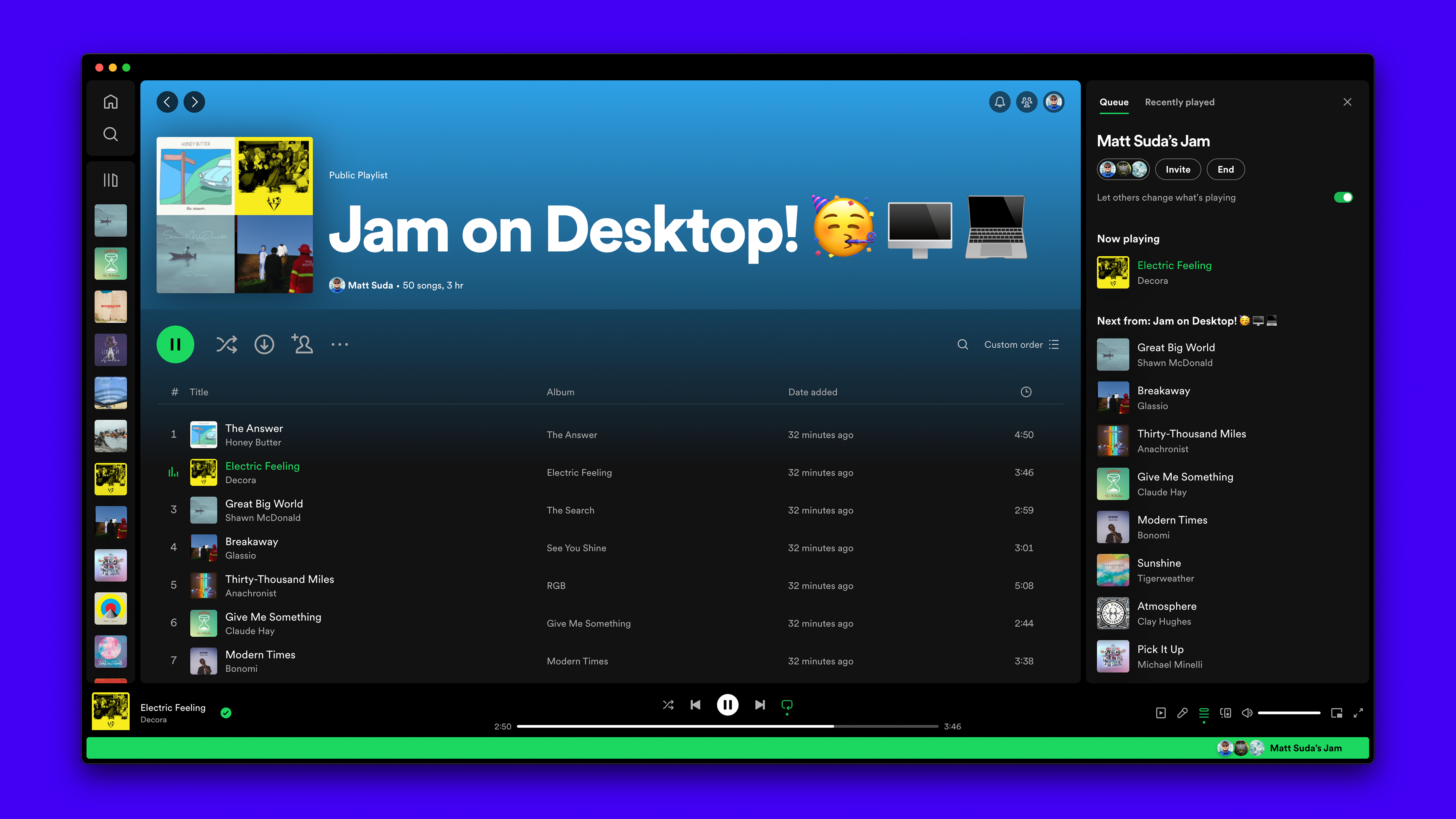
Spotify recently released the new “Jam” feature for its Windows 11 and 10 app, which allows users to listen to the same playlist or album at the same time on different devices. So you and a friend or coworker can enjoy the same tunes while you work, study, or just jam out (hence the name). However, with this new feature, the queue list has been booted to a small space on the right side of the app's UI.
Please, please change it back. This is the opposite of an improvement.
foryoublue94 via Spotify Forum
This change has proven to be rather unfavorable among Spotify users, who’ve taken to Reddit to voice their complaints. The official blog post that announces the arrival of Jam dubs this change as the “new Queue experience”, explaining that the right sidebar now allows you to browse content in the app and keep an eye on what's currently playing.
The official post has several disgruntled comments from users dismayed by the change, with one user saying “Why on earth has Queue and Recently Played been moved and is now cramped into the small right-hand column? This is just horrible, and a pain to look at. It makes zero sense from a usability standpoint.
Article continues belowThanks, I hate it
You may be thinking something along the lines of what an odd little change for people to be riled up about! Pre-update, you could have your library on the left, your queue in the center, and your Now Playing view on the right. In other words, you could boot up the app and have everything you need all in one place. Now, you can only have one or two of these views open at once because of the new layout.
If you’re someone who’s a fan of the Jam feature and plans to use it quite often with your mates, you’re probably not as upset as other users. But, as a person who will probably never use the Jam feature, I feel robbed of a pretty decent app layout with nothing in return. Now, I am no longer able to see how long the current song is or the album name in the queue.
It seems like Spotify users live in fear of every new update that is implemented. A common notion that’s shared on Spotify Reddit and in the blog post comments is ‘another Spotify update, another change no one asked for.’ I use Spotify every day, and I can’t remember a single update implemented to the app on mobile and desktop that didn’t make me mad. Hopefully, we can convince Spotify to change everything back to how it was - or we'll just end up waiting until another update comes around and knocks everything out of place again.
You might also like...
- Google Wallet gets overdue feature to help fix iPhone ticket-sharing headaches
- I'm a pro video editor and I couldn't live without this app
- Leaked Apple roadmap hints at iPhone SE 4, foldable iPhone, and AR glasses launch dates
Sign up for breaking news, reviews, opinion, top tech deals, and more.

Muskaan is TechRadar’s UK-based Computing writer. She has always been a passionate writer and has had her creative work published in several literary journals and magazines. Her debut into the writing world was a poem published in The Times of Zambia, on the subject of sunflowers and the insignificance of human existence in comparison.
Growing up in Zambia, Muskaan was fascinated with technology, especially computers, and she's joined TechRadar to write about the latest GPUs, laptops and recently anything AI related. If you've got questions, moral concerns or just an interest in anything ChatGPT or general AI, you're in the right place.
Muskaan also somehow managed to install a game on her work MacBook's Touch Bar, without the IT department finding out (yet).
 Become a TechRadar Insider


