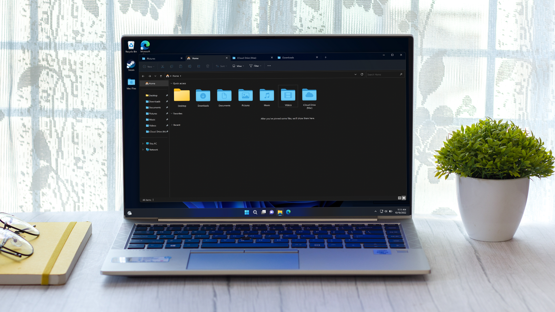
Windows 11 gets a big redesign for folders – and an exciting feature is imminent
File Explorer revamp lands in new preview build, plus the settings for ‘never combine’ mode are here (with a catch)

Windows 11 just got a new preview build which brings in the much talked about revamp of File Explorer, and a number of other features besides.
File Explorer is the central pillar of the Windows 11 interface – it’s the very windows on the desktop you use to browse through folders and files – and it has undergone a full overhaul in the latest test version in the Beta channel (build 22621.2050 / 22631.2050).
Microsoft calls it a modernized File Explorer, and it comes sporting a new details pane and address bar plus search box.
When you select a file, the new details pane shows contextual info relating to that file such as a thumbnail, share status, recent activity for the file, any related files and other details.
The modernized address bar in File Explorer automatically recognizes local (on the PC) or cloud folders and shows their status as such, and for those who use OneDrive, the bar carries the storage service’s sync status to see at-a-glance (plus there’s a quota flyout).
For those signed into a Microsoft account, Quick Access folders have also been rejigged with an ‘updated experience’. And lastly, those signed into an Azure Active Directory (AAD) account (business users) will get recommended files shown in a carousel (with file thumbnails coming soon, we’re told).
Another major introduction here is the Dynamic Lighting hub that we’ve heard a lot about in the past. This provides a central place to control your peripherals with RGB lighting, so you don’t have to bloat your system with multiple third-party apps from hardware makers.
Get daily insight, inspiration and deals in your inbox
Sign up for breaking news, reviews, opinion, top tech deals, and more.
We’re told that a bunch of peripheral manufacturers have partnered with Microsoft on this, including Acer, Asus, HP, HyperX, Logitech, Razer, and Twinkly.
Elsewhere in this beta build, Windows Ink is getting pepped up so users can write into edit fields in the OS. That means you can, for example, write directly into a search box in the Windows 11 interface, with the eventual goal being you can use your stylus to write anywhere in the UI.
There’s a bunch of other bits and pieces going on here, such as a new volume mixer in Quick Settings, plus adding new natural voices for Narrator (including UK English, Chinese, Japanese, and Spanish). For the full details, see Microsoft’s blog post introducing the build.
Analysis: Happiness is a setting that doesn’t work (just yet)
Clearly, there are some big moves here. For gamers, the Dynamic Lighting hub should be a real gem, although it’s slightly late arriving for testing – we were expecting to see it debut in May.
And it’s great to see the redesigned File Explorer land, of course. This will be an ongoing piece of work, and doubtless one of the central cogs of the 23H2 update when it arrives later this year – it’s also set to introduce an image gallery view for folders (which has already been incorporated into the Beta channel earlier).
Excitingly, there’s something else here – and that’s the settings for ‘never combined’ mode in Windows 11. This is a long-awaited feature for many (ourselves included) that is now included in Taskbar behaviors (in Settings) in this preview build, but sadly, the functionality doesn’t work yet.
However, Microsoft tells us that it will be enabled in a beta build ‘soon’, so the wait is nearly over for the ability to tell Windows 11 not to stack up running instances of the same app on the taskbar. This feature must also be pretty much a dead cert for the 23H2 update, too, and we’re happy about that.
Darren is a freelancer writing news and features for TechRadar (and occasionally T3) across a broad range of computing topics including CPUs, GPUs, various other hardware, VPNs, antivirus and more. He has written about tech for the best part of three decades, and writes books in his spare time (his debut novel - 'I Know What You Did Last Supper' - was published by Hachette UK in 2013).