Windows 11 gets a cool new look for a feature everyone uses – but nobody loves
Settings revamp gives you a home page and some nifty new abilities

Windows 11 has got a new preview build which comes with a whole lot of work on the interface, and other tweaks besides.
The most significant introduction with preview build 23493 (in the Dev channel), mind you, is the rollout of Windows Copilot – which we cover in-depth here – but there’s also a new home page for Settings, and a revamped volume mixer.
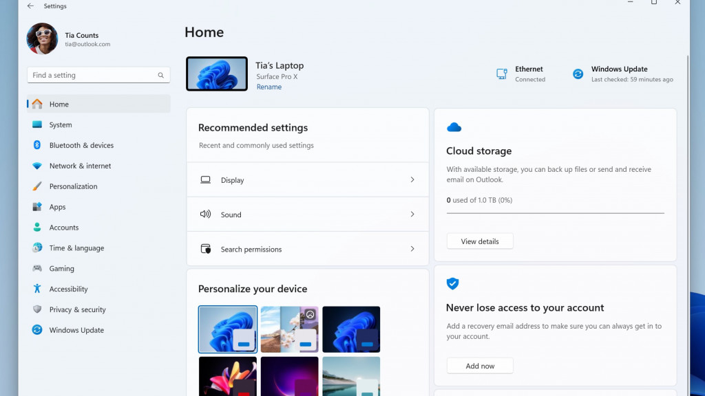
The home page for the Settings app provides an overview of the status of various bits and bobs pertaining to your PC – for example, cloud storage used (in OneDrive), and messages about your Microsoft Account (relating to security, as shown in Microsoft’s example, where you’re reminded to add a recovery email address).
The home page is actually divided into different ‘cards’ (panels), and the most important cards we see in this first take on the idea are Personalization and Recommended Settings.
The Personalization card provides easy access to basic customization options for Windows 11, a useful touch. But the real prize here is those recommended settings, which intelligently present changes based on “your specific usage patterns”, saving you time by allowing you to apply commonly used (or recently used) settings right on the home page when needed.

Moving on to the revamped volume mixer (accessed via the system tray, far-right of the taskbar), this offers the ability to not just swiftly adjust the volume, but you can do so on a per-app basis.
The new mixer panel also allows you to quickly swap your output device, plus options for switching Spatial Audio formats are provided here too. On top of that, Microsoft has implemented a new keyboard shortcut to bring the mixer straight up (Windows key + CTRL + V).
Get daily insight, inspiration and deals in your inbox
Sign up for breaking news, reviews, opinion, top tech deals, and more.
Preview build 23493 also expands support for compressed file formats (not just ZIP, but also RAR, TAR, 7-Zip, and much more – this was a much-wanted tweak Microsoft announced last month, you may recall). Furthermore, Microsoft says it has improved the performance of archiving files in Windows 11, so you should see this happen faster.
There are a bunch of other changes in this preview version, all detailed in Microsoft’s blog post. Another notable one is making Snap Layout suggestions, where recommended window layout options are presented to the user complete with app icons to show which programs will go where.
Analysis: Ready, Settings, Go!
That Recommended Settings card looks like a big benefit for Windows 11 users, and should mean you have to take fewer trips deep into the cogs and machinery of the Settings subpages to make any necessary adjustments to the OS.
Nobody likes having to search around in Settings, as it can be a head-scratching affair trying to find what you need, and on-tap suggestions based on your previous usage of Windows 11 should be very handy.
On top of that, we have Windows Copilot coming in to make performing changes and switching on features in Windows 11 a far easier process, so between these two new elements of the interface, the operating system should be much improved when it comes to tweaking settings.
The volume mixer overhaul is a nice addition to boot. Want to turn down the volume for just your browser? That’s now possible with the per-app volume controls, and the new panel also makes it very easy to configure some important settings, like the chosen output speaker, and that’s just more added convenience.
Darren is a freelancer writing news and features for TechRadar (and occasionally T3) across a broad range of computing topics including CPUs, GPUs, various other hardware, VPNs, antivirus and more. He has written about tech for the best part of three decades, and writes books in his spare time (his debut novel - 'I Know What You Did Last Supper' - was published by Hachette UK in 2013).