Windows 11 is a confusing mishmash of old and new – and that means Microsoft needs to make some difficult decisions
Blame Windows 8

There’s been a lot of internet chatter recently about the revelation that the Format drive window in Windows 11 hasn’t only not been changed for 30 years – but it was supposed to be a temporary interface. While this 30-year-old piece of Windows legacy is in some ways part of Windows 11’s charms, it’s also emblematic of Microsoft’s problems with its operating system.
For those of us who still use the Format drive feature in Windows 11, it’s little surprise that it looks almost identical to when it first appeared back in 1994. With a simple interface that gives you all the basic features you need to erase and format a drive quickly, in some respects you could argue this is a great example of ‘if it isn’t broken, don’t fix it.’
However, posting on X, former Microsoft developer Dave Plummer revealed that the interface of the Format feature, which he created in late 1994, was supposed to be temporary, with a more ‘elegant UI’ for WindowsNT eventually replacing it.
I wrote this Format dialog back on a rainy Thursday morning at Microsoft in late 1994, I think it was.We were porting the bajillion lines of code from the Windows95 user interface over to NT, and Format was just one of those areas where WindowsNT was different enough from… pic.twitter.com/PbrhQe0n3KMarch 24, 2024
Maybe fix it anyway
There is something comforting about having certain tools or windows remaining unchanged for decades. However, while it may be pleasing to some old farts (like me), having a modern operating system peppered with 30-year-old apps is far from ideal – especially if those apps were only supposed to be temporary.
The fact that the Format feature hasn’t changed for three decades explains why there are some odd things that remain. It’s unlikely that anyone these days needs to adjust the ‘Allocation unit size’, yet that option remains. Formatting a drive to use the FAT file system also remains limited to 32GB, even though – as The Verge explains – FAT supports volumes of up to 2TB. With Windows 11 sticking to the old Format drive interface, there’s no official way of creating FAT volumes in Windows 11 that are larger than 32GB.
It's these little quirks that have led some people to believe that the reason why Microsoft hasn’t changed the Format drive interface isn’t because it thinks that it is perfect – but simply because it has forgotten to.
That’s certainly an amusing theory, and I imagine that the Format drive feature is one of the least-used parts of Windows 11. Still, I find it hard to believe that Microsoft has forgotten about it. Instead, I think it simply doesn’t care. And that’s worse.

Blame it on Windows 8
Now, it’s always fun to blame everything on Windows 8. Microsoft’s failure to come up with a decent smartphone to take on the iPhone? Windows 8’s fault. The fact that the iconic Start menu is now largely useless? The rot started with Windows 8. Your car breaks down just before you need to get somewhere urgently? You’d better believe that’s Windows 8’s fault.
However, there is a major issue with Windows 11, exemplified by the 30-year-old Format drive interface, that I can legitimately blame on Windows 8.
If you can’t remember Windows 8, then let me fill you in on one of Microsoft’s worst operating system missteps.
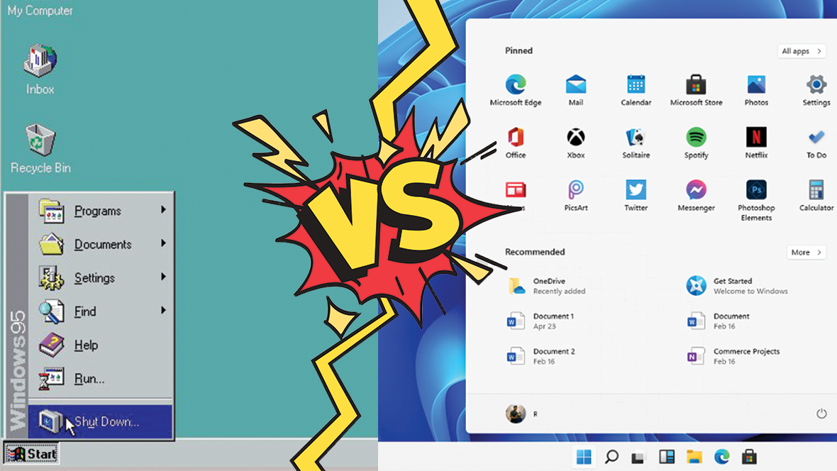
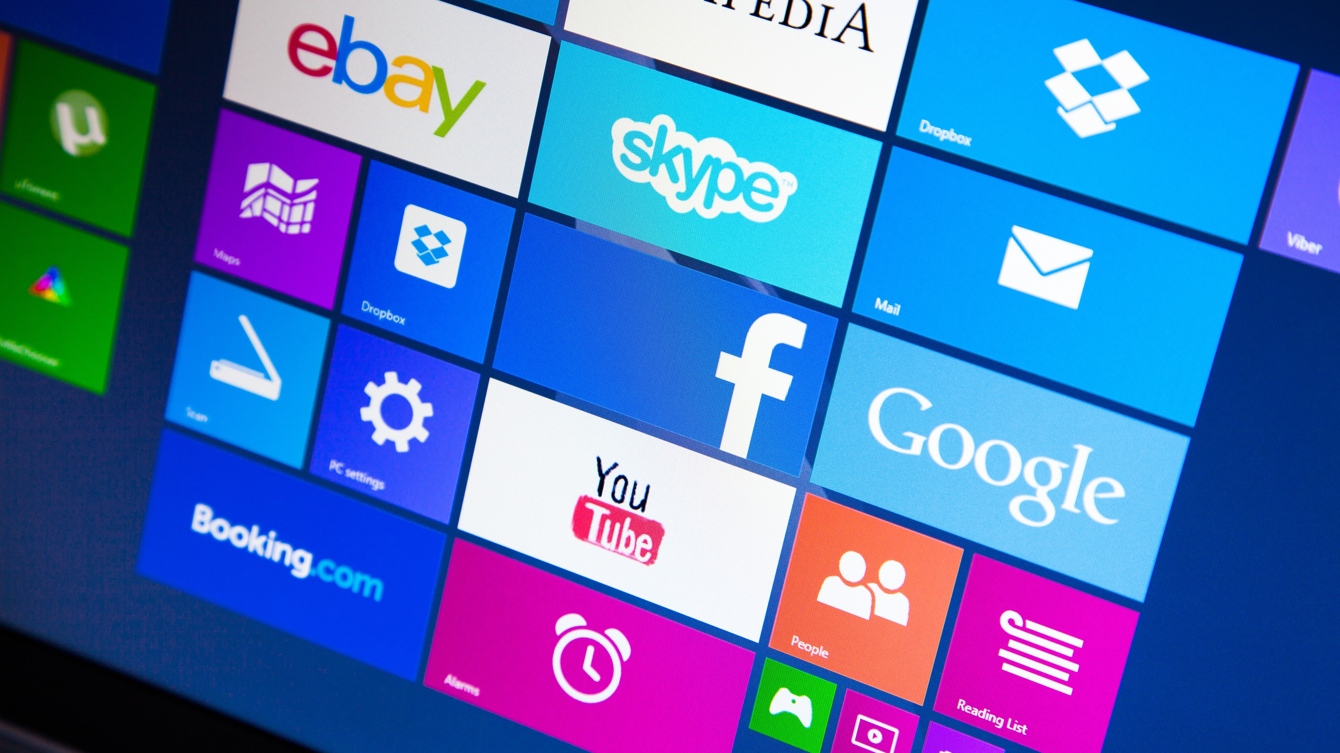
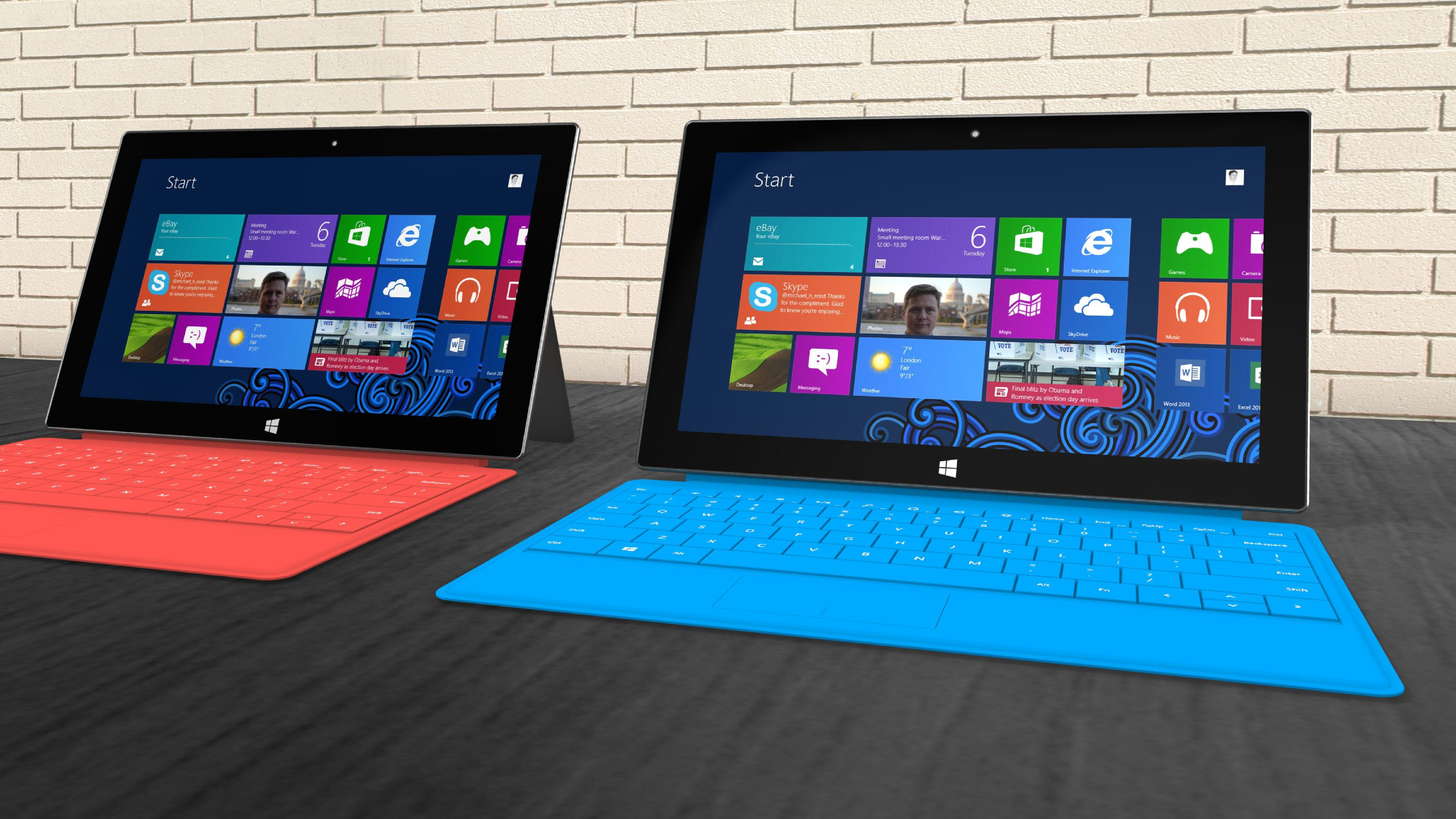
Launched in 2012 and following on from the very popular Windows 7, Windows 8 brought an ambitious, though flawed, overhaul to the Windows interface. Ditching the traditional Windows desktop layout of a taskbar along the bottom and the iconic Start menu that had been a cornerstone of Windows releases since Windows 95, and replacing it (kind of) with a big-buttoned ‘Start screen’ that was designed with touch screen devices in mind, and taking cues from mobile operating systems like iOS and Android, Windows 8 was arguably the biggest revolution since Windows 95. It was also a bit of a disaster.

While the new Start Screen might have looked good and worked well on touchscreen devices, for traditional laptop and desktop PCs, which were by far the majority of devices running Windows 8, it felt basic, garish and unintuitive.
Even worse, Microsoft didn’t fully commit to making Windows 8 a mobile-first operating system. This meant that the touchscreen-friendly Start screen was clunkily overlaid on top of a more traditional desktop interface. This meant desktop users had to put up with the Start Screen, while touchscreen users had to fiddle about with certain apps and screens that were designed to be used with a mouse and keyboard. By trying to appeal to traditional Windows users as well as mobile users, Windows 8 ended up annoying everyone.
This is perhaps the worst legacy of Windows 8. Since that OS, Microsoft has scaled back on its touchscreen ambitions, but it has continued to keep some more modern, simplified, elements alongside more traditional Windows parts.
This has led to post-Windows 8 versions of Windows still feeling like an awkward mix of two different operating systems. Not only does it make using modern Windows, including Windows 11, feel clunky, but it’s confusing as well. It’s why Windows 11 still has the Control Panel, an app containing a selection of options that has been around since Windows 1.0’s launch in 1985, but it also has the Settings screen, which essentially does the same thing, but with a modern look (and debuted with Windows 8). At first having Control Panel and Settings was simply redundant as they do the same thing, but Microsoft is slowly moving parts of the Control Panel to the Settings app.
This has made matters worse, in my opinion, as it’s now unclear where I need to go to get to a certain setting in Windows 11. It also feels like I’m using two different operating systems at times.
The fact is Windows 11 has an identity problem. Is it a modern operating system that has evolved along with how people now use their PCs, or is it a safe, familiar, legacy operating system that does the job but doesn’t wow people? It can’t be both and that means for the future of Windows, be that Windows 12 or something else entirely, Microsoft is going to have to make some tough decisions.
That could mean cutting all these old parts of the operating system out and starting from scratch. Do a Windows 8, but fully commit to it. Unfortunately, due to Windows 8’s unpopularity, Microsoft might be too timid to really revolutionize Windows. If that’s the case, then Windows 8’s legacy will be even worse than I thought.
You might also like...
Get daily insight, inspiration and deals in your inbox
Sign up for breaking news, reviews, opinion, top tech deals, and more.

Matt is TechRadar's Managing Editor for Core Tech, looking after computing and mobile technology. Having written for a number of publications such as PC Plus, PC Format, T3 and Linux Format, there's no aspect of technology that Matt isn't passionate about, especially computing and PC gaming. He’s personally reviewed and used most of the laptops in our best laptops guide - and since joining TechRadar in 2014, he's reviewed over 250 laptops and computing accessories personally.