10 examples of brilliantly executed email marketing campaigns
Each have their own unique attributes

Email marketing is key to your business’s success, and designing an effective HTML newsletter to promote your business is one such method. Before putting pen to paper, consider going through your own inbox in order to take note of what stands out to you.
Below are 10 examples of brilliantly executed emails that each have their own unique attributes.
Techradar's Choice for Best Email Marketing Services
See how Constant Contact's award-winning live support, list-growth tools, and customizable templates can help you reach your marketing goals. Buy today and save 40% off 3 months.
Attracting new customers and bringing back lost customers

1. Harry’s
‘Hit them in the pocket’ has long been an approach to deter certain human behavior, however it can be seen inversely, too. Shaving product delivery service Harry’s offers both the existing customer and a new customer £5 off their next orders.
Elsewhere, the email includes a link to an ‘about us’ style article, a summary of the recipient’s order, and a button to track the package, all using blue colors and a minimal design - in keeping with the company’s branding.
2. Bloombox
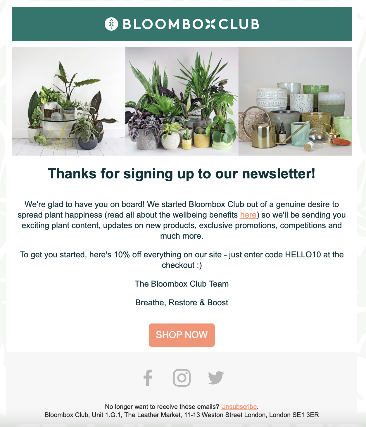
Offering a discount on a product or service is a great way to incentivize new subscriptions. Potted plant delivery service Bloombox offers a 10% discount for all new customers who sign up for the company’s newsletter.
Are you a pro? Subscribe to our newsletter
Sign up to the TechRadar Pro newsletter to get all the top news, opinion, features and guidance your business needs to succeed!
To encourage new customers to spend their money, photographs of some of the company’s more expensive products set expectations high. Under a “SHOP NOW” button - that implies urgency - are three links to the Bloombox social media where customers can view more alluring photos.
3. Simply Cook
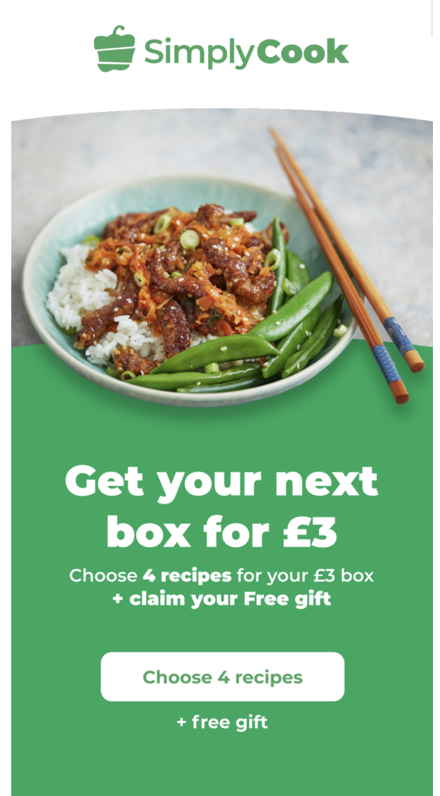
A company that uses email marketing campaigns to re-gain subscribers, food delivery box service Simply Cook sends attractive content-filled emails to consumers who have previously used the service.
The email appears to come from a specific employee - in this case, Penny - and a subject that reads “Grab your FREE gift with a £3 SimplyCook box today” adds instant appeal.
Calls to action are aplenty, with bold, colorful buttons to resubscribe to the service, to investigate the free gift, and to download the company’s app. Among other design elements used are vivid images that help us to envision Simply Cook’s ideological culinary world.
Marketing to existing customers
4. Waggel
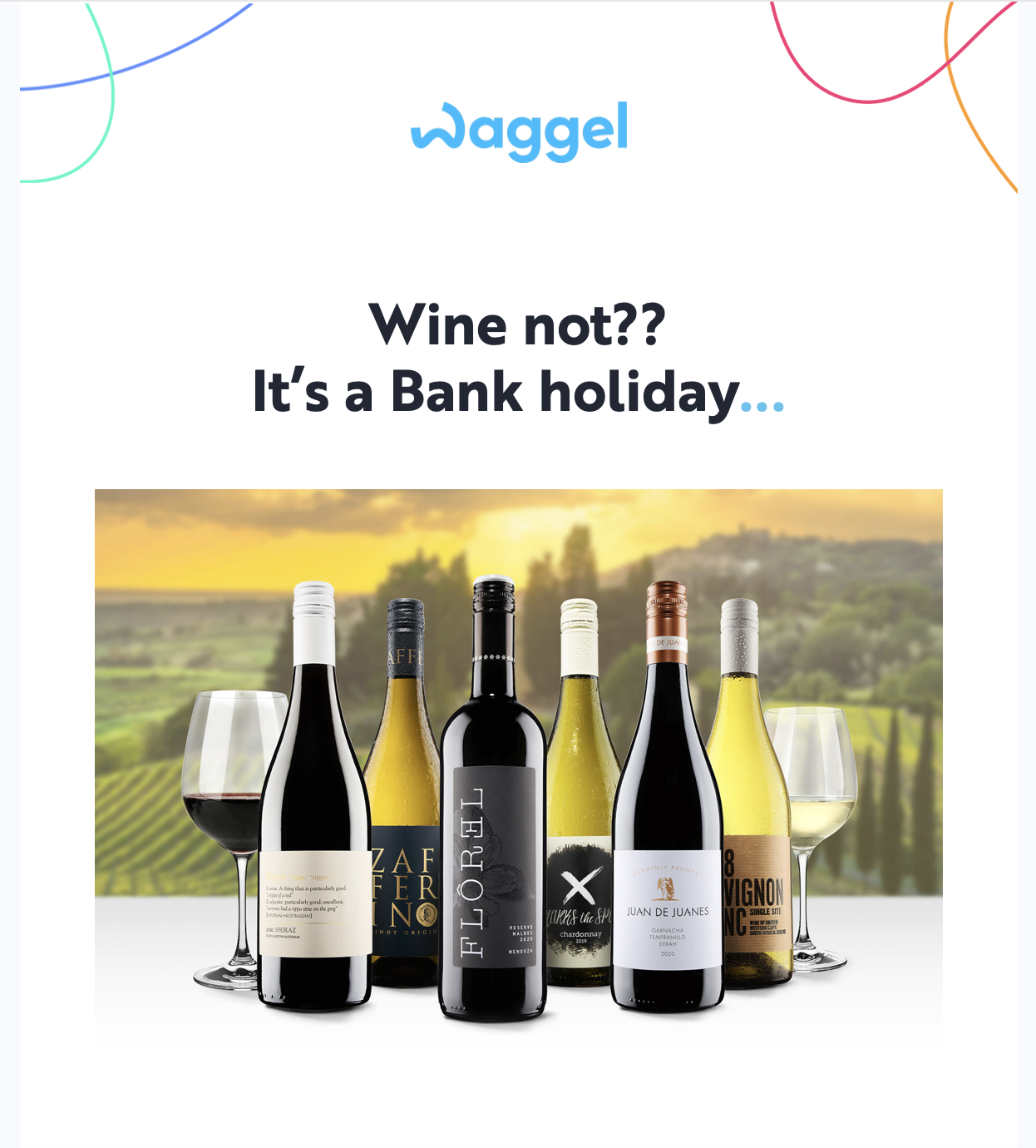
Pet insurance company Waggel offers frequent discounts to active members as an incentive to remain loyal; in this case, a discount on a wine delivery service was available.
A simple but attractive design that incorporates the brand’s colors is just half of the story, and it’s clear the team behind this email had other priorities. In order to engage with customers, Waggel opted for friendly, conversational language in the form of “Wine not?”.
This timely email coincides with the Easter bank holiday weekend: an opportunity for many workers to relax. Waggel recognizes this, offering a justification to purchase the wine so that the reader doesn’t have to.
5. Kickstarter
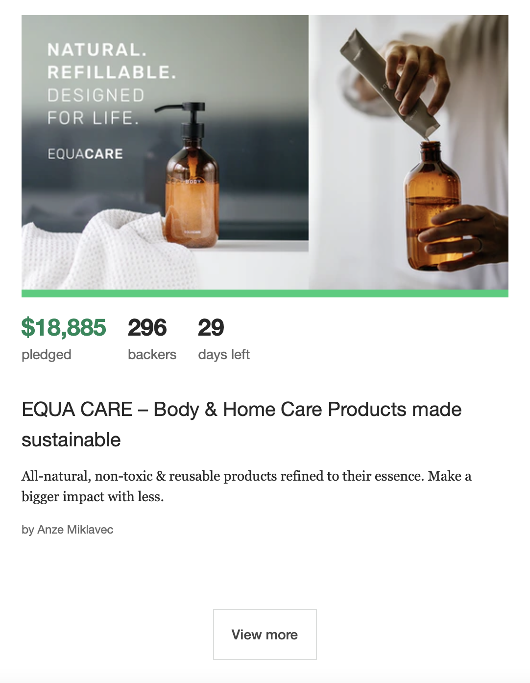
Provide the right type of content and repeat custom should be easy to drive. A surefire way to encourage customers to remain loyal is to tailor your marketing to their wants and needs. In this case, crowdfunding platform Kickstarter has followed up a product investment - or purchase - with a range of similar products.
The key information is displayed underneath an image that doubles as a link to the product, though this could be made more obvious.
6. Tesla
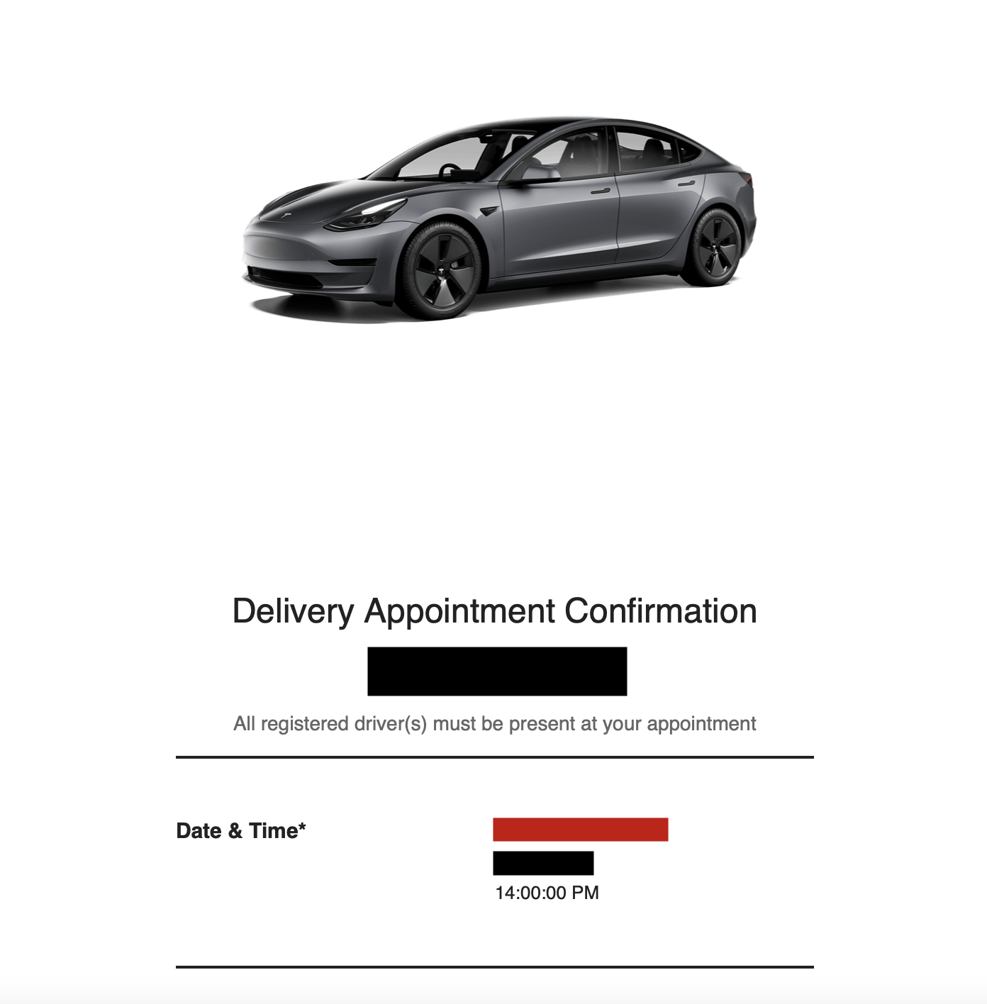
A car is usually a person’s second-largest purchase, after a house. It can be an especially anxious time, and many questions may arise. Electric car company Tesla uses automated email marketing to keep buyers informed regularly.
This email highlights some frequently asked questions and key information, all under a personalized image of the buyer’s exact car that adds to the success of this email.
Beneath the seemingly informative face of this email is an opportunity for Tesla to plug its own services, with call to action buttons for buyers to explore other products in the hope that they will part with more money.
Informational newsletters
7. BP Pulse
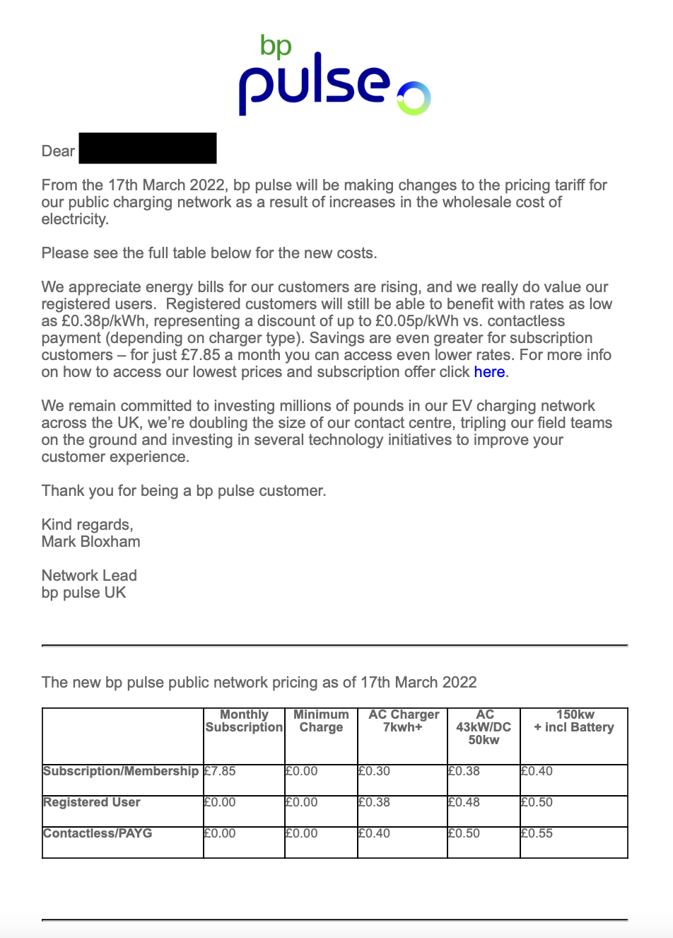
Electric vehicle charging network BP Pulse responded to the rising energy costs with an email newsletter to members who have used its services. The purpose of this email is to inform customers of a rise in prices, and the simple text formatting clearly lays this out.
Key to this email’s success is the table that highlights the new prices, which is built into the body meaning fewer clicks are needed for consumers to get the information. The only in-text link - thus a prominent one - directs electric vehicle drivers to a part of BP Pulse’s site that offers the potential for frequent chargers to save money.
A simple footer gives access to the company’s social media and other ways to communicate. Overall, while simple, this email fulfills its purpose of sharing a company announcement in a brief, concise manner.
8. Starling
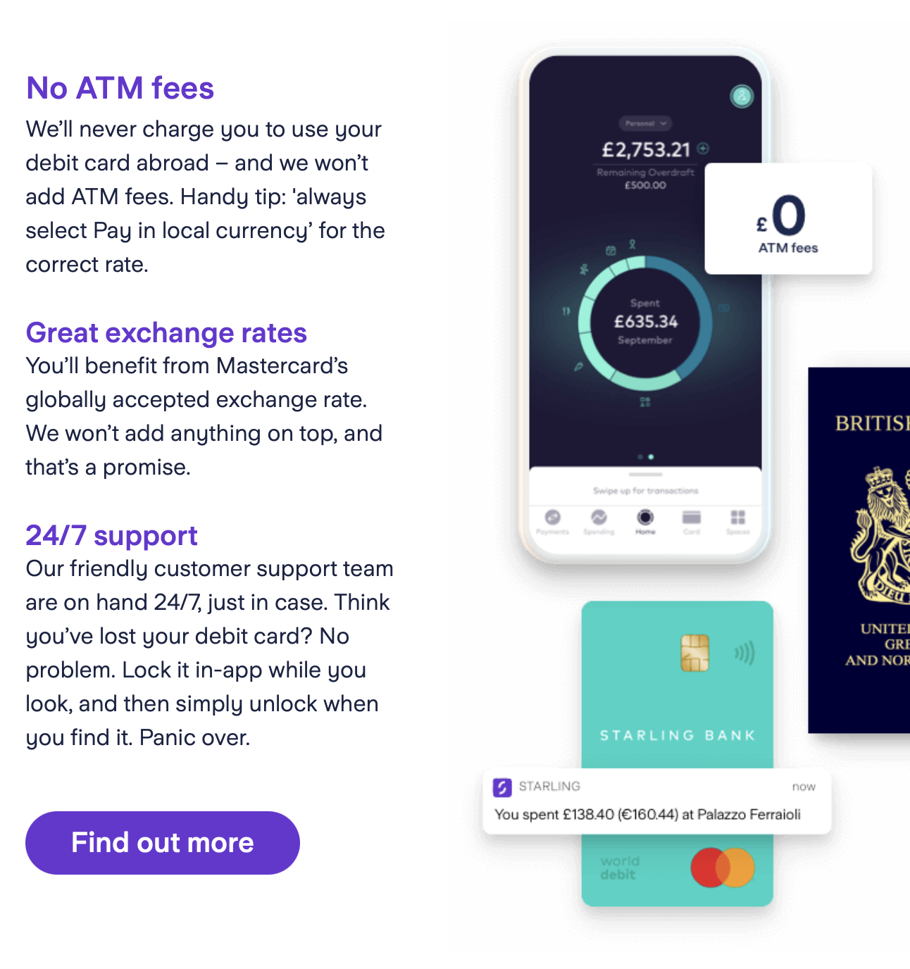
In business, maintaining customer loyalty can often be a challenge. Investing in marketing that entices new customers is obvious, so in order to prevent customers from being tempted elsewhere, Starling bank reminds customers of new and additional features that they are entitled to.
This summer edition of the company’s newsletter - entitled murmur (itself a playful pun on the formation that starling birds create, known as a murmuration) - takes a seasonal approach in reminding customers that they are entitled to certain foreign transactions.
The newsletter uses the rule of three - a key point in our beginner’s guide to marketing - to influence subscribers’ next steps. Headings in the brand’s colors are followed by informative summaries and a clear call to action button. Attractive infographics add to the appeal and provide an additional layer of information.
Marketing newsletters
9. Patagonia
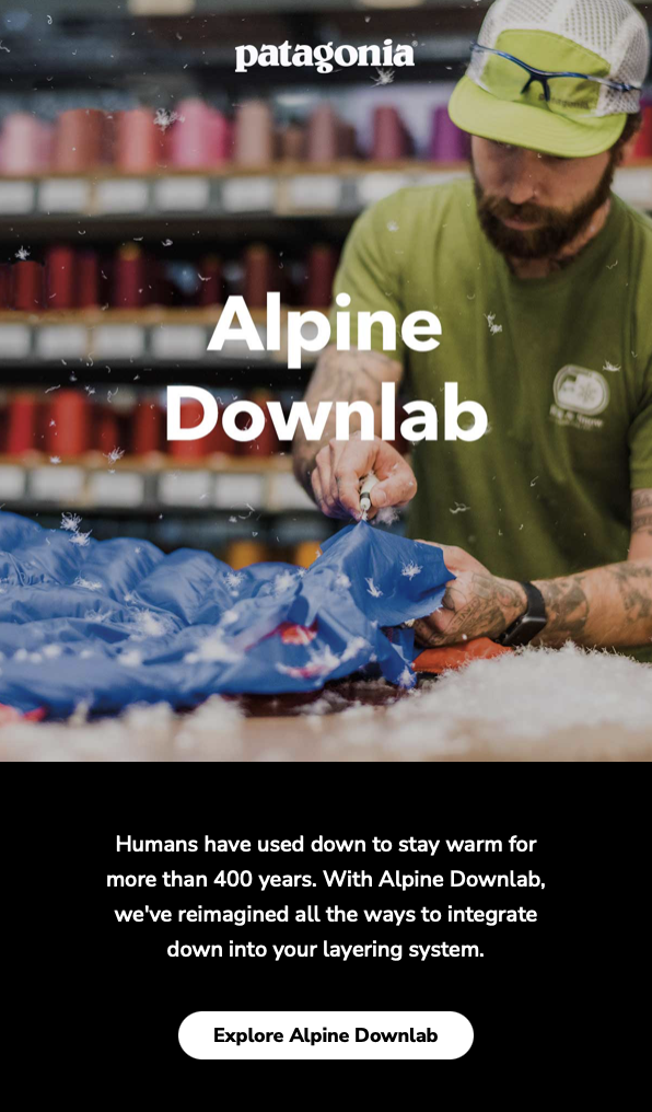
A company with sustainability at its forefront, clothing brand Patagonia reminds customers of its back-to-basics eco-credentials with reassurance that the materials it uses are sustainable.
This marketing email was sent at the start of autumn as temperatures began to plummet, and is filled with links to purchase warm, down-filled coats and jackets. Other content includes short summaries and a blog post on the company’s website relating to “inclement weather”, making it a well-rounded seasonal email.
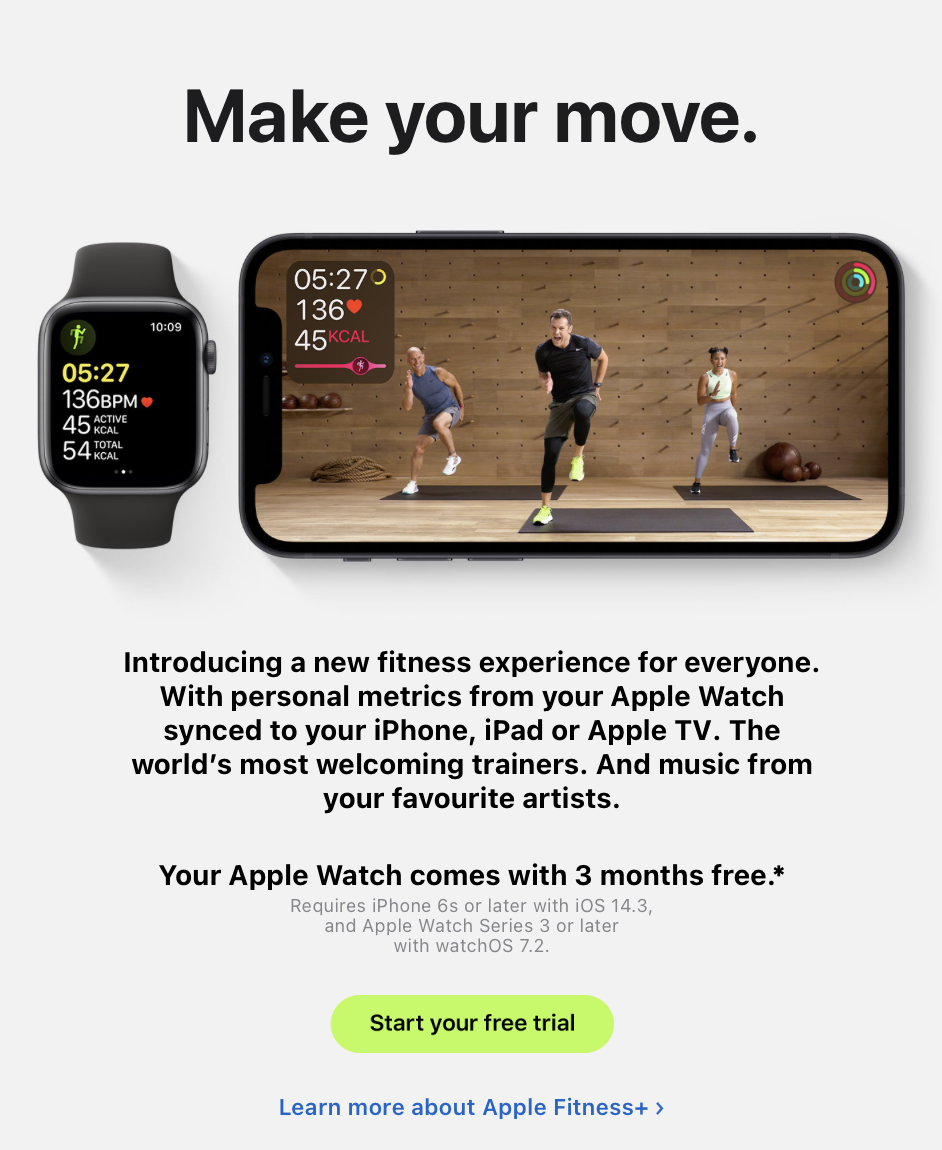
10. Apple
Launching a new product or service can be hugely rewarding after a long, exhausting process. Where better to look for inspiration than tech giant Apple?
With the launch of its Watch-based fitness service Fitness+, new Apple Watch owners were invited to a three-month free trial. The image shows the deep integration between Apple’s devices - one of the company’s key selling points. This carefully crafted email leaves the recipient wanting to know more; it’s no coincidence that the link to start the free trial is more prominent than others in the email.
TechRadar created this content as part of a paid partnership with Constant Contact. The contents of this article are entirely independent and solely reflect the editorial opinion of TechRadar.
With several years’ experience freelancing in tech and automotive circles, Craig’s specific interests lie in technology that is designed to better our lives, including AI and ML, productivity aids, and smart fitness. He is also passionate about cars and the decarbonisation of personal transportation. As an avid bargain-hunter, you can be sure that any deal Craig finds is top value!

