A look at five popular membership sites and what we can learn from them
Need something to ignite your creative spark? Here are five extraordinary examples of membership sites

Membership sites in all shapes and sizes have exploded over the past few years. Imaginative individuals are searching for a way to cash in on their creative outlets, while established businesses are looking to branch out and freshen up their brand’s content. Whatever your reason for researching membership sites is, before setting everything in motion you should decide what type of membership site you wish to create, who you are creating it for, and how much of yourself, your time, and money you are willing to invest.
The first step can feel daunting, even more so if you’re not sure in which direction you should go with your membership site. To give you a hand, we’ve made a selection of five simple yet successful membership sites that came with bright ideas and turned them into a booming business. From blogging about blogging, inspirational quotes, popular personality tests, learning through frustration to wonders of star divination, we’ve got everything covered.
Before we start our journey, we should note that learning by imitation isn’t only a shortcut for studying how to create, launch, and grow your membership site but also a search for inspiration. Sometimes the challenge of coming up with innovative ideas can get the best of us, and the fastest way to overcome it and fire up your imagination is to take a look at the works of others. So, get ready to get inspired.

1. QuotesCover or a lesion in simplicity
A wise man once said that simplicity is the ultimate sophistication, and the same applies to website design for the reasons we’re going to address. After taking a break from all the hustle and bustle of everyday life, average site users aren’t looking for a way to overwhelm themselves even further by wildly wandering around the site looking for information. The easiest way to keep their user experience enjoyable is to make your site seem simple to use, which implies seamless navigation on the site. What’s more, by creating your site with simplicity in mind you’ll also benefit from faster loading time and less time-consuming maintenance while making your site less likely to break down.
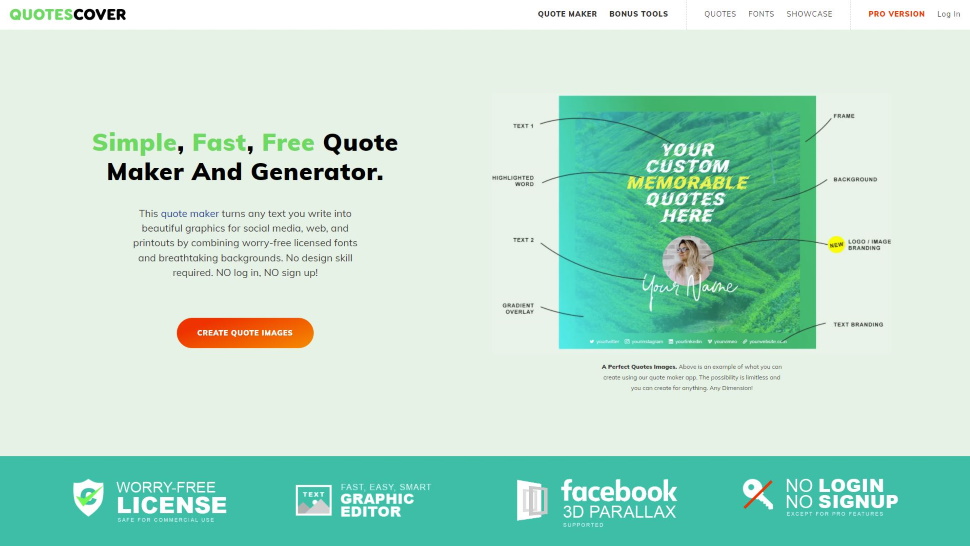
However, QuotesCover is not only simple in its design but it also took a simple idea and turned it into a thriving trade. As its name implies, this membership site offers a quote maker which is a simple, swift, and multipurpose graphic editor that is created with quotes for social media networks in mind (that is, eye-catching images with text over them). The simplified version of this tool is completely free-of-charge and includes some additional graphic design tools (such as profile picture maker for several social media platforms, Facebook cover maker, YouTube thumbnail maker, and Instagram carousel maker), an inspirational gallery with over 12,000 memorable quotes, more than a million background pictures and around 400 fonts free for commercial use, and the list goes on.
QuotesCover seemingly offers two plans, a free one and a “Pro” version which currently starts at $2.50. However, the free plan doesn’t make you become a member of the site’s community since it doesn’t require any kind of registration. Perhaps it seems a bit paradoxical at first, but with such a combination of free and paid programs guests are more likely to stay on the site, use its tools, and ultimately upgrade their plan to get more of everything (and get rid of the ads). The quote maker itself is mobile-friendly, surprisingly simple to use, and enables users to create anything from low-resolution pictures for social media to high-resolution images for desktop wallpaper, printouts, or marketing materials in general.
As its creators like to point out, “the main philosophy of QuotesCover is simplicity and easiness” and there is a valuable lesson to be learned from that.
Are you a pro? Subscribe to our newsletter
Sign up to the TechRadar Pro newsletter to get all the top news, opinion, features and guidance your business needs to succeed!

2. Smart Blogger, metablogging, and finding your audience
Before making plans on how to launch a membership site into cyberspace, you should ask yourself whether there is a place in the market for your site and, if not, how to make one. The market is more crowded with membership sites than ever before, so unless you can put a unique spin on your site and offer something no one else can, you’ll be shattered by the competition in two shakes. The easiest way to do this is by going with a unique niche and solving a problem for something very specific. However, you often have an opportunity to take an opposite approach and go meta, as did our next membership site example.
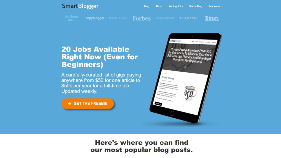
If the title doesn’t make it obvious enough, Smart Blogger is a blog about smart blogging. To tell the truth, you’ve probably heard about this one before and it is one of the main reasons we’ll have to talk about it. Launched in 2012 by Jon Morrow (now a living legend), Smart Blogger has earned over 300,000 subscribers, more than 4 million readers, and became one of the largest membership sites and a niche leader dedicated to blogging in the world.
Although Smart Blogger’s site isn’t as showy as many others, it’s content-heavy, and much of it you can access without signing up or spending a penny. Nonetheless, to get everything the site has to offer, bloggers-in-making will want to subscribe for some of its courses at least. Although all of this makes it sound as easy as anything, the lessons one can learn with Smart Blogger are not for the faint of heart nor for those who wait for others to do the work for them. The courses are extremely exhaustive and will walk you through the whole process of starting your blogging business, but being text-heavy and light on videos these are not lessons meant for those who are unwilling to commit to work.
By putting its focus on one specific niche and one that’s passionate about blogging to boot, Smart Blogger smartly avoided both becoming a jack-of-all-trades (yet master of none) and struggling with too much competition in the membership market. When blogging started to take off, Jon Morrow felt the disturbance in the blogosphere and answered the call, sending its start-up on a path of success.
Be smart like Smart Blogger and before starting your membership site ask yourself what do you wish to create, who do you wish to create it for, and is there a place for your creation in the world of membership sites.

3. 16Personalities and how to niche it down
The competition out there is though and it can be hard to shine, more so if you’re short on resources. One way to avoid blending in with the crowd and all without blowing your budget is to have a specialty that can seldom be found anywhere else (in other words, by niching down your membership site). With a highly specific niche, it’s much easier to characterize your content and find an audience who’s almost always ready to support your site (rather than browse casually). Bear in mind, this doesn’t have to be a big audience, but a small one with a strong interest in the content you’re creating.
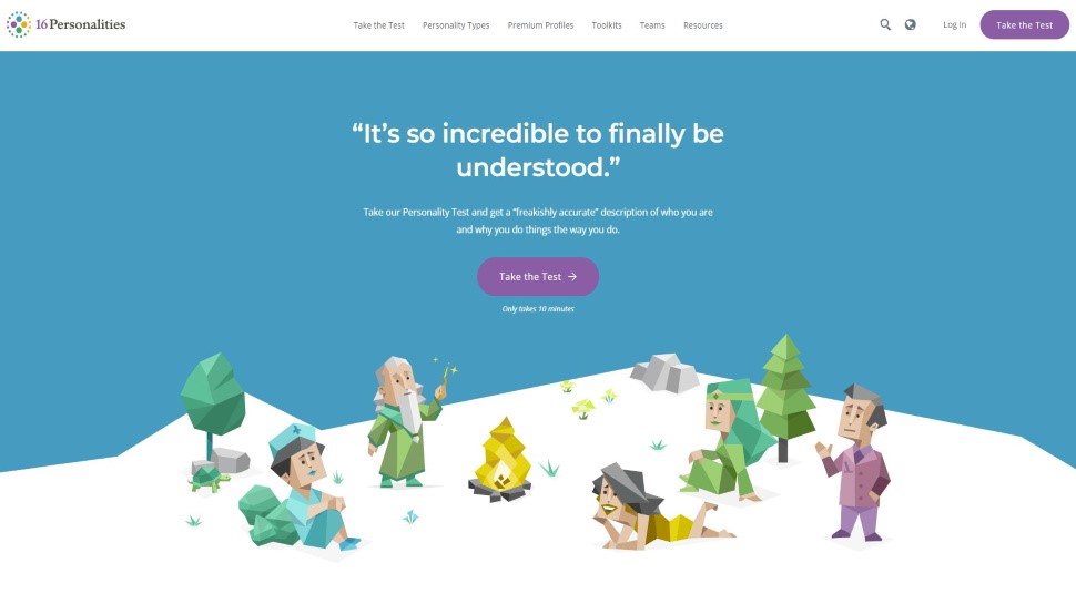
Such is the audience of a curious little site called 16Personalities which you must have come across if you have ever poked around the Internet searching for a key for unlocking the secrets behind different personality types (we know, we’ve been there). The first thing that’s likely to catch your attention on the site is its peculiar picture book-like illustration style, as well as its ease of use. The visitors are welcomed with tests that will reveal in which of the 16 MBTI (Myers-Briggs Type Indicator) personality types they fall into.
The test takes about 10 minutes after which you’ll get a brief analysis of your type and an option to update to a “Premium Profile” (yes, a paid one) with which you’ll get a personalized reading of the type you’re registered as. So, although the membership itself is free of charge, updates are put forward as a must-have chance to dive deeper into yourself, learn from it, and discover how to lead a more successful life (it’s a cunning upselling strategy by all means).
16Personalities offer a special call to action for every personality type, unique visual assets, and a value proposition to motivate their users to invest in membership plan upgrades. In a way, 16Personalities has split one niche into 16 separate niches personalizing the content (and user experience) all the way.
So, if there is a piece of advice to be taken from 16Personalities it’s that sometimes the best strategy is to niche it down until there is nothing to be niched down anymore.

4. Jan Spiller Astrology and why personalized content matters
Not so long ago, personalization of the customer experience in products and services was viewed as a welcome trait rather than an essential part of it. Today, it’s a whole different story. Personalization has become a must-have for any modern business, even more so with the membership model. Personalization is pretty profitable and its benefits range from boosting customer engagement, loyalty, and member retention to creating a buzz around your brand and beating your competition.
One membership site that has mastered the art of personalization is Jan Spiller Astrology. Upon entering the site you’ll be brought into the blackness of the starless universe with one sparkling sphere in the center of the page with Jan Spiller’s monogram carved in it. There you can choose between “Enter the Website” (which will simply scroll you down a bit) or “Membership Login” (which is a members-only area). Apart from the old-school charm of the landing page and the sense of mystery it evokes, the site seems rather unremarkable. However, there must be something that has turned it into a success story that lasts for more than two decades, and that something has everything to do with personalization.
Jan Spiller Astrology offers a lot of personalized freebies (both for registered and unregistered users) such as daily and monthly horoscope, natal chart, relationship calculator, full moon and newsletter notifications, and questions for a so-called goddess oracle. However, if you sign up for one of the paid plans you won’t only get more of the same stuff but it will also get more personalized content, which turns out to be a superb long-term survival strategy for a business.
Therefore, whether or not astrology is your cup of tea, if you wish your membership site to survive in this day and age make sure your site’s content is personalized.

5. Duolingo and having a crack at gamification
If you’ve been following the latest trends in web design, you’ve likely bumped into the idea of gamification. It is a technique of applying gameplay elements and game theory to non-gaming settings to enhance user engagement with a product or a service. By injecting entertaining elements into apps or systems you’ll keep your visitors amused, absorbed, and overjoyed with your site and its content. However, since there’s no one-size-fits-all solution for gamification, you’ll have to figure out which type works with your membership site.
If you’ve ever tried to learn a new language via an app or a website, we’re sure you’ve stumbled upon Duolingo and its famously freakish green owl mascot. Created in 2011, Duolingo is a USA-based language-learning website and mobile app with over 500 million users from all over the globe. One of their key strategies for keeping their subscribers returning for more is its inventive implementation of gamification. There’s a standard progress indicator, a badge reward system, a streak feature, progress bars, leaderboards, leagues, experience points, and a notorious notification bombardment from the meme-inspiring Duolingo owl itself.
Duolingo has mastered gamification mechanisms in a way that makes the learning process both effective and engaging while making it easy and enjoyable for everyone.
Starting your membership site
In case you’re still struggling to start a membership site, perhaps some of the examples above will give you an idea or two you can inject into your success strategy. However, don’t think that you should stop at these or that you need to apply all of the strategies mentioned above. Choose the ones you suppose will complement your site and leave out the rest. And keep in mind that it won’t be an easy ride, but at the end of the journey you could end up with a stable, scalable, and satisfying membership site business.
We've also featured the best web hosting, best website builder and best payment gateways
Mirza Bahic is a freelance tech journalist and blogger from Sarajevo, Bosnia and Herzegovina. For the past four years, Mirza has been ghostwriting for a number of tech start-ups from various industries, including cloud, retail and B2B technology.