iOS 16 Public Beta hands-on: Stunning image tricks, fresh lock screen and more
iOS 16 doesn't just look different. It IS different
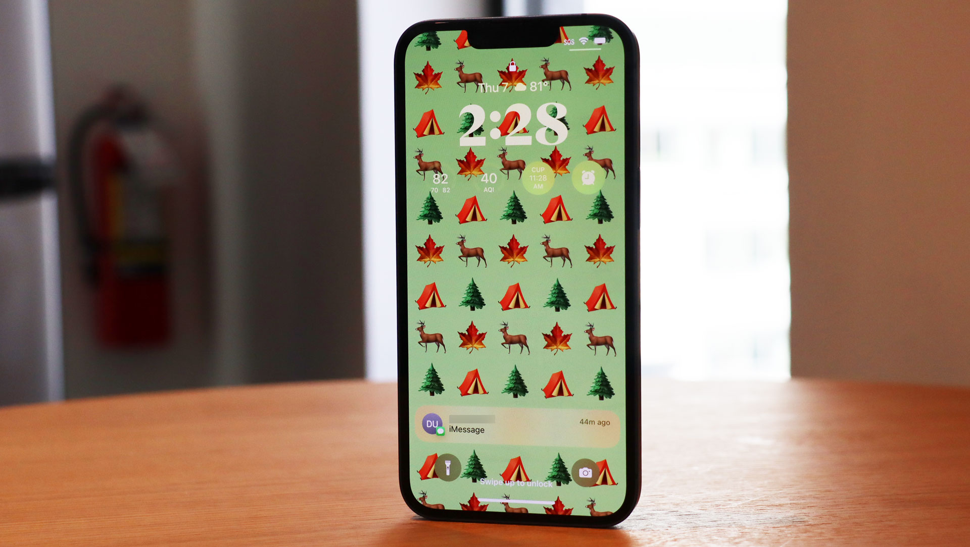
If I were Apple's iOS 16, I'd be a little annoyed at the iPhone. People obsess over the design and hold and caress the phones like a lover, but without the mobile platform, these handsets are just useless hunks of metal, glass, and silicon. Maybe iOS 16 will be the update that gives the platform its due and makes people realize that with just a handful of changes, you can completely alter the experience of using an iPhone.
That's the story of iOS 16, really. The platform is not a full redesign, but it offers a handful of big changes (along with so many little ones) that fundamentally change how we interact with and think about the Apple iPhone and its mobile design philosophy.
And it's not even done yet.
Roughly a month after unveiling iOS 16 at WWDC 2022, Apple launched the first iOS 16 Public Beta on July 11 officially opening its still-in-development platform to any iPhone owner (iPhone 8 and above) who wants to try it for themselves.
I've been using the developer beta for weeks, which is now in Beta 3, and while it's been a very stable beta thus far, I would remind you that betas, even public ones, can be somewhat unstable and still missing key features.
If you want to download the iOS Public Beta and follow along, you can read our How to Download.
Unlocking Design
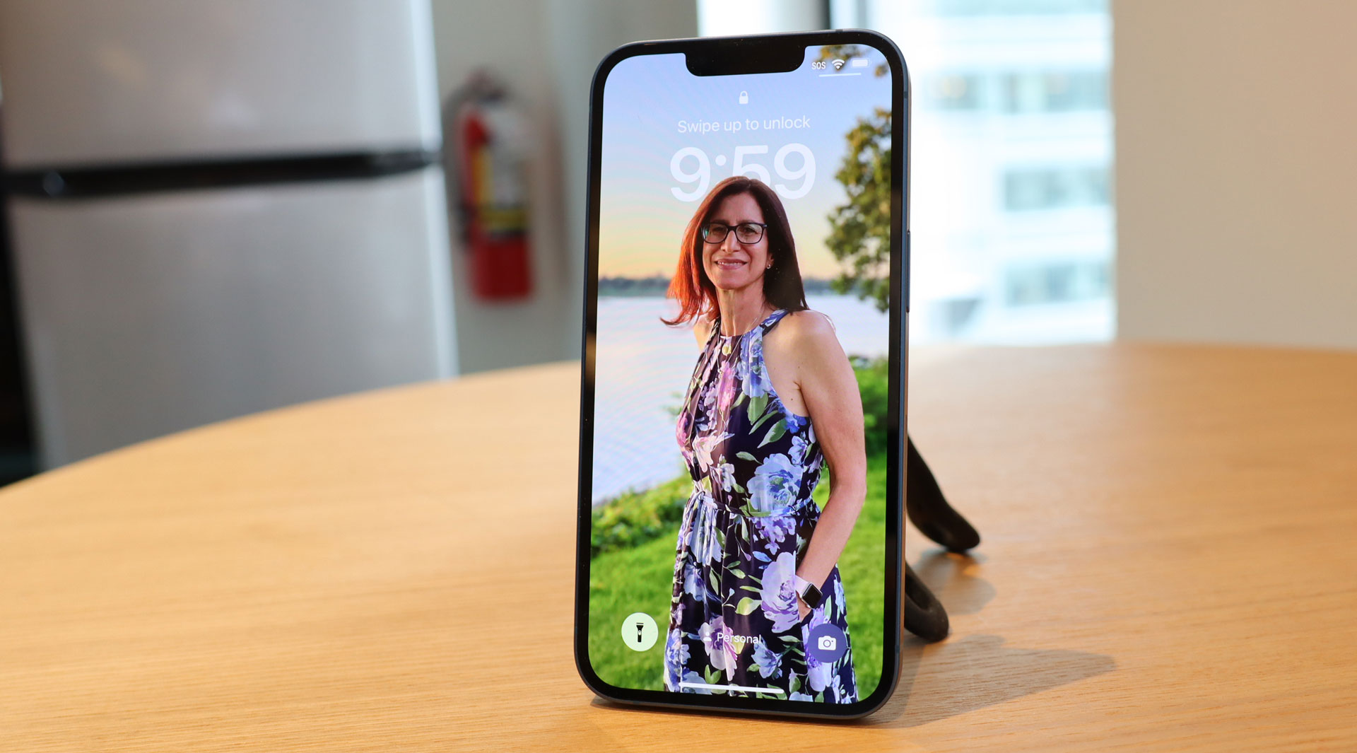
So much of what's new and special about iOS 16 public beta revolves around, at least for me, the programming wizardry Apple is now applying to images or rather segmentation of images.
Get daily insight, inspiration and deals in your inbox
Sign up for breaking news, reviews, opinion, top tech deals, and more.
It all starts with the Lock Screen, which makes sense since it's how you and anyone who happens to glance at your iPhone first sees the platform anyway.
For years, Apple didn't do much with the screen other than stuff it full of notifications that obliterate whatever beauty might lie in your lock screen image. Now, however, the Lock Screen can be a signature piece of art. Photos of almost any vintage can live on the display and the subject can have a sort of interplay with the still-iconic time and date.
Apple figured out how to pull the subject of almost any image forward. On my device, for instance, I have a photo of my wife where her head partially obscures the time. It's a striking effect, but it's just a small piece of the Lock Screen's new power and customizability.
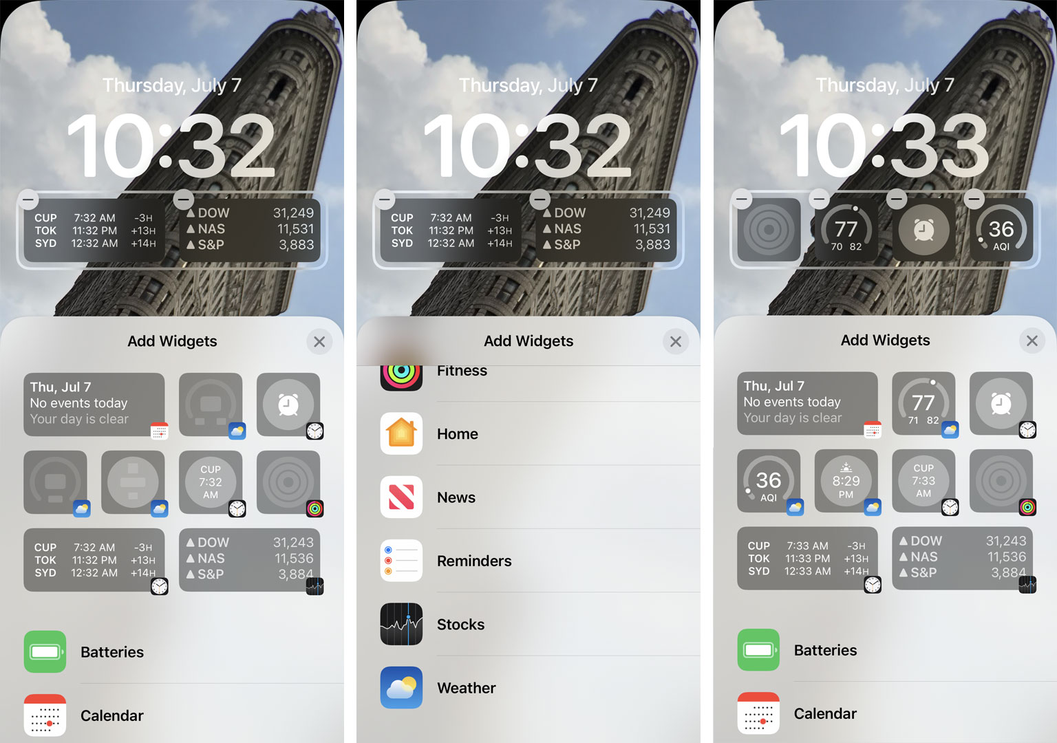
The lessons Apple learned from its Apple Watch and the watch screen face complications (bits of live-feed information that you can sprinkle around the display) have been carried over to the iOS 16 and the Lock Screen. Now I can hold down on a Lock Screen to access the "Customize Button." Through it, I can add a screen-width widget that sits right below the time. You cannot move or resize this box. However, I can add up to four elements that surface information like my calendar, a different time zone clock, stocks, activities, battery life, and more.
Adding this widget, though, at least in the current beta, is like a signal to iOS 16 that you prize information over beauty. As a result, the image segmentation effect disappears and, on my screen, my wife's head is now behind the time and widget box. As soon as I deleted all my widgets, her head popped back to the front.
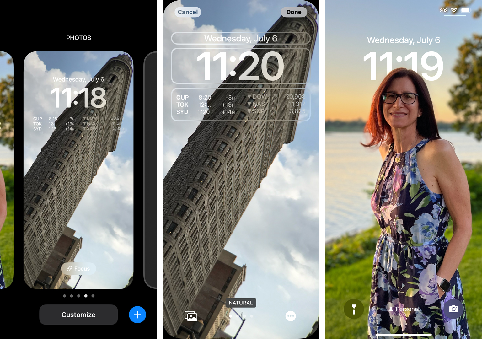
I can also pinch to zoom in and crop my photo to better work on the screen. I did this for a while to find just the right size and position for my Flatiron building Lock Screen. For any of the Lock Screen images, I can also apply one of a handful of filter effects such as Black & White or Color Back Drop to further enhance my Lock Screen look.
iOS 16 is not just about the Lock Screen, it's about the Lock Screens. When I hold down on my current Lock Screen, I can access a carousel of Lock Screens that I built earlier, or I can build a new one (or delete one). The additional Lock Screens not only feature different images, which can be built off photo suggestions from iOS 16 or pre-built ones like Astronomy, which lets you select between the Earth, moon, and a solar system view. I can set a specific Focus filter to go with each one. In my current setup, I have a personal screen with my Personal Focus filter on it, and a Work one with, naturally, my Work Focus filter in place.
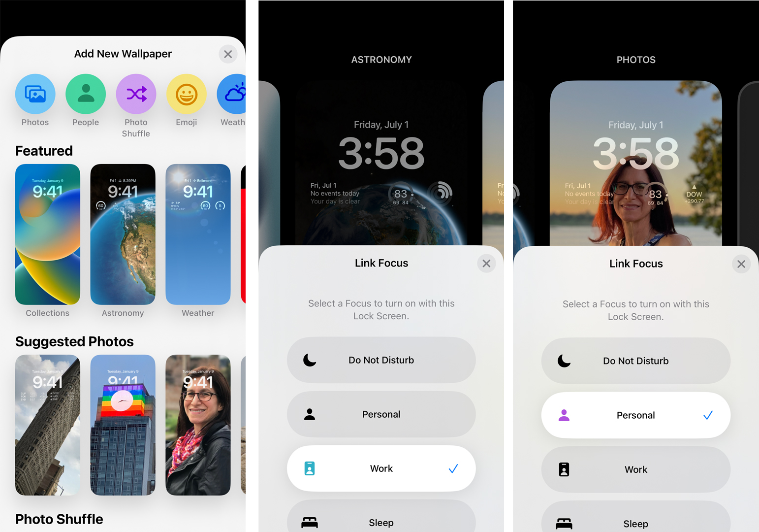
This becomes truly powerful once you dive into your Focus Filter settings, accessible through Settings, or via the Control Center. In there, I set who can contact me during, say, Personal focus, which apps I want to allow notifications from if I want the Lock Screen dimmed, and if I want Silenced Notifications to still show on the Lock Screen.
Now, I have a focus connected to a bespoke Lock Screen in a way that makes sense.
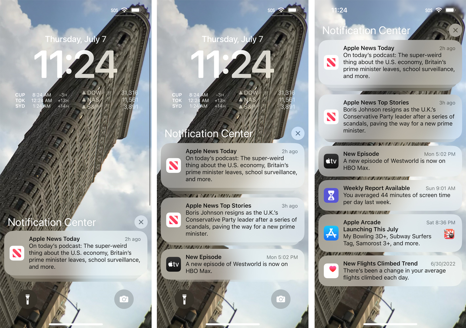
The other big Lock Screen change is how the notifications you do allow are managed. Personally, I love that the Lock Screen design I spent so much time perfecting is no longer obscured with a massive notification list. Instead, all my notifications sit collapsed at the bottom. I can sweep up to slowly expand them or swipe slowly to the top to see all the notification stacks. The new design definitely lowers my stress level.
By the way, if you're interested in learning how Apple remade its Lock Screen. you can check out my interview with the developers.
Find it fast
As I noted above, you won't find a ton of design changes between iOS 15 and iOS 16, but each one that does exist is very much about changing how you work with the OS and giving you better access to what matters.
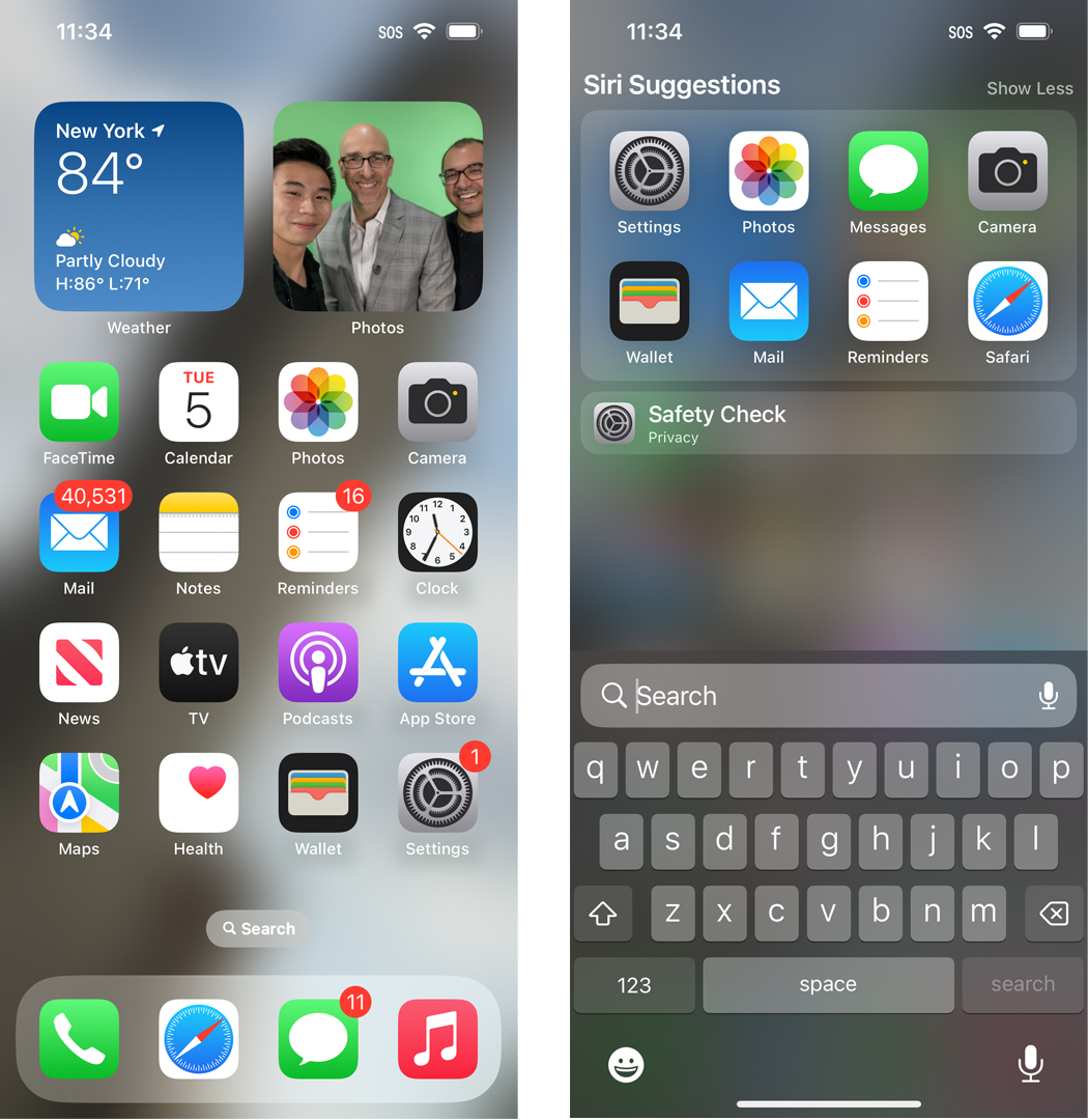
One example is the new "Search" button on your home screen. It lives right above the dock, just below your app icons, and features a little magnifying glass icon and the word "Seach."
Instead of sweeping down on my home screen to access Search, I tap the button, which reveals a slightly upgraded search console, where the search entry field has shifted from the top of the iPhone screen to the lower third. It's a great usability feature since I no longer have to look at the top of the screen while typing at the bottom.
When you start sweeping through your app screens, you'll notice that the "Search" button transforms into the app page ellipses but reverts to "Search" a second after you come to rest on an app screen.
Pieces of your image
There are precious few changes on the photo and image-capturing side in iOS 16. In the current beta, the camera appears to work exactly as it did in iOS 15. This doesn't bother me as I'm more or less satisfied with how the iOS Camera works - even if I do wish for easier access to more granular (read Manual) controls a la Android. It wasn't visible in my current beta, though.
iOS 16 will be adding Shared Photo Libraries, which you should be able to access through the Camera app. It would allow you to add freshly captured photos directly to a shared album. Imagine photos of the kids instantly popping up on Grandma's iPad or iPhone. I could not access this in the current beta, though.
There is, though, one very big change in imaging technology.
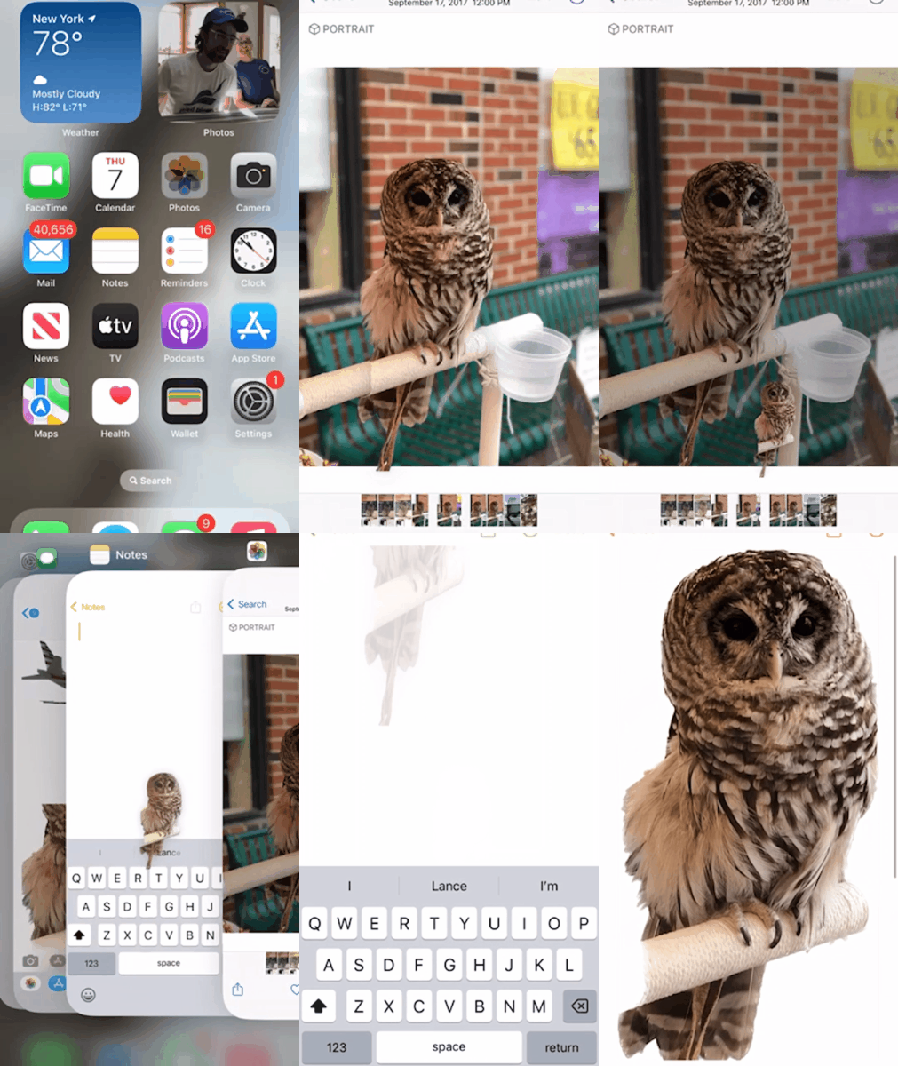
Remember that segmentation technology I mentioned earlier? Apple is using it to identify subjects in almost any image (in my tests it covered photos going all the way back to iPhone 6), select them, pull them out of the background, and then move them to another app.
This is a shockingly inspired and intuitive bit of programming. To select a photo subject, I opened the image in Photos, held my finger on the subject while I watched the system magically marquee it (or multiple subjects standing near each other), and then I used my other hand to navigate to where I wanted to deposit the cut-out subject.
Most of the selection work is excellent and I only detected the occasional artifact. In one instance, the marquee left behind my shoulder and arm. But for most photos, including ones that are not in Portrait mode, the selection work was very good.
I dropped marquees of my wife, my wife and I together, a dog, a bird, and more into Messages, Notes, Keynote, and Mail. It's fun and really remarkable, and lets you work within iOS in a truly new and multi-model way. It's a true iOS 16 highlight.
Going places
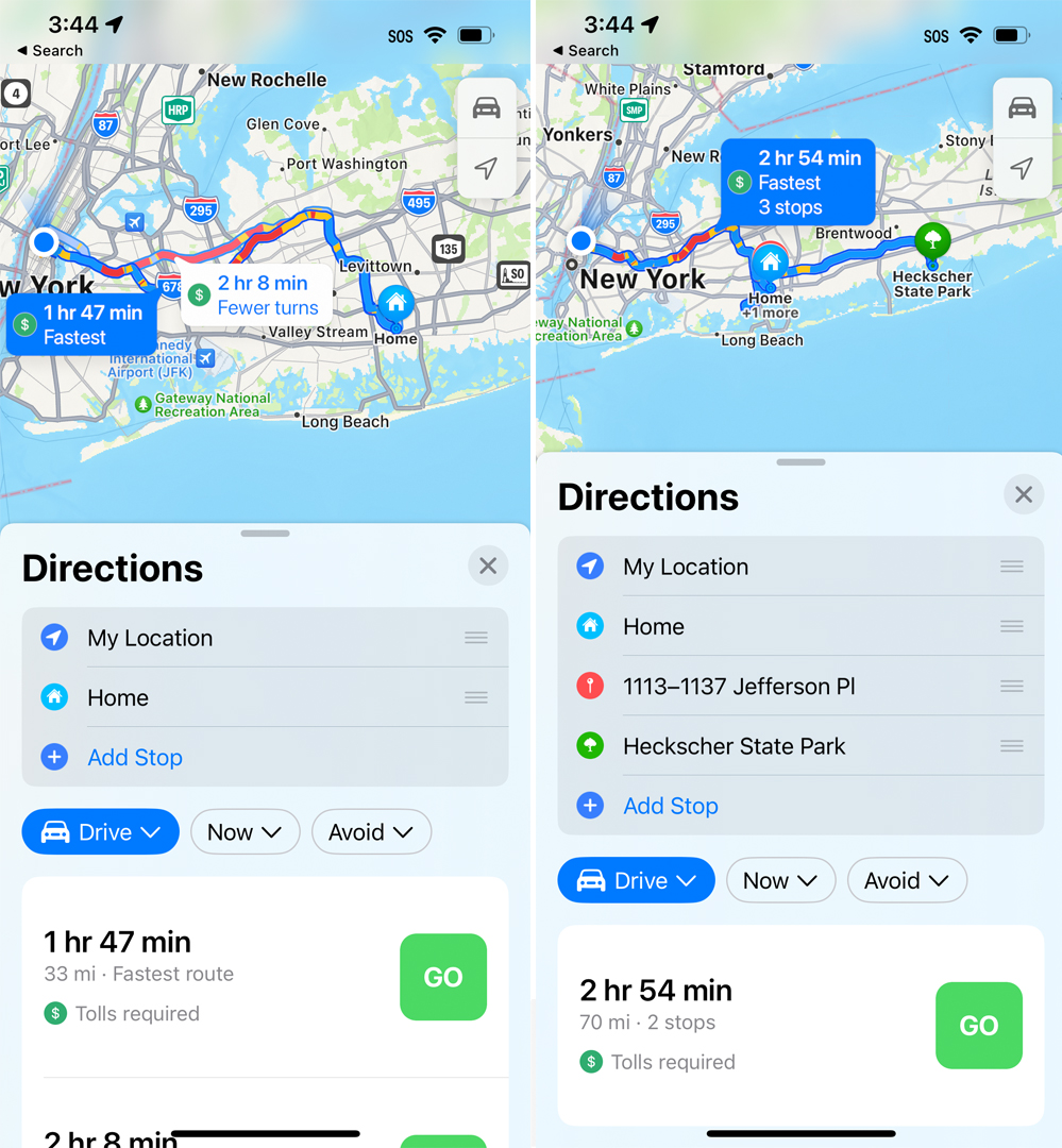
The highlight of iOS 16's Maps update is the multipart trips. When you select your directions for your destination, there's a new interface that includes "Add Stop."
I found I could add an almost unlimited number of stops and Maps would calculate the best direction based on the order of the stops. That order is easily changed by dragging and dropping stops or I could remove a stop by swiping to the left on it.
Even after I started my trip, I could add and remove waypoints. I think this will be a very popular feature.
Spatial Audio
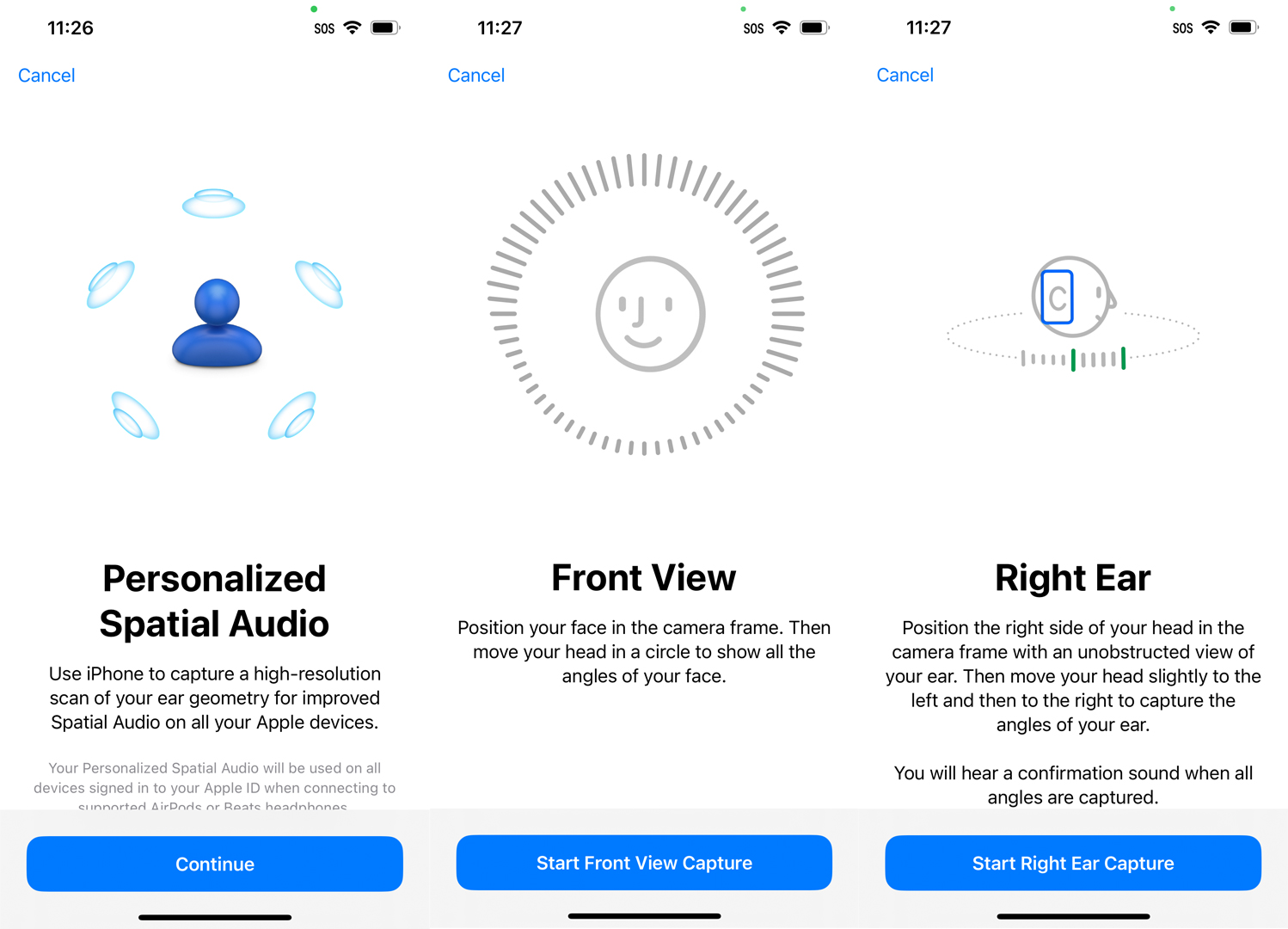
iOS 16 includes a treat for anyone who owns a pair of AirPods Pros: Personalized Spatial Audio.
The setup for this is a little bizarre. Remember how when you would set up Face ID, you'd have to scan your face with the iPhone? iOS 16's Personalized Spatial Audio wants scans of your ears from the front and both sides of your head.
To set it up, I followed the on-screen instructions, which require you to not have your AirPods Pros in your ears, and turned my head to one side and moved it around a bit, and then did the other side, as the iPhone scanned the contours of my ears. It did not take long, but with this information, the iPhone and iOS 16 can ostensibly deliver a better spatial audio experience.
I like spatial audio, which puts sounds and instruments in the virtual right spaces around you. It can be a moving experience with the right music or movie. However, I must admit that I struggled to tell the before and after difference. I will keep trying, though.
Text sea change
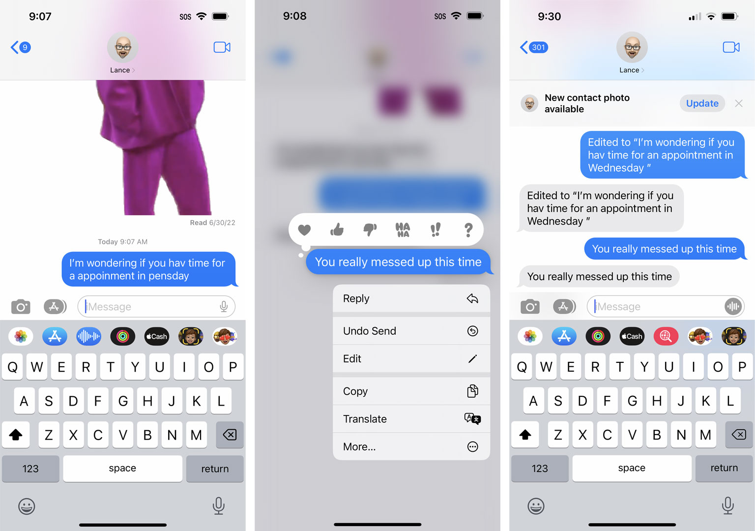
Apple's iOS 16 Messages update could have the most significant impact on your day-to-day iPhone experience.
Even though my wife is still on iOS 15, I've already started using messaging editing and recalls with her. Granted, she doesn't have the cleanest experience. Sometimes she can still see my retrieved text or both the edited and unedited versions. Between iOS 16 users the experience will be smoother.
On my side, I can hold down on a text and access the new Edit option (for up to 15 minutes after I send the text). Editing is self-explanatory. Once I hit the button, I can rewrite the text as I see fit.
For deleting a text, I select "Undo Send" and watch as the text disappears in a puff of blue smoke. That's when the system warns me that people running older versions of iOS still might be able to see the text message.
Even so, this is a powerful new feature and I cannot wait until everyone is on iOS 16 and we say goodbye to embarrassing autocorrects.
A safer system
I like some of the new safety and privacy features in iOS 16.
There's the new Safety check which let you see exactly who and what has access to your private information and digital activities. More interesting, though, is the new Emergency Reset.
It includes the slightly daunting "Immediately reset access for all people and apps, and review your account security," which I consider the nuclear option of digital privacy protection.
If you don't want to obliterate all apps and people from accessing your data (much of which you chose to share), you can review people and apps and see what information you might be sharing with them.
It's an almost alarmingly powerful tool where you can very quickly shut people and apps out. I bet some people will l love it.
I also appreciate the more granular and sensible family restrictions controls. There's an age slider content settings per content category, time away from screen controls, and the ability to share your child's location with other Family share members.
I wish these tools existed when my kids were young iPhone users.
It's deep
Even unfinished, Apple's iOS 16 public beta is a deep mobile operating system with hundreds of differences between it and iOS 15 and there's no way I could cover them all here.
Some smaller things jumped out at me like the new "SOS" that stays stuck to the top of SIM-less iPhones, the ability, with a long press, to schedule email sends, the powerful Lockdown Mode, and the voice-dictation that no longer hides the keyboard so you can make edits on the fly and not have to toggle back and forth between recording and typing.
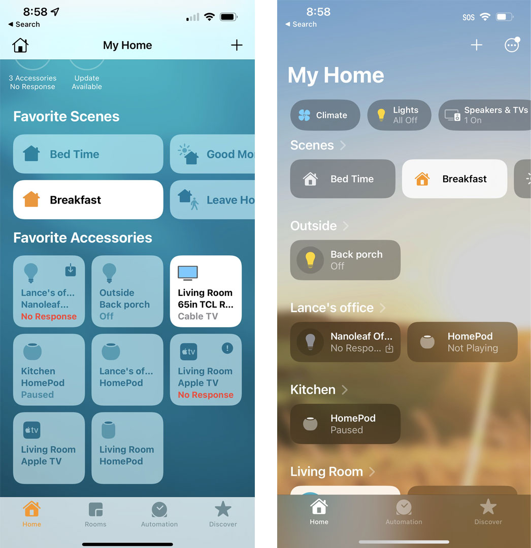
I'm also already a fan of the redesigned Home app, which finally makes sense of all my smart devices in a logical, well-organized, and inviting interface. I still do not have enough HomeKit devices to effectively use scenes, but maybe this new look will encourage me to expand Apple's influence in my smart home
Plus, some things are sure to change between now and the final release with, we're guessing, an iPhone 14 in September.
I suggest you try it out and start to experience all the wild and deeply impactful changes to images, the Lock Screen, and Messages. I bet you won't go back.

A 38-year industry veteran and award-winning journalist, Lance has covered technology since PCs were the size of suitcases and “on line” meant “waiting.” He’s a former Lifewire Editor-in-Chief, Mashable Editor-in-Chief, and, before that, Editor in Chief of PCMag.com and Senior Vice President of Content for Ziff Davis, Inc. He also wrote a popular, weekly tech column for Medium called The Upgrade.
Lance Ulanoff makes frequent appearances on national, international, and local news programs including Live with Kelly and Mark, the Today Show, Good Morning America, CNBC, CNN, and the BBC.