iPadOS 16 Public Beta hands-on: Solving multitasking with an old solution
Welcome to Apple's House of M
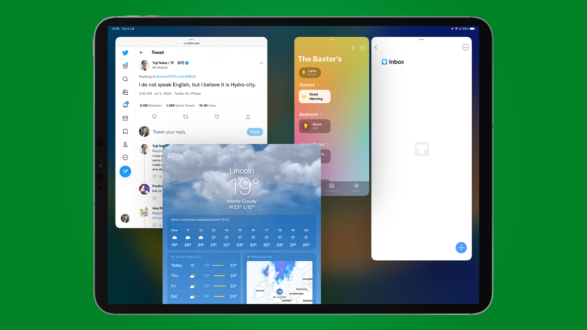
Now that the public beta of iPadOS 16 is available to download, I've been trying the latest update out on an M1 iPad Pro, and while some features are very welcome, Stage Manager brings the whole thing crashing down, for now anyway.
I've spoken before of how I moved away from the iPad as I needed something else that was more powerful, software-wise, and the MacBook Pro fulfills that in droves.
However, iPadOS 16 looks to be Apple's way of saying that an iPad can be as good as, if not better than, the laptop you currently have.
There are a bunch of new features that are also appearing in iOS 16 and macOS Ventura, so we'll be covering what's new for only the iPad here. But if you want to see what we think of iOS 16 so far, our US Editor-in-Chief has written up some thoughts.
I decided to write down this very post on an M1 iPad running iPadOS 16, just to see how it would be with Stage Manager and the other upgrades.
There are improvements scattered across the iPad here, such as better menu options across many of Apple's apps, alongside an improved zoom display to show more content, and long-awaited improvements in Mail. However, in my time with the software it's all been dragged down by the inconsistency of Stage Manager - Apple's latest attempt at fixing multitasking on M1 iPads.
It’s good, but it’s not quite right
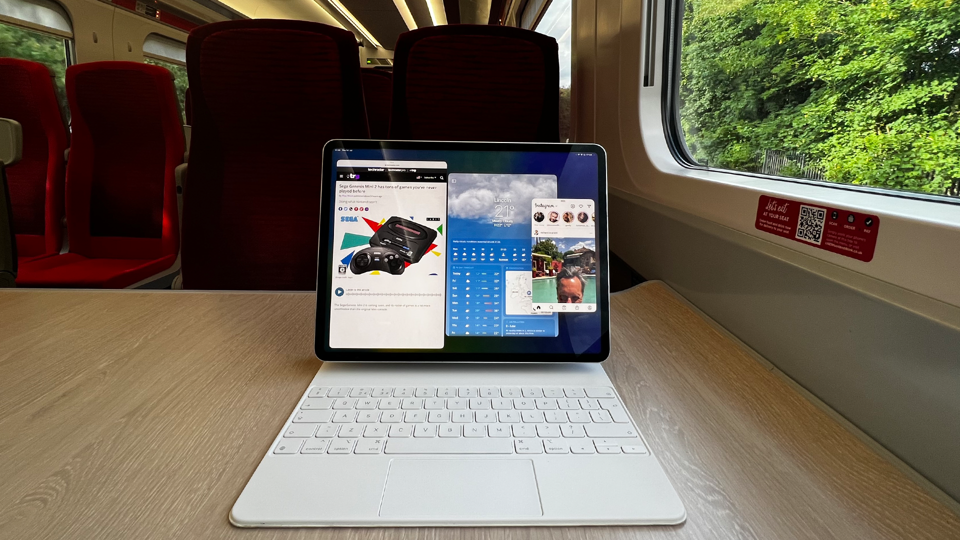
First off, let's tackle the name, as the phrase doesn't best describe what this feature tries to achieve to me. Center Stage makes more sense for another feature for example, which allows the camera on an iPad to track you as you move during a call. But Stage Manager feels off. There's no stage here for windows, and managing them is a stretch at best. Perhaps Window Manager or Window Control to better describe this new way of multitasking?
Get daily insight, inspiration and deals in your inbox
Sign up for breaking news, reviews, opinion, top tech deals, and more.
In any case, Stage Manager can be enabled by going to Control Center, accessed by swiping down the right-hand corner of your iPad, and a new icon will be there toward the bottom.
You may not see any difference once it's enabled, but if you're in an app, you may see a small line at the bottom left or right. This will enable you to resize an app to certain sizes.
I say certain sizes, as Apple has made it so that you can't resize windows to any size you wish. You also can't place windows anywhere, similar to how a picture-in-picture video works. They all snap to an invisible grid, and sometimes, as you're trying to arrange these windows, they can move and resize of their own accord, which has only added to my frustrations with this feature.
Not being able to place your windows anywhere on the iPad's display doesn't make much sense, and it's only when you try to add more windows that others decide to resize themselves.
Worse still, when I switched off Stage Manager, windows would merge with each other, displaying in the split-screen multitasking view that iPad users have been accustomed to since iOS 11. Oddly, when I decided to resize the two apps, the one on the right would change from Weather to something else that was in Stage Manager previously.
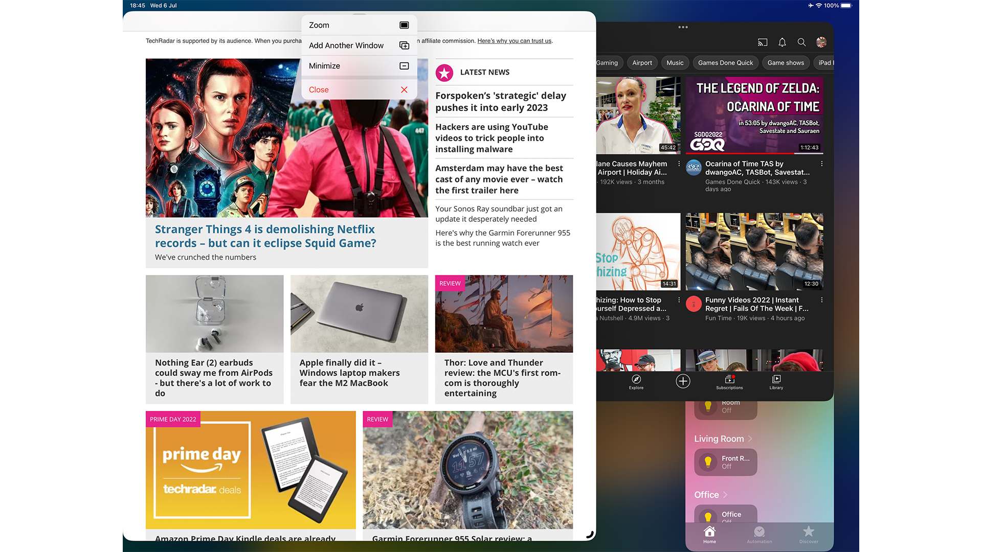
There’s also three dots at the top of every window, which you can use to close a window, make it full screen, or add a new window. But i found each of these options to only work occasionally, as some windows would refuse to go full screen, or closing a window would rearrange the view of the other apps in Stage Manager, most likely due to the invisible grid.
Regardless of my issues here, I can have four apps display at once, all in different sizes that I was almost happy with. Writing this very article, I’d be in Google Docs, Slack, Outlook, and Safari all at once. However, if I needed to switch between two apps, I’d have to bring up the dock, and then select - for example - Google Docs or Safari to bring one to the forefront. Reaching for one that's behind some of these active windows is awkward, and sometimes I'd find myself selecting the wrong app.
One shining positive here that must be mentioned, is external display support. Finally arriving with Stage Manager, connecting the iPad to my 1440P 27-inch monitor was a sight to behold, and it rendered iPadOS correctly, alongside the four other apps in this view. But again, the above issues were there for me, so the intricacies of Stage Manager did dampen the experience slightly here.
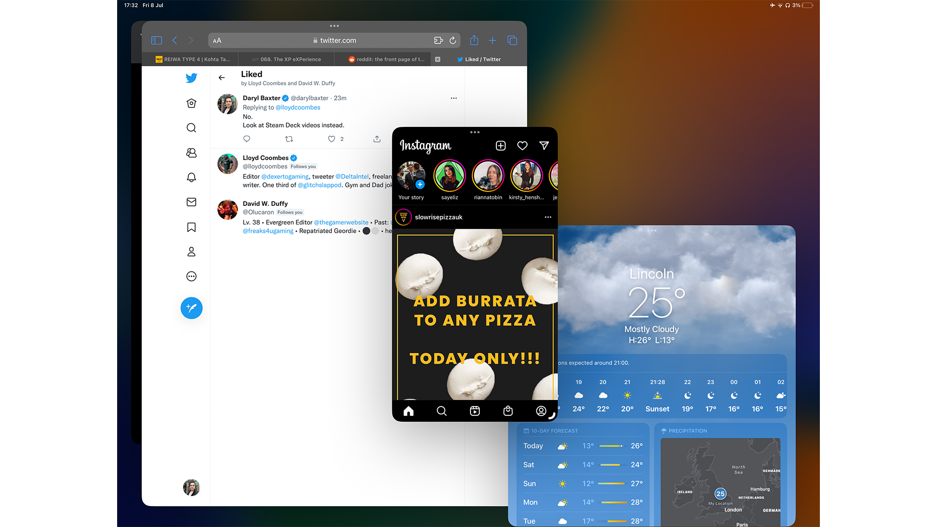
However, the public beta also brought a new improvement here for iPhone apps that haven’t been optimized for iPad, so for example I can use Instagram, in its iPhone 13-sized design, alongside Safari, Google Docs and others. It’s a great little touch.
Multitasking can be a struggle
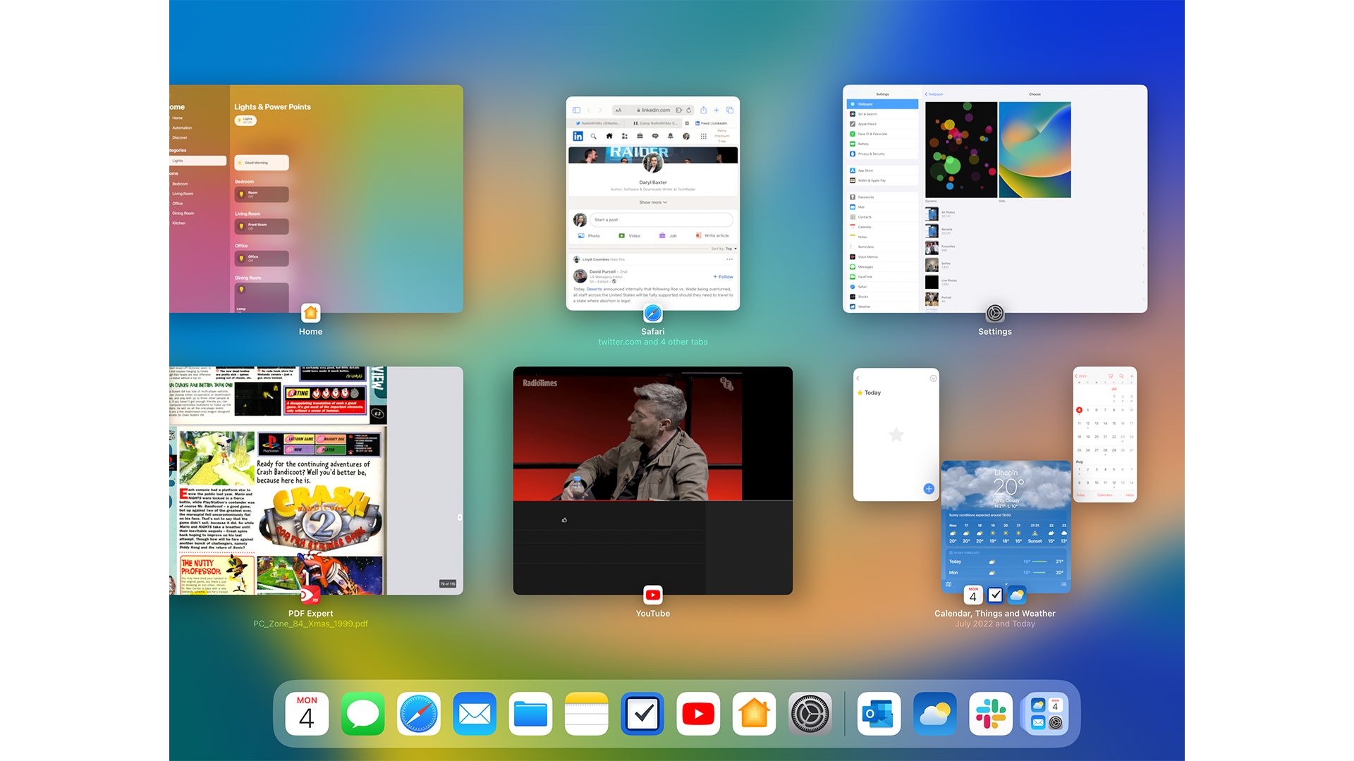
When you slide up with three fingers, you're usually brought to the above screen where you can switch to a different app.
The apps you have in Stage Manager now show here too, and you’d think that you could select the apps in this view. But instead, it just freezes the same view you’re in, and you can’t bring one of the four apps to the forefront through here.
Currently, you also can't switch between apps in Stage Manager with CMD + Tab, so to see some improvement here towards its release later this year would be welcome.
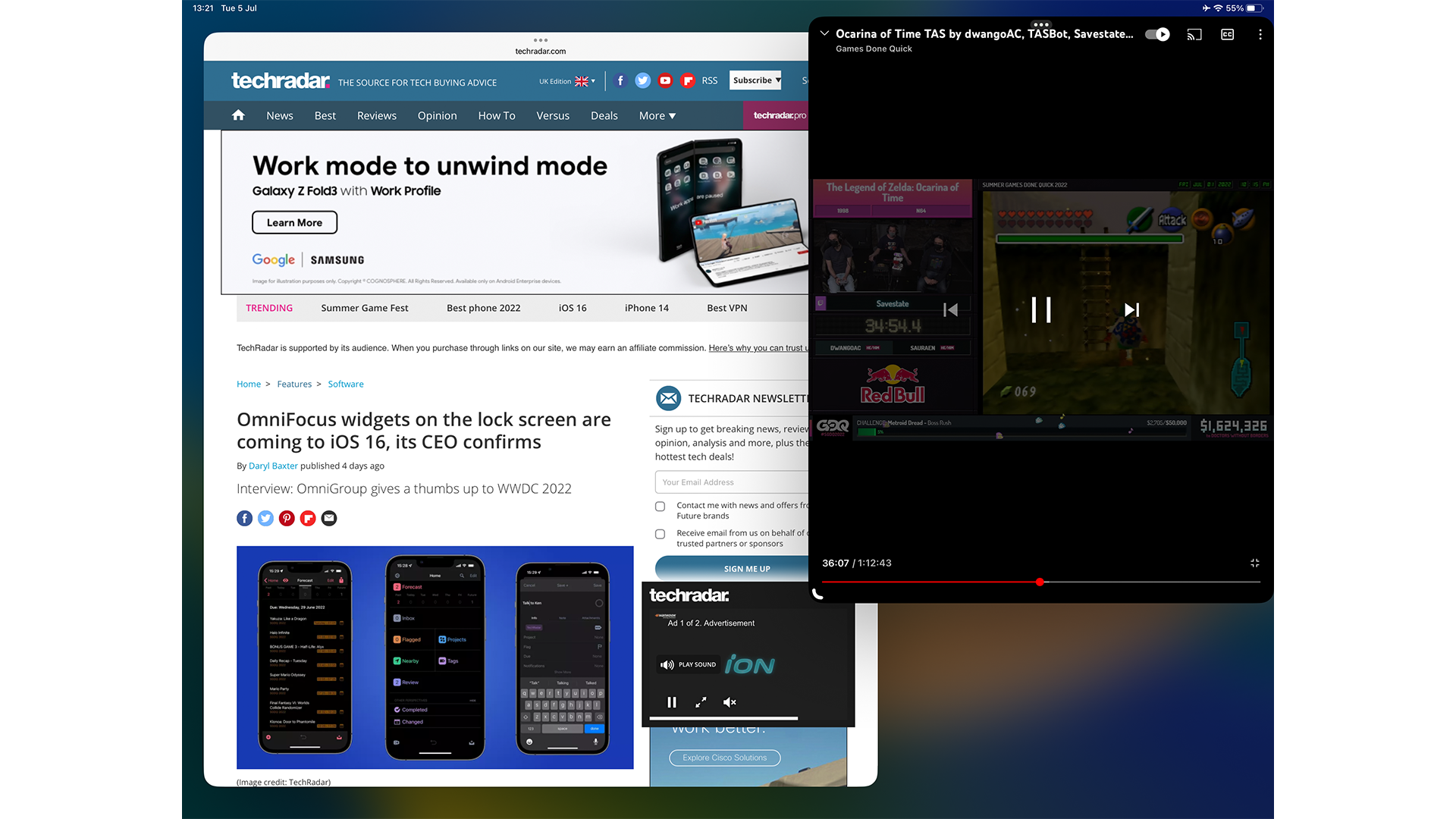
One other aspect is when you want to replace an app with a new one. For example, I wanted to use the Weather app, and it replaced Outlook with no prompt. Instead, I’d love to see a dialog box, asking me which app to replace. Otherwise, I’m playing roulette as to which app will be replaced. It’s a headache.
However, Stage Manager does highlight how much PiP (picture-in-picture) support needs to be improved. This can allow some videos to be played wherever you are in iPadOS, but it's not seen an update since iOS 9.
In Stage Manager though, I can have YouTube and Safari in their own windows, and I can resize YouTube to be the same size as a PiP, but with a timeline scrubber. It renders PiP pointless in these situations due to the better control I have here in Stage Manager.
For now: It's good, but it could be great
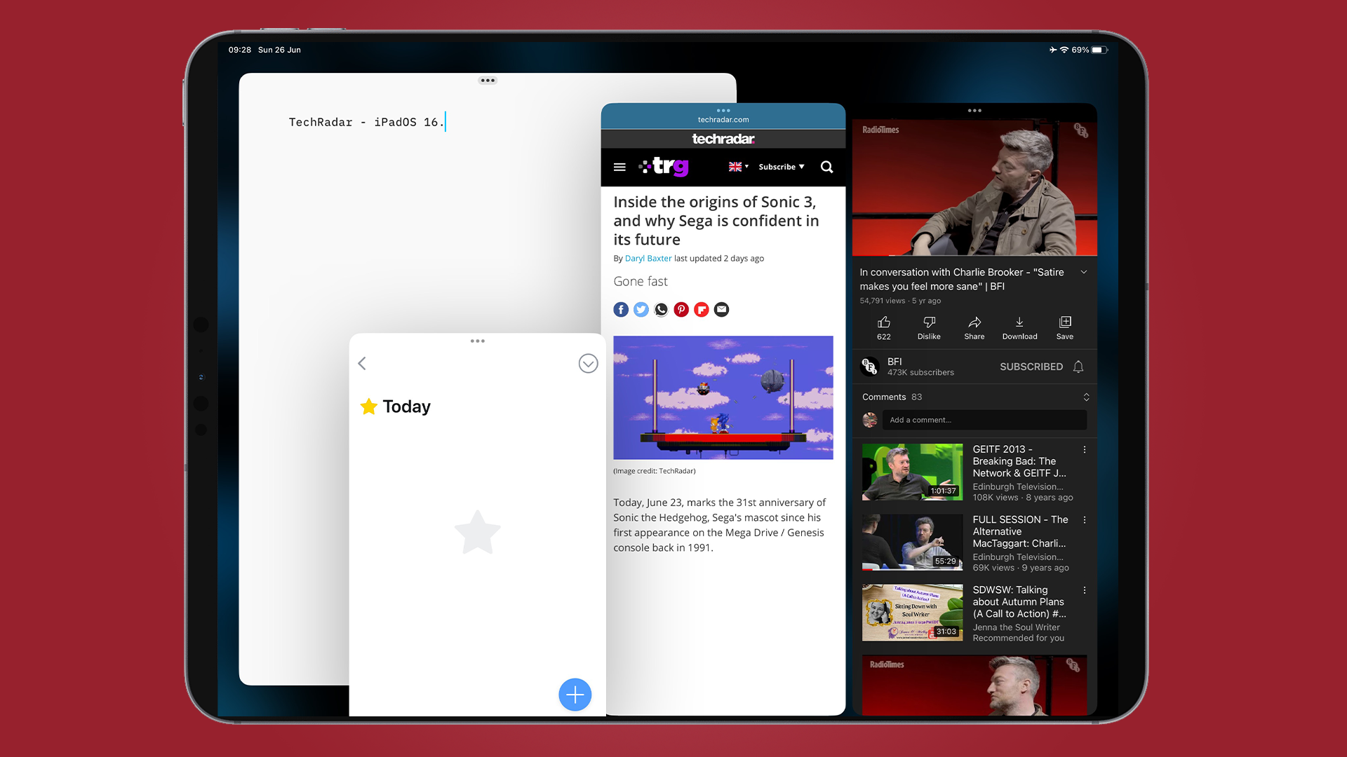
Look, I know multitasking on iPad has needed a redesign for a few years now, but using Stage Manager in its current state, I’m constantly reminded of how Safari in iOS 15 went in 2021. Apple's web browser dramatically changed its design from how it was when announced at WWDC 2021, to when the new version released in September.
I can see the same occurring with Stage Manager over the coming months. Snapping to an invisible grid, having apps disappear without you being prompted, and the awkward resizing of windows, alongside the clunkiness of trying to get some apps to move to the front, are all things that clearly need work - and hopefully will get it.
I'm also perplexed to the fact that Stage Manager, available on macOS Ventura as well, works great without the restrictions of iPadOS. While one look at the desktop on a Mac with the feature enabled makes it looks busy, the absence of an invisible grid and the freedom to arrange windows with no worry of apps disappearing, makes the feature enjoyable to use on a Mac.
However, some users may opt to leave it switched off, as features such as Mission Control and Expose already solve these issues of window management on the Mac.
I agree with Apple’s approach to having this be available on M1 iPads only. Many users wondered what the point was of the M1 chip arriving on iPad. Here’s your reason, and of course, it won’t be the only feature exclusive to M1 as future releases of iPadOS beckon.
But as it stands, Stage Manager needs more love as we approach the final release of iPadOS 16 later this year. It works up to a point, but unless some more fixes and refinements arrive, it could frustrate users more than it appeases them.

Daryl had been freelancing for 3 years before joining TechRadar, now reporting on everything software-related. In his spare time, he's written a book, 'The Making of Tomb Raider'. His second book, '50 Years of Boss Fights', came out in 2024, with a third book coming in 2026. He also has a newsletter called 'Springboard'. He's usually found playing games old and new on his Steam Deck, Nintendo Switch, and MacBook Pro. If you have a story about an updated app, one that's about to launch, or just anything Software-related, drop him a line.